
Journal
In our blog, we tell stories about what we’re up to at the studio, our clients and the projects we are involved in.
Here you can find complete case studies, photo reports or simply accounts of the beautiful things made by the creatives we work with.


ECHN - European Creative Hubs Network
Saber Fazer / Ofício has been an associate member of the ECHN - European Creative Hubs Network since the beginning of the year!
The positioning of Saber Fazer as an aggregator and facilitator in the universe of artisanal work and small-scale industrial production and its relevant role as a training entity, combined with the experience of Ofício in supporting entrepreneurs and businesses in the creative industries, has led us to participate in different projects and networks that go beyond our national borders.

GatewayCrafts
GatewayCrafts was launched in January! GatewayCrafts is an Erasmus+ project proposed and coordinated by Saber Fazer / Ofício and which has @cru_creativehub (Portugal) and @materahub (Italy) as partners. The project consists of preparing pilots to facilitate access to technical knowledge in small-scale manufacturing and artisan work. In addition, over the next few months, we will be developing and distributing high-quality educational content free of charge, oriented and adapted for contemporary audiences and digital media.

How we made the ONEX. identity
Recently we finished the branding and graphic design strategy for a leading Portuguese catering solutions provider.
The challenge with ONEX (Onexperience Group) entailed simplifying how the brand is presented in different markets and developing a new identity and shared visual system for the seven companies composing the conglomerate.
We developed a comprehensive visual system to organize the brand presence in different media. The strategy was to put forward a strong presence, combining typographic elements with an expansible set of symbols and colours representing each of the present and future business areas.
Bombarda Podcast
After difficult times during the pandemic, Bombarda, Porto's Art District community, came together again to favour different projects, fostering innovation and networking in a frankly and continually creative territory.
BOMBARDA is a podcast dedicated to everyday topics in the Miguel Bombarda neighbourhood in Porto. Made by and for residents of this territory - whether residents or entrepreneurs - this space exists to record and amplify reflections and discussions around the local development of the well-known "Art District" in Porto, whether these are cultural issues, social, environmental, urbanistic or economic.

Ofício/ Saber Fazer is a VET provider certified in Portugal by DGERT
We open the year 2023 with excellent news: Ofício/ SABER FAZER has become a Vocational Education and Training (VET) provider certified in Portugal by DGERT!

How (and why) we made the new Ofício website
The project took several weeks, and, like all internal projects, creating a new website for Ofício was constantly pressured by the tight schedule of other things.
The need arose in 2021 when we launched the new Ofício identity. The site, which had evolved disorganizedly over the years, was no longer fulfilling its function, not even remotely. It didn't even respect the direction that Miguel Moreira had given our identity.

How we created Ana Paula Almeida's identity
Ana Paula Almeida, artist and maker, among many other things, came to us with a challenge. To think strategically about the brand, she was creating for a product and, based on that thought, to develop the entire visual identity.
The product in question is a lamp whose most distinctive feature (in addition to the design) is that it is built with wool yarn. These yarns are the leftover stock from the wool factory that now houses the New Hand Lab, a life project by Ana.

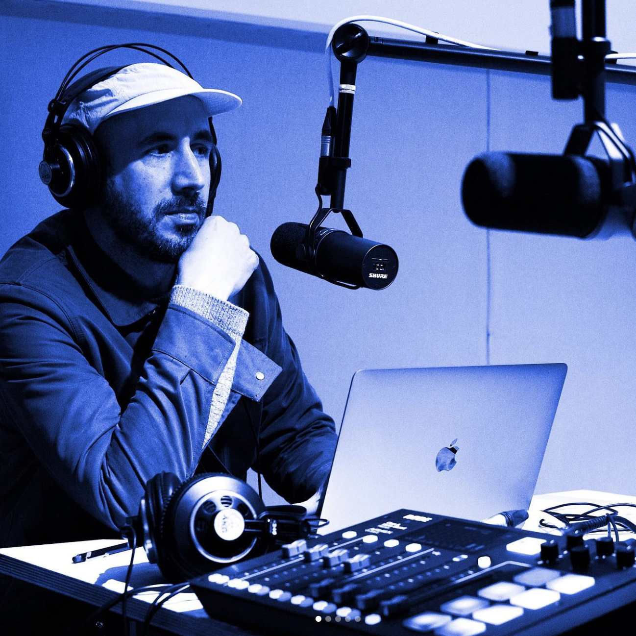
INDIEWORKERS PODCAST #1: The power of anticipation, Miguel Barbot
It was late September when I visited CRU Creative Hub's brand-new audio studio. I was very excited about spending that morning with our dear friends and clients (we still owe you a post about our extensive work there). We recorded the first episode of their new Indiworkers podcast, and I had the honour of being the first to be interviewed.
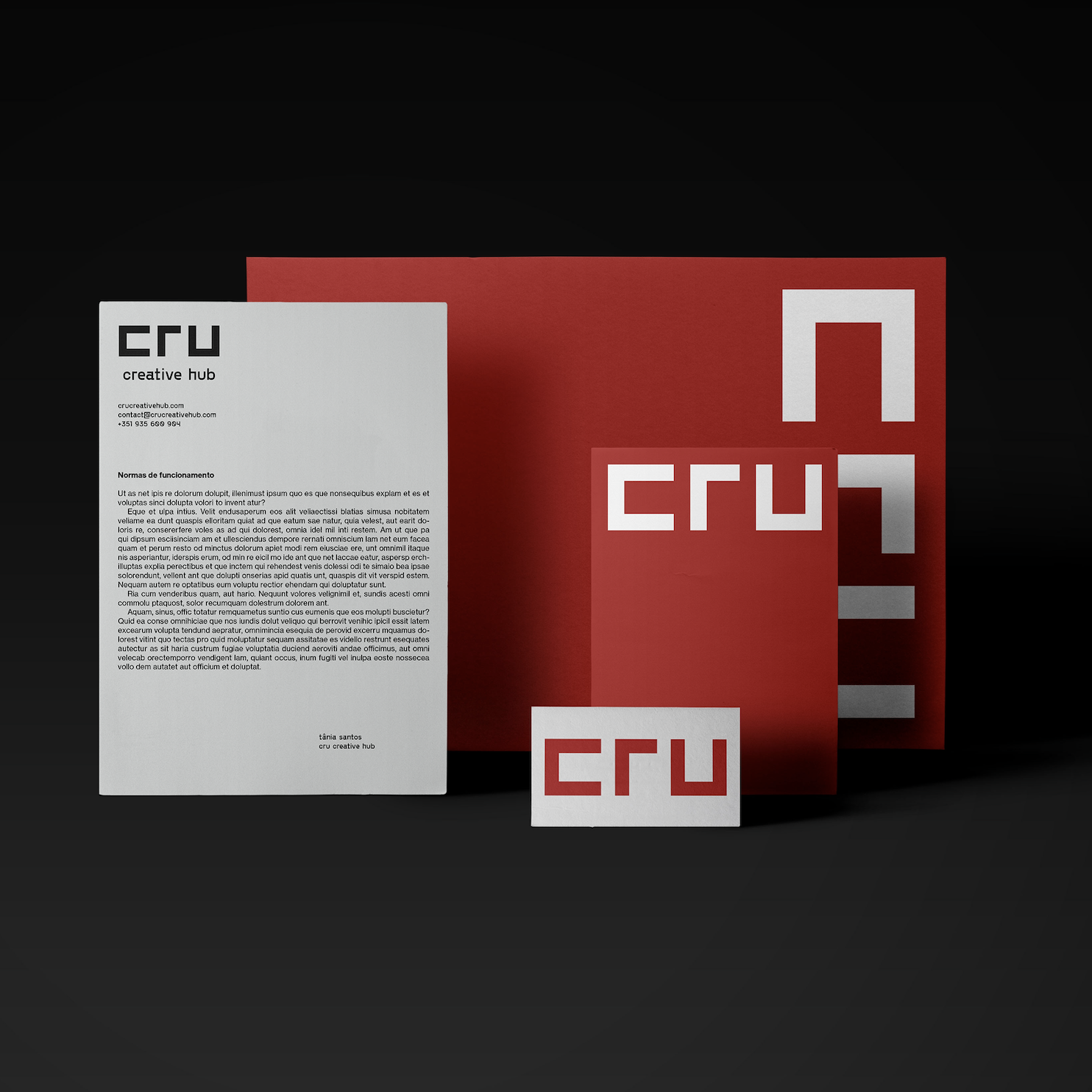
From co-work to creative hub: How we rebranded CRU
Cru was founded in 2012. The original logo was used for almost one decade until the founders asked us to help rebrand this iconic space in the heart of Porto's art district. By then, we had just finished a strategy project that repositioned Cru from a Cowork to a Creative Hub, something we will tell later in a different post.

Nova Type Foundry
Typography is a subject we love — kerning, small capitals, punctuation, alignment, baseline grids and optical sizes — we love it all. So Joana, the founder of Nova Type Foundry, asked us for help regarding Nova's social media communication: strategic marketing within a subject we hold dear.

Velo Culture: enjoying the city, with calm.
Velo Culture, a business closely linked to Barbot Bernardo and Ofício, was created in October 2011 by people united by the love of bicycles and a more "calm" way of living in the city. They decided to open a store in Matosinhos's then-degraded Matosinhos Municipal Market.
After almost ten years, it is a national reference in everything that respects cycling as a means of transport and a more contemplative way of cycling on road and travel cycling.
Velo Culture is very concerned with more conscious consumption, and its customers are people who buy less but buy better.

Please use wool. The environment (and the sheep) will thank you!
The shearer's taste for the art of shearing and love for sheep is an essential factor we can share whenever we organise a shearing with Marty. In his hands, the sheep relax and often fall asleep as he gracefully removes their fleeces, like a dancer in wool shoes on his small stage.

SUST.CO
Today we returned to 2020 to tell the story of a project that still needed to be posted here.
The Sust.co identity was a challenge proposed by Sofia Ferreira, who later hired our strategic consultancy services. We can only tell you a few details about the project and the client's plans. Still, we can say that it is linked to one of our central themes, "Craft", which means beautiful things, handmade and/or on a small scale and to last.
Business models and model businesses
"A small business, growing only as far as it should, has much more capacity to be a model business. Being obliged to create value for the customer, since without it, it cannot survive, it is also subject to very direct scrutiny and immediate impact. I work fundamentally with design and creative businesses. For them, the value is in the cocktail that combines different things: the sold product, its function, durability, responsibility in the choice of materials, provenance and ethics in the manufacturing process, history, aesthetics, artistic value, and service. All are easily noticeable and valued by those who leave their money there."

Ofício + Senzu Coffee Roasters: La Garza
After having the first editions sold out, Senzu Coffee Roasters roasted a new and bigger batch for our collaboration, this El Salvador (La Garza). Maria Helena designed the beautiful label.

How we did Ana Rita de Albuquerque’s identity
Within the team, the objective of positioning the work on a multidisciplinary level was clear: we got inspiration from the work's very delicate but very organic and visceral character. We also considered wool's primitive rawness and the dialogue with technology: an invisible but ever-present second layer in many of her artworks. Finally, we took visual clues from music and the early eighties' sombre bohemia.

ABCOFFEE School Podcast
For the first episode of a series full of illustrious connoisseurs, the crazy people deciding this podcast decided it was a good idea to invite me. Maybe I'm illustrious, one never knows, but I'm certainly not a connoisseur.

In the studio: Ricardo Gil
It was early Autumn, and Jacquie and I spent a few days with Ricardo and his business partner Carol defining the studio strategy. By then, we had the opportunity to photograph the work in the big loom, handbuilt by Ricardo himself. It is so big that we almost couldn't use the title "in the studio" due to the lack of space inside.

How we did Prata’s identity
“In my research, Wassily Kandinsky's "Point and line to plane" informed most of the process: I love this book, a marvellous piece exploring graphic expression, painting and geometry theories with scientific precision, relating them with dance and music.”

The Wolf Skin - A Pele do Lobo
A Pele do Lobo/ The Wolf Skin is a series I'm creating at my studio about the fleeces of Portuguese native sheep breeds. It started with a gentle approach to this animal's raw material. On the one hand, Pele do Lobo is a declaration of care and love to the origin, made with a specific technique observing the manufacturing rhythms. On the other hand, it is an artistic concept. This order is a perfect circle where the human context gives value to the material's provenience. This provenience responds by transforming itself into an artwork.