How we made the ONEX. identity
Recently we finished the branding and graphic design strategy for a leading Portuguese catering solutions provider.
The challenge with ONEX (Onexperience Group) entailed simplifying how the brand is presented in different markets and developing a new identity and shared visual system for the seven companies composing the conglomerate.
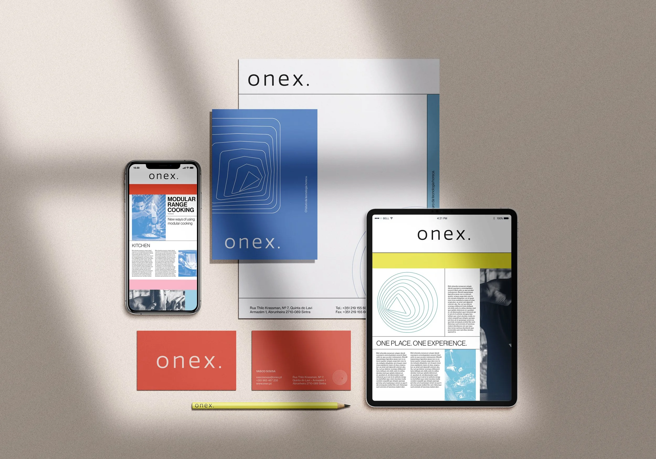
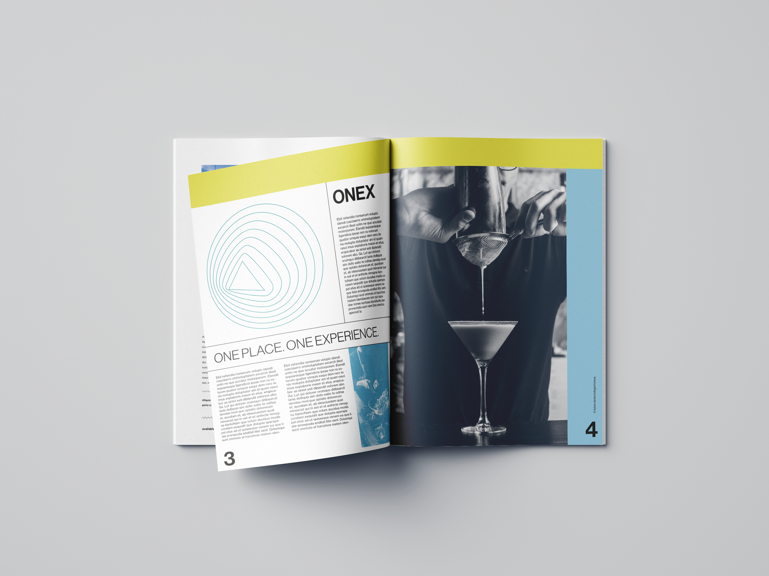
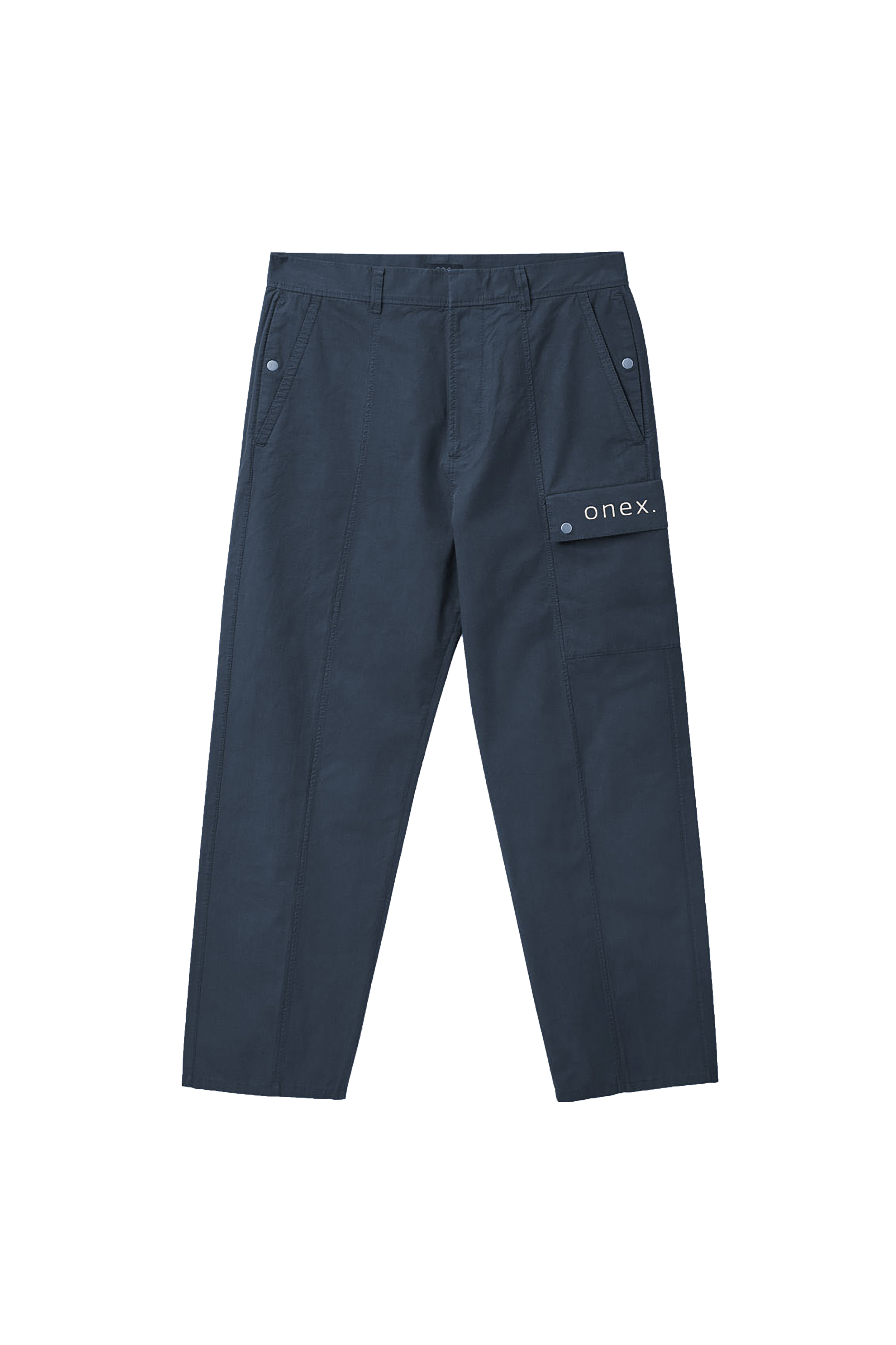
We developed a comprehensive visual system to organize the brand presence in different media. The strategy was to put forward a strong presence, combining typographic elements with an expansible set of symbols and colours representing each of the present and future business areas.
The challenge came to us from our great friend Vasco, one of the directors of the company ONEXPERIENCE and with whom we have already collaborated on projects with Aliados Consulting and Inovar.te
ONEXPERIENCE results from the merger of different companies throughout the entire value
chain of services and equipment for hotels and restaurants, from design to stainless steel manufacturing, assembly, wholesale of appliances and professional equipment brands. Among its customers are some of the restaurants we most admire.
The first part of our work involved brand consulting, where we simplified the name graphically and phonetically, paving the way for the design work that followed.
This first work aimed to help the new brand to position itself in the market and create the foundations of an internal marketing process to assimilate a unique identity and respective values, as the teams had migrated from previous companies and continued to take on the cultures of each one of them in a powerful way. As a result, a brand was created with a simple and short name, easy to understand and without any relation with the previous brands: ONEX.
The project's creative direction followed the path of simplification, seeking to "tame" the numerous references in the portfolio and the different materials and supports. At the same time that we sought a certain rigidity, with well-defined grids and rules, we wanted to lighten the brand's atmosphere. Another concern was usability, as the company generates hundreds of documents every week without a design department that can control how the system is used.
Taking the new logo as a starting point, which we designed based on ps Type’s Quatro, a visual system was created combining solid colours and symbols, which can be used in different supports and even represent each group's business areas. The difficulty in establishing the limits of each business area, since the companies that comprise the group, despite working along the entire value chain, presented competing services, and their evolutionary dynamics, led us to opt for more abstract, without a direct link to each of the services.
Credits:
Creative Direction: Miguel Barbot, Maria Helena
Art Direction: Maria Helena
Graphic Design: Maria Helena, Inês Pereira, Mariana Teixeira
Typography: ps Type’s Quatro


