Estúdio Ofício is Barbot Bernardo’s graphic design studio and creative agency.
We founded the studio in 2019 to support our clients in implementing their marketing strategies, from graphic and web design to content creation.
Ofício design, editorial and content development projects are aligned and inspired by Barbot Bernardo’s extensive experience working with culture and creativity and Saber Fazer’s expertise in craft and small-scale industrial techniques.
You can follow Estúdio Ofício on Instagram and read about our creative process in our journal.
Identity Design
-
Identity and visual system for our sister project Saber Fazer.
Reflecting upon what had been done so far in the last 13 years and the brand’s future challenges, we designed an extensive flexible visual system, creating a coherent identity for different mediums and outputs, both digital and physical, including the many editorial projects.
-
Visual Identity developed for Zumbido Books and Coffee, a bookshop and café a few steps from the Matosinhos Fish Market.
This project was a joint effort between Barbot Bernardo (consulting and strategic design) and Estúdio Ofício (graphic design), shaped by the realities of working with culture, creativity, and independent retail, where resources are limited, improvisation is essential, and a scalable visual system makes all the difference.Besides the visual identity, we worked on web design, editorial, and multiple applications, while contributing to the shop’s interiors, furniture, and equipment.
Read about how we designed this project on our journal.
-
Images designed to showcase Nova Type Foundry’s typefaces on MyFonts website.
Typography is a subject we love — kerning, small capitals, punctuation, alignment, baseline grids and optical sizes — we love it all. So Joana, the founder of Nova Type Foundry, asked us for help regarding Nova's social media communication: strategic marketing within a subject we hold dear.
-
Identity and visual system for Golden Pilates, a new Portuguese Pilates machines manufacturer.
The project evolved from Golden Pilates visual identity to a flexible system shared by all three brands, including Estúdio Phi, a new name for the studio, and Golden Mean, the Pilates teachers academy.
-
Visual Identity developed for Comeca, a reference brand in the HORECA sector.
Our strategy aimed to honour the past while projecting for the future, communicating renovation, innovation, technology, confidence, proximity, and knowledge.
-
Visual identity developed for Susto, a creative studio located in Porto.
The logo was designed by Maria Helena through custom typography and transformed into different versions, taking on different textures and expressions between them.
-
Visual Identity for Fios Jardins Suspensos.
Fios Jardins Suspensos, a small business dedicated to commercialising Kokedamas and green functional wall coverings, pretends to launch its internationalization strategy by the end of 2024. For this project, we provided strategic support, brand strategy and developed a new brand identity and complete visual system based on a monospace typography and modular elements , including a new logo and colour scheme. A new website and online store will be available by the end of 2024.
-
Visual Identity for Vic - Aveiro Art House's Break in Case of Emergency2023, a two-week hybrid boot camp and festival for independent musicians and labels, focused on exchanging practical skills concerning some of the most pressing aspects of today's independent music industry.
Besides the visual Identity, we worked on Web Design, Advertising, Marketing and Editorial, supporting Break’s team with all of the Communication, Strategy and Design.
-
Visual identity developed for Ana Paula Almeida, a designer and visual artist from Covilhã, Central Portugal, who is one of the heads behind New Hand Club.
She came to us with a challenge: thinking strategically about her new brand and developing a new visual identity. The system we designed brings consistency to the brand identity and enables the development of new visual elements in a very organic and accessible way.
-
Visual identity for a new real estate developer in Porto.
-
Visual identity and website for a company operating in the hospitality sector.
-
Visual Identity and graphic design strategy developed for Onex, a leading Portuguese catering solutions provider.
We created a comprehensive visual system to organize the brand presence in different media. The strategy was to put forward a strong presence, combining typographic elements with an expansible set of symbols and colours representing each of the present and future business areas.
-
Visual Identity for Gateway Crafts, a Erasmus+ project that focuses on developing and distributing high-quality educational content within small-scale manufacturing and artisanal work, oriented and adapted for contemporary audiences and digital media.
We created a flexible system with specific guidelines for each component, as well as how the system works as a whole and at each moment of interaction with the brand.
-
Strategy, graphic design and photography for a new marketplace.
The project is linked to one of our central themes—craft. We wanted to escape the commonplaces of this area and look for a visual space of its own for the new brand.
-
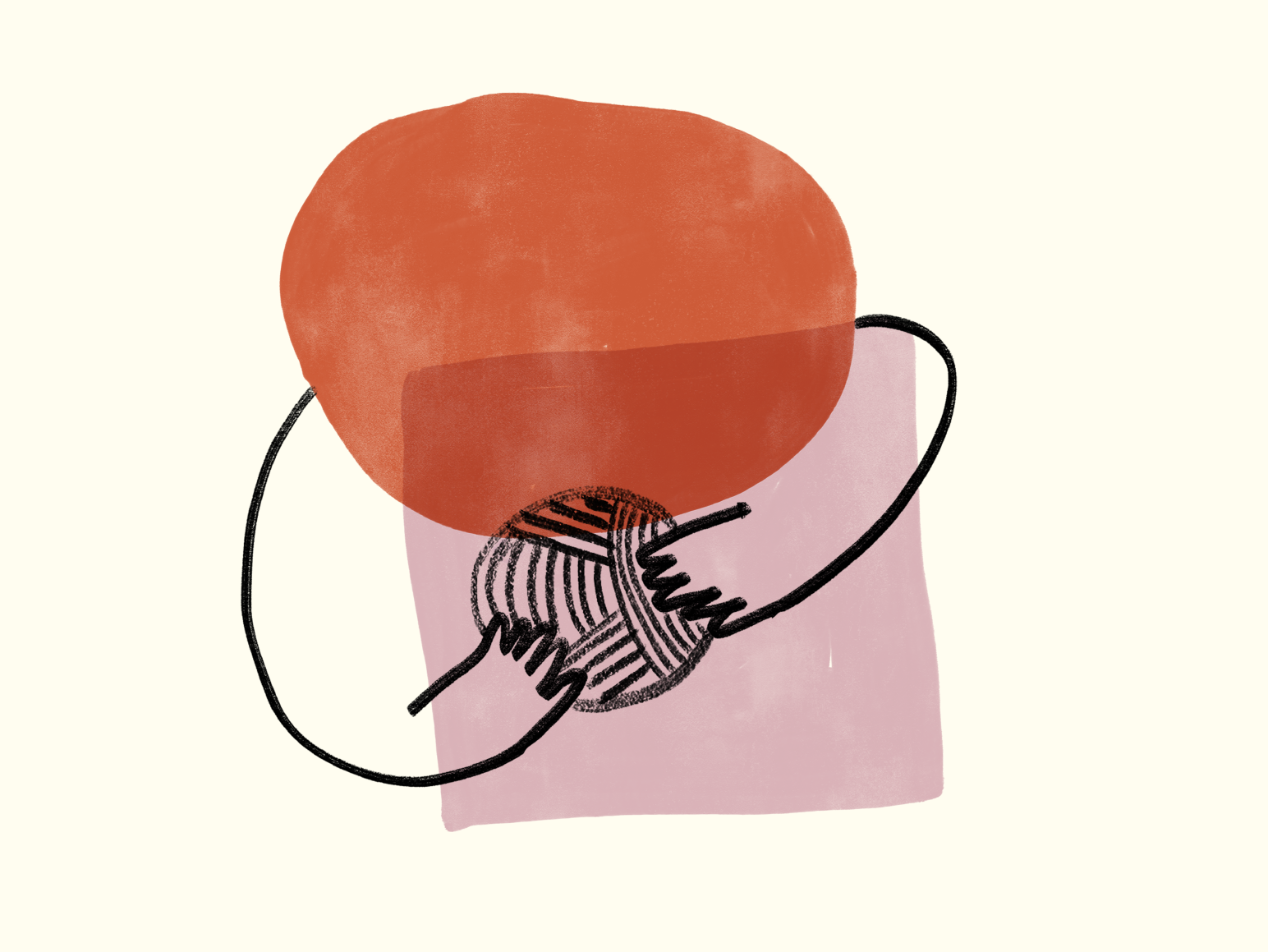
Indentity design for a Portuguese handmade knitted garments brand.
-
Strategy and graphic design for a dancewear brand.
Barbot Bernardo and Ofício supported the founder with consultancy in all components of the creation of the business, from design to creative direction, from supply chain and production to finance.
-
Visual identity for the artist Ana Rita de Arruda.
Ana Rita de Arruda is an artist, investigator and art educator based in Porto. Ana Rita’s work has a very delicate but organic and visceral character, on which Miguel Moreira took inspiration from while developing this visual identity.
-
Graphic design for The Seed, a “hybrid and flexible business” that spreads across several areas, from strategic consulting to retail and product development. We developed an equally flexible visual identity.
-
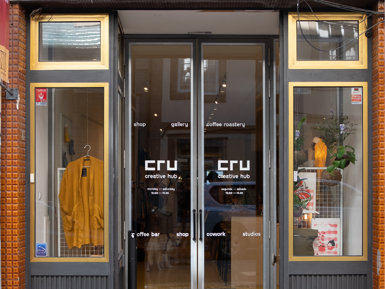
Visual identity developed for Cru Creative Hub.
The original logo was used for almost one decade until the founders asked us to help rebrand this iconic space in the heart of Porto's art district. Without losing the connection with the original logo, we developed a coherent system that accommodates all the brand assets and supports.
-
A 2020/2021c project consiting in a new logo for our own practice.
-
Strategy and graphic design for a retail project in Central Porto.
Our client asked us to help her with planning for the upcoming years of a family's historical business right next to the renovated Bolhão Market. Keeping the textile theme of the company, the department store welcomed a new universe dedicated to national manufacture.
-
Strategy and graphic design for a restaurant in Porto serving specialty coffee, natural wines and vegetarian and vegan food.
Illustration
-
Imagery and hand-drawn lettering created for the Zumbido Books and Coffee project. The illustrations play a vital role in establishing a connection to the world of comics and illustrated books, themes we took inspiration from for the visual identity.
The collection features spot illustrations and hand-drawn calligraphy combined with type or other graphic elements.
-
Poster Natural Dyeing, illustrated and designed to showcase a selection of iconic plants and animals that have historically been used to colour our world.
The poster features custom handdrawn calligraphy.
Created for Saber Fazer.
-
Poster Wool, from sheep to yarn, illustrated and designed to showcase the wool cycle’s six steps.
The poster features custom painted typography.
Created for Saber Fazer.
-
Social media illustration made to celebrate Portugal’s revolution day and the 50 years of 25th of April.
-
Illustrations for Cabanas, a company operating in the hospitality sector.
-
Poster made for the event "Velhos Amigos" (“Old Friends”).
At the first weekend of 2024, Barbot Bernardo, Cru Creative Hub and RDI, Rede de Inovação, brought together a group of old (and new) friends for an afternoon of drinks, conversation and networking.
This illustration was screen printed as a gift for the participants.
-
Illustrations for Gateway Crafts, a Erasmus+ project that focuses on developing and distributing high-quality educational content within small-scale manufacturing and artisanal work, oriented and adapted for contemporary audiences and digital media.
-
Illustrations developed for the book “Silk - from Silkworm to Thread” for our twin project, Saber Fazer.
-
Illustrations developed for the book “Manual de Iniciação à Tecelagem” for our twin project Saber Fazer
-
Illustration made for Velo Culture that resulted from a collaboration between Ofício and Miguel Moreira.The design is being used in posters, postcards and bicycle stickers.
-
Illustrations commissioned by Cordoa Sandals, a handmade footwear brand.
-
Illustrations for “Ilídia e a lã” printed and published on Saber Fazer’s website.
Web Design
-
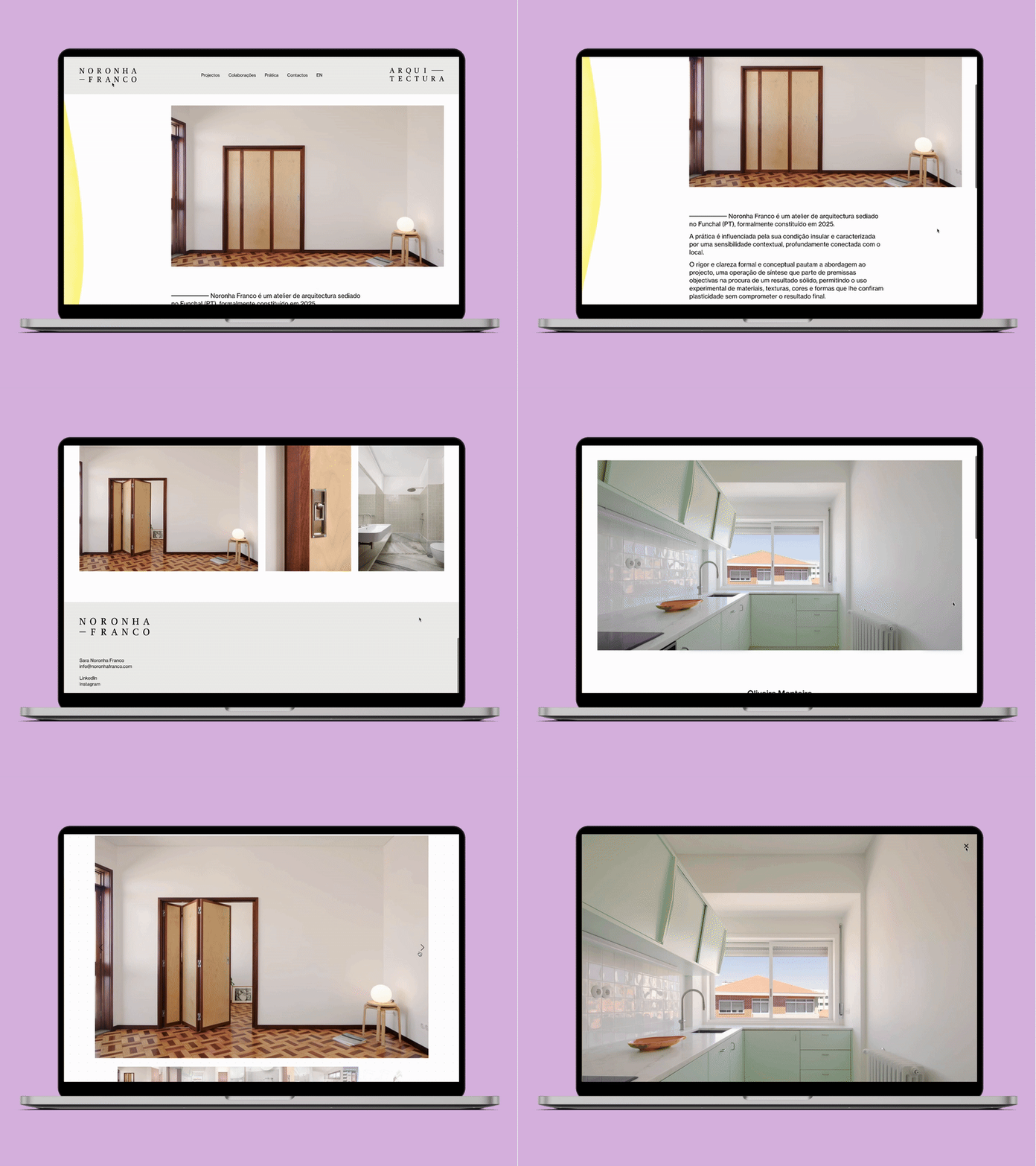
Web design and development for Noronha Franco Arquitectura’s website.
-
Web design and development for A Padaria Farmhouse’s website.
-
Web design and development for Zumbido Books and Coffee’s website.
Read about how we designed this project on our journal.
-
Web design and development for Aliado's website.
-
Web design and development for Saber Fazer's website.
-
Web design and development for Comeca, a reference brand in the HORECA sector.
-
Web design and Shopify development for Fios Jardins Suspensos, a small business dedicated to commercialising Kokedamas and green functional wall covering.
-
Web design and development for Break in Case of Emergency 2023’s website.
Aveiro Smart House’s Break in Case of Emergency 2023, is a two-week hybrid boot camp for independent musicians and labels, focused on exchanging practical skills concerning some of the most pressing aspects of today's independent music industry.
-
Web design and development for Cabanas, a company operating in the hospitality sector.
-
Web design for Susto, a creative studio located in Porto.
-
Web design and development for Gateway Craft’s website and learning management system.
Gateway Crafts is an Erasmus+ project that focuses on developing and distributing high-quality educational content within small-scale manufacturing and artisanal work, oriented and adapted for contemporary audiences and digital media.
-
Webdesign of the Inovar.te landing page. In this project, we supported one of the founders and editor-in-chief of Inovar.te in the relaunch of the first Innovation magazine in Portugal. Inovar.te was absent from the market for more than ten years before its comeback.
-
Web design for SUST.CO website and e-commerce platform.
-
Web design and development for a distributor of vegan food products.
In this project, we sought to visually position Off-Milk among the different retailers and present an appealing product portfolio considering both the B2B and B2C markets.
Editorial Design
-
Editorial design for the book “Manual de Tinturaria” for our twin project, Saber Fazer. This book will be published in 2024.
-
Editorial design for Aveiro Art House’s Break in Case of Emergency 2023 Survival Kit book, compiling the ground-breaking insights from the 2023 event edition.
Break In Case of Emergency was a two-week hybrid boot camp for independent musicians and labels focused on exchanging practical skills concerning some of the most pressing aspects of today's independent music industry.
-
Editorial design for the book “Silk - from Silkworm to Thread” for our twin project, Saber Fazer. The first edition of this book was published in August 2023.
-
We have been helping Joana, the founder of Nova Type Foundry, with Nova's social media communication: strategic marketing within a subject we hold dear.
Our love for all typography's details originated "Nova Type Foundry's Type Glossary": A Glossary of typography terminology comprising 32 social media publications where you can find information on several topics from typeface classifications, glyphs' anatomy, legibility rules, type design tips and much more.
-
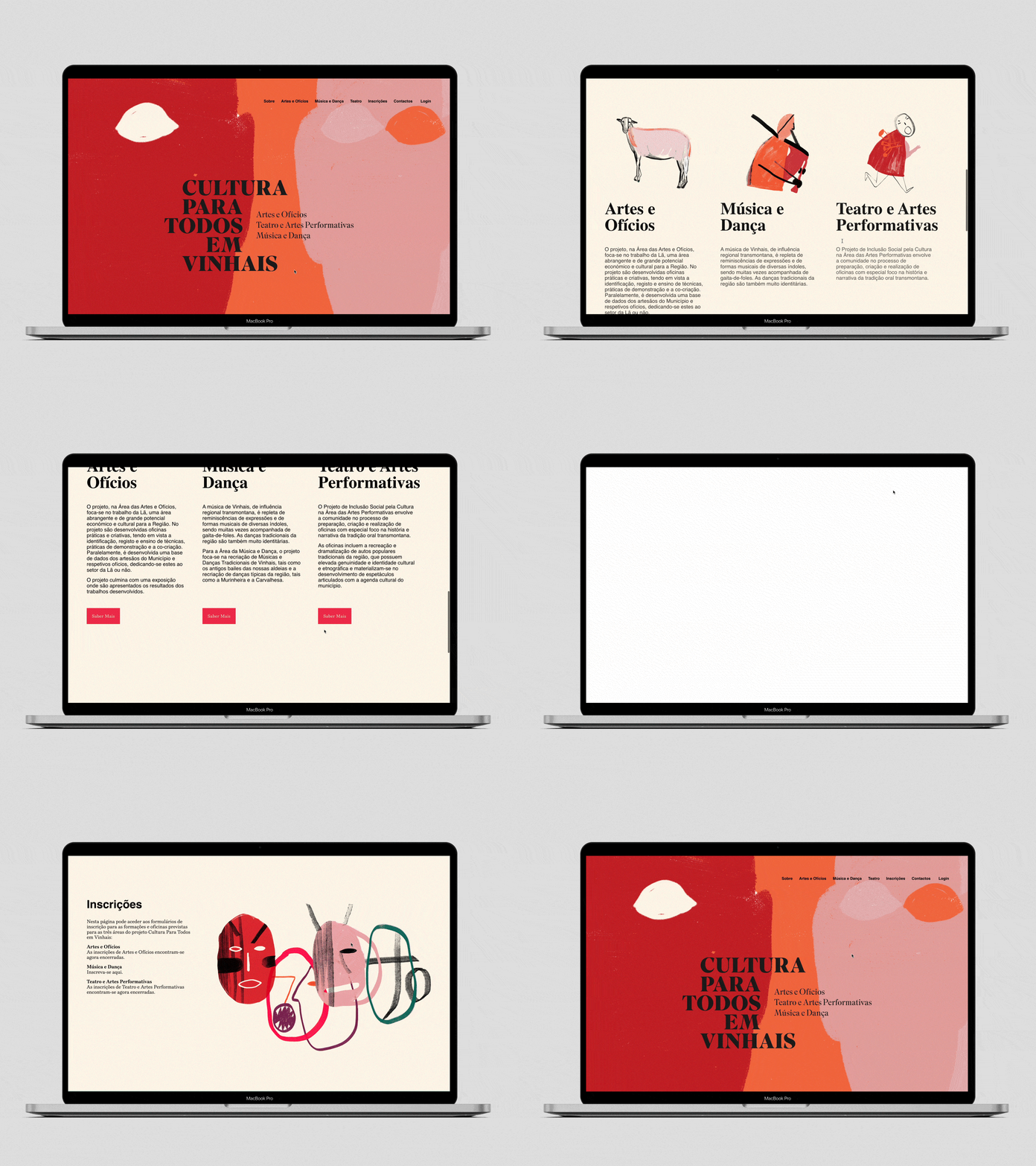
Visual Identity for Cultura para Todos em Vinhais, a project created by Saber Fazer and Barbot Bernardo that operates in areas such as management, content creation, educational training, and graphic and editorial design.
We developed all the Identity and Visual system for all the project's touchpoints, from print, editorial, web design, social media and advertising.
-
Editorial Design developed for Onex, a leading Portuguese catering solutions provider.
-
Graphic design, editorial design, strategy and creative direction.
In this project, we supported one of the founders and editor-in-chief of Inovar.te in the relaunch of the first Innovation magazine in Portugal. Inovar.te has been absent from the market for more than ten years and is now planning for a comeback.
-
Editorial design for the book “Woodworking Tools - Carpentry and Joinery” and poster for our sibling, Saber Fazer. The first edition of this book was published in 2014. This project resulted indirectly from ROP ( Porto Workshop Guide).
