How we designed Comeca’s new visual identity
With over 75 years of experience, Comeca is a leading company supplying appliances and technology for the HORECA sector (an acronym for Hotel, Restaurant, and Café/Catering), being national distributor for some of the most recognised brands on the market.
We started this project by creating a plan for a complete brand redesign and a new brand strategy considering the significant but exciting challenges that the clients are currently facing, and to mark the company’s 75th anniversary.
The redesign’s main goal was to communicate Comeca’s principles: modernity, innovation, trust, closeness and connection, but at the same time, the brand’s vast history in the sector.
The new Logo
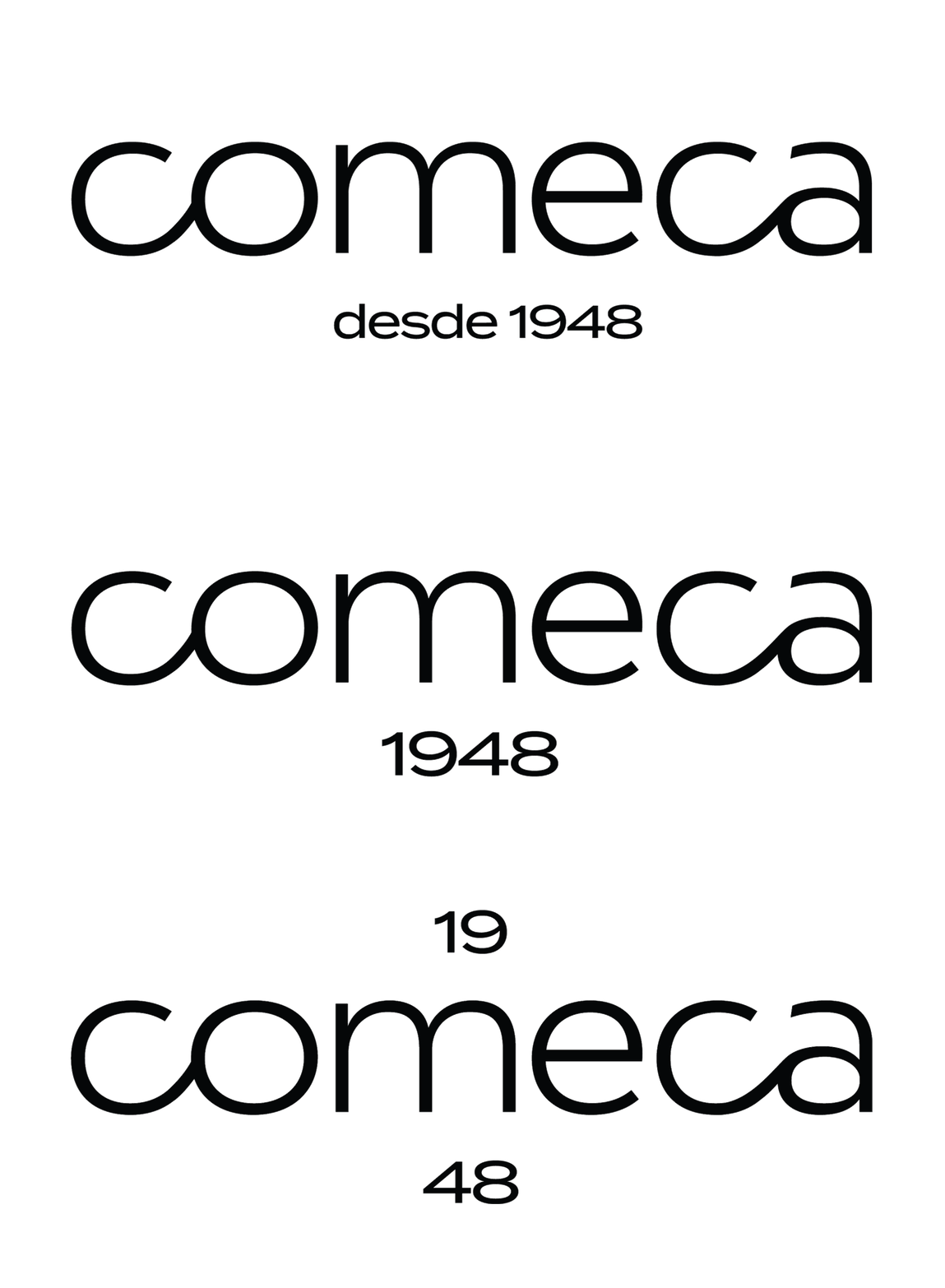
With this in mind, we designed a new logo with low-contrast strokes, connecting the letters in a fluid handwriting movement, suggesting infinity and connectedness.
The circular shapes are prominent in the logo and throughout the identity within the typography, imagery, visible grids and patterns.
Logo options with foundation date
The logo has several options and signatures with the foundation date 1948 to adapt to various uses.
The identity is based on a designed geometric grid with two layers, creating a pattern and the base in which we constructed the symbol, the letter C of Comeca, made of connected circles. After it was drawn, we noticed the grid also resembled the shapes of kitchen stove tops — a serendipitous moment.
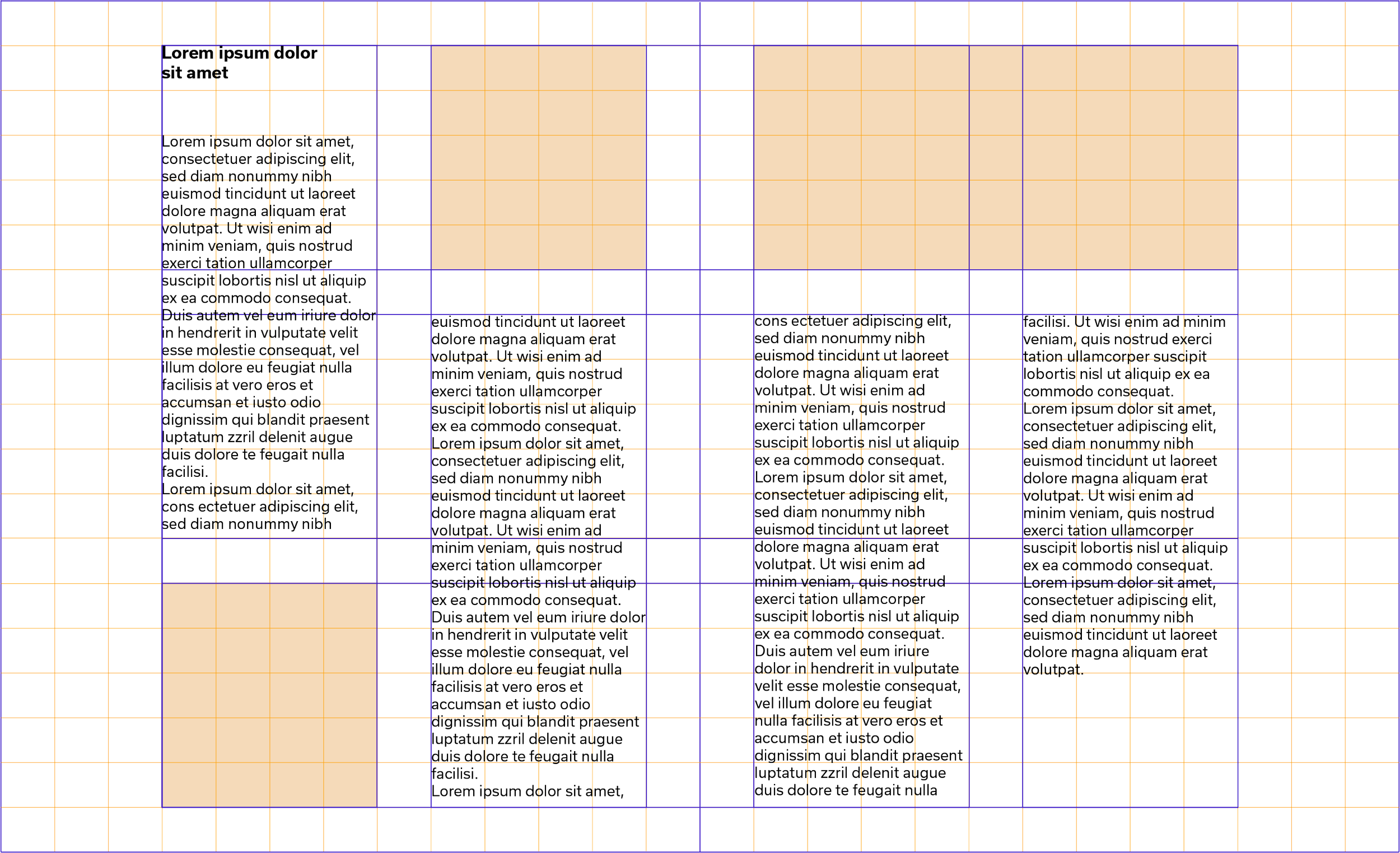
The grid is also our baseline for the entire visual system, with which we create layouts, imagery or other applications.
Symbol construction
Grid
Layout options within the geometric grid
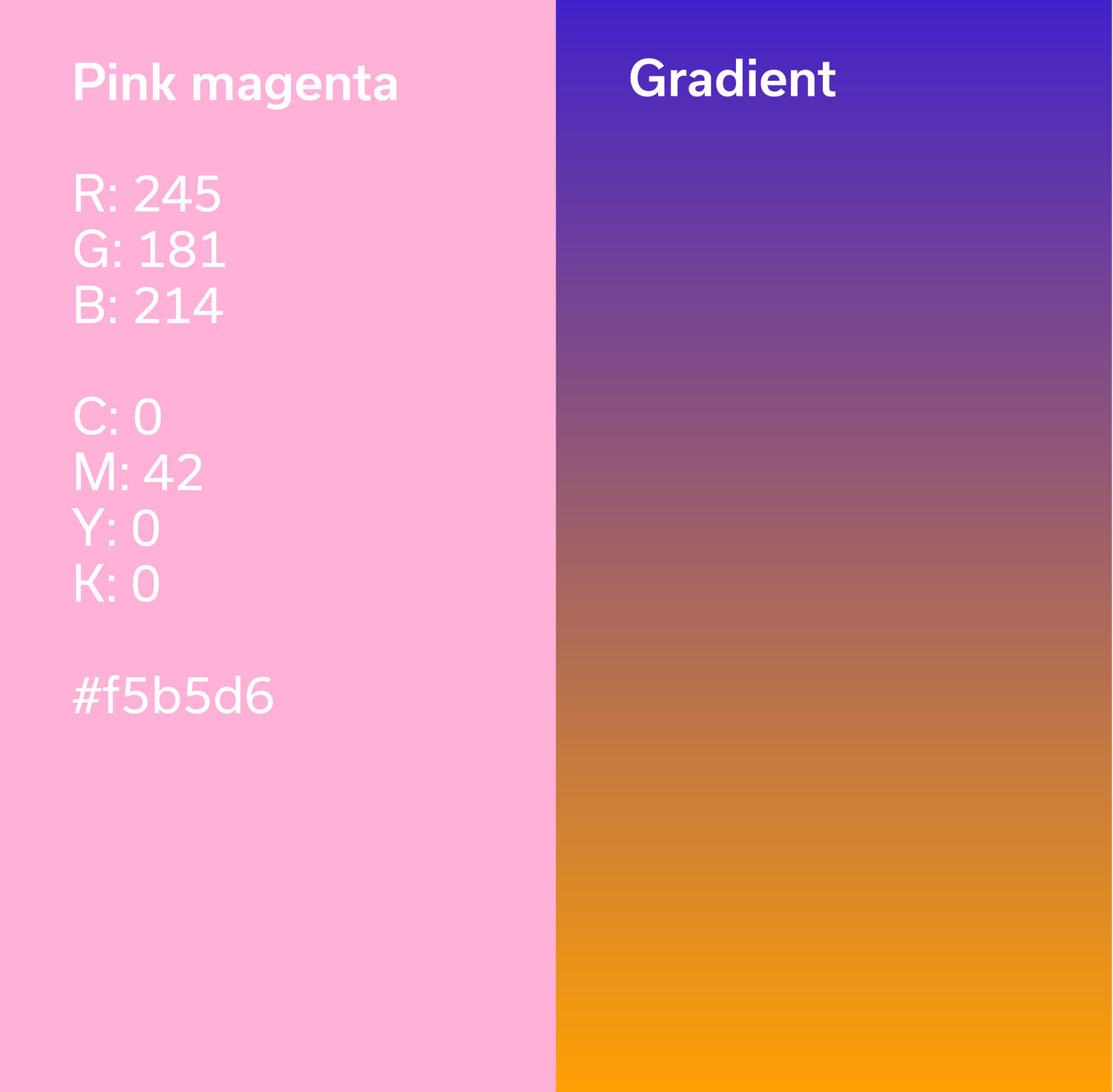
The colour palette has two central bright colours inspired by cooking and the kitchen environment: warm temperatures (Gialloro bright orange) and cold temperatures (Iris blue).
The cool tone was also inspired by the blue already belonging to the brand, while the warm tone works as its complementary colour. Likewise, because they are strong tones, they convey confidence and strength. Combining the two main colours creates a gradient, reaffirming the stove flame colours. The gradient, as well as a bright pink, form the secondary colours used in the imagery or occasionally when needed.
The illustrations are designed according to the system grids.
With this visual system in place, it’s possible to create endless patterns and combinations for multiple applications and uses in printed or digital materials.
The imagery is a fundamental part of the flexible visual system, allowing multiple versions respecting the shapes and grid.
The typeface used is Usual by Rui Abreu (R-typography type foundry): modernist, precise, sophisticated and bold when needed. We love its geometry and OpenType features, such as the alternate letters a and k and shorter descenders, which help set headlines with tight line spacing.
The five weights and matching italics allow us to work with a single typeface for all the identity materials.
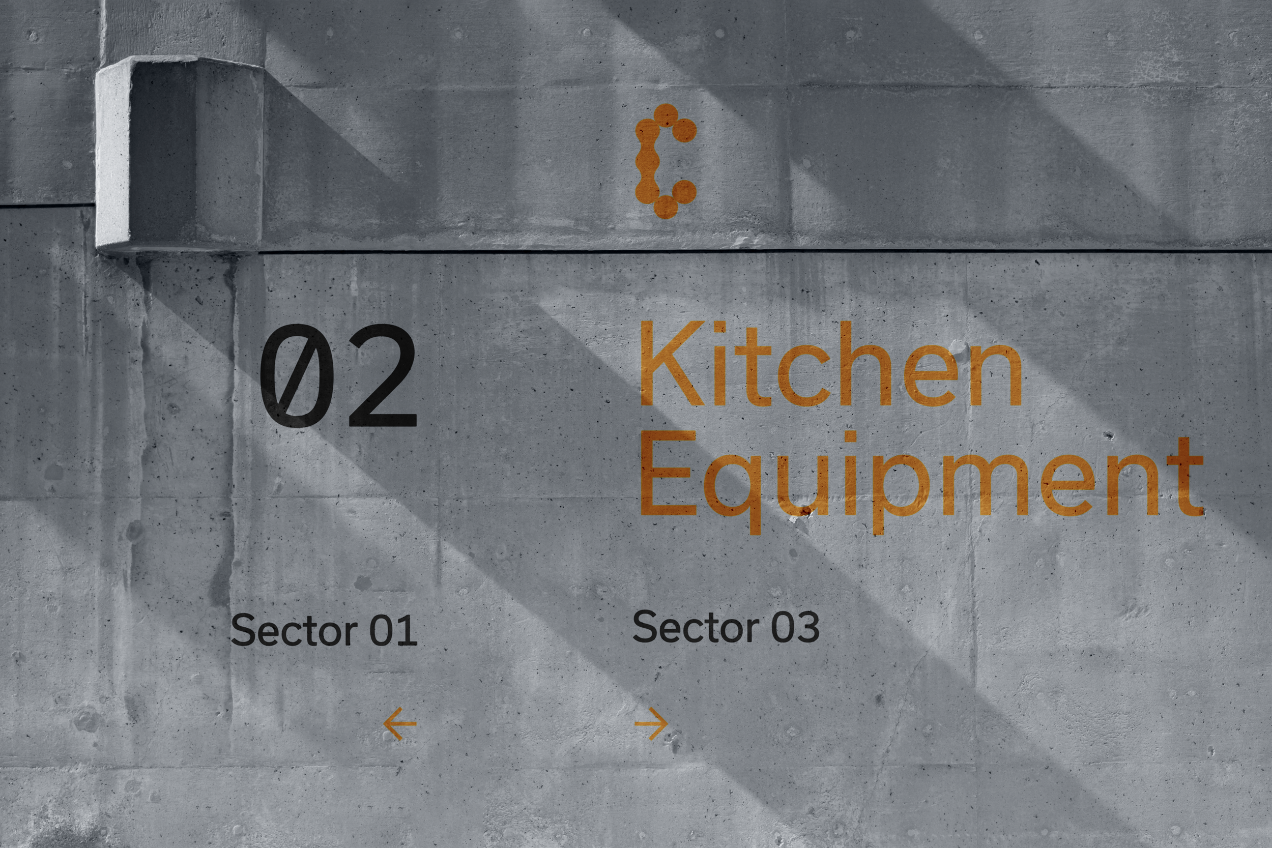
We applied the visual identity to different materials, from posters to stationary, signage, social media visual content guidelines, presentation cover images, layout structures, publication covers, outdoor advertising and a new website.
Credits:
Creative Direction: Miguel Barbot and Maria Helena
Art Direction and Graphic Design: Maria Helena
Webdesign: Maria Helena, Mariana Teixeira, Margarida Matos
Typography: Rui Abreu, R-Typography
