How we did the Ofício’s identity
Text: Miguel Moreira
Photography: Miguel Moreira e Miguel Barbot
When designing Oficio's new identity, I had the feeling of being in a delicate position. I was both the designer and the client, along with Miguel Barbot. Having these two hats on implies an extra responsibility. The final design must reflect our practice, the things we like, the incredible men and women we represent and our style.
The briefing consisted of designing a new identity reflecting the artisanal work of the craftsman, artists and makers with whom Ofício works. However, Barbot kept saying, "don't forget: you must design something you will be proud to use in your card".
The first pencil sketch had a loose uncompromised style and was very expressive. I kept the same look and feel when vectorising. In Portuguese, the word "ofício" means "labour, craft or a profession" and has this accent in the "i". I stylised this letter to solve a loose element of the word and add some personality to the logo.
I planned some decisions during the design process, and others were more spontaneous. The "f" looks just like a tool, something I didn't plan and was a happy coincidence. This specific letter was the one where I spent most of the process.
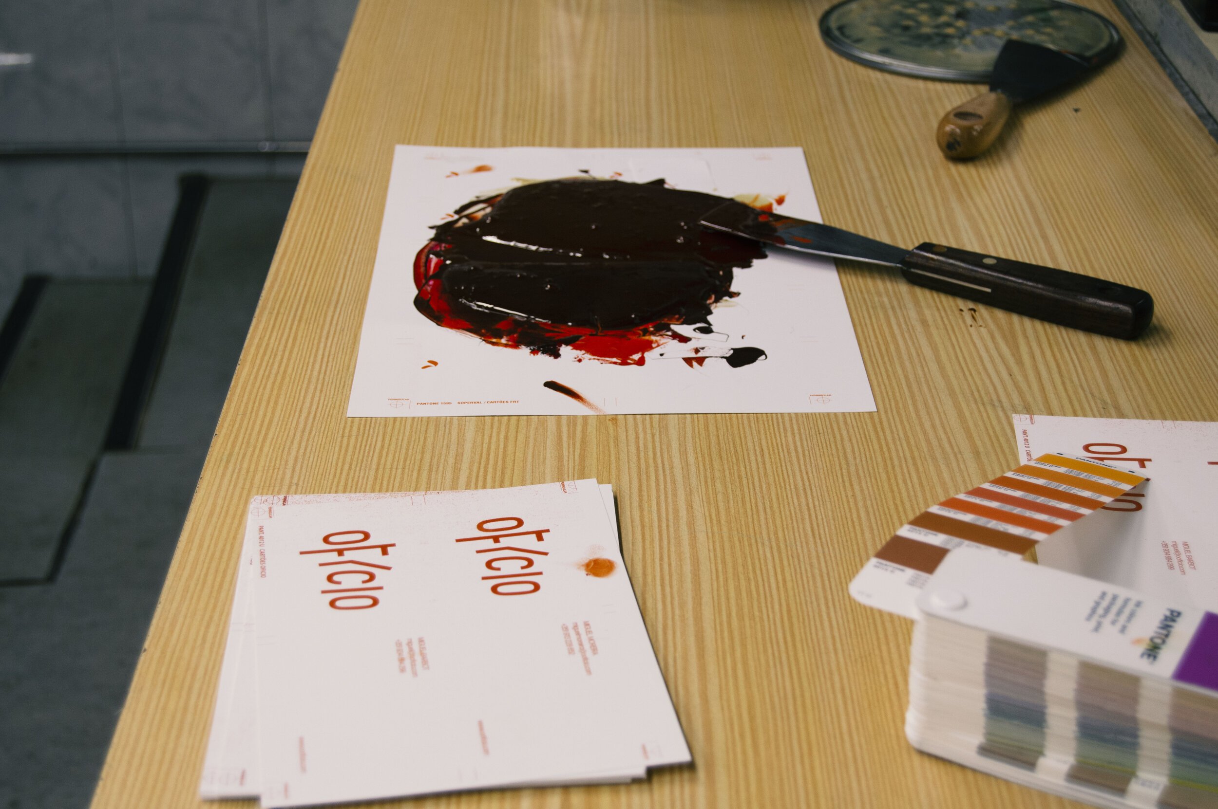
On the studio shelves, one can find many terracotta objects and oranges, reds, and ochres prevalent in the collection palette. However, we wanted to have a specific orange tone. So, after a visit to Diogo Barbedo at Peninsular (the printers), we chose this Pantone, our new colour.
We wanted to be at Peninsular during the printing of the new cards. We saw the colour mixing and were hypnotised by the high-relief production in the century-old Heidelberg. Diogo is the man running Peninsular and with whom I love working. He is passionate about what he's doing. He has an in-depth knowledge of the trade, probably the thing we most value at Ofício. And it has a special meaning when we are the client.


