
Business and Brand Strategy and a new Visual Identity for Fios Jardins Suspensos

We are happy to show you the new brand identity we developed for Fios Jardins Suspensos, a small business dedicated to commercialising kokedamas and green functional wall coverings.
Our work with the co-founders Telma and Rui began last year with a strategic consultancy process to help define the business model for the brand, focusing on its internationalisation strategy, services, communication, content creation strategy, e-commerce platform, online courses and their soon-to-open new space — coincidently very close to our own studio.
For this project, we created a new visual identity system, website, and online store (to be launched soon).
For the visual identity, we started with typography, searching for a flexible modular concept using a monospaced typeface for the logo system, envisioning the identity used in many different ways; for example, the boxes carrying the plants could also function as display branding and be staked as a foreground for presentations or events. Or the logo or information being painted with stencils on different surfaces or uses.
The idea was also to counterpoint a flexible but rigid system with the round and organic shapes created by the plants.
As a typographic system the logo allows multiple combinations. We used the typeface Calling Code by Dharma Type, a monospaced with a slightly condensed width for more useful space, excellent legibility and curved tails.


Aktiv Grotesk typeface
For headlines and texts, we used Aktiv Grotesk by Dalton Maag Type Foundry, a grotesque sans known for its functionality, with weight, width and italic variable font axes, extensive language support and an icon set.
Not using green or earthy tones was a bold choice from the brand strategy in a market where everything is green.
We chose contrasting colours to highlight the plant's beautiful green hues, and opted for the complementary vibrant pair of blue and orange. Both colours express Fios Jardins Suspenso's personality: Blue's trust, stability, and calmness with orange's friendliness, confidence and enthusiasm.

Thank You postcard

The boxes carrying the plants also function as display branding, staked as a foreground for presentations or events.

Gift card

The modular system works within a grid and is applied differently in each format: for the logo, website, stationary, plant care guides, shop window, or packaging.

New Shopify website & online store

Handtag

Kokedamas care guide illustrations

Business cards

Paper tape
The plant guides and website feature illustrations that help explain the plant's characteristics and care.
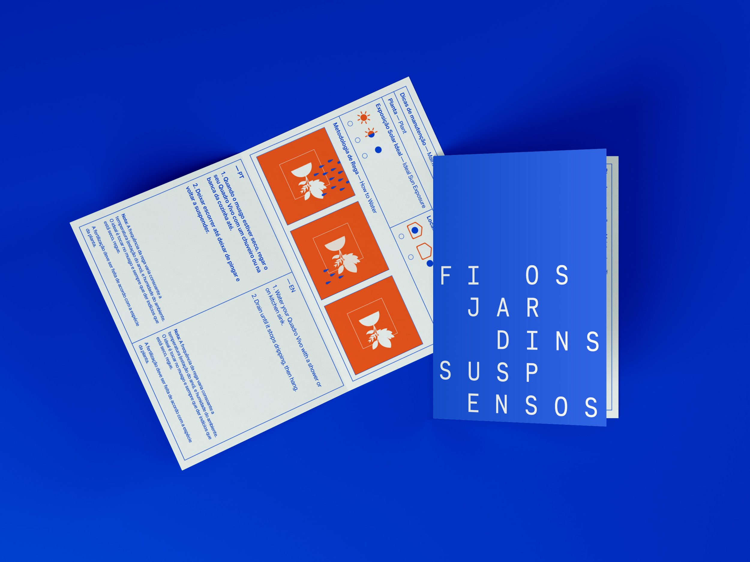
Plant care guide folded card

Care guide illustrations

Apron

T-shirt

Website
Credits:
Creative Direction: Miguel Barbot and Maria Helena
Art Direction: Maria Helena
Graphic Design: Maria Helena, Margarida Matos
Webdesign: Maria Helena, Mariana Teixeira, Margarida Matos
Typography: Dharma Type and Dalton Maag Type Foundry

Shop window