SUST.CO
Today we returned to 2020 to tell the story of a project that still needed to be posted here.
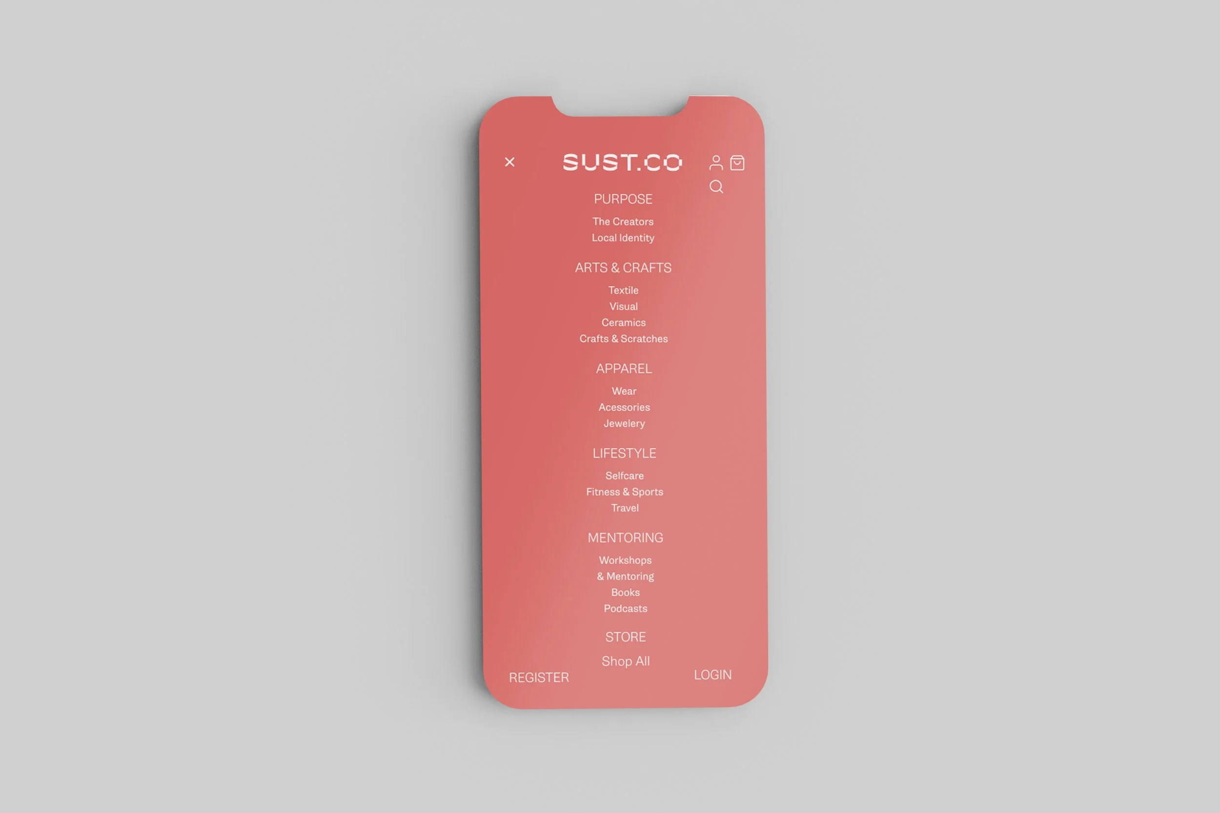
The Sust.co identity is linked to one of our central themes, "Craft", which means beautiful things made to last or on a small scale.
We wanted to escape the commonplaces of this area and looked for a visual space of its own for the new brand.
The logo was designed by Miguel Moreira, with elements that can then be repeated to form patterns. For the colour and photography, we thought of an environment with one foot in Australia and the other in California (a big stretch indeed).
The photography also has a story. Shot by Miguel Barbot on vacation in the Algarve, this roll looked like being irretrievably lost, with all the frames "burnt".
The camera was poorly sealed, letting in a trickle of light and several grains of sand, hence the scratches. It was one of the best rolls from the old Fujica 35, though! Editing allowed for recovering a significant part of the information.
Credits:
Creative Direction: Miguel Barbot
Art Direction: Miguel Moreira
Graphic Design: Miguel Moreira
Typography: Gira Sans - R-Typography, Rui Abreu


