Interview with Joana Correia for the first episode of our new podcast
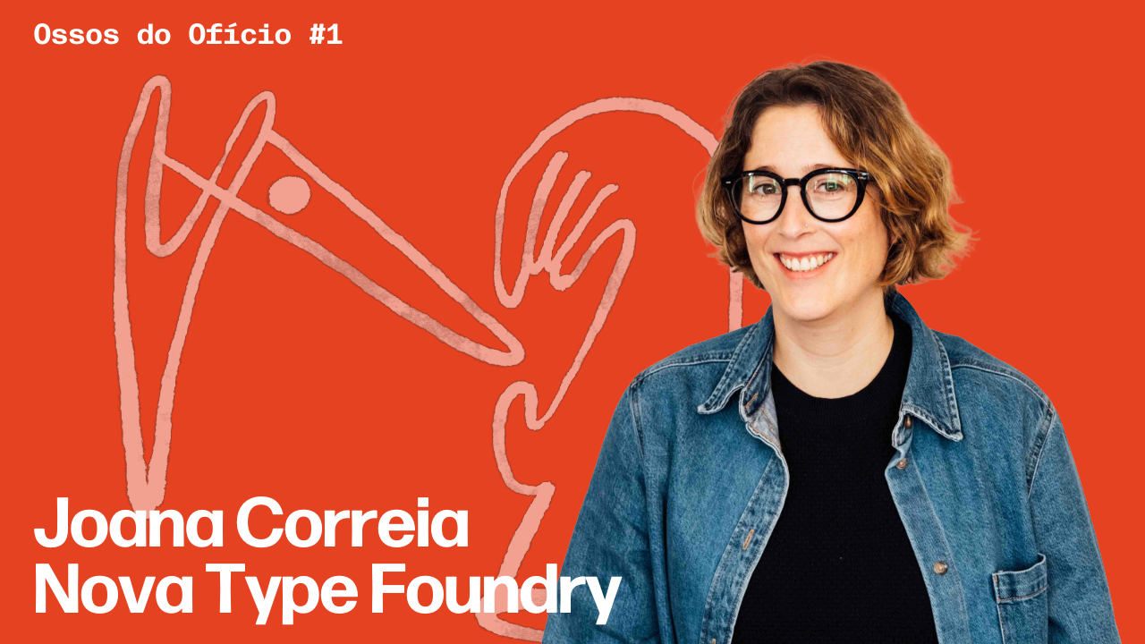
This post is a translated transcript from the first episode of our recently launched podcast, Ossos do Ofício.
In this episode, Miguel Barbot talks to Joana Correia, a type designer with fifteen years' experience and the founder of Nova Type Foundry.
We talked about her career, from her early work with Google Fonts to her collaboration with The Type Founders in the United States, and above all about what is rarely discussed: how much it actually costs to design a typeface, how long it takes before it starts to pay off, and how you build a sustainable business in a market that is global but niche (and dominated by large platforms).
The conversation covers sales and licensing channels, the industry's shift towards subscription models, and what all of this means for independent foundries, many of them micro-businesses.
At the end of the episode, Joana explains how Ligado Studio came about, founded with Paley Dreier to support type designers and foundries in developing their businesses.
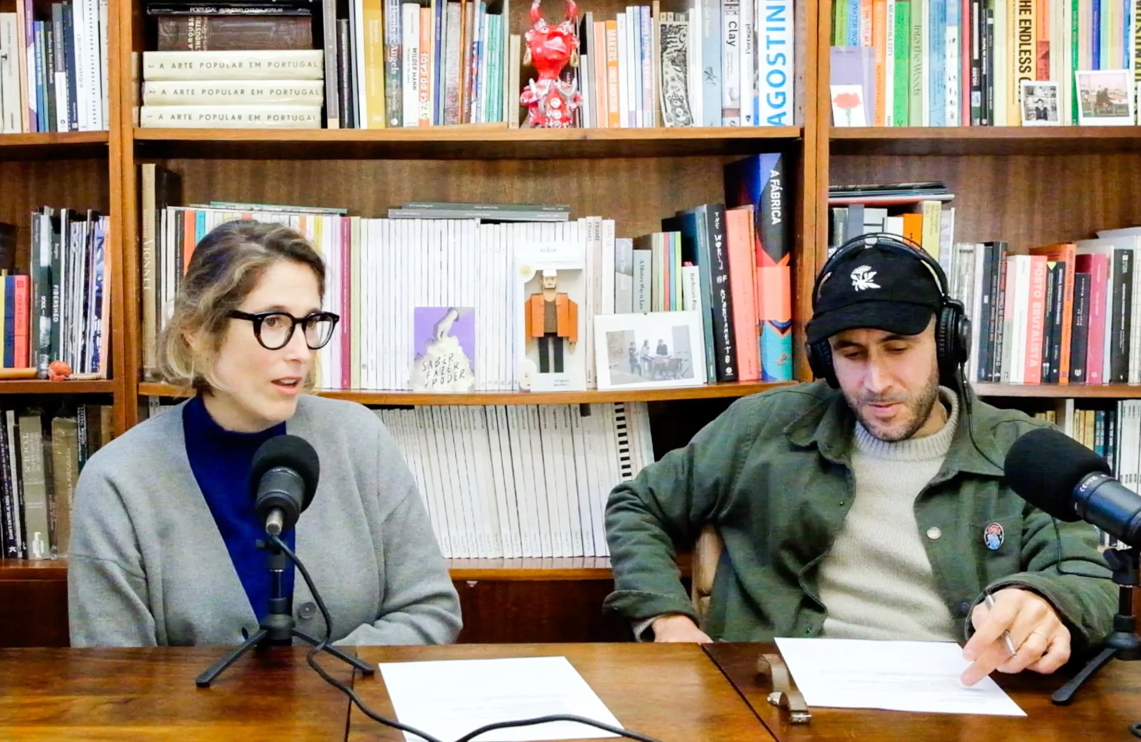
Miguel Barbot: Welcome to Ossos do Ofício. This is one of the first episodes we are recording. In fact, it is the first, and it will also be one of the first to be released. Since it is the first, all of this is an experiment. There may well be pauses, interruptions and technical problems. We do not have a big team working with us here, it is just the two of us.
We are in our studio, but the idea behind the podcast is to keep changing the setting. For anyone watching on YouTube, it is a bit dull to look at two people against a fixed background, so we will try to change the backgrounds, the places and the ideas. In the next episodes we want to go to people’s homes, to their studios and to the places where they work, and record from there.
Today we have Joana Correia with us. Joana is a great friend of ours, of Barbot Bernardo and of Ofício. We have been working together for some years now, practically since the beginning of this arrangement between Ofício, Barbot Bernardo and Saber Fazer, when we moved into this space. Joana has had a long career, more than a decade in type design, despite having a very varied background, and she still takes that same care over continuous learning. Joana, welcome.
Joana Correia: Thank you.
Miguel: Tell us a little about your path, with several things running in parallel, from founding Nova Type Foundry through to what you have been doing in this industry.
Joana: Thank you again for the invitation and for having me. It has been almost fifteen years working in type design. I started around 2010, with the training side of things. The first years, 2009 and 2010, were the most formative. When I started working I was very lucky, because I went straight into collaborating with Google, in the early days of Google Fonts, and it was extremely interesting. Wonderful people, who I worked with and learned from.
It was a period of continuous training, of doing a lot of workshops with type designers I greatly admired. I did a workshop with TypeTogether, and another with Alejandro Paul, who I also admired a great deal. They were formative years, but I was always working, collaborating with other foundries and drawing, finishing typefaces I had already started.
Later, in 2015, I founded my first foundry with a colleague here in Portugal, Natanael Gama. We set up Ndiscover, which ran for three years, and we had some very large projects, again with Google. We made a very large multi-script typeface, with Indic scripts, and it was an enormous project. Throughout that time we were always working for other large companies, doing production work. In 2018 we ended up going our separate ways. Ndiscover carried on, and I founded my own, Nova Type Foundry, with my typefaces and with new ones I was developing at the time.
It was always a heterogeneous path, as you said, because I kept collaborating with other companies too. In 2020 I began working with Rainer Erich Scheichelbauer, my colleague from Glyphs, who had a production company, Schriftlabor. I worked with him for three years, more on the management side and with clients. He is from Vienna, but at the time we were in Porto, we had an office there with two or three people, doing all kinds of design production. It was a very good period of discovery and learning, because at the same time I was also studying and doing other kinds of training. It opened a lot of doors for me. And I carried on with Nova Type at the same time, drawing typefaces, keeping the foundry ticking over.
Over the last two or three years I was on another very large Google project, Google Sans Flex, which was released not long ago. I was involved for around eighteen months, with a colleague of mine based in Spain, who I also collaborate with in other areas. It was extremely interesting. But I always kept the foundry going, always maintaining the communication and the building of new typefaces.
Then, in 2023, I was approached to work with The Type Founders, a very particular and specific company in the United States. It was a very interesting project, because they support the foundries that form part of the group. I worked with them on design and production, and on managing the relationships. The personal side is very important in these companies. It was also a superb piece of work, and I kept the foundry going alongside it, although that period was more demanding, because I was working full time and then a little more part time. It ended in September last year. Time passes quickly, it was almost two years, a little more.
And now this is where I am. I am carrying on with the foundry, very focused on growing it, and we have also founded Ligado, which we will talk about a little more later.
Miguel: At the end of that there was also the process we went through together last year, of strategic reflection. It ended up leading you to make some decisions. That is the part people do not see, the backstage of thinking projects through.
Joana: Yes. I think it was imperative. It was very important that we did that process, which was more than a year ago now. We drew up a strategy for me personally, for my career, and for the foundry. The whole strategy of what might be possible, and of how I could bring together all the knowledge I had already acquired and all the experience into a new business. In effect, it ended up being the founding of Ligado, without our even knowing at the time that it would exist.
Miguel: This is a very particular industry, it is a niche. For the young designers who may be listening to this, and I have no idea at all who will listen, but for anyone working in this market, it is a very particular industry. There are not many people in it. People tend to know one another almost globally. In fact, between the work I have done with you over recent years, the work I did for a while with The Type Founders, and what we are doing with Verónica in European cooperation and projects, the names repeat themselves. We are nearly always talking about the same people. In other words, this is an extremely important industry within the design market, but it is small and very technical.
That brings me to a question. There is naturally a particular taste for this whole ultra-technical side. Of course it is a creative business, and it has a very large component of creation and innovation. But it is fundamentally technical, and there is a career decision involved. My question is this: how do you build a type business? You do not become a type designer just by playing around in Glyphs.
Joana: True. At the start, people usually come to it through the creative side, because of the design and because they want to make their own typeface, so they can use it in projects. A lot of people come from design and do that kind of initial work. “I want to make a typeface to use on this project.” That happens a great deal.
But of course, when it comes to building a business, you need to generate some income, to get back the value of the work. And there are various ways of doing that. Some people work almost as freelancers throughout, for other companies and for agencies, almost as font producers rather than as authors of their own work. Some people do only production work for practically their whole career: drawing, completing typefaces, drawing other people’s typefaces, producing custom work for brands and branding. They often end up staying backstage, but they are extremely important to the quality of the work in the industry.
Then there are other people who take a more authorial approach, who start creating their own typefaces. It used to be far easier. You just put a few typefaces on MyFonts and started selling, experimenting, seeing what worked. Now we have a slightly more saturated market, which I want to come back to.
But yes, there are various ways of working as a type designer. You can work at an existing foundry with a larger structure, or at a more corporate company. There are various routes. That said, there are not many openings, because there simply are not that many companies.
Miguel: As you said, it is a niche, and it is a global market.
Joana: It is, but it is concentrated in a handful of small and medium-sized companies. And there are people who work directly with them, not as employees but as collaborators over a whole career, which is also very valuable. And then there are the independents. Most are independent, and most build their own libraries and try to create value. That is what I would like to talk about later, this question of IP. How you make it pay.
Miguel: What I think people have no sense of is that creating a typeface is very expensive, because it involves a great many hours of technical work. We are talking about investment. So, apologies to all the freelancers, but we work with some too, now and then, when our pipeline is very full. Except that hiring a designer to do production work for a client is not the same as hiring a type designer to do highly technical work. There are few of them and they are expensive. People have no sense of what a foundry involves in terms of human resources, and of everything needed to get the IP out there and make it, to all intents and purposes, a source of income.
Joana: Yes, they are two different things. I can create a retail typeface, which will sit on the shelf for the rest of its life, available for people to license. Then there are people working with agencies, for example, who have to produce a typeface in two months. These are projects of a different character. When it comes to creating a retail typeface, it is about thinking through the best possible product, one that will be available for years. The commitment has to be somewhat greater, in technical quality and in maintenance. You try to have a product from the outset that will be very flexible and very easy to use. And for that you need a great deal of technical and design knowledge, so that it creates value for designers, so that it is a genuinely useful and interesting tool. Which is not always easy, because we never know the trends, nor how design will evolve.
Miguel: And that is where experience comes in, and not only experience. Luck, a lot of the time. How far should a typeface go in terms of depth? These days we are talking about multiple formats: digital, print, mobile, video, whatever it may be. For you, where is the balance between the depth of a typeface, meaning how far the family goes, what variations it has, what possibilities it offers, and profitability and time? I imagine that at some point you have to stop. Or not, and you keep growing the family?
Joana: It used to be more the idea that you had to release it and then not touch it again, never go back to that typeface. Now it is not really like that. We are in a different phase, where the idea already exists of testing the design with Latin only and then expanding into other scripts. Or the other way around, starting with other scripts and adding more later.
Typefaces can normally be used in almost any medium: digital, print or video. But you can think about typefaces focused on a specific area, and that sometimes turns out to be a good way of attracting people. The more specific the problem the typeface is solving, the easier it will be for people to identify with the project. It is a difficult thing to do, to say “I am going to make a typeface specifically to solve this problem” and speak directly to the designers who have that problem. But usually designers, when they are drawing, end up doing it in a freer, more creative and more spontaneous way, following their own interests.
So when a typeface gains traction in the market, that is a good moment to think about developing it further. At the start it might have only a few weights, or less depth, and then you can come back to it. That is something that used to happen less. Now you can go back, expand, add other widths, add other scripts. Because the time that investment takes often does not justify doing it right at the outset. It is better to spread it over time and find out whether the typeface really does give a return, whether people identify with it or not. If the project does not gain much traction, it may not be worth investing much more.
But all this is to say that there are typefaces you pour an enormous amount of time and work into, huge projects, and often it is the ones with two or three weights that sell best. We never know. Time and quality are not always evidence of sales.
Miguel: Another question, and we will come on shortly to the sales side. But just on production, do you have a sense of how much it costs to make a typeface that is, let us say, more or less complete?
Joana: Doing those sums based on the volume of work involved, I would say somewhere close to ten thousand euros, a little less. It depends on where you live, it depends on your hourly rate, and on how quickly you work. The more expert you are, the faster you are, and the cheaper it becomes to produce.
Miguel: So this basically has no intangible component. Of course it is something tradable, but production is clearly tied to working time. Sometimes it is difficult, for someone building a business, to do that accounting for their own time. It is very subjective. If I have a very full pipeline and a very regular flow of clients, I know what my hour is worth, I know what things cost, because I know what I am earning per hour. Every hour I invest in the project is an hour I am not earning from a client. But that does not happen to me, and I have had a long career. I do not have a completely full schedule. And it certainly does not happen to someone starting out, for whom that calculation is rather difficult.
Joana: Yes. I would say it is important to accept that at the beginning no money covers it. Anyone starting out really does have to invest a lot of time in the work and in the creation. I think what matters here is to think of typefaces as a long-term return. It is not something that pays off quickly. Ideally you understand that it is an investment of time, and that it will take as long as it takes. Of course not everyone can afford that, and that is the difficult part. You manage it by combining it with other areas of work, as I always did. When people ask, I was always working behind the scenes, for other clients, always doing production work so that I could, in effect, pay for my own hours producing my own typefaces.
Miguel: It is what I have now with the publishing market. It is exactly like writing a book. If you are lucky enough to get an advance, which barely exists any more. But you will have to give up your time, often your free time, to create that work, and then it will pay. And, especially with what we are going to talk about next, the platforms, it will pay in royalties and in IP, something that spreads out over time. But with one big advantage here in type design: we can revisit our work, we can promote it, we can carry on doing that far more independently. When you write a book, you normally have a few years in which it sells well, and unless you land in the ultra-bestseller category, where you sell for many years, there has to be a downward curve. In type we can have several things selling at once, and as our library and our brand grow, we potentially get a better return.
Joana: But there are also people who manage to produce the bestseller, to make the typeface that really lasts, that has an enormous impact. And often it is not right at the start. There are typefaces that take a while, until suddenly they have a huge impact and become very widely used. Of course it is harder to achieve that impact now, although it still happens.
Miguel: We have the case of someone who made a monospaced typeface that sells extremely well.
Joana: Absolutely, MonoLisa. A project made very specifically for programmers, a monospaced typeface aimed at them. And it had an incredible return. I think that is it: it is a lot of luck, it is intentional, but it is not always easy.
Miguel: And the Connary Fagen's one that was used in a very well-known series (Severance).
Joana: Yes, on television. It only takes being chosen for a book cover, a film, a series. There are certainly moments when you can get that bestseller, and normally it is then the one that funds all the others. But, like any writer or producer of design and content, you cannot stop. You have to carry on making new things, carry on creating, even if people stay attached to only one or two typefaces in the library. But the library, as you rightly said, gives people the room to carry on with their business and to spread the royalties across several typefaces. And that creates far more value, because if I have only one bestseller, it has to be a real super-bestseller.
My beloved Proxima Nova, which is the darling of the lot, was also an exceptional case of popularity, still today.
Miguel: Which of your typefaces sells the most?
Joana: It is interesting, because it depends a great deal on the platform, which is why we should talk about the different platforms too. There are different bestsellers on each one. On my own site, it is probably Laca. And Loretta has also been very well received. If we are talking about Adobe, then it is Lemongrass, which is my script typeface, and which ends up having a very low acquisition cost for the designer, unlike the cost of licensing directly through the site.
Miguel: The question is also this: how do you sell a typeface? What are the channels available to us? Of course there is the direct channel, when somebody contacts us directly to commission work or to license something. But where are they available?
Joana: Back then, fifteen or twenty years ago when I started, there were already some digital foundries, and most people had begun selling their typefaces on FontShop, which was very famous and had high-quality curation. Everyone looked to it and tried to release their typefaces there, to have their typefaces under the FontFont label. It was very good, because the royalties were good and because they sold a lot at the time. We also had MyFonts, which back then was not yet the giant pool it is now. In those days you really could earn money month by month. Even when I started with Ndiscover, we began releasing and there was some money to be made from typefaces. It was different from how it is now. Things have changed a great deal in recent years.
And then there are direct sales through your own site. In the past there was no possibility of running a direct shop. That is a recent thing, only a few years old. Licensing directly, the licences, the weights, the applications. It is not exactly a uniform rule across the industry, but that is another story. We will not get into licensing, it is a genuinely difficult area.
People can normally license for various types of use: desktop, web, app. Now there is also social media, some foundries do that. And broadcast. Although increasingly the larger licences, the higher-volume ones for larger clients, are done directly, under contract. It is almost like having a client and specifying. And then there are the subscriptions, like Adobe’s. They are different ways of acquiring typefaces.
Now, how do you sell? There are different strategies. There are entirely independent foundries that sell only directly through their own site. There are others that are on every platform: MyFonts, Fontspring, Creative Market, and many others. And now on Google Fonts too, because the typefaces on Google Fonts are free, but the designers were paid for them. They are not free for the people who make them. They receive in one go, in effect, what they would have received over, say, ten years of royalties. And that is work too.
It depends a great deal on each foundry’s strategy and on the kind of work it is. In the case of MonoLisa, which speaks directly to the programmer, they sell only through their own site, because it would not make sense for such a specific project to sit in a pool like a typeface that might then lose some of its force. As it happens I no longer know whether it is there or not, I am not sure. But the biggest sales really are on their own site, because it is so specific.
In my case it is a bit varied. Some typefaces sell better on the site, others do better on the platforms. But I would say Adobe Express works very well, because of this new use on social media. Script typefaces are also very important. Lemongrass is used a lot for packaging, I have come across it several times, and that kind of use is quite common.
Miguel: How much can a typeface earn in a year, across all the platforms? Do you have a sense of it?
Joana: It is difficult, because I normally look at the library as a whole. I am not going to give my figures here. And it also depends enormously on the state of the market, and on where people are based, which makes a big difference. If I had a foundry in Germany, it might well be different.
Miguel: For that ten thousand euros of investment, when should we expect a return?
Joana: You will get far more than the return. And the initial return is likely to come in two or three years. And then it carries on. If I have made a typeface and it is still active ten years later, it has already earned far more than the time that went into it. So it is very much worth it.
Miguel: In other words, after two or three years all the money coming in is profit, it comes after the investment has been made.
Joana: Yes. I am not talking about earning ten thousand from one typeface a year, that is the minimum. Of course more is possible. It is a good return. If we have ten typefaces, the return becomes larger, and after X years it becomes very good indeed. And I am talking about small numbers, because that is my experience, my library. I have had a good return, but there are people who have far more. It also depends a great deal on each foundry’s focus and niche.
Miguel: Was there ever a phase when you were dedicated one hundred per cent to the foundry? Did you have a year or two when you did only this?
Joana: I think so. There was at least a year or two in the early years of the foundry when most of my time went into building it. I would say from 2015 to 2019, perhaps seventy per cent of my time went to the foundry, drawing the typefaces, and thirty per cent to work for other people. Except that the work for other people is what earns me a good deal, so I do not need to work as much at it. I do not need to do many projects to have a bit of extra comfort and to be able to devote the rest of my time to the foundry.
It depends on the person, and it depends a great deal on where they live. At that time I was living in Porto with very few outgoings, and so I could do it. It was a different time. I spent a lot of that period growing the library, without much of a plan. At the time it was simply what I was doing, it was what I had to do, and I kept creating. I think it is only later that you realise how important those years were, because they were years of training, of learning and of a great deal of creation. Of building a structure there, a foundation, typefaces that are now very popular, like Laca and Artigo. All that work was done then. The others came later, made alongside other projects, but they were successful too.
For me it was always important. I know people who work differently, who focus heavily on retail and do very little work for others. But perhaps they were also luckier with typeface sales early on.
Miguel: Let us move into the final stretch. There is a whole question in the market now, a market made up mostly of independents or of very small businesses. But the truth is that it is moving towards something close to a streaming model, a formalisation of access to typefaces. For us, as studios, it makes things much easier. It is a great convenience. What is your view on this?
Joana: I think typography has reached a point where the whole industry reflects the current picture, this sense that people want convenience, they want subscriptions, they want access to a range of possibilities conveniently and more cheaply. It began with music, as we know, quite a few years ago, and then it started happening with software. Most people now have subscriptions for everything. I was thinking the other day that I even pay for newsletter subscriptions now.
Miguel: That is about the value of an almost direct payment to the author. You are talking about us having a subscription that gives us access to multiple typefaces, exactly as happens with Adobe, which we use. It is rather a no-brainer for a project where we have no particularly specific licensing need.
Joana: Yes, I think it came out of the need for a response to what was already happening. It started with Google, because everyone began using Google Fonts a great deal, because it was free and because it gave access to a lot of typefaces. Then Typekit appeared, which was the first company to do it, and there was also Webtype. These new projects started up, and Adobe is now the largest, it has grown enormously. And not by chance: it has huge reach through the applications, and putting typefaces inside Adobe was a very interesting move for designers, for the convenience, but also for those producing them, who end up with far greater reach. My typefaces would never be so widely used if they were not there.
Miguel: In our case, in the studio, we use far more of them, and it is much simpler. It gives us enormous visual flexibility. We can basically go from Illustrator to Squarespace with access to the library. We can work in print, we can work across multiple channels at no cost beyond the subscription we already pay to use the software.
Joana: And it has to do with that whole idea of the platform. As we said, Figma also has access to Adobe fonts. There are many platforms, and now other kinds of platform are starting to appear, more curated ones. Fontstand is one case, but so is The Type Founders’ platform, which is a very specific library but also a pool of typefaces. It is a collection I have access to, of studios and of typefaces. Or Fontstand again, where the subscription already exists foundry by foundry, but where in future the whole collection will probably be available. Because convenience and this possibility of having access to far more design available has become completely central for designers.
Canva is another example. It has more and more users, and not only professionals. This is an area that is growing enormously. These are people who enjoy making their own work in Canva and who have access to typography of real quality, which they did not have before. And those Canva fonts are served by various platforms: by MyFonts, but also by Type Network and others, which give access to our creations.
Of course there are people who prefer not to have their typefaces available on those platforms, because it will cannibalise direct sales somewhat. Many people prefer direct sales because they end up with one hundred per cent. On the platforms, they take their cut too. It is not a large cut, but they reach far more people and create this sense of convenience.
Miguel: Is it difficult to get into the catalogues?
Joana: It is no longer as it once was. It is no longer easy to get into Adobe. I was very lucky, I was there at the right moment and I also had a particular kind of library. Now it is not nearly so easy. They already have a great many foundries, and they curate quite tightly for the kind of product they want, for the quality. Because it has to do with how typefaces are used, which has changed completely. People now communicate differently, they communicate with typography in motion, across the various platforms.
Miguel: That was the last question, because we want to keep this within thirty minutes. We do not want to leave anyone stranded with five minutes of podcast to listen to on the way back.
At the end of last year you took a big step with Paley Dreier, one of the founders of The Type Founders. You created Ligado Studio, which you have been promoting recently, and which we have also been trying to give some visibility. It is a project with parallels to what we do at Barbot Bernardo, although we work the art and creativity niche. You go further still, providing strategic support, business development and even structuring, to type designers and foundries. How did this come about, and what do you do? Give us the pitch.
Joana: I will try to be quick. Ligado Studio, whose name took a lot of work, carries this idea of being connected, of being alert to trends and to the market. Of understanding how small and medium-sized companies can be grown, because in type design we are always talking about small and medium-sized companies. In our case we will focus more on this area, because it is our experience, and it is about helping people grow their businesses. Our motto is “helping type thrive”. This idea of helping reach a bit more of the market, of managing to sell, of making businesses sustainable.
Because if people want to carry on creating typography, we are no longer in the same environment as fifteen years ago. The way people use typography is different, and we are looking to provide that support. We are already starting with some clients, either to launch a new foundry and do it in a deliberate, well-structured way, or for people who have been in the industry for many years and who want to stay relevant and alert to trends. Not design trends, but market trends. Understanding how you sell, how you optimise your site, the design itself. That is also why we are different, because in our area we will help people think through the typefaces themselves, to think of products as something durable and sustainable for the future.
Ligado began last year. I ended up leaving The Type Founders of my own accord, because I wanted to refocus heavily on Nova Type, to carry on growing the foundry. And this idea had been there since our strategy work, of doing a bit of this helping, of bringing the experience and knowledge I already had, and had also studied, with the MBA and all that nonsense. Of helping foundries gain that knowledge.
Paley is a colleague who worked with me, one of the founders of The Type Founders, and he has a great deal of experience. He has roughly the same number of years as me in the industry, on the legal side, on licensing, and he knows the market inside out, on the design side too. We got together, we started talking about this idea of helping foundries, and we saw that together we had a very valuable body of experience.
It really comes out of enjoying seeing businesses grow. I think that is one of the things Paley and I share, liking to watch things take shape, gain strength, helping other companies do that work, just as I did with Nova Type or as others have done. But adjusting things and helping people be better adapted and more resilient for the future. It is largely about that, preparing people for the market and for the changes that have already been happening.
Miguel: Excellent. If you are a young designer wanting to get into this world, or if you have a foundry, as we said, this is a market with a very specific community. Not closed, I would say, but very specific. Joana, Paley and Ligado Studio can be excellent help. They have various programmes, from the simplest to more advanced ones, with different levels of involvement. If you want to get into this industry, they are the right people, and they have expertise across every area, from licensing through to development and communication.
I will put all the links in the episode description, to Nova Type Foundry, to Ligado and so on. Then you can go and explore for yourselves. By the time we publish these podcasts, Ligado will already have a new website, which will be good. We are the ones making it, and we are literally in these weeks finishing it. It will look rather good, we hope. When it goes live, you will be able to see exactly what Ligado Studio can offer.
And as you know, you can find Joana’s work on the foundry’s site, or on your usual platforms, because Joana’s typefaces are on quite a few of them.
Thank you very much, Joana, and thank you all for listening. We will shortly be bringing other makers and other people here to talk about their creative businesses. Thank you and see you soon.