How we made Zumbido’s visual identity
Words: Maria Helena and Miguel Barbot
Photos: Miguel Barbot
This project began after an intense period of strategic planning in early 2025, aiming to help Joana open a bookshop and small café a few steps from the Matosinhos Fish Market. We will write about the first part of this project and its business side in one of the following posts here in the Journal.
This project for Zumbido Books and Coffee is a joint effort between our two units: Barbot Bernardo (consulting and strategic design) and Estúdio Ofício (graphic design).
Those who have followed us since the beginning know that this is a very special part of town for us. Both Ofício and Saber Fazer originated here (as well as other ventures) before moving to central Porto. We spent years strolling these streets, working, teaching, learning and socialising here (which involved a lot of eating and drinking).
Zumbido’s storefront
The thing about working with culture, creativity, and independent retail is that typically, there is no big budget involved. It is a lot of fun, though.
Zumbido is, as you guessed, a low-budget project, so we had to assist the client with most of the choices, from furniture and interiors to coffee equipment. Unfortunately, they didn't have a budget for an architect, which made things a little bit more complicated, and we had to improvise a lot.
Being low-budget also means a greater effort to create a comprehensive visual system that can be easily scaled at a low cost and be used by someone playing all the instruments: selling books, brewing coffee, doing admin work, updating the website, creating Instagram content, cleaning the bathroom. Everything must be printed on a budget home printer and be available as Adobe Express templates for simplified editing.
Joana brewing a V60 coffee with Combi Coffee Roasters beans
As soon as we had a physical space to work with, we began creating moodboards to understand the project's full visual potential.
How would it work both online and offline?
How would it set the mood for the coffee shop?
How would it be perceived by Zumbido's multiple publics, ranging from children and young adults (the primary target audience of the bookshop) to individuals seeking a place to spend the afternoon reading or grab a coffee?
How to avoid the typical clichés and a dated look?
How to accommodate many different visual styles without loosing coherence, from the bookshop close collaborators to the titles on sale?
In our extensive research for the visual identity, we closely examined comics and graphic novels (a theme we absolutely love — how could we not?), ranging from Franco-Belgian comics, such as Gaston Lagaffe, to Daniel Clowes, Sempé, and many more. We also discussed skateboarding, collage, DIY culture, cinema, manga and Japanese culture.
Moodboard
At the same time, the moodboard was also a tool to imagine what the interior design could be, including objects, colours, and materials: we were heading towards a vibe that was a little bit Japanese convenience store, a little bit NY deli, and a little bit Finnish school, taking full advantage of the prime location of the cornershop by the fish market.
3D drawing of the interiour space
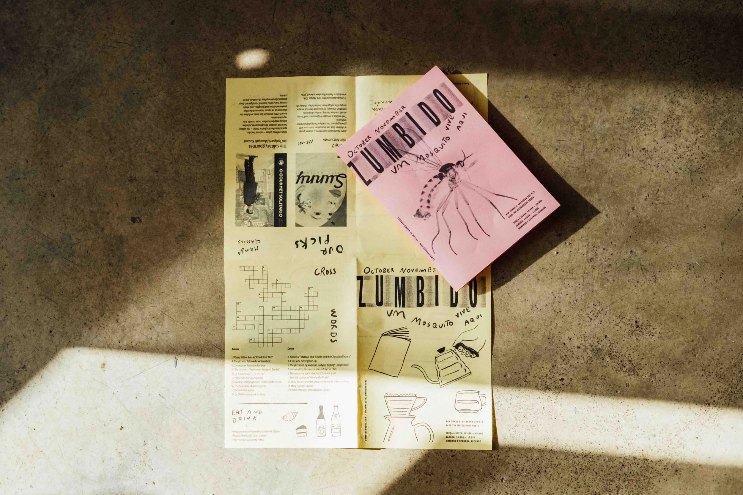
Our approach to Zumbido's identity is experimental, playful, and ever-changing. We created the logo structure through a somewhat manual process: we were not entirely satisfied with what we were getting in the computer, so we resorted to low-quality printing on light paper, cutting, and physically rearranging each letter to create some imbalances in the tracking and a natural distortion (the thin paper bent after cutting), which was then photographed and digitally re-perfected.
Logo's study and multiple versions
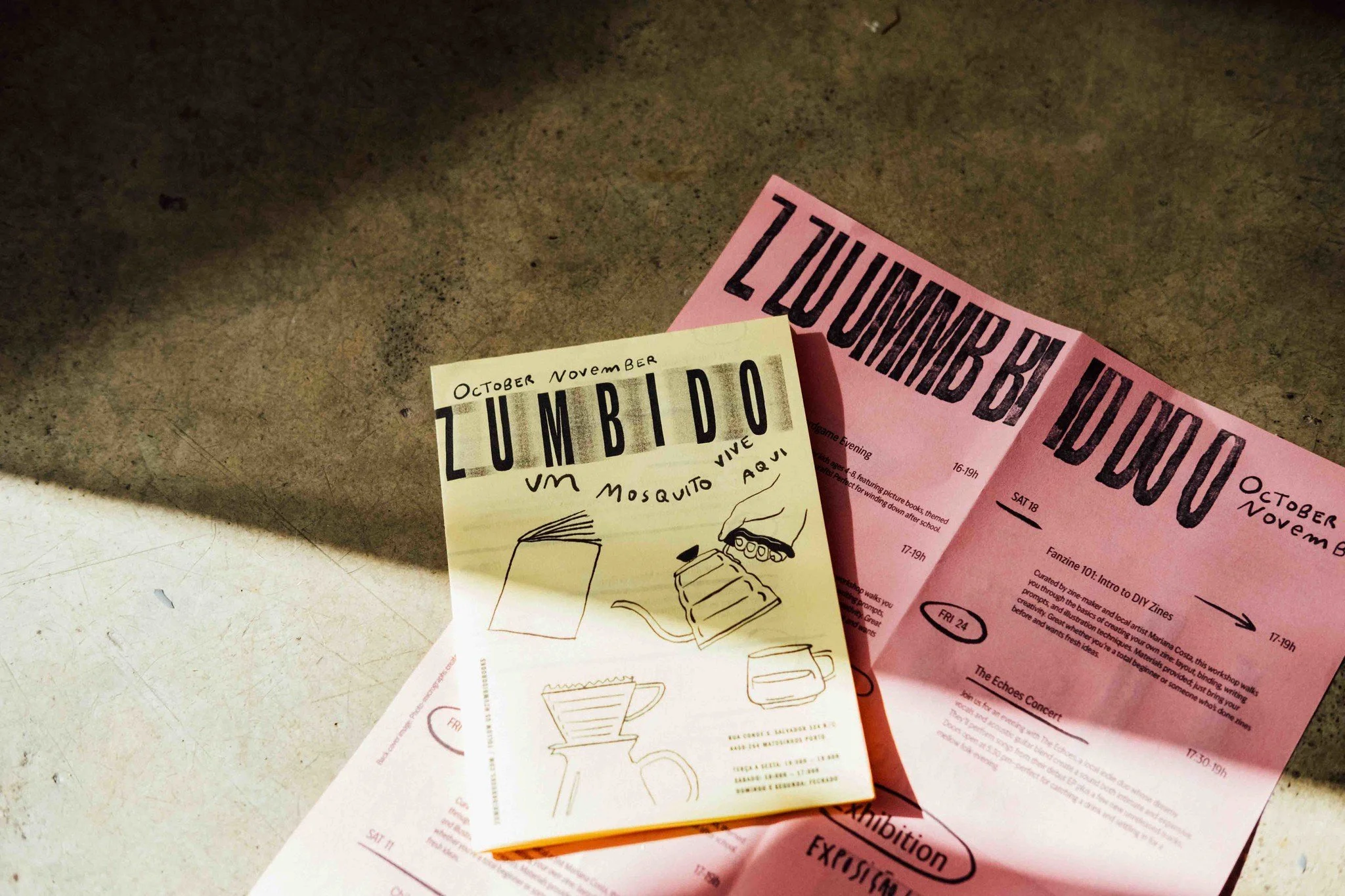
Home printed posters, a folded zine study and stickers
Imperfection, tactility and texture take centre stage, evoking the idea of something homemade, alive, and never the same. As we explored possibilities, the logo evolved into different versions, incorporating overlays, textures, and distortions.
The typography used in the logo, “Obviously” by Oh No Type Co., is set in bold and compressed, with a strong vertical axis and generous tracking — balancing impact and lightness. Another small but important detail, and one of the reasons we chose this font, is the slightly flared terminals.
“I love when the vinyl starts peeling up on the sides, and the corners are the only bits that manage to remain adhered to the substrate” — James Edmondson of Oh No Type Co.
For Display typography, ITC Franklin Gothic in all caps is combined with Ivy Epic for body text, both condensed. The tall x-height and compact counters create the dense visual impact that we were looking for.
Ivy Epic has a bit more contrast than your typical sans serif, which makes it easier to read—especially at smaller sizes. What really sets it apart are the unique tapered tails and terminals. These details help keep the counters open, even in the heavier condensed weights, so the whole typeface feels more approachable and friendly.
Because both are condensed, we must say this improbable pairing greatly surprised us — they work in perfect harmony, with a slight uncanny touch.
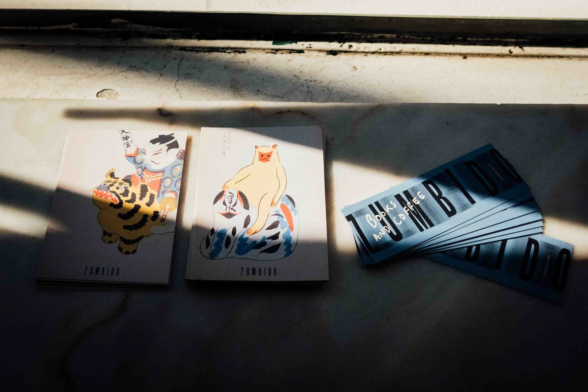
Postcards and bookmarkers
The bookstore’s interior details and visual assets
Risograph printing and fanzines are at the root of the colour palette, with their emphasis on pinks and yellows. The blue directly evokes the corner shop building, while the orange and green create a link between the bookstore’s interior details and visual communication.
The imposing blue of the building exterior led to the decision not to use blue in larger formats, such as posters or interior details, but to make it present on the website. For the overall colour visual system, we worked with layering and the opacity and transparency of the inks.
Risograph colours and a selection of main colours
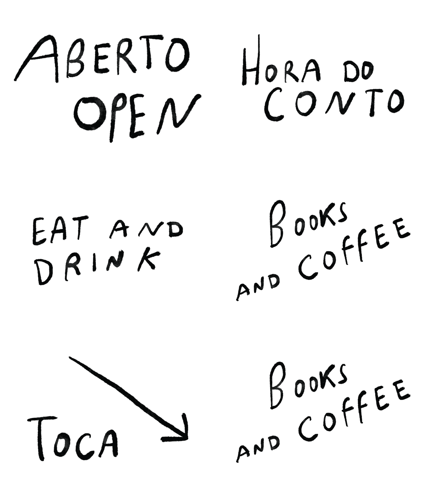
Handrawn lettering for signage and posters
Imagery and hand-drawn lettering play a vital role in establishing a connection to the world of comics and illustrated books.
The collection features spot illustrations and hand-drawn calligraphy applied to the logo, combined with type or other graphic elements, depending on the context.
Signage
Folded Zumbidozine studies
Additionally, we researched the world of Japanese vintage books to find “Unai no tomo: Catalogues of Japanese Toys (1891–1923),” a fascinating public domain catalogue that evokes childlike imagination, as well as the world of manga and Japanese culture, expanding the visual territory of identity.
As Zumbigo Books is a place for creativity and imagination, we aimed for a visual system designed to hold a broad spectrum of possibilities and diverse imagery, such as illustration narratives or photographs, allowing space for different communication outputs.
Open/Close sign, postcards and bookmarks
Menu and opening day announcement
When applying the visual system, the challenge was to maintain coherence amidst such open possibilities. Still, as soon as we started creating the signage, posters, bookmarks, website and many other applications, everything worked as a harmonious symphony: structured yet playful, experimental, and fun, just like the bookshop, allowing space for various imagery without compromising the recognisable identity.
Website/Online Shop study, in development
A few photos of Zumbido’s Books and Coffee, so you can feel the vibe before we publish a complete post about the business development process
Credits:
Creative Direction: Miguel Barbot
Art Direction: Maria Helena
Illustration and Lettering: Maria Helena
Graphic Design: Maria Helena, Cristiana Braz
Web Development: Mariana Teixeira
Typography: Obviously by Oh No Type Co., ITC Franklin Gothic by Morris Fuller Benton and Ivy Epic by Ivy Foundry
