
Nova Type Foundry: our new designs for MyFonts and beyond
Words: Cristiana Braz and Miguel Barbot

If you’ve been around for a while now, you’ll know that we have been long-time close partners of Nova Type Foundry, working closely with the foundry’s founder, Joana Correia, on her brand’s graphic design and communication.
Typography is at the heart of what we do at Estúdio Ofício. As such, in this post, we’ll be showcasing some of our latest design developments for Nova Type Foundry and taking you through the strategies we use to translate type design into clear, engaging communication.
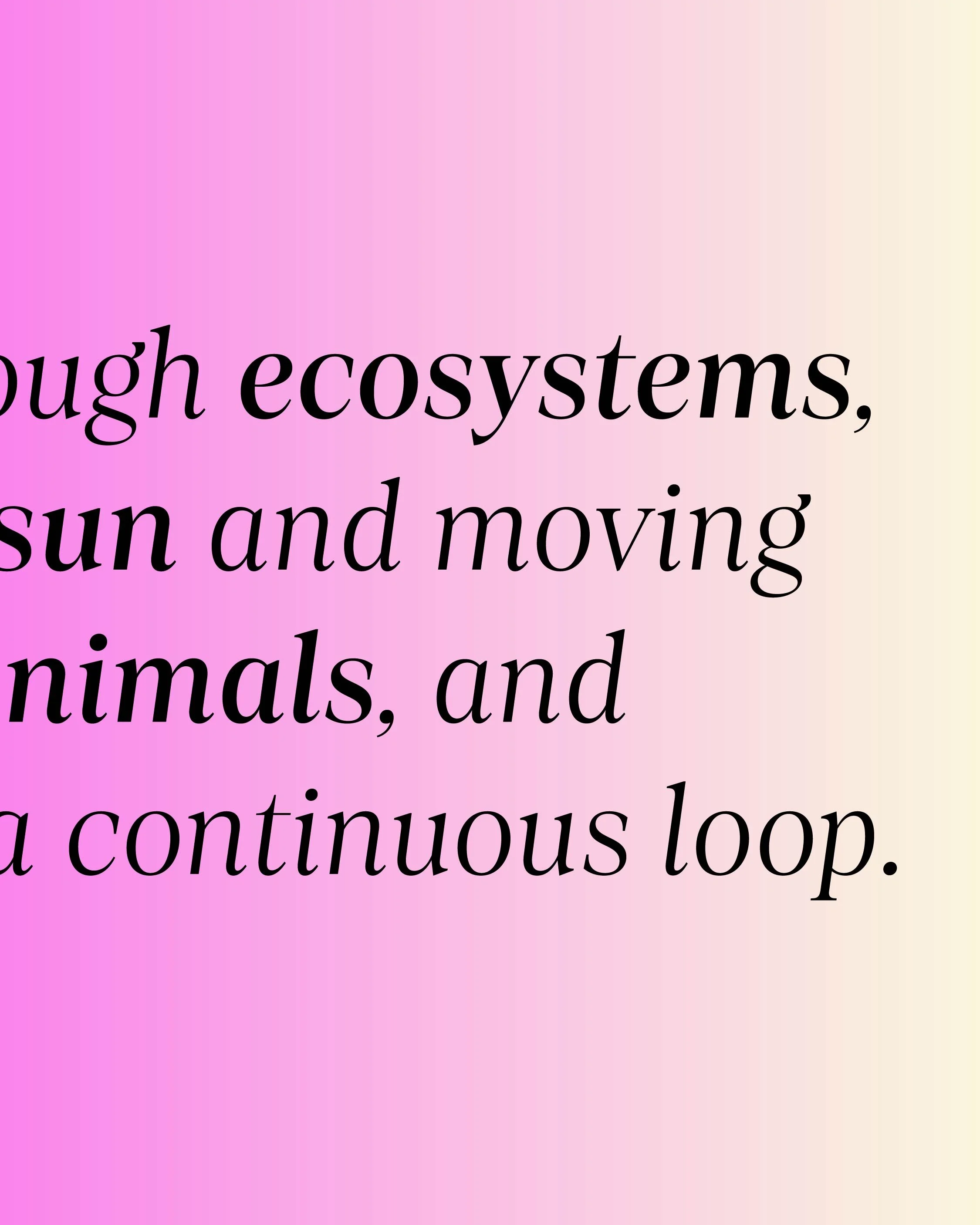
A typeface is often judged in the very first moment a designer encounters it, and the way it is presented can make or break the spark of connection that leads someone to explore it further. That’s why when Joana asked us to develop a new set of visuals to display her typefaces on the MyFonts platform, we took it very seriously. MyFonts is not only a marketplace; it is often the first point of contact a potential user has with a font family.
Our task was to design visuals that showcased each typeface while remaining both functional and visually appealing to professional designers. We didn’t choose a particular style of vibe for the visuals and preferred to create a mix of more serious/introspect designs with others more funny and light.
MyFonts
For each of the typefaces, we developed a cohesive family of images, centred around a specific theme and colour palette. The visual direction was matched to the typeface’s tone and expressive qualities, so that the imagery itself reflected their personality.
Our goal was for someone to look at the visuals and immediately sense the atmosphere, potential applications, and overall mood that each typeface carries. We aimed to highlight the full range of features, from all caps and small caps to ligatures, punctuation and other symbols, as well as weights, alternate glyphs and stylistic sets.
By weaving these elements into the visuals, we were able to convey not only the technical versatility of the typefaces but also the nuances that define their character.


A few of our designs for NTF’s MyFonts
Social Media
Once those visuals were created, we adapted and extended them into the foundry’s communication across Instagram and LinkedIn.
Here, the goal was slightly different: not just to present typefaces as products, but to showcase them in context, in motion, and in conversation with the broader design community.


Anona


Artigo


Artigo Display


Baga


Laca


Laca Text


Lemongrass


Loretta


Loretta Display
On Instagram Reels, we’ve been experimenting with choosing a theme and focusing on specific details, such as terminals, serifs, ligatures, or alternate glyphs, so that audiences can appreciate the craftsmanship behind the design and get to know the typefaces more intimately, little by little.


Instagram Reels (originally mp4 videos, here we present them in gif format)
We also launched a monthly GIF series, where we display the full spectrum of a chosen typeface’s weights, alternating between colours and upright/italic versions.
This format provides a quick yet comprehensive view of their range, and is an excellent example of how a simple animation can effectively demonstrate a typeface’s potential.
We also find it quite fascinating to compare the individual posts and appreciate how different the typefaces are, as they all feature the letter “a” as the central element being animated.


Aside from animated content, we’ve also been highlighting font pairings using only Nova Type Foundry’s catalogue, demonstrating how families can interact and complement each other in real design scenarios. Because Nova Type Foundry’s collection spans expressive display faces, text-optimised families, and finely designed sans serifs, there’s a wide range of possibilities for combining them.
For example, we have explored combinations such as Loretta Display with Laca Text, leveraging the high contrast and calligraphic detail of Loretta in headings against the body-copy design of Laca Text. Pairings like Lemongrass with Artigo or Artigo Display with Anona further highlight how connected script typefaces and angular display forms can be grounded by more rational, text-focused companions. These pairings not only show compatibility but also underline the importance of optical contrast, rhythm, and feature sets in typographic systems.


Alga and Laca Text


Artigo Display and Anona


Baga and Artigo


Laca and Loretta


Lemongrass and Artigo


Loretta Display and Laca Text
To help designers envision practical applications, we’ve been using a variety of mockups and real-life scenarios, including signage, packaging, editorial spreads, and digital interfaces.
By contextualising the fonts, we help show how Nova Type Foundry’s typefaces can move from concepts on a screen to functional elements in real-world design. Coming up with ideas for the applications and copy is sometimes challenging, but at the same time, it’s the part of the process our designers enjoy the most: seeing the typefaces work together and come to life.


Alga showcase


Anona phone mockup


Baga showcase


Lemongrass showcase


Anona showcase
What excites us most is how communication design can open doors for type design. By blending educational content with diverse formats, like deep dives into glyph anatomy to quick, engaging animations, we’re not just promoting fonts, but also encouraging a wider appreciation of typography as a craft. For this reason, working with Nova Type Foundry continues to be a rewarding collaboration, and we’re excited to keep exploring new ways of making their typefaces visible and inspiring for designers around the world.
Credits:
Creative Direction: Miguel Barbot
Art Direction: Maria Helena
Graphic Design: Maria Helena, Cristiana Braz, Margarida Matos
Project Management: Mariana Teixeira