
Binomial Advisory: how we designed the visual identity and helped the founder create a brand and position his practice.
Words: Miguel Barbot
Normally, it is Helena who writes these design cases, but this one is a bit more personal, so it will be up to me.
In our practice at Ofício, we divide the creative work into Creative Direction (me) and Art Direction (Helena). Sometimes, when new work arrives at Ofício after a Barbot Bernardo strategy project, I’m also responsible for strategic design, outlining the marketing strategy, and defining what the brand should be. I start the project by understanding the client and their customers, defining key elements such as tone of voice, and decoding the value proposition and how the brand should be seen in the market.
Then we move to research, a joint effort with Helena and the start of the Art Direction tasks. It implies benchmarking, forecasting and hours of book digging, before the moodboarding phase. Our shared experience and visual culture, allied with her impeccable taste and creativity, define the work we have been doing together over the past few years. Here, we onboard other designers and more junior team members who will help us design parts of the project.
For this project, things were no different, but I had much more information to start with than usual: the client is an old friend, and his industry is something I know very well.
Filipe, founder of Binomial Advisory, is a good friend with a decades-long career in “big guys” consulting, having decided to go solo by the end of last year. We met in the mid 90’s, don’t ask me how, and I’ve been following his career closely since then. After working an early stint in auditing, he became a Tax expert.
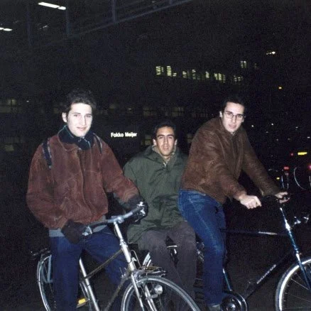
Eindhoven, 1998, with our mate G. Back then, I trusted Filipe (right) to carry me in his bike carrier. I shouldn’t, but I easily trust him with my taxes.
We all know that consulting does not have the best rep. We are also part of the industry - I spent almost a quarter of a century working as an innovation and business consultant (that’s how old I am), something that remains core to our parent company, Barbot Bernardo. Not all of us are part of the bad guys, the inconsequential, or the lazy, as our industry is often seen nowadays, though. There is plenty of value and good people doing fundamental work, from creative to technical, from strategic to legal. In our case, we prefer to frame our consulting practice as strategic design and education for culture, creativity, and independent retail. It sounds better and is less misleading.
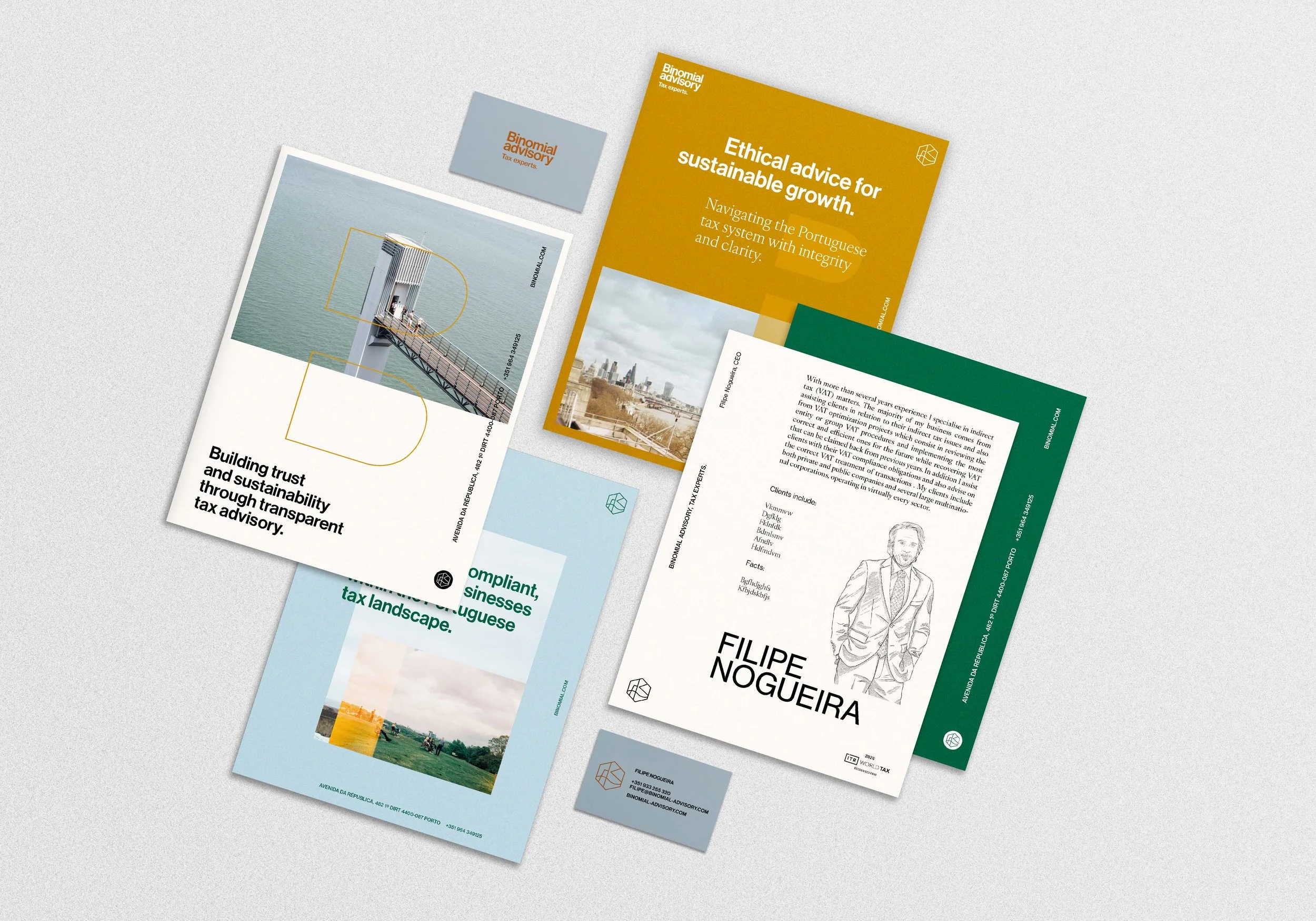
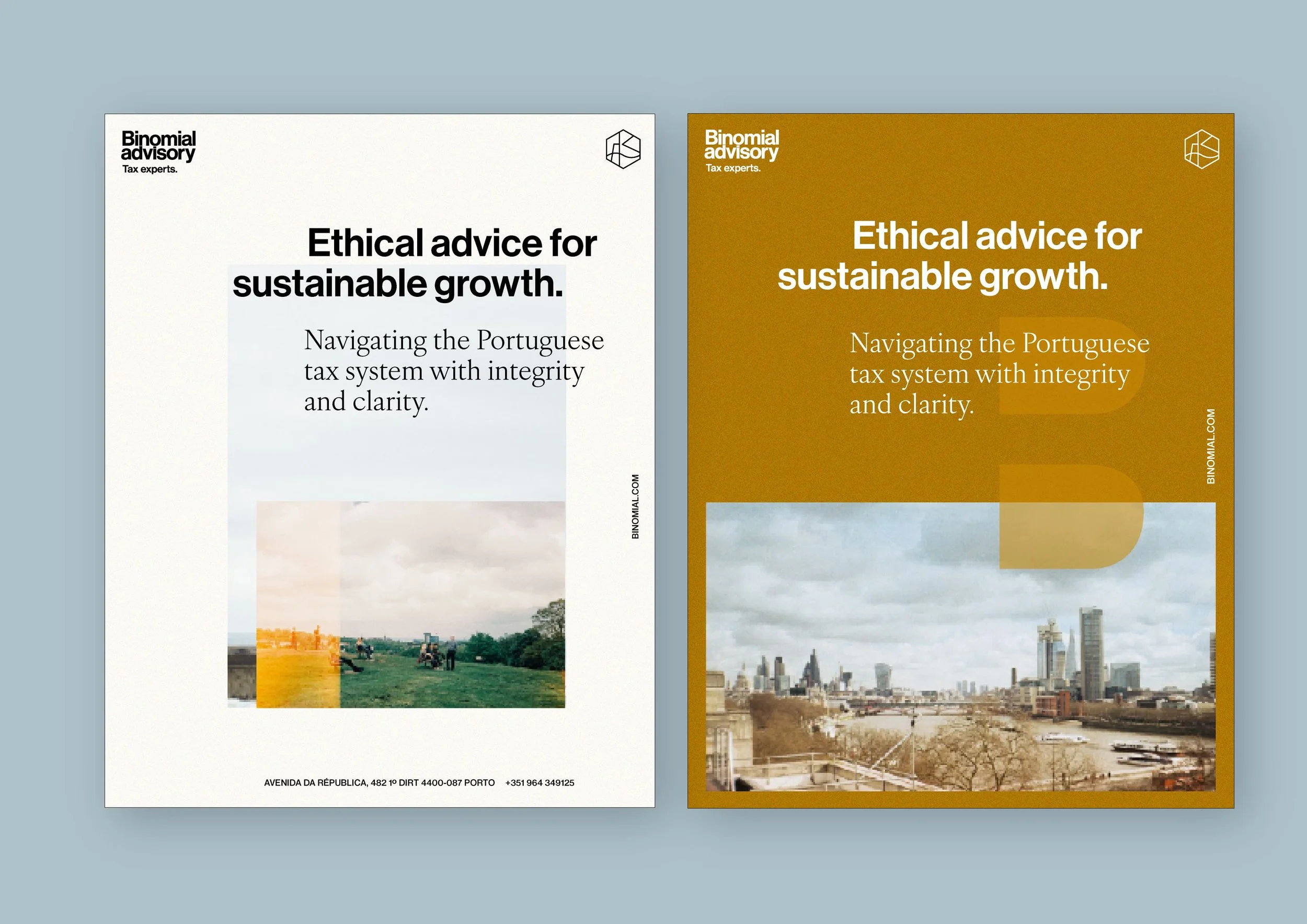
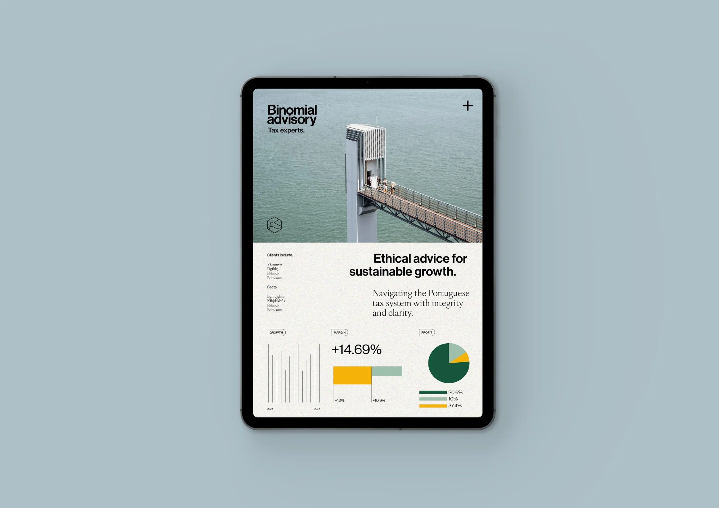
For this project, challenging the typical perception of Tax consultants was our first design hurdle: reframing the practice as a proactive partner in compliance and sustainability, helping both private and public sectors navigate the tax system and avoid unnecessary legal issues. This idea guided how we positioned Binomial Advisory as a trusted, positive force.
The brand construction was made in three steps:
First, Refining the name: Filipe has been operating under the legal name Expert Binomial for many years. When he chose the name from a pre-approved list, a mere bureaucratic act to simplify proceedings, he was not thinking about using it as a brand.
Our first exercise was to understand if Expert Binomial would work, both visually and phonetically. And it didn’t. It was just too complicated and confusing. What does the word binomial mean, anyway?
We opted to create a new version using part of the elements: Binomial, which visually works really well, would be part of the main name, with “Advisory” added to create a more bespoke, personal, and “small office” vibe. It would also frame the practice.
The work “Expert” was relegated to the signature, making it both specific and flexible. Given potential expansion and the arrival of new partners, we can now use “Tax Experts” alongside other potential expertise, such as Compliance Experts, VAT Experts, and Mergers and Acquisitions Experts.
Second, defining the visual system core elements: a benchmarking exercise led to a desire to move away from the consulting and finance corporate clichés.
We were looking for a more human sphere, but not too personal. We were also thinking about clarity, proximity, and timelessness. Something that both clients and future partners and collaborators could easily relate to. We were looking for easy-to-understand modern classics, pairing grotesk typefaces with humanistic serif fonts. Soft colours, illustration and an analogue je ne sais quoi.
Third, acknowledging strong copy as a central part of the brand: in the brand construction, we understood that copy would be an essential part of the visual identity, being the first driver for positioning and to communicate the value proposition. Everyone looking at the different materials, from stationery to a website homepage or social media profile, must easily acknowledge what Binomial Advisory, as a tax expert, stands for: someone who helps public and private organisations to be compliant with the Portuguese tax system and make the correct and legal decisions when operating in our market.
Visual Identity
The Logo
Nothing says “modern classic” like the good old Helvetica. Loved by many, hated by more, it still is an incredibly versatile typeface. As in other projects, we went back a few decades and chose Neue Haas Grotesk, a purer version of this workhorse typeface. It was the first time we used it in a logo, though.
Neue Haas Grotesk is one of the most influential typefaces in the history of graphic design, not only for its formal value, but also for its central role in shaping the modernist aesthetic of the 20th century. It emerged at the height of the International Typographic Style (Swiss Style), integrated into visual systems based on grids, strict alignments and structural clarity. It was originally designed to be a more refined alternative to 19th-century grotesque fonts, such as Akzidenz-Grotesk.
In 1960, when the typeface was distributed by Linotype, it underwent changes to adapt to mechanical typesetting systems and was renamed Helvetica. The current version, Neue Haas Grotesk (released by Christian Schwartz in 2010), restores the behaviour, rhythm and details of the pre-Helvetica version, as it existed in metal, returning the subtlety lost in later digitised versions.
The “Binomial Advisory, Tax experts” logo is a typographic logo inspired by modernist principles, with clean, cohesive, and highly functional strokes. Adjustments were made so that the spacing between ‘Binomial’ and ‘Advisory’ was as minimal as possible, while maintaining legibility.
Symbol
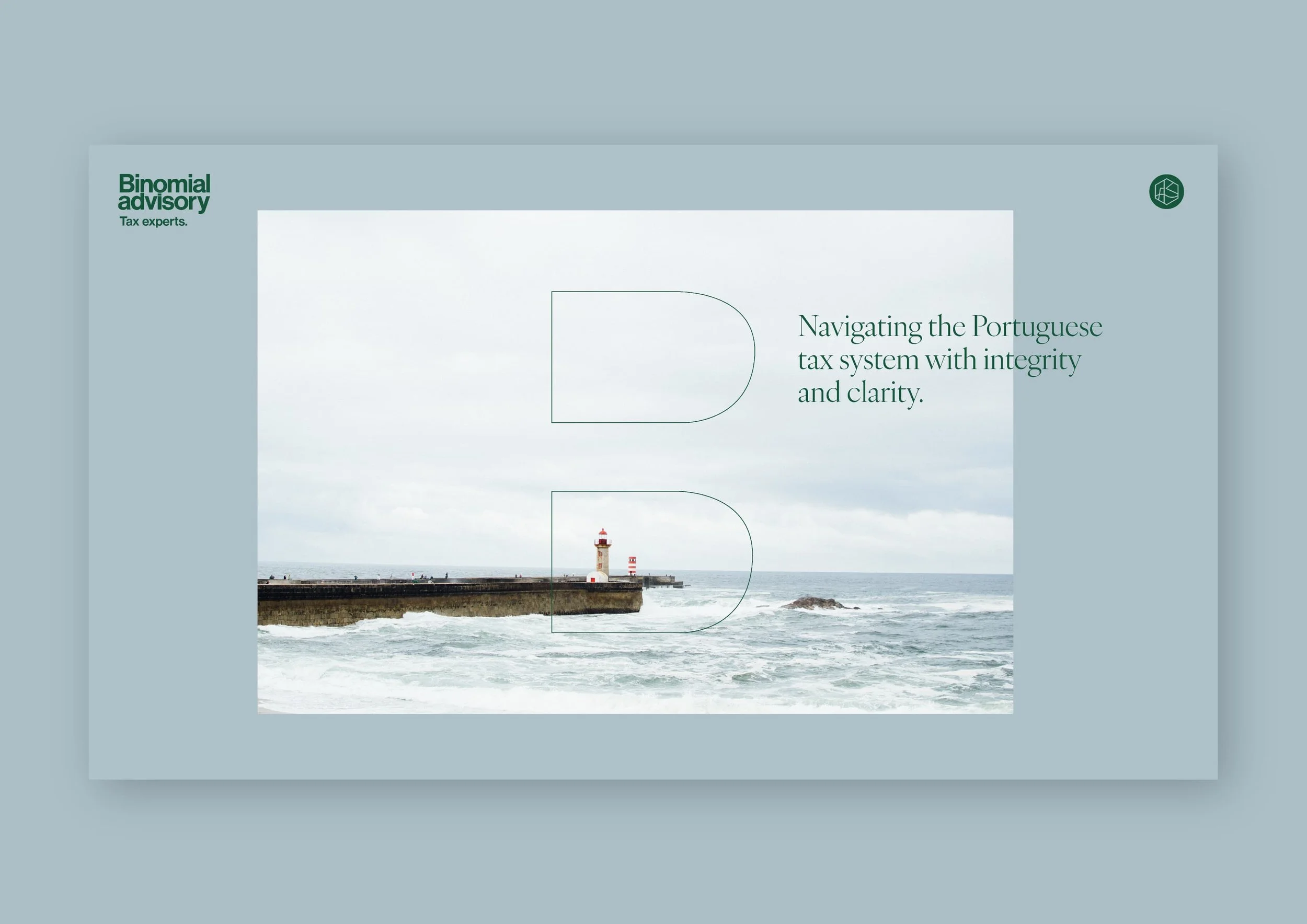
The brand symbol was inspired by the positioning statement ‘Navigating the Portuguese tax system with integrity and clarity’ and the idea of a lighthouse, also present in the brand's photographs.
Geometric, functional, and symbolic, the icon depicts a lighthouse with a beam that illuminates and guides, next to the mouth of the river and the rough sea. It can be used alone or in conjunction with the logo, as shown in the applications developed.
The starting point for this idea was our own Douro River Mouth, and its two lighthouses. There are loads of symbols behind this idea. The tricky river mouth was tamed by the construction of a new pier. As Portugal and Porto saw an unimaginable transformation in the past few decades, being part of the EU and becoming a dynamic, modern and safe place to live and work, the river estuary is now a calm, clean, and pleasant place, where economic and leisure infrastructures coexist with a breathtaking natural park and wildlife reserve. This is a very interesting analogy for what Portugal stands for nowadays, with many companies and individuals relocating to both metropolitan areas and to more off-the-beaten-track parts of our beautiful country.
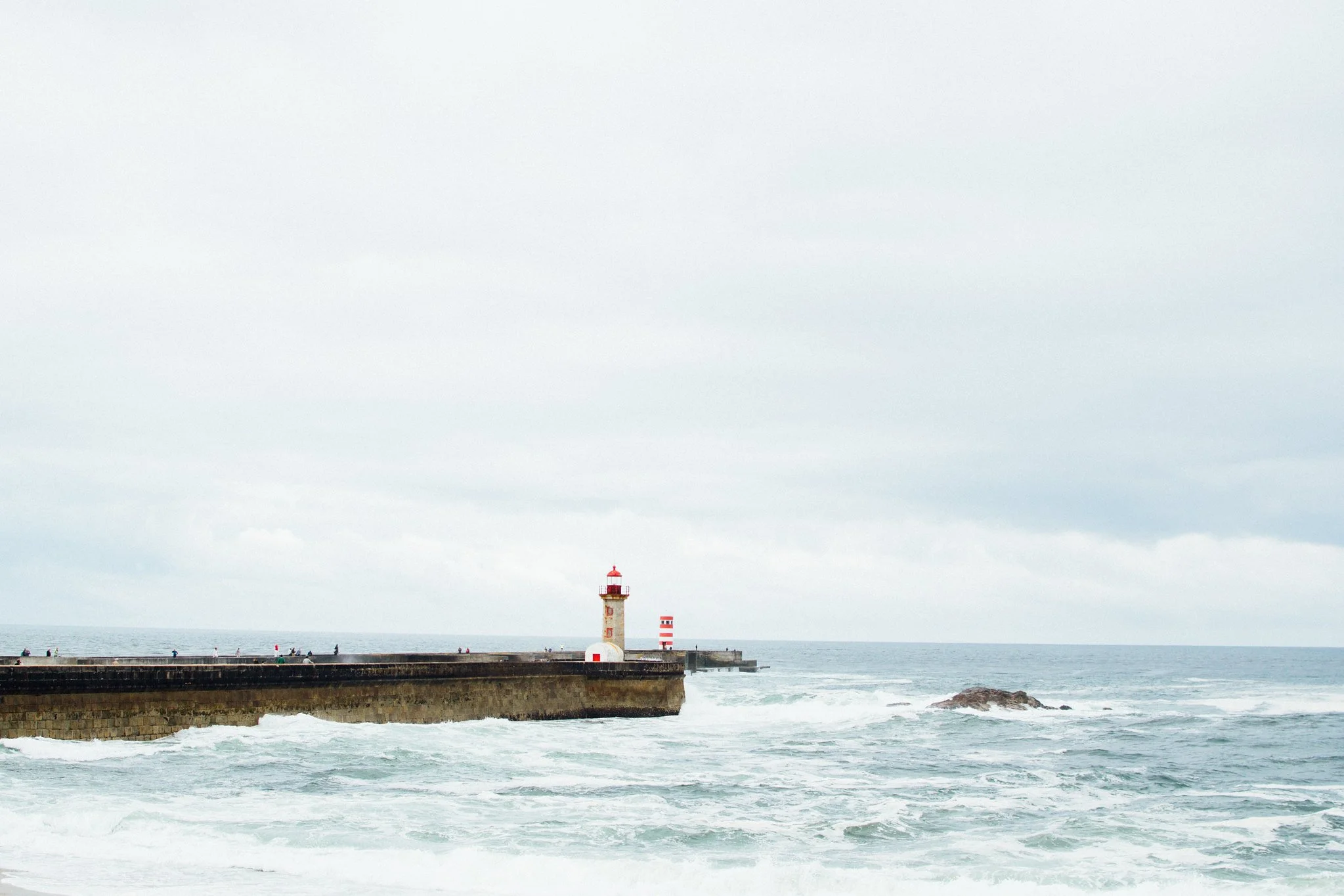
Porto’s two lighthouses. Photo: Miguel Barbot
We are very happy with what we got here. We started with a “pre-approved” name meaning nothing and ended, in a serependity way, to create something aligned with the meaning of Binomial: “an expression that has two terms that are not the same. Two lighthouses, sea and river, old and new, confusion and clarity.
Typography
Typography is sometimes overlooked, but we take our time thinking about it when designing a visual system.
We have a bunch of our go-to typefaces, but every project has different necessities. Most of our clients don’t have a budget for multiple licenses, so we tend to use typefaces available on Adobe Fonts, making it easier to integrate with Squarespace Websites (which have Adobe licensing). Working with creatives means that many of them also have their own Adobe licenses, making it easier for everyone. And then we have clients from other walks of life who want something beautiful but usable on a daily basis across other ecosystems, such as Google or Microsoft.
As I said before, we were looking for a combination of Grotesk and Humanistic fonts that could work in tandem across different media.
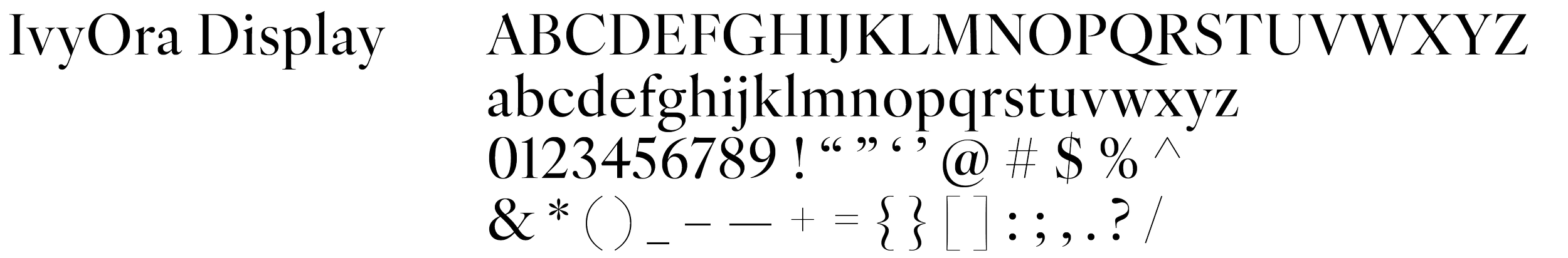
For display and titles, we chose New Haas Grotesk, designed by Christian Schwartz of Monotype Studio and the same typeface used in the logo. This typeface family combines the history of Swiss typographic modernism with contemporary functionality, resulting in an extremely versatile, elegant and solid font. It consists of Display and Text versions, with 8 and 3 weights respectively, plus italics. We chose the Display Pro version for identity applications.

For highlights and secondary information, we chose IvyOra Display, a high-contrast serif typeface family designed by Jan Maack for Ivy Foundry and commercially published, with a wide range of weights and styles (including Thin, Light, Regular, Medium, Bold, and their italics).
For text, we chose IvyOra Text, available in multiple weights and italics (including Thin, Light, Regular, Medium, and Bold, with cursive versions).
As alternatives to be used in Microsoft apps, Filipe’s chosen ecosystem, the visual system, also works with Helvetica Neue or Arial instead of Neue Haas Grotesk and Garamond instead of IvyOra.
Illustration
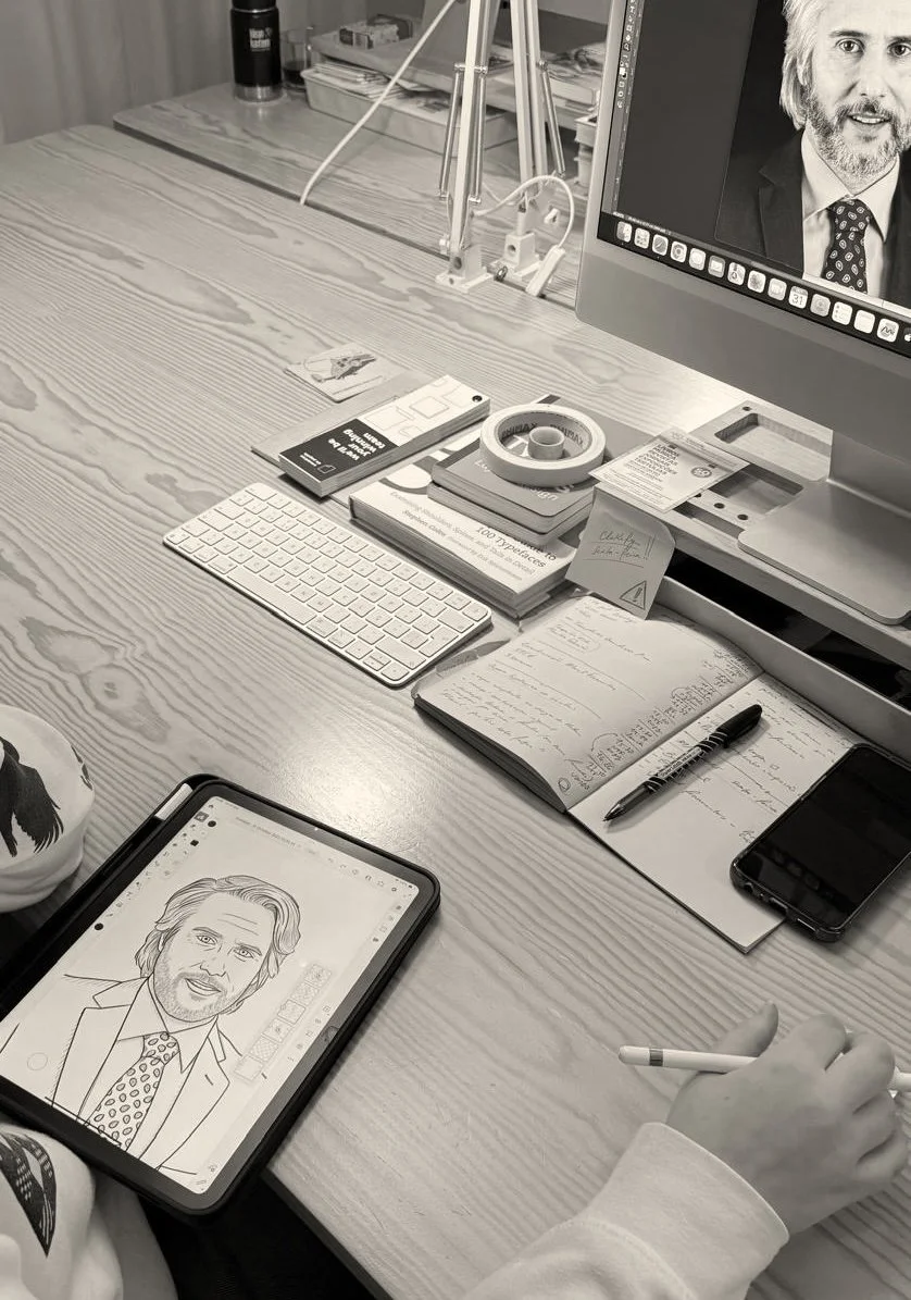
The illustrated portraits are a fundamental part of the system. We drew inspiration from lifestyle and affairs magazines, toning down the “suited-up” vibe of corporate photos to make it more sophisticated, approachable and scalable. By hand-drawing the portraits, we created an easy-to-replicate style to depict new partners in the future without overwhelming the design with photography. The talented Cristiana spent hours drawing this portrait. It turned out exactly as expected!
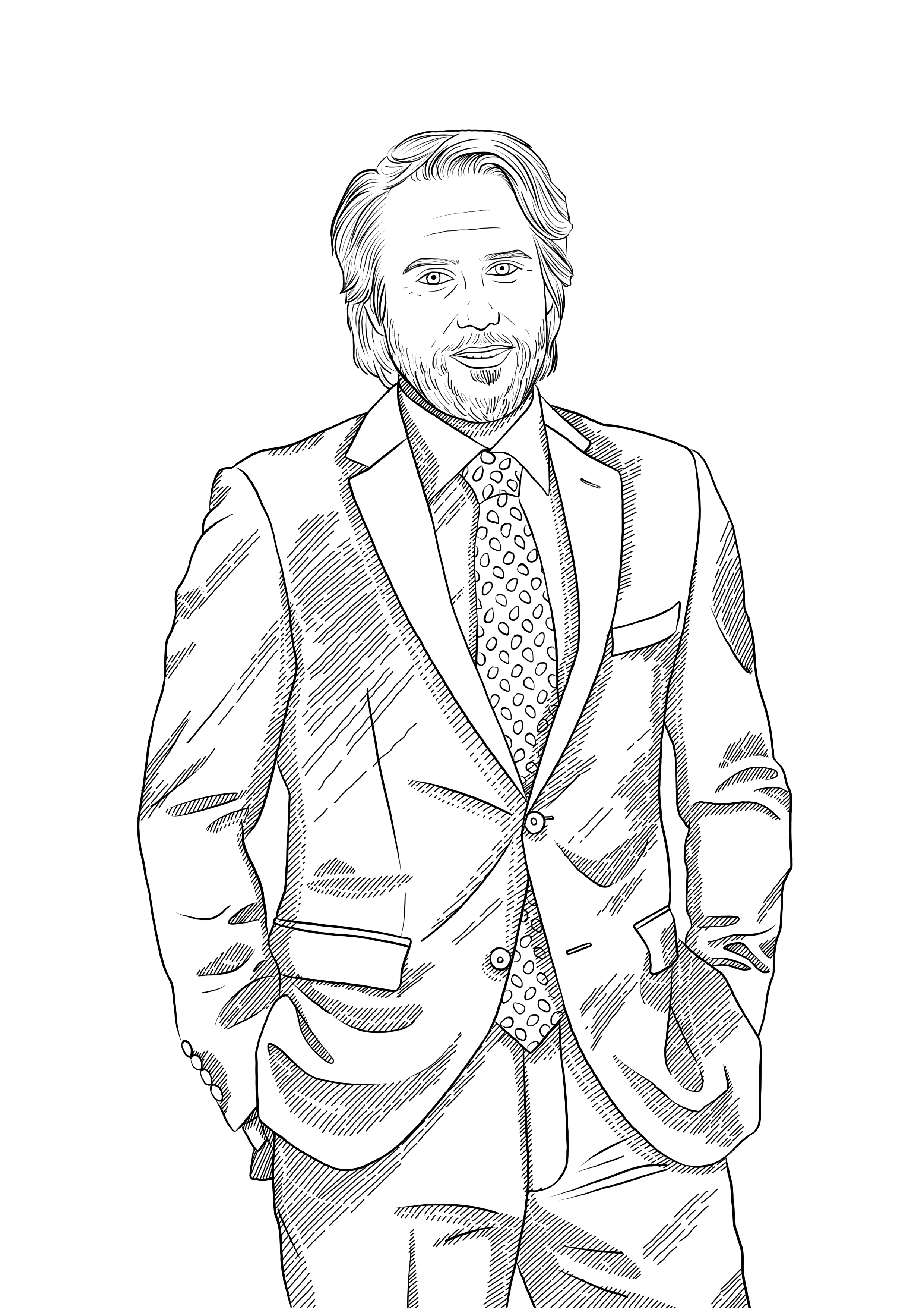
Looking dapper.
Colours
The brand's visual identity is based on an elegant palette. Maria Helena chose “Foz” as the main colour, balanced by “Açafrão”. “Foz” means estuary in Portuguese, but is also the name of the city's westernmost corner. Being surrounded by water, the Atlantic and the Douro, this area has a very particular light, cold but gentle, very distinct from the rest of the city. Açafrão means Saffron, adding warmth and symbolizing diversity and openness.
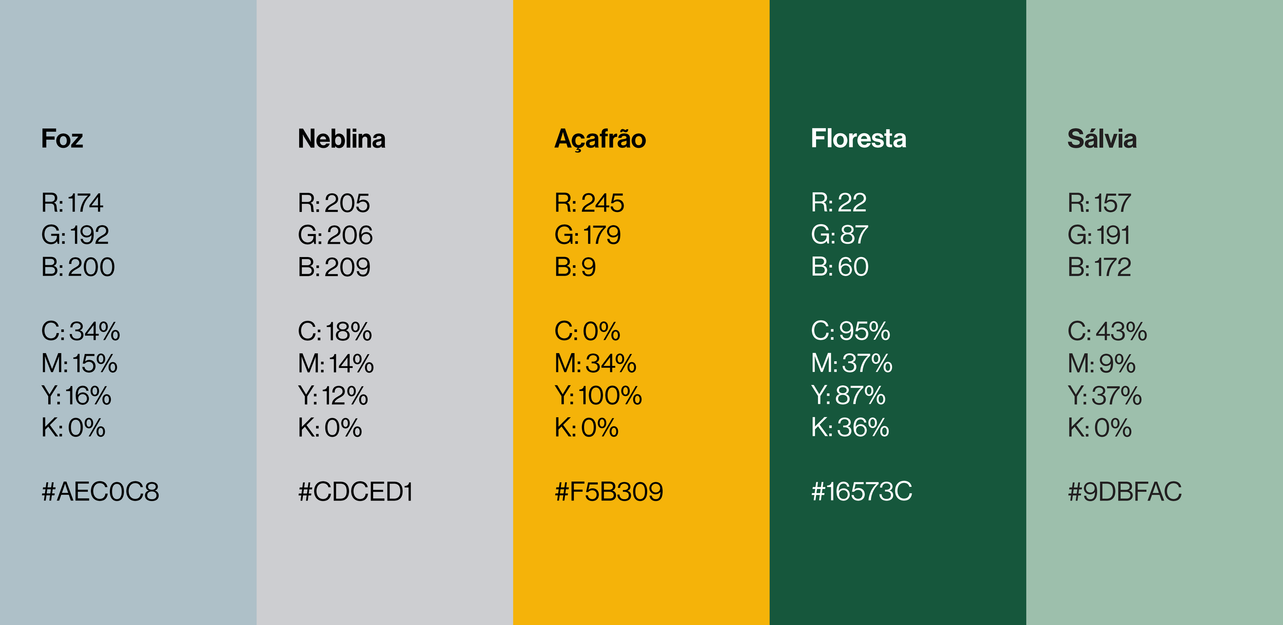
The grey base tones create balance and convey seriousness and sophistication. Black and white complete the palette, ensuring clarity and versatility in all applications.
Photography
With a small budget, it would be easy and acceptable to rely on an image bank for use across different applications, namely websites, brochures, or PowerPoint decks.
But, in line with a personal, approachable vision for the brand, we preferred to go the extra mile and use some of my own photographs, both digital and film.
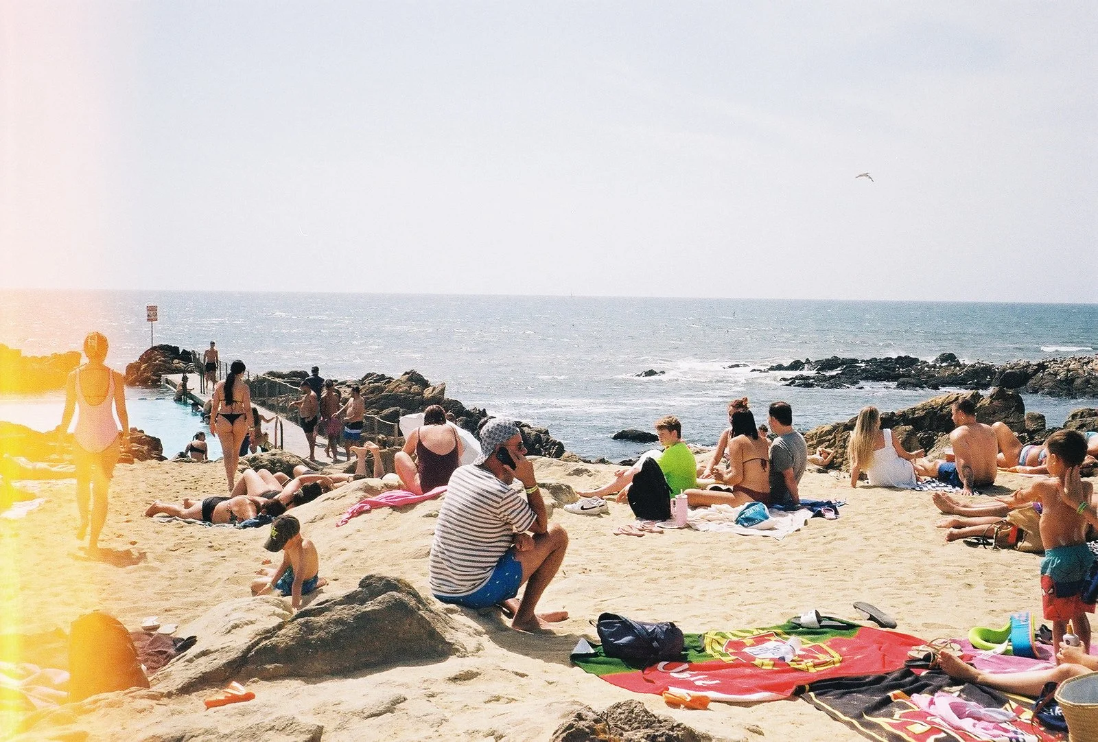
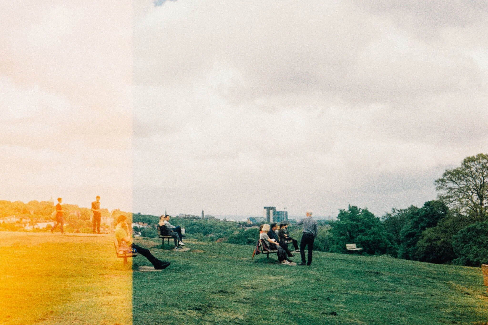
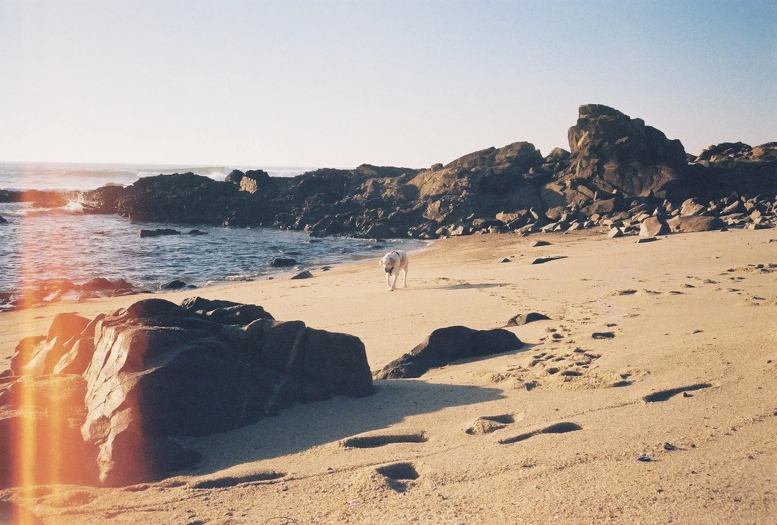
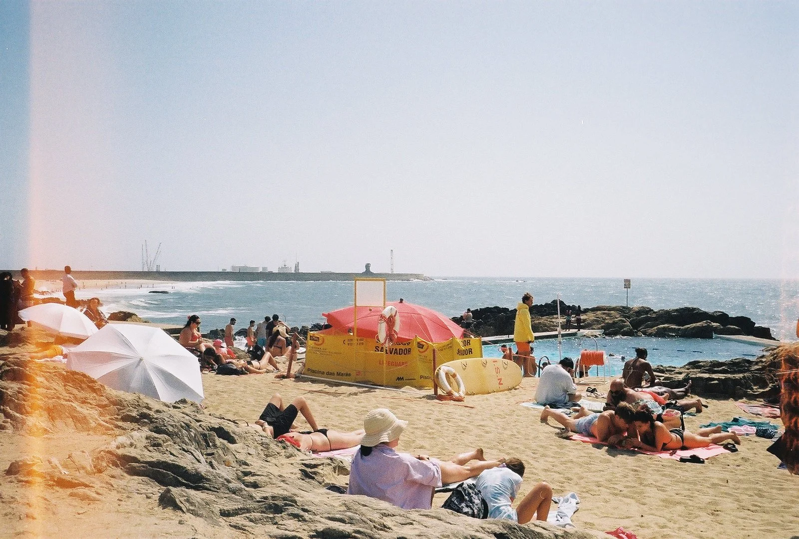
A few of my favourite end of the roll photos.
I normally shoot with a vintage Fujica from the 60’s, which I inherited from my parents (who got it from my uncle). It is a workhorse that relies on “all manual” settings because the exposure meter has been broken for a long time (so no automatic exposure). The back lid is broken, and has to be insulated with duct tape with every new roll - It tends to get increasingly leaky by the end of the roll, but I still love the result.
I don’t think Filipe will need more photos in the foreseeable future, but if needed, I still have plenty of them for a good friend. Burnt or not.
Credits:
Creative Direction: Miguel Barbot
Art Direction: Maria Helena
Graphic Design: Maria Helena and Cristiana Braz
Illustration: Cristiana Braz
Photography: Miguel Barbot