How we designed Noronha Franco Arquitectura visual identity
Words: Maria Helena
The story with Sara Noronha Franco dates back to 2019, when she bought a Brompton bicycle from Miguel’s former shop Velo Culture. Since then, Sara has been following our work and, inspired by a shared design vision, she challenged us to develop the visual identity for her architectural practice, Noronha Franco Arquitectura, which was launched just a few weeks ago.
Sara is an architect whose work unfolds between Lisbon, Porto, and her native Funchal on Madeira Island, where she is currently based — cities and landscapes that each carry distinct rhythms, stories, materials and light.
Our starting point was this geographic richness and the idea of layered textures were our starting point. Sara’s visual references across architecture, interiors, and graphic design are rooted in the modernist movements and emphasise function, durability, and spatial clarity, a balanced aesthetic with a nod to the local vernacular, identity and materials.
One thing that was worrying us before starting, was the “weight” of the brand. Two strong names, and probably the sort of thing you could expect from a very respectable and notorious lawyers practice, or a hedge fund office. It reminded us of a different scale than the subtle, detailed and human-centred work that Sara has been doing in her private practice.
So, design should match a different vibe and scale, without infantilising the brand. It should be serious and precise, but approachable.
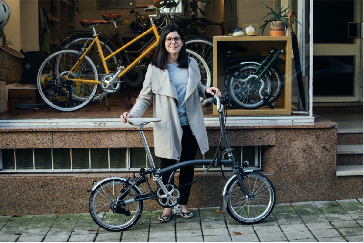
Porto, 2019. Sara happy to leave her car parked and spin on the new Brompton bike she just acquired at Velo Culture Boavista store near Palácio de Cristal.
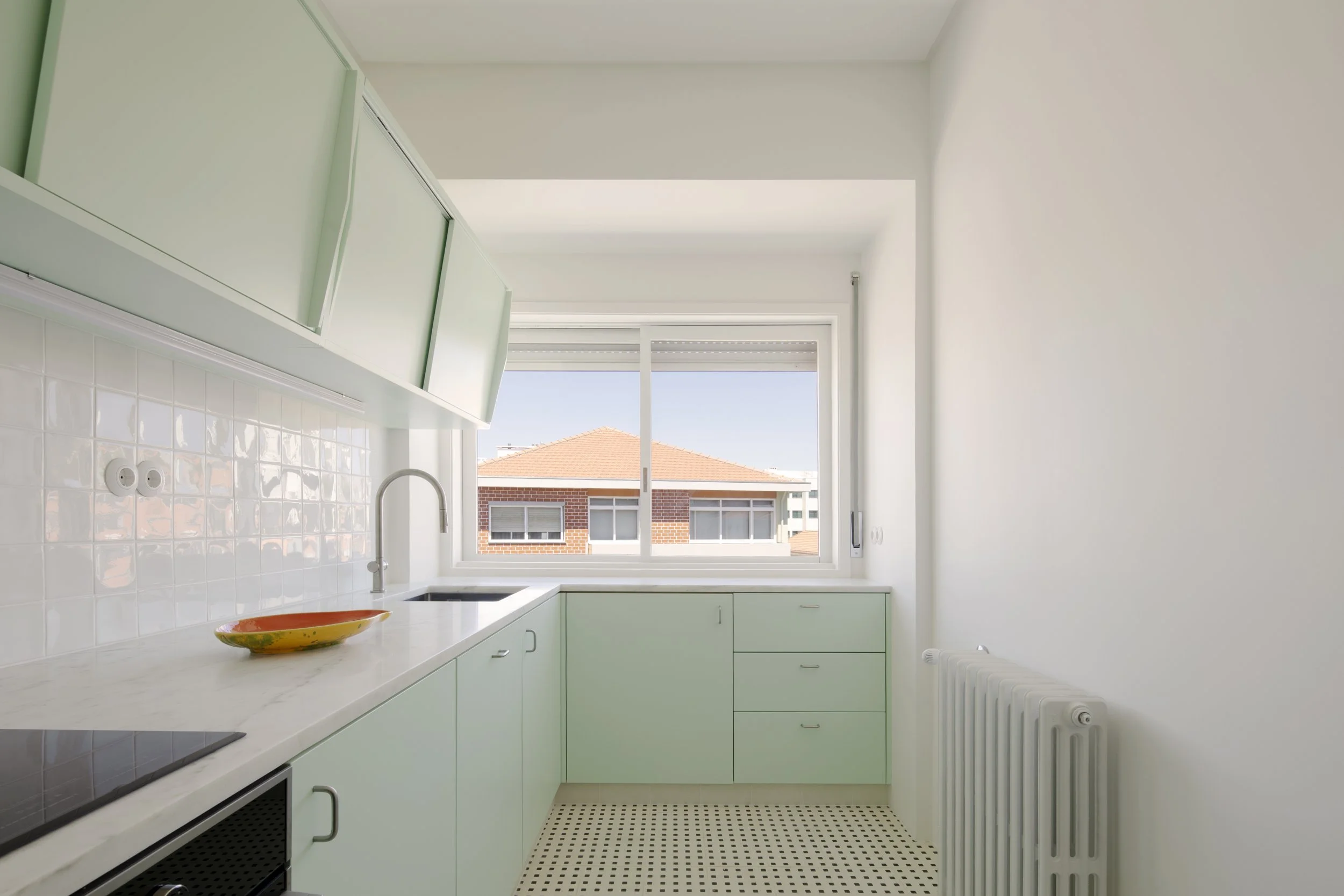
One of Noronha Franco’s architectural projects, the rehabilitation of an apartment on the top floor of a building from the sixties, whose modernist architecture prevails.
We spent time with Sara’s own architectural language, inspirations and projects, to translate the practice into a visual identity that feels architectural in its precision and human in its gestures. Then, we went after our own references, as we normally do.
The aim was to balance between the poetry of space and texture and the rigour of architectural thinking.
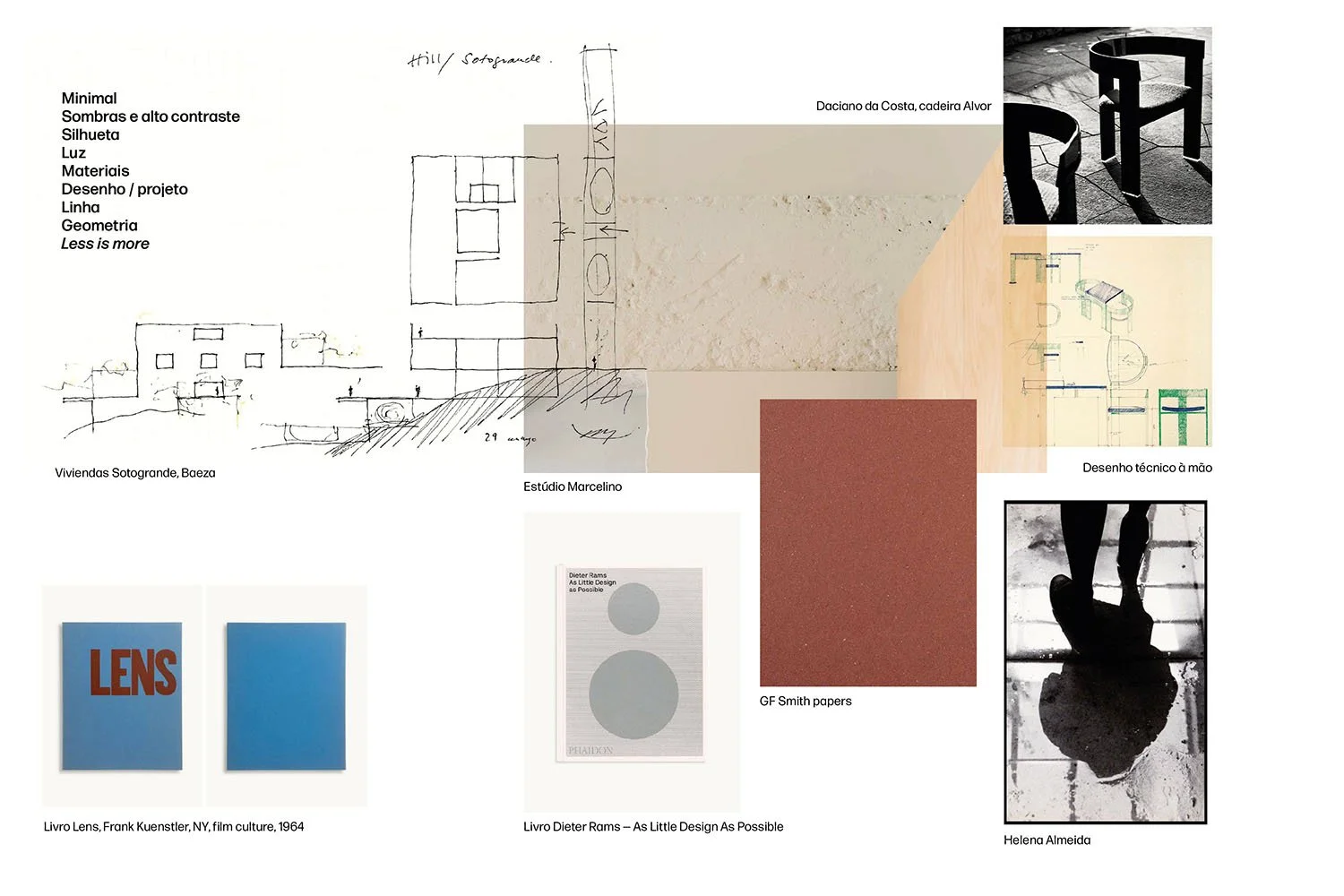
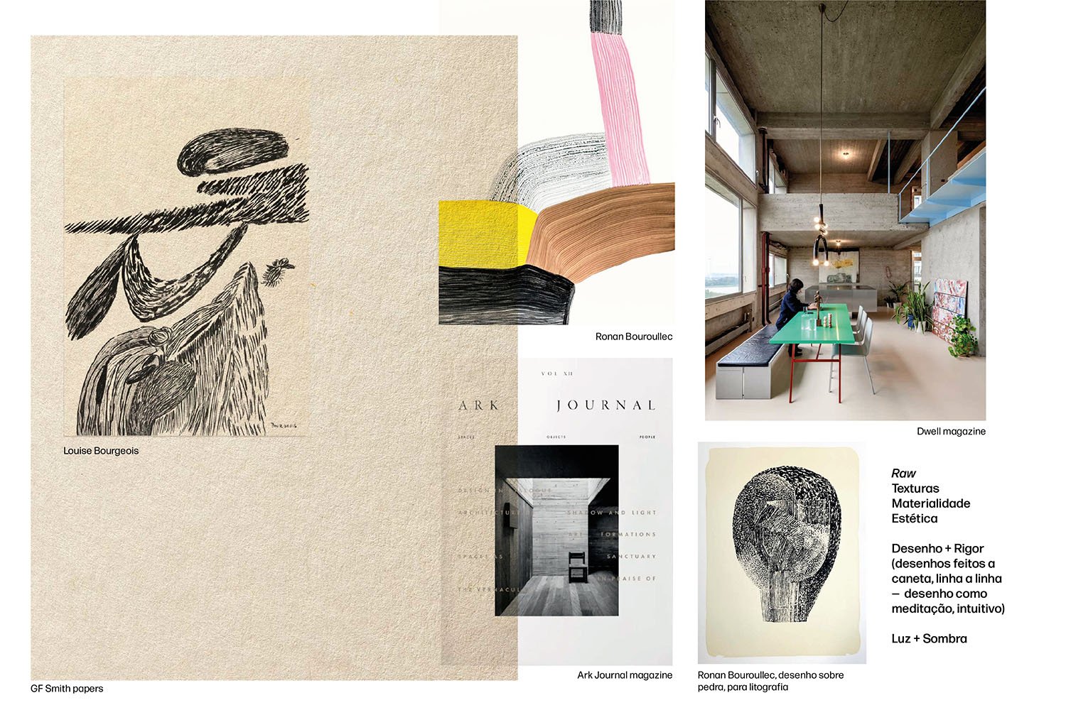
Light/Shadow, Geometry, Helena Almeida’s photographs, Estúdio Marcelino, Dieter Rams design principles and Daciano da Costa’s work.
Louise Bourgeois’s line drawings, textured, intuitive paintings, lithographic textures, and brutalist spaces contrast with the use of colour.
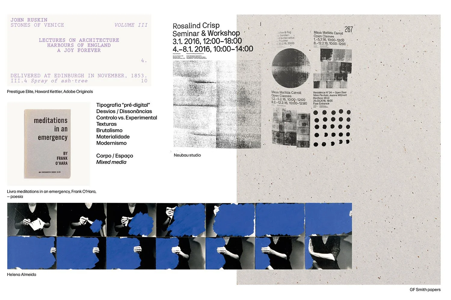
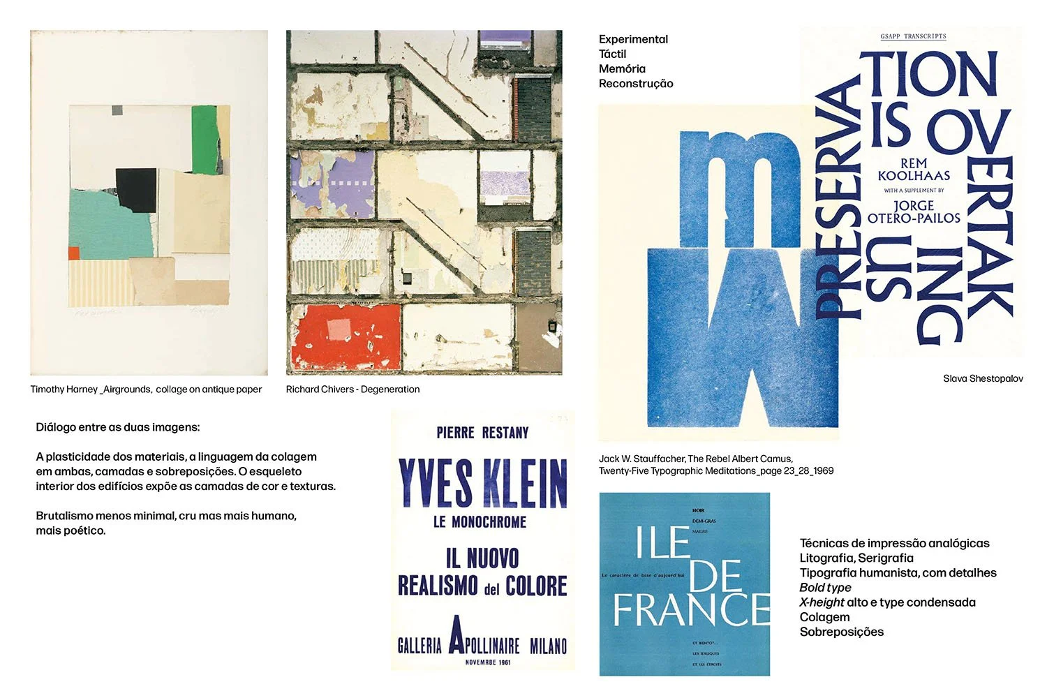
In the moodboard, we translated these concepts into visual signals and sensations, gathered raw materials, drawing gestures, light-and-shadow contrasts, and brutalist spaces, making connections among artists, from photographers to visual artists. We think of analogue printing techniques such as lithography and serigraphy.
Concepts of experimental versus control, deviations and dissonances, Frank O’Hara’s poetry, Helena Almeida’s work and pre-digital typography.
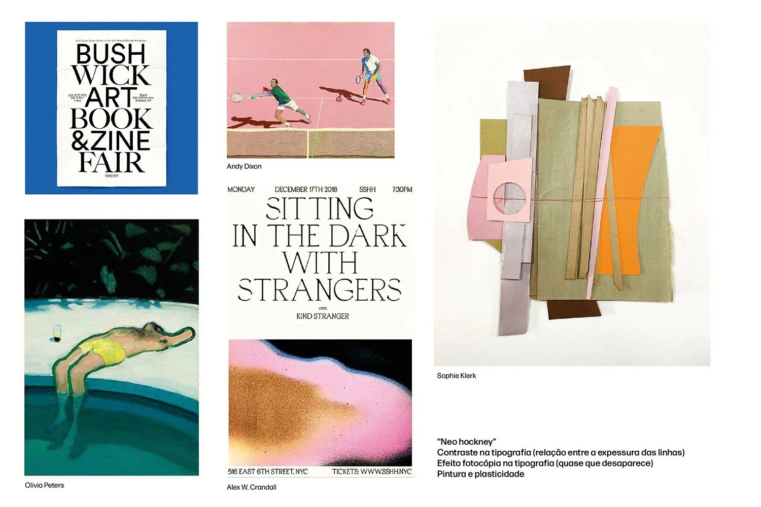
Making connections between artists, from photography to collage and looking for the typographic feel and language, specially looking at contrast and terminals.
How do we translate these ideas into printed and digital outcomes? How do we communicate Sara’s architectural precision and love of textured gestures and materials?
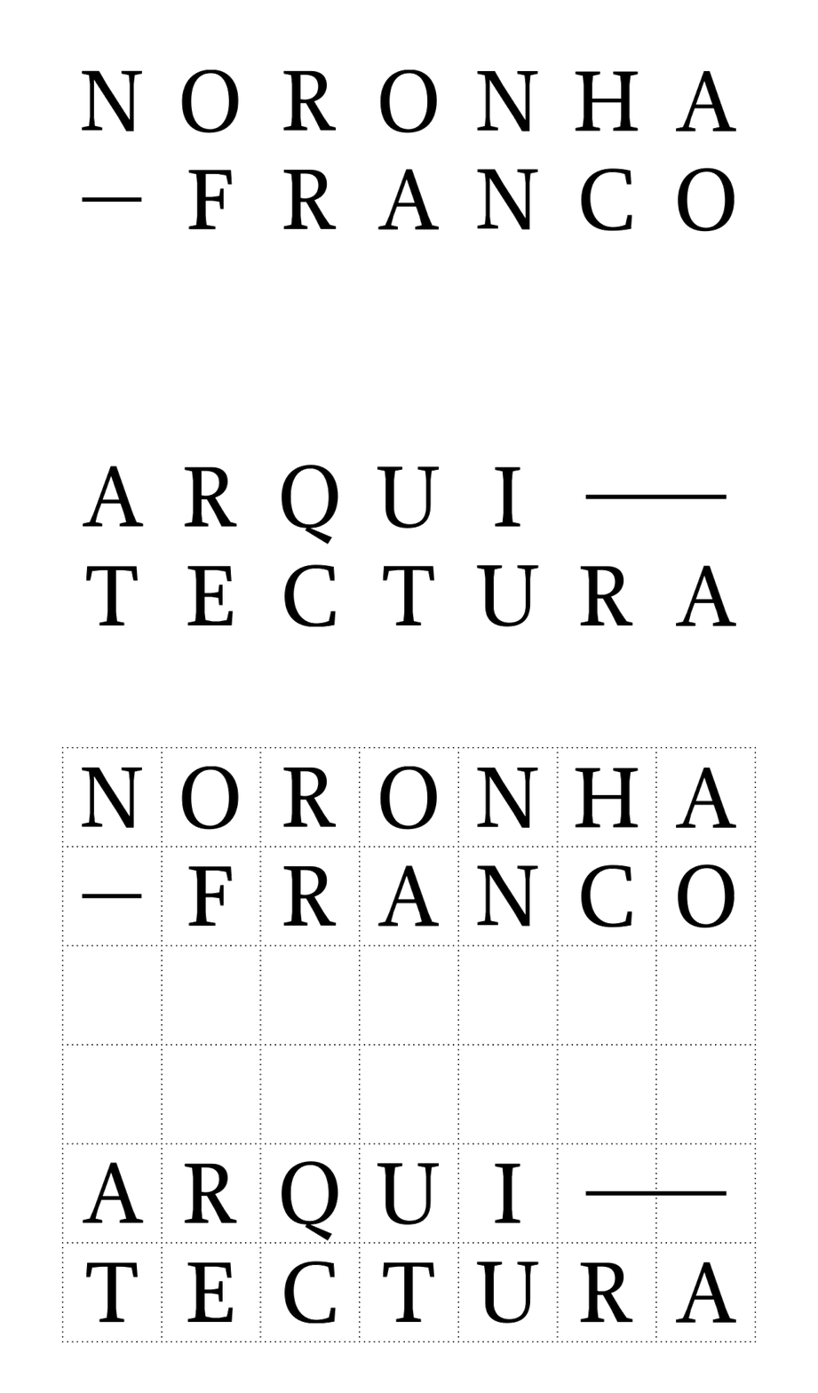
Starting with the logo, Noronha Franco Arquitectura is a big name, with difficult spacing that could sound a bit institutional. So our initial challenge was to visually soften it, maintaining the ideas of structure and rigour.
The solution was creating a grid system for the logo to ensure consistent spacing and letter arrangement, and to explore the division of words and the spacing between the two parts, creating a more dynamic composition and allowing each part to function autonomously. This solution also conveys the idea of space, not only between each letter but also between “Noronha Franco” and “Arquitectura”. The logo can be used with the grid visible or invisible, evoking ideas of construction and structure. The space between “Noronha Franco” and “Arquitectura” is a visually important signal of the concept of space in itself.
The logo is set in Proforma, a lightweight typeface designed by Petr van Blokland in the mid-1980s, with well-defined terminals for a light but serious feel.
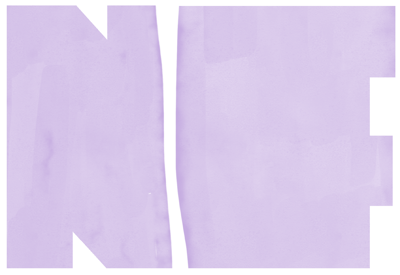
Throughout the visual identity, the imagery appears as the letters NF (Noronha Franco), a symbol grounded in the idea of volume and blocks of space (and negative space).
Drawn with texture, transparency and subtle nuances of light, this element is plastic, fluid, and expressive, contrasting with the geometry of the remaining visual components. Used as an expanded colour block, it brings movement and depth, reinforcing the balance between structure and expression.
The space between
The idea of space is explored throughout the visual identity, focusing on the negative space between type blocks, their placement, and scale. The logo in itself speaks of space and geometry.
We used Neue Haas Grotesk as the main typographic family for precision, control, and optical intelligence.
Cast in metal in the late 1950s, Neue Haas Grotesk was designed with size-specific precision. As it evolved into Helvetica, much of that nuance was lost to technological compromise. Christian Schwartz’s digital revival restores those original intentions, recovering the optical and structural qualities that once defined the typeface.
Initially drawn in multiple sizes for metal typesetting, each cut was adjusted for its point size. Smaller sizes are sturdier and more open; larger sizes are tighter and more refined. Strokes are largely uniform with minimal contrast, reinforcing its neutral, modernist character without feeling cold or mechanical.
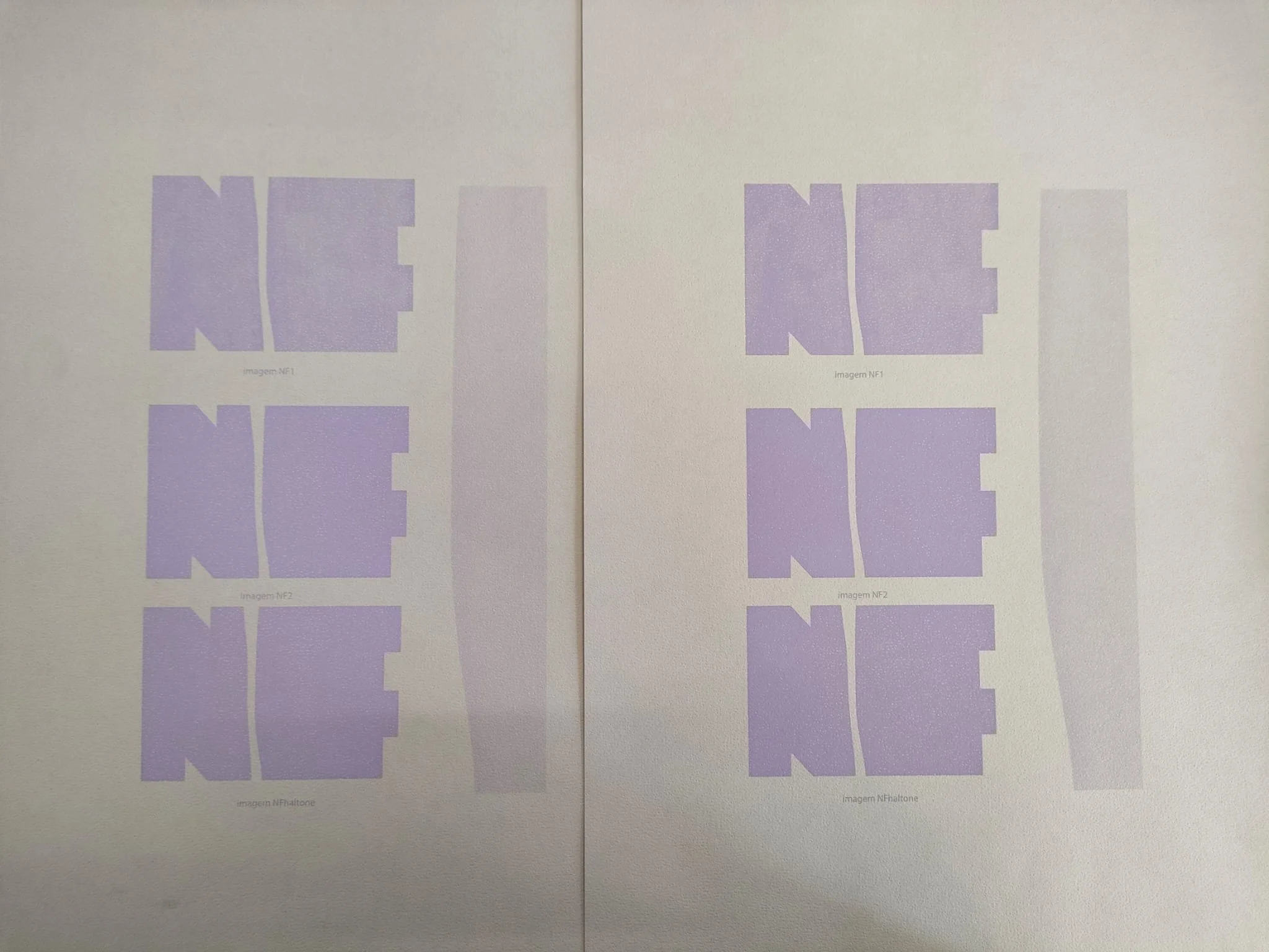
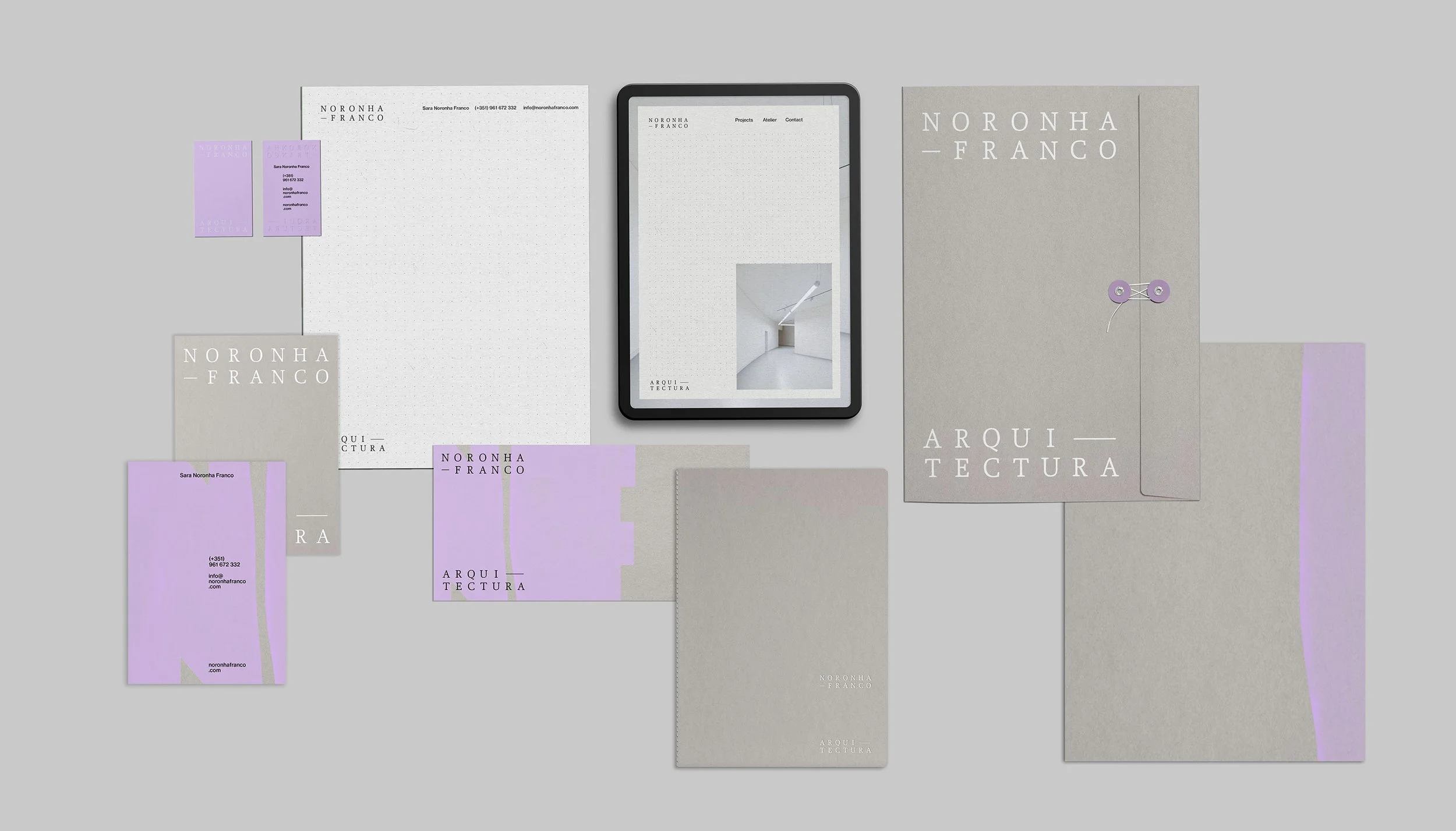
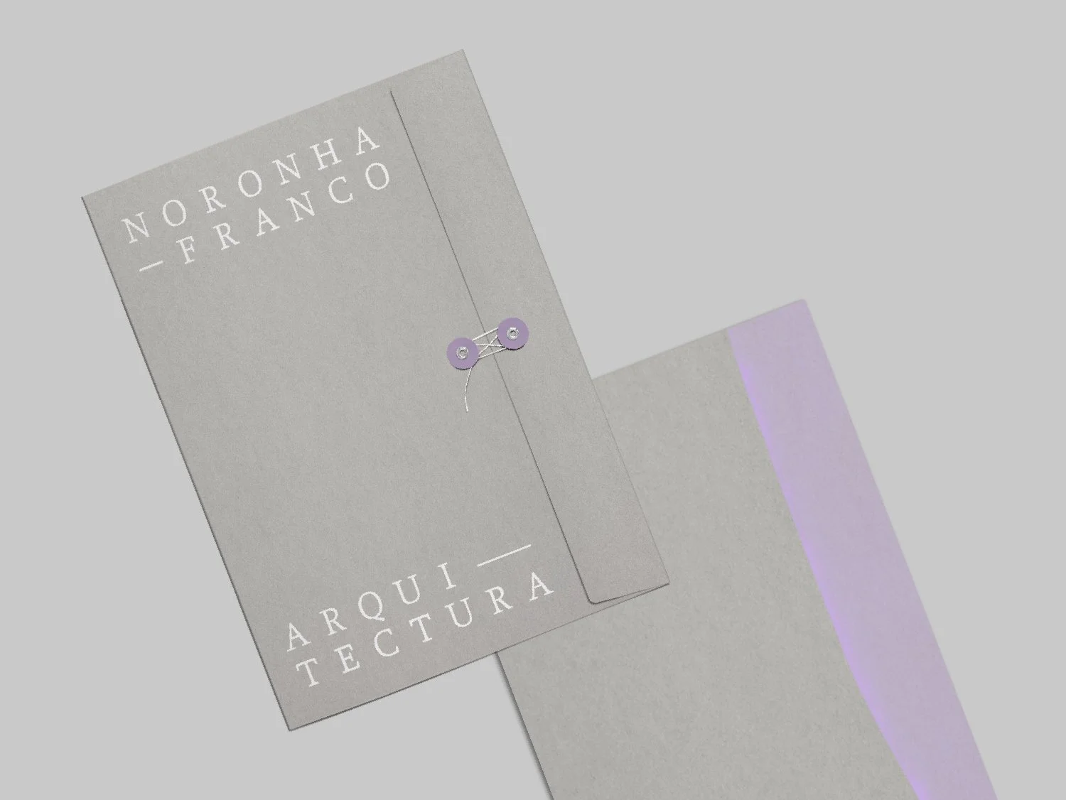
For the printed stationery materials, the challenge was to print the imagery without losing its transparency and painted feel. With the help of our partners at Tipografia Peninsular, we ran a series of printing tests using halftone dot patterns to achieve the perfect (yet always imperfect) result. We were beyond excited with the final result.
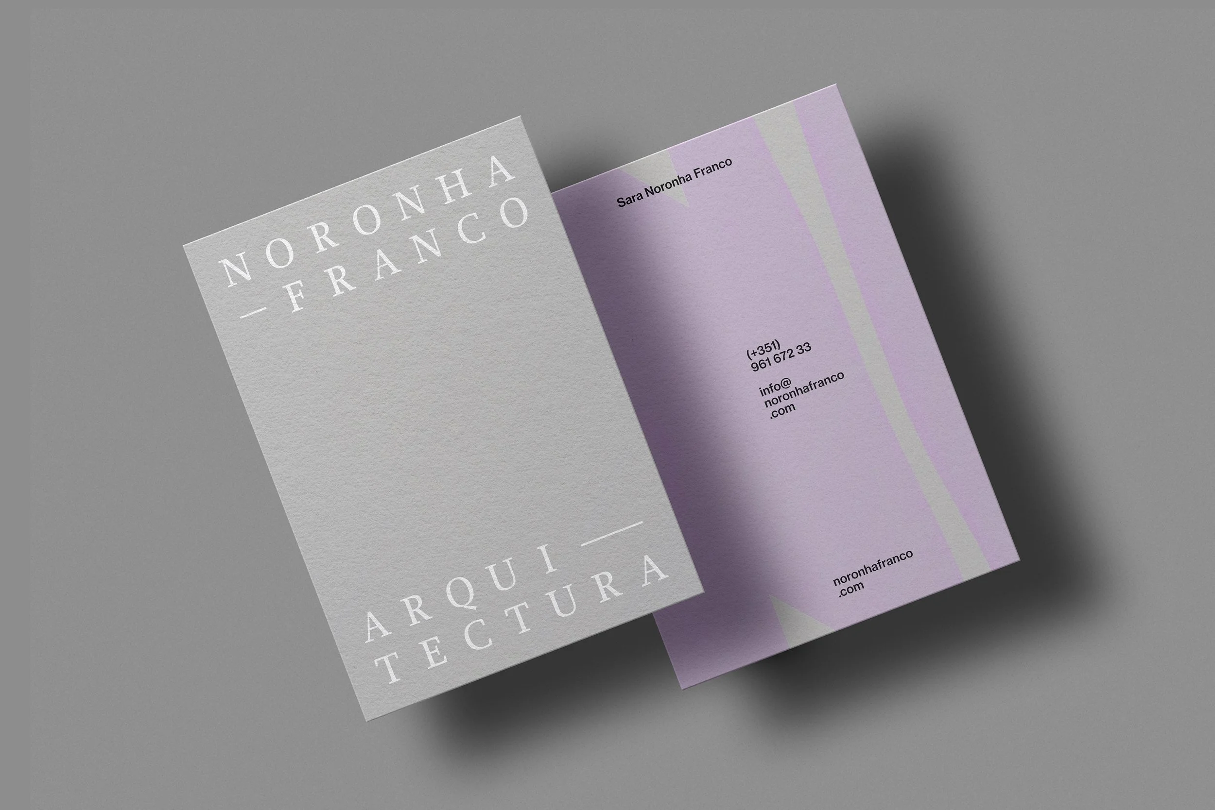
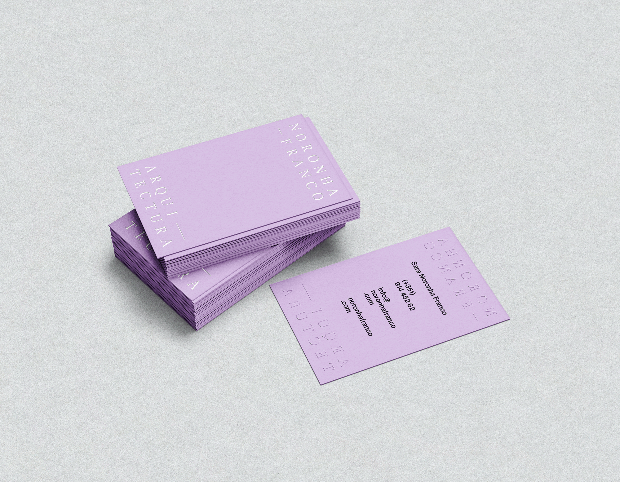
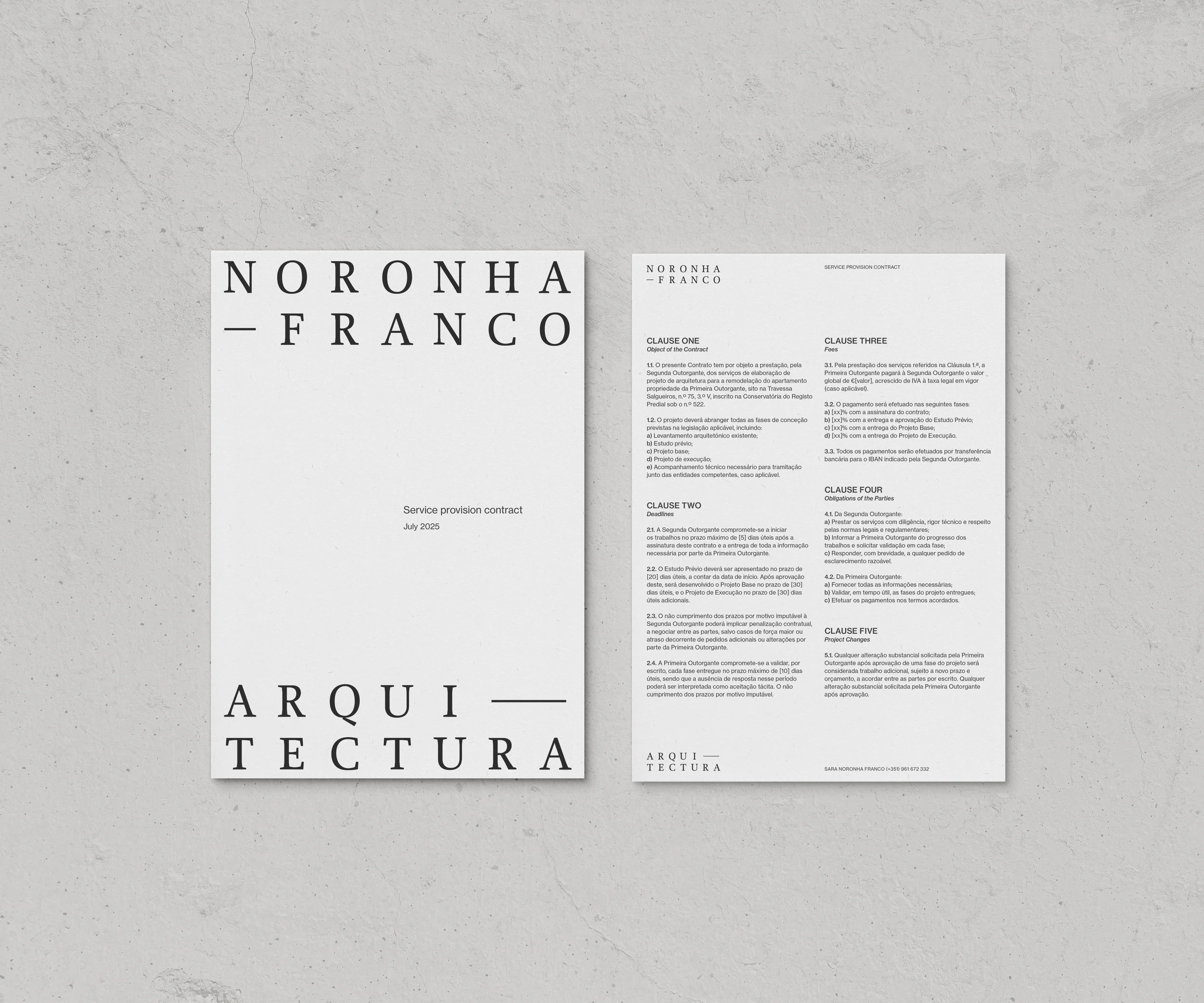
The main stationery paper is G.F. Smith Colourplan in colour Earl Grey with granular embossing, crafting the rawness of concrete or stone, highlighted by the coat of white, black or lavender paint.
We produced three rounds of tests to achieve the perfect texture and transparency level for the illustration.
The business cards were printed on G.F.Smith Colourplan in colour Lavender with an embossed logo.
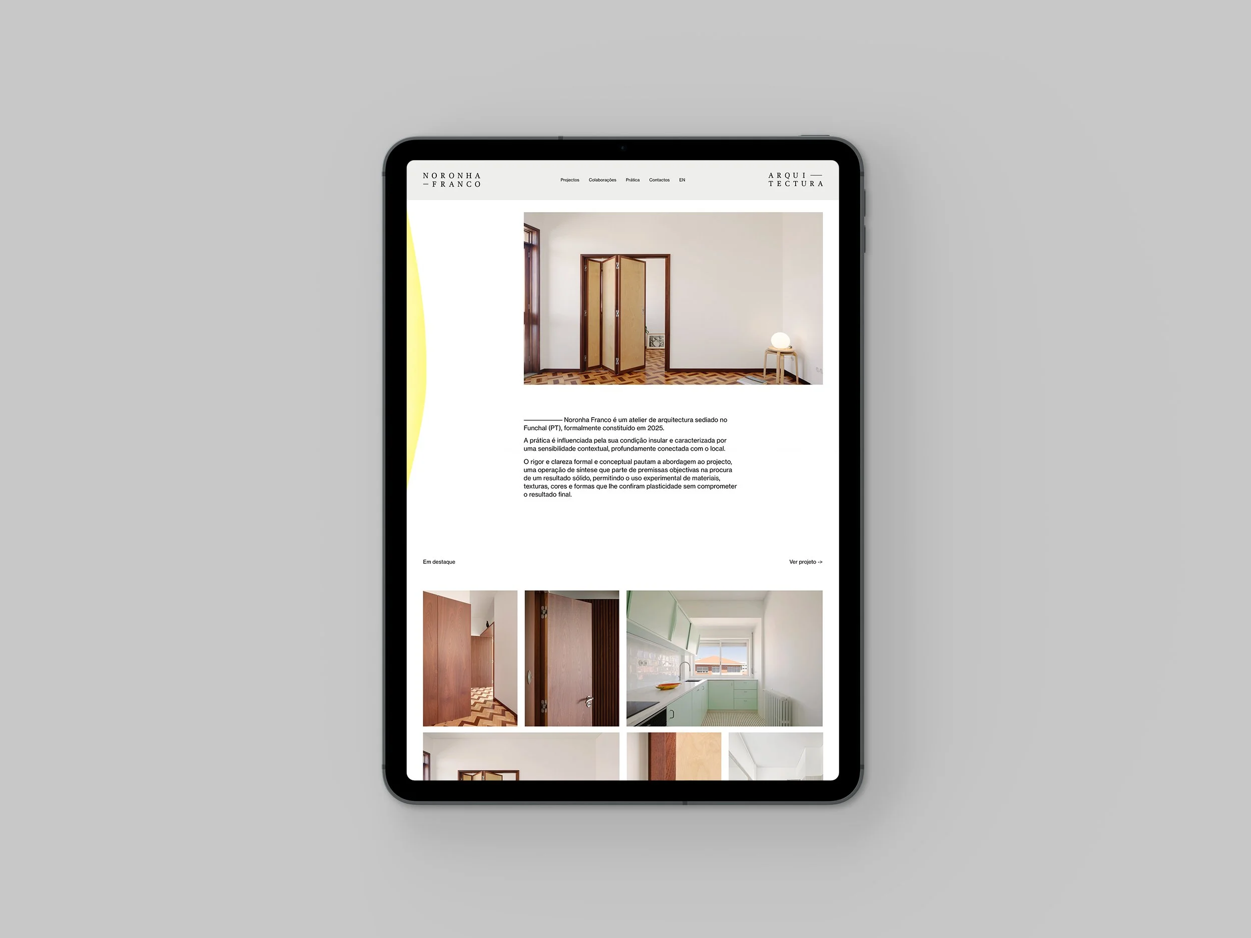
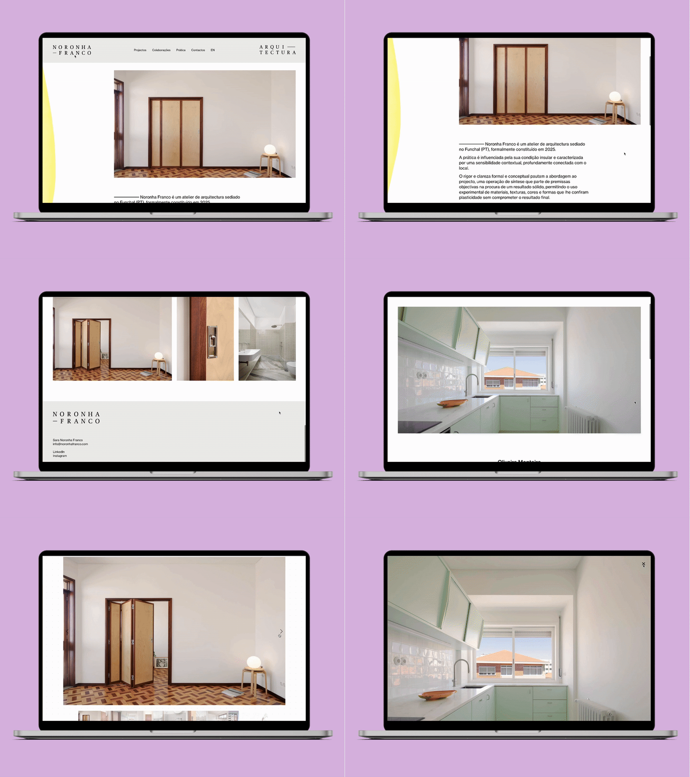
The website sits on a dotted-grid background as a structured baseline for all the content, meticulously placed. Throughout the website, graphic design shouldn’t be overwhelming or clash with other visual references, such as the architecture images, drawings, photographs, and the website’s content.
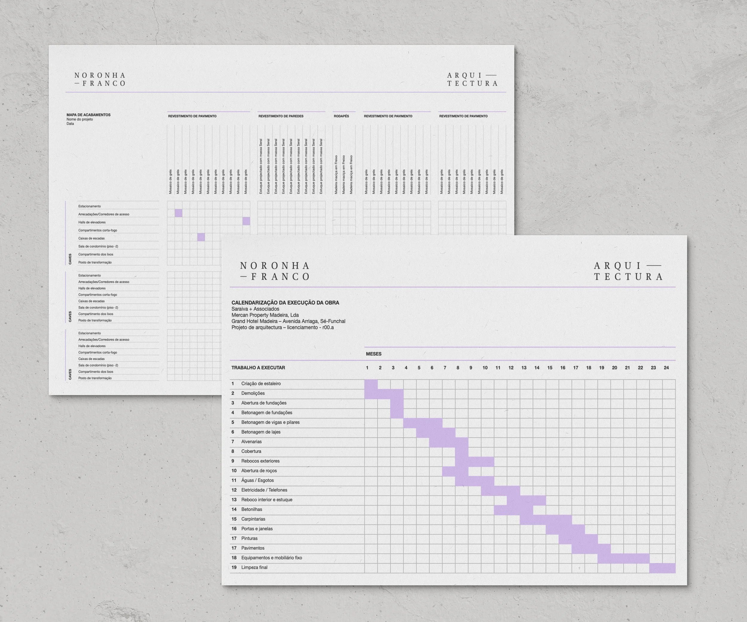
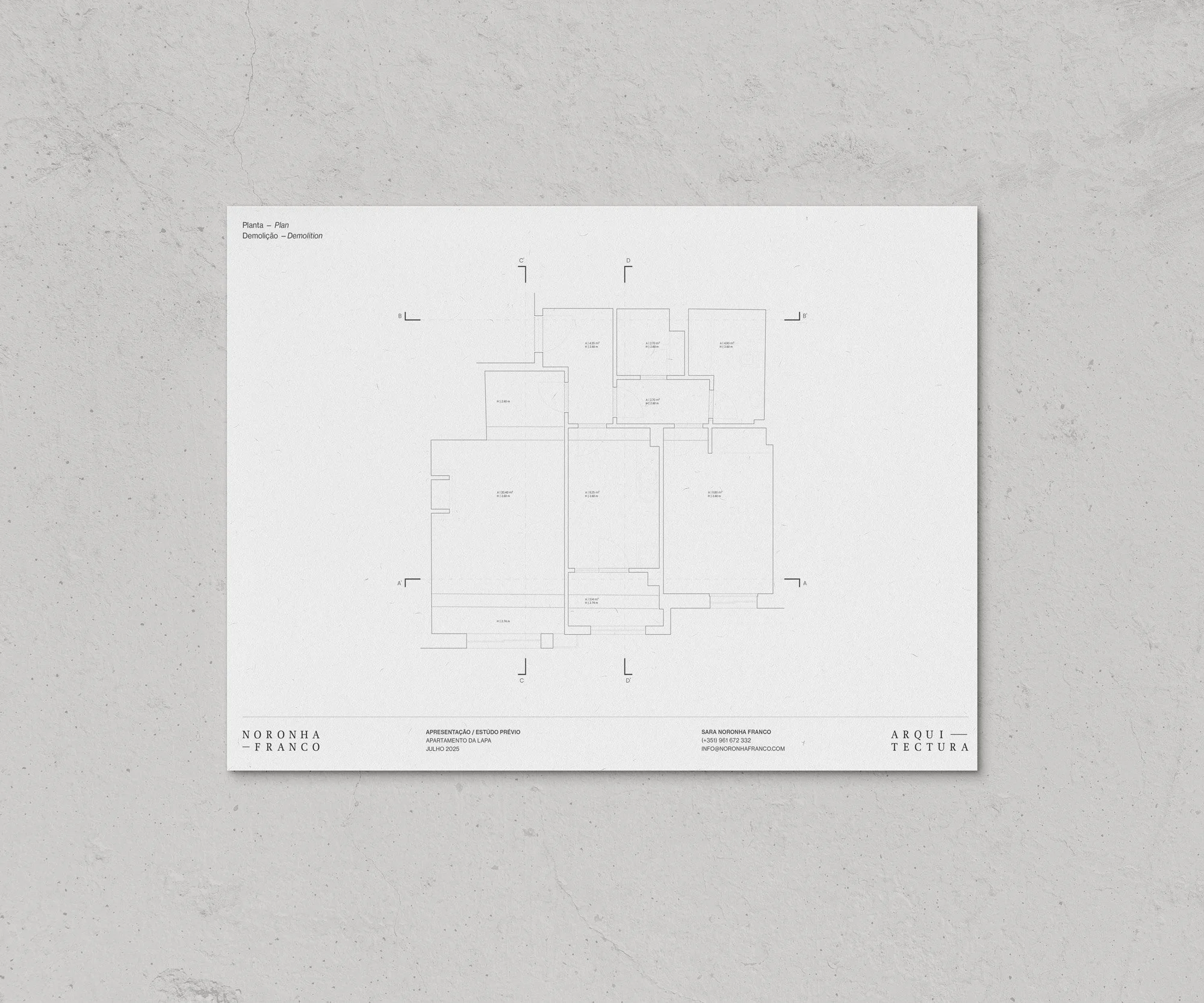
For visual application in technical documents and other supporting materials, we maintained a soft, dotted grid background and developed simple, functional layouts so the work itself could take centre stage. These documents serve as templates for daily business tasks.
The final structure of the visual system works with the ideas of space, functionality and texture, a toolkit — rigorous and adaptable, ready to communicate across media, from stationery to template documents and the website.
Credits:
Creative Direction: Miguel Barbot
Art Direction: Maria Helena
Graphic Design: Maria Helena, Cristiana Braz
Web Development: Cristiana Braz and Mariana Teixeira
Illustration: Maria Helena
