
Looking to the past to find the future of natural dyeing : behind SCARLET's new visual identity
Words: Maria Helena, Photos: Miguel Barbot
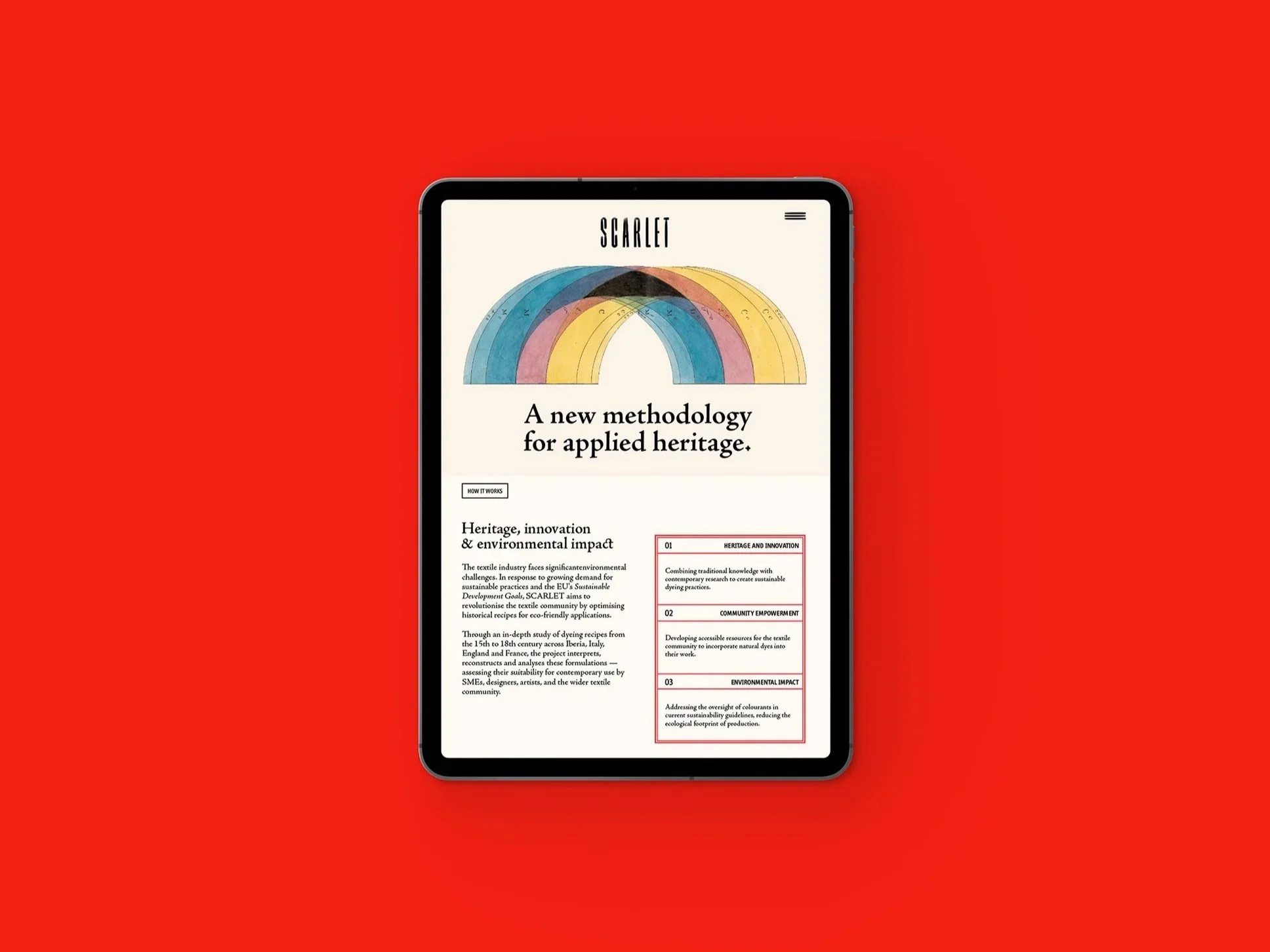
For centuries, master dyers across Europe recorded their methods in recipe books with tests, adjustments, and formulas refined over generations to produce colours that have outlasted the hands that made them. That accumulated knowledge is what SCARLET, a five-year ERC-funded project, sets out to study, interpret, and update to address today's textile industry challenges. Commissioned to lead the visual identity and communication strategy, Ofício set out to translate the project’s premise into a visual language, building a system that will be applied in multiple ways.
In this post, we'll take you through the research, the decisions, and the thinking behind the final result.
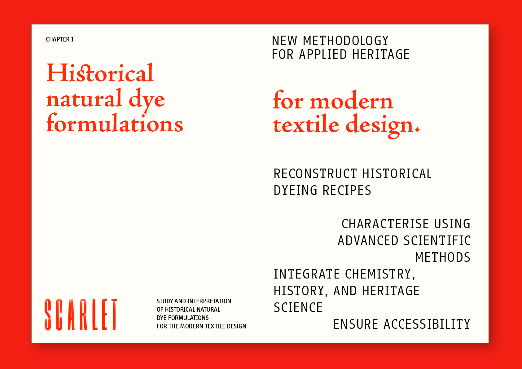
SCARLET is a five-year research project led by Professor Paula Nabais at NOVA FCT, funded by the European Research Council. In this project, Prof. Paula, a Heritage scientist and her team study historical natural-dye recipes from the 15th to the 18th century, across Iberia, Italy, England, and France. The work involves the interpretation, reconstruction, and analysis of recipes, and then turning what they learn into tools and resources the textile community can actually use.
"I'm a heritage scientist. This means I study the materials artists used to prepare certain artworks. When studying textiles and colour specifically, which I'm very passionate about, I understood the value of that production — because if we go to a museum, for example, and see pieces, artworks, tapestries, and textiles, we see the beautiful colours still present. So I was always a bit confused about why natural dyes aren't used as commonly nowadays, and why people say they're not stable and can't use them. Well, of course, things have certain conditions, but maybe it's all about knowledge. We work a lot with recipe books that master dyers were using to produce these natural dyes. So there are centuries of tests they used to make sure they were getting the most stable colours. And so we're just sitting on this lost knowledge and not really taking advantage of it. That's why I started trying to bring this knowledge back and figure out how we can reuse it in contemporary times.
It started with a project focused on production in Portugal — Project ReVIVE — which then scaled up to this European project, the ERC, where the idea is to build a digital platform with "Barbot e Bernardo" to make these historical recipes available to the textile community. We'll test their stability and what's left in the wastewater to really prove how durable they can be. So, really, to bring this knowledge to the public so that they can reappropriate it."
— Paula Nabais, during “From Soil to Story” roundatable event, at Saber Fazer in Porto, May 7th 2026
Our team at Studio Ofício is currently working on the visual and communication strategy for ERC SCARLET, so between 2026 and 2029, we'll be responsible for the project's visual identity, communication strategy and editorial design.
We are now we're entering a new phase with the communication strategy and social media content, while also developing ERC SCARLET’S digital platform. Throughout the project, we'll also be designing multiple applications for events, exhibitions, publications, and presentations, among others.
When we started to work on the visual identity, our goal was to communicate the idea of connection between the past and the future. This concept of connection is at the core of SCARLET's project: the connection between historical heritage and cutting-edge research, connecting the investigation of historical dyeing techniques to modern sustainability standards and the connection within the textile community, through numerous activities and resources.
The design process began with creative and art direction, exploring the ideas of colour and geometry through Emma Kunz's large-scale drawings on graph paper with coloured pencils and oil pastels, and Hilma af Klint's paintings for their intricate study of colour. At that time, Miguel came across one of Emma Kunz's works in an exhibition, part of the Museu Romântico collection. The work was projected onto a wall, inspiring us with the juxtaposition of the hand-painted drawing displayed in a bright, crisp RGB. At the same time, we dived into all the historical dyeing research and recipe images from Paula's work and her team, as well as The Book of Colour Concepts by Alexandra Loske, an important book during our process, thanks to its in-depth study of colour theory. At this point, we focused broadly on colour, then narrowed to colour within textiles, dye recipes, and the research team's information.
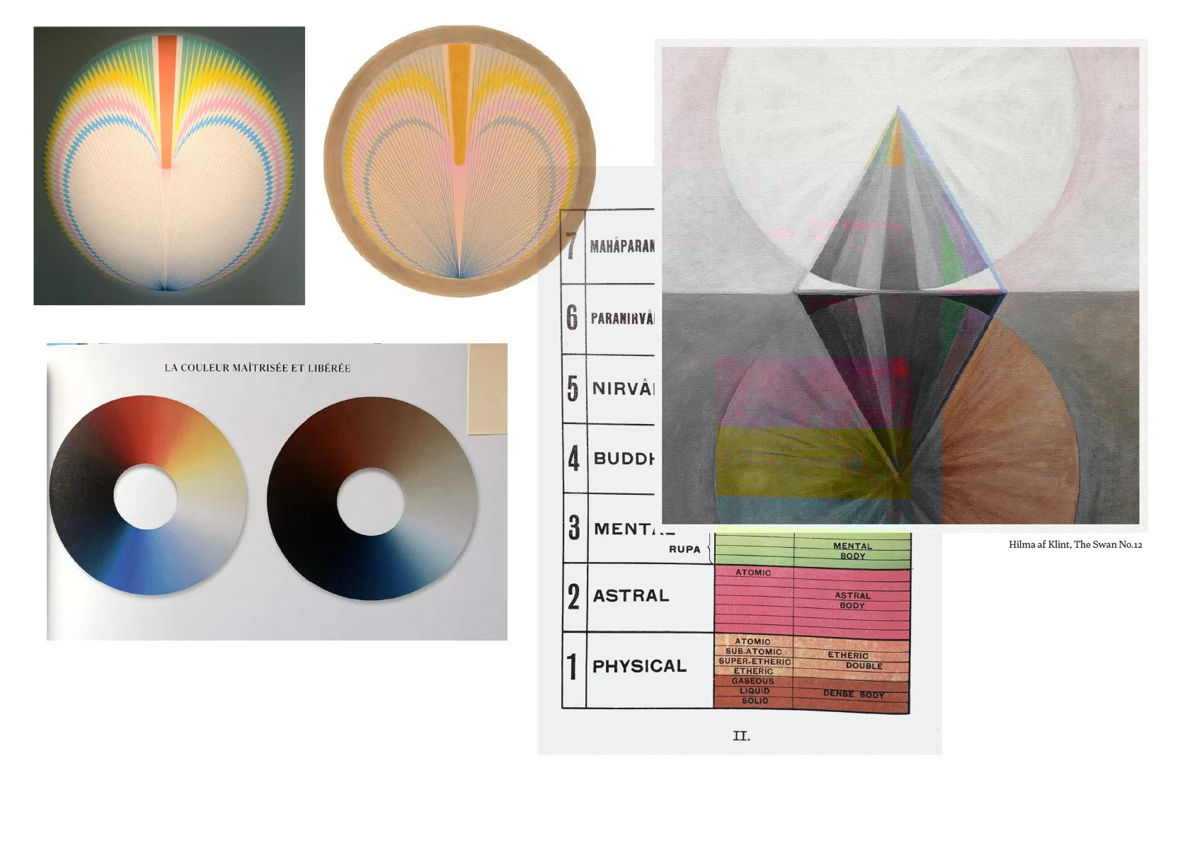
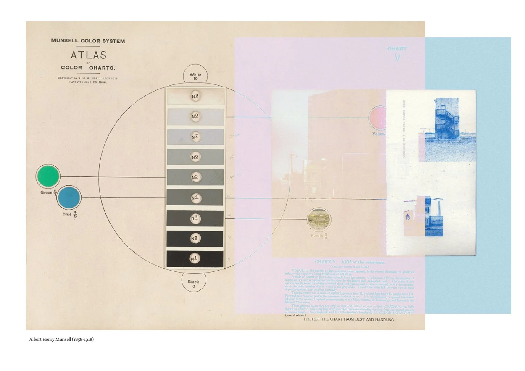
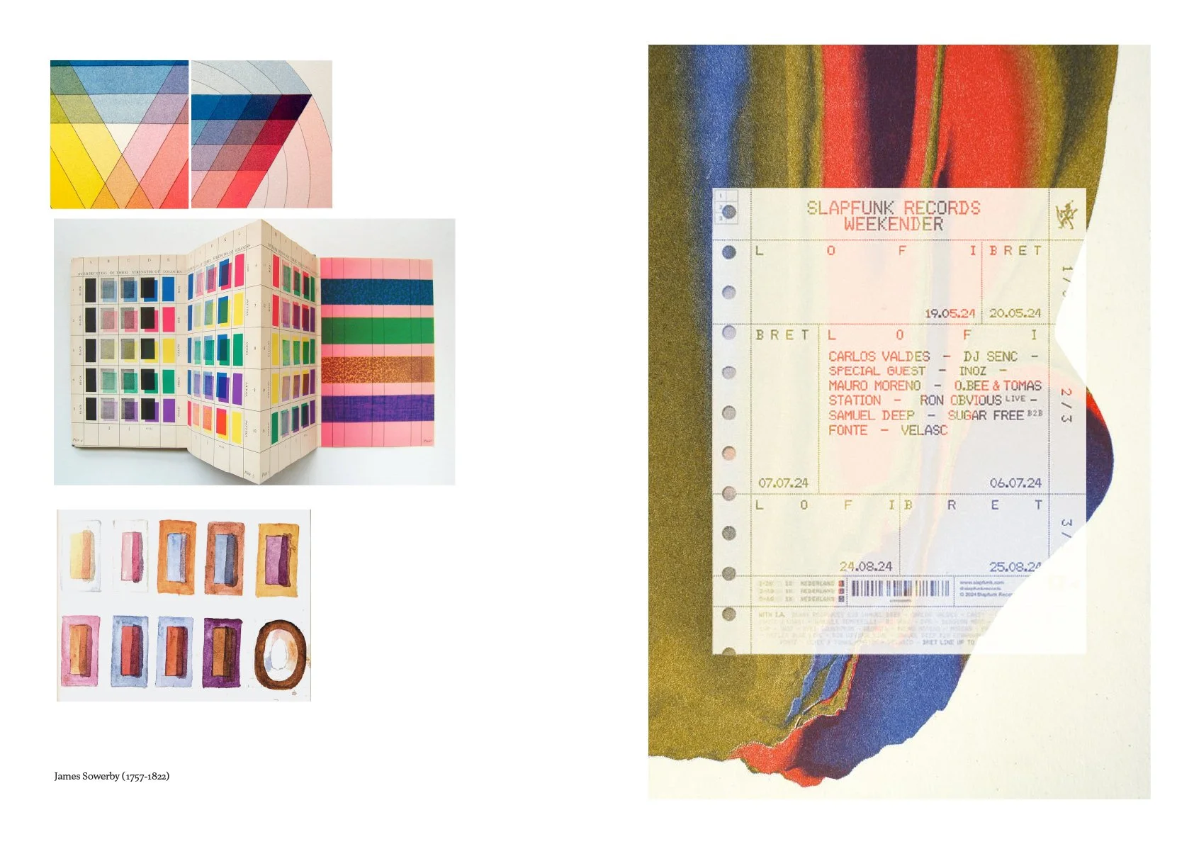
The moodboard included Albert Munsell's Atlas of Colour Charts, Philipp Otto Runge's colour wheel, James Sowerby's 18th-century colour charts, and the theosophical diagrams Annie Besant and Charles Leadbeater used to map colour onto states of mind. The sense of geometry in these images with different structures, grids, frames, colour wheels, and label systems became a common ground for the visual language.
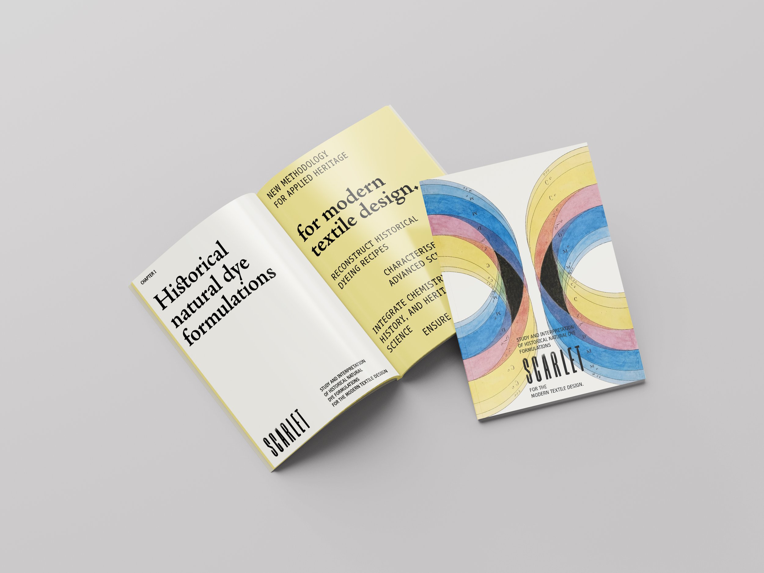
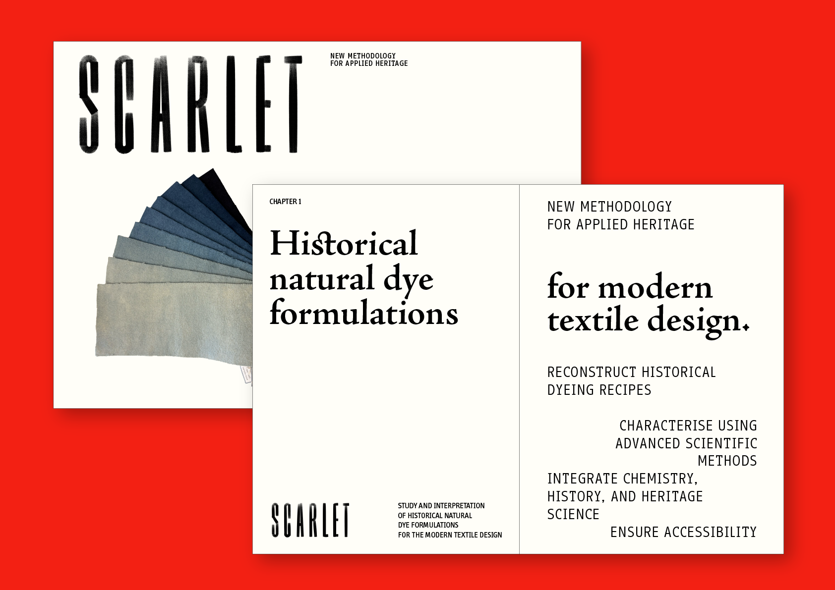
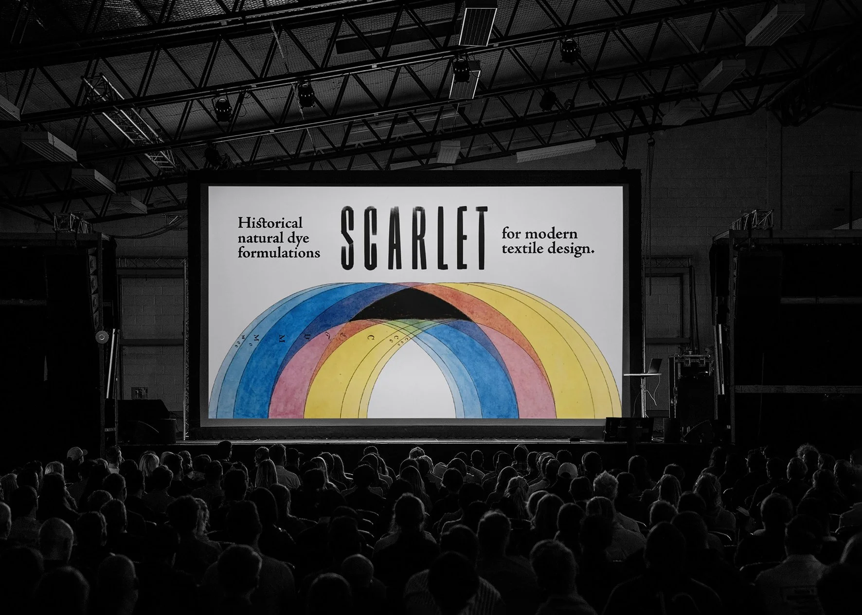
The logo is custom-designed, hand-painted and highly condensed, brushed with different pressure points and gestures, with the movement imprinted, balancing the ink. The texture comes through as textile when painted with the dye itself, and the kerning creates an almost monotype effect, with each letter and space optically designed. We kept it in three versions, black, white and red, as a connection to the name itself, scarlet.
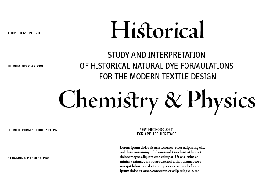
We developed the typography system to immediately express the connection between the past and the future, as well as the idea of the scientific method and the concept of exactitude, through the typefaces chosen and their pairing.
The system gathers an old-style serif with technical sans in two versions. Headlines are set in Adobe Jenson Pro, with calligraphic ligatures that we can see in words like "historical" or "chemistry," connecting to old manuscript printing, and the origin of humanistic typefaces. We pair Adobe Jenson Pro and FF Info Display or FF Info Correspondence for subheadlines, signalling the technical and scientific information, as well as the monospaced typefaces used in the heritage laboratory for labelling. Smaller text and section labels use FF Info, which keeps the more functional content, methodology labels, captions, and navigation highly legible. Body text runs in the humanistic classic Garamond Premier Pro.
FF Info and FF Info Correspondence are two branches of the same typographic superfamily designed by Erik Spiekermann and Ole Schäfer. Both share the same architecture and high legibility, while having different features: FF Info is more compact and space-saving, while FF Info Correspondence has a generous, open spacing design that is close to typewriter-style clarity, with distinct slab serifs.
Colour, naturally, will be omnipresent throughout the system in the content itself, including all historical images, photographs, and research diagrams.
The palette is built around three main colours, black, white and bright red, as well as neutral cream colours, allowing space for all the different colours that appear in natural dye recipes and research images, with their own beautiful hues and vibrancy.

The imagery used in SCARLET's visual identity draws on the colour theory study by Mathias Klotz (1748-1821), as shown in his publication Gründliche Farbenlehre, a comprehensive doctrine on colour, as we can read in The Book of Colour Concepts. "Klotz's intention was to provide a broad scientific and artistic overview of colour theory". He created some of the most beautiful illustrations in 19th-century books on colour, though his work remains largely unknown. His images are early examples of the "painterly" method of lithographic printing.


Mathias Klotz (1748-1821), Gründliche Farbenlehre, from the book “The Book of Colour Concepts”
Another important visual element of the identity is the single and double-outline frames. We've seen them throughout books, diagrams and tags at NOVA FCT's Department of Conservation and Restoration Laboratory. The frames create a connection to scientific processes, archives, categories, and note cards, and work as both a graphic asset and as a way to signal technical information.
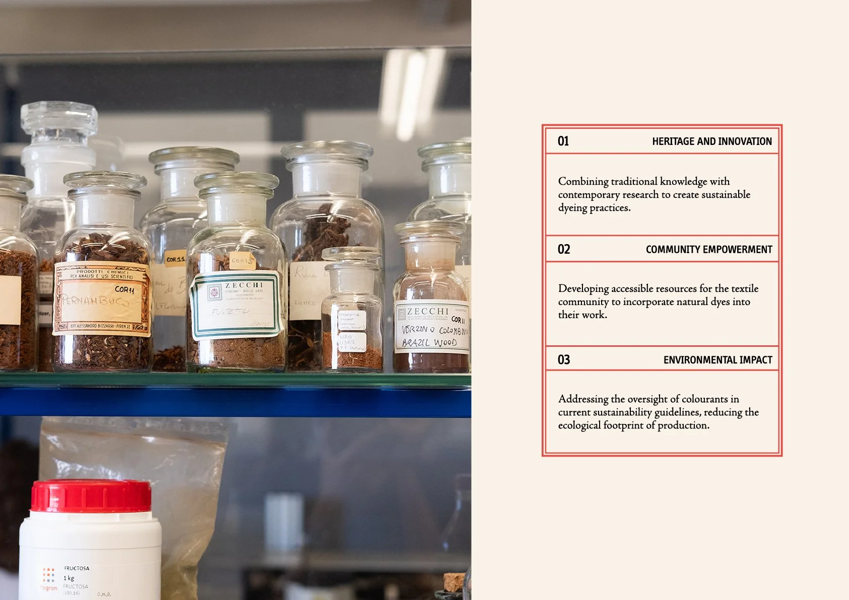
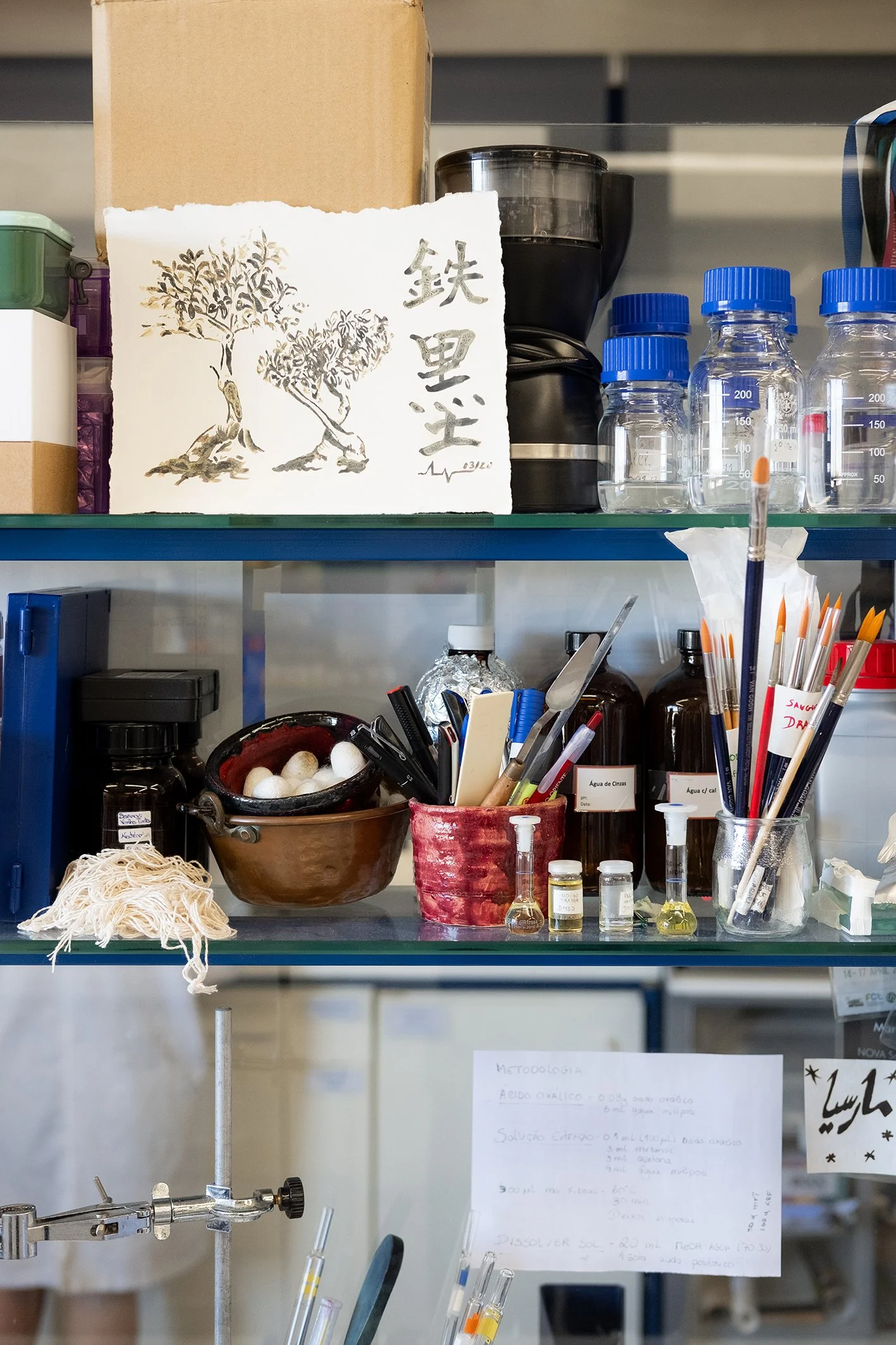
Department of Conservation and Restoration, Laboratory, NOVA FCT
The system is built to be flexible with a consistent set of rules that can carry the project across five years of varied applications without losing coherence. At every scale, the connection between historical knowledge and contemporary research remains the organising principle, giving the identity both a clear foundation and room to expand.


At this stage, the visual identity is mature and ready for the next five years, during which it will evolve across different applications.
Follow ERC SCARLET (@scarlet_erc) to keep up with the project as it unfolds and learn more about all the amazing discoveries and behind-the-scenes from SCARLET’s team of scientists.
If you have a design challenge you'd like to work on with us, we'd love to hear about it, so feel free to email us at info@barbotbernardo.com. In the meantime, explore more Ofício’s work in our case studies.
Credits:
Creative direction: Miguel Barbot
Art direction and Design: Maria Helena
Photography: Miguel Barbot
Web development: Cristiana Braz