“O Corpo Arqueométrico como Projeto Artístico: A Condição Votiva da Prática Duracional” editorial design
Words: Maria Helena and Miguel Barbot, images: Maria Helena
“The Archeometric Body as an Artistic Project: The Votive Condition of Durational Practice is a practice-based investigation grounded in the artist’s own artistic practice, taking the body itself as its point of departure and return, understood as the locus where experience is measured and inscribed. It draws on the experience of living with type 1 diabetes and the constant need for measurement as a condition of survival, understanding the diabetic body as a cyborg body and a measurement system, in order to propose that durational practices have a votive dimension and that votive practice, in turn, presupposes duration. It problematizes the desire to prolong life through artefacts and biometric data, as an attempt to indefinitely postpone the limits of the body, unfolding into artistic projects sustained by a self-referential methodology centred on the direct experience of the diseased body.”*
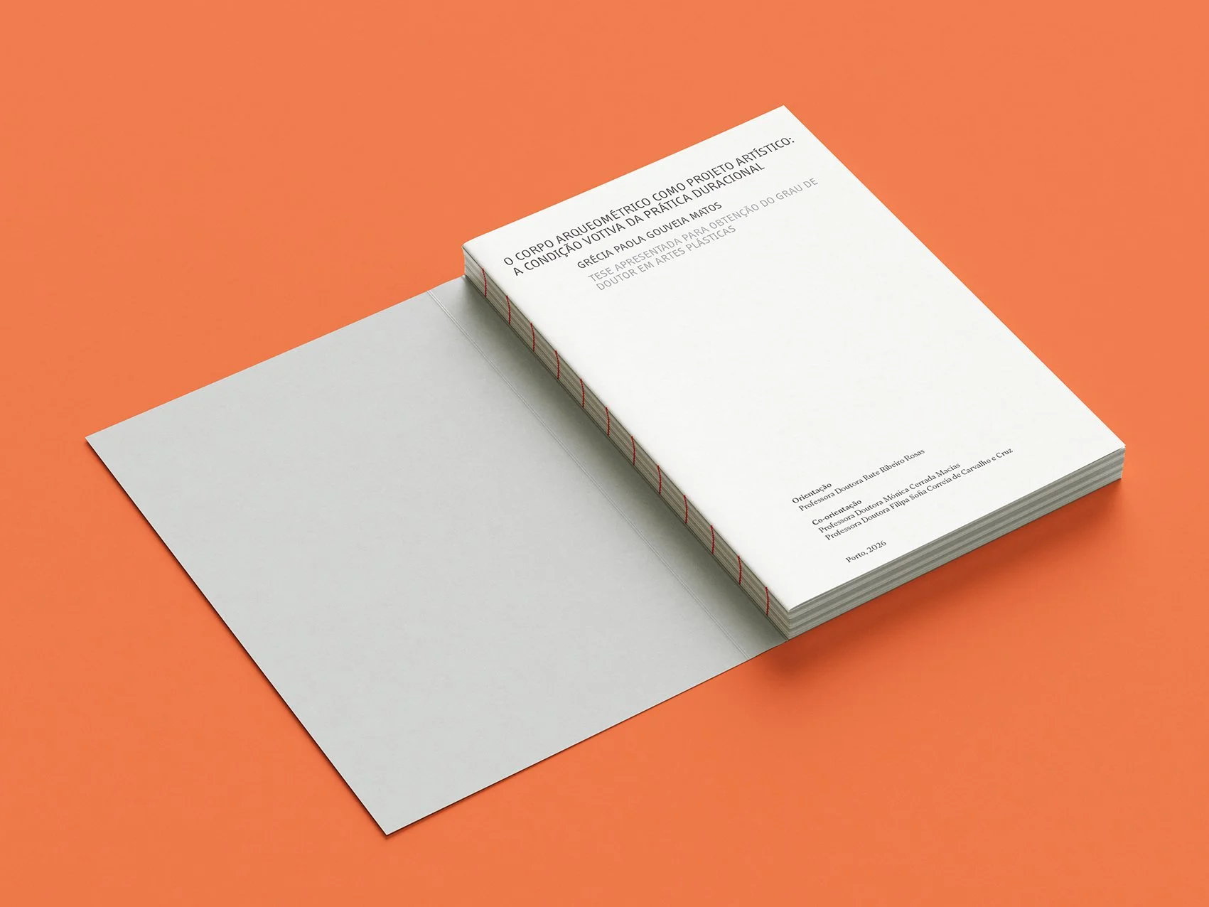
Over three intense weeks, we designed a 600-page doctoral thesis by the artist Grécia Paola. Translating the ideas of measurement, time, repetition, movement, and finitude into a visual language, we developed a flexible grid, a typographic system, and a series of graphic markers that guide the reader through the research and artistic practice.
Our aim was to create a structure to a complex body of work while allowing the artist’s images, writing, and ideas to unfold throughout the book.
* From The Archeometric Body as an Artistic Project: The Votive Condition of Durational Practice doctoral thesis, pag. 9.
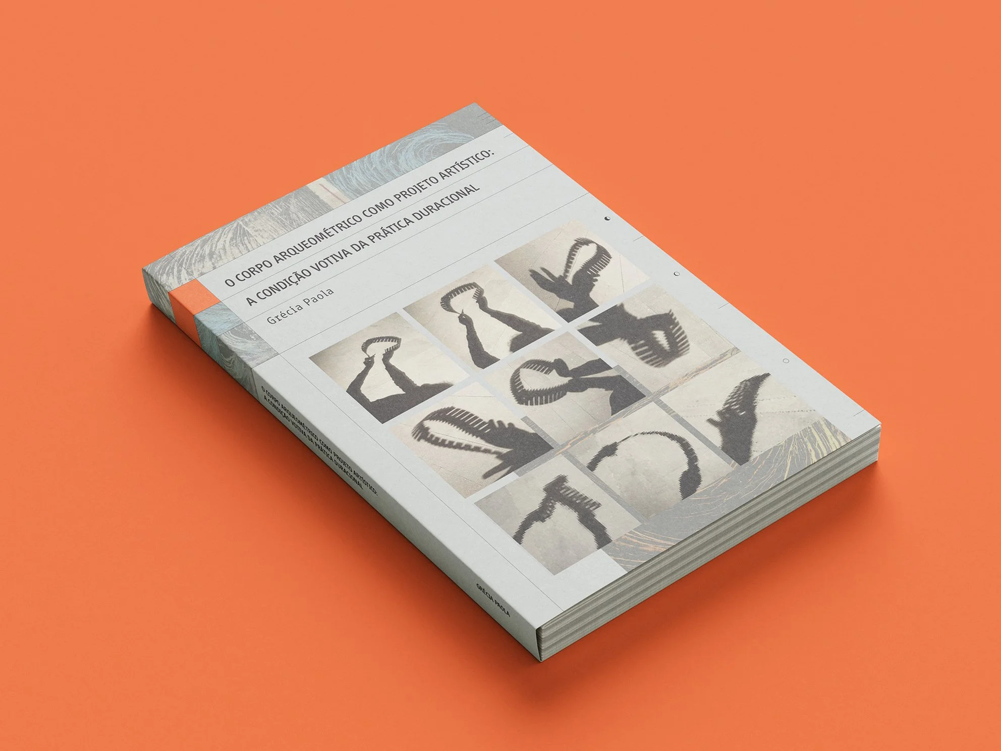
At the beginning of August, Grécia Paola, an artist based in Porto, approached us with a clear brief for the editorial design of O Corpo Arqueométrico Como Projeto Artístico: A Condição Votiva da Prática Duracional, her doctoral thesis in Fine Arts, nearing final submission. We faced a very tight deadline, with only 3 weeks to design everything between August and early September.
The thesis investigates how the continuous measurement required by type 1 diabetes can be transformed from a survival tool into material for artistic creation. Drawing on the author’s autobiographical experience, it proposes the concept of the Archeometric Body, connecting body, data, technology, repetition, duration, and finitude. The research explores these relationships through an artistic practice across epistemological, operational, and conceptual dimensions.
"The longing for the infinite coexists with the awareness of limits, and it is from this confrontation that imagination is born as an exercise of survival."
— Grécia Paola
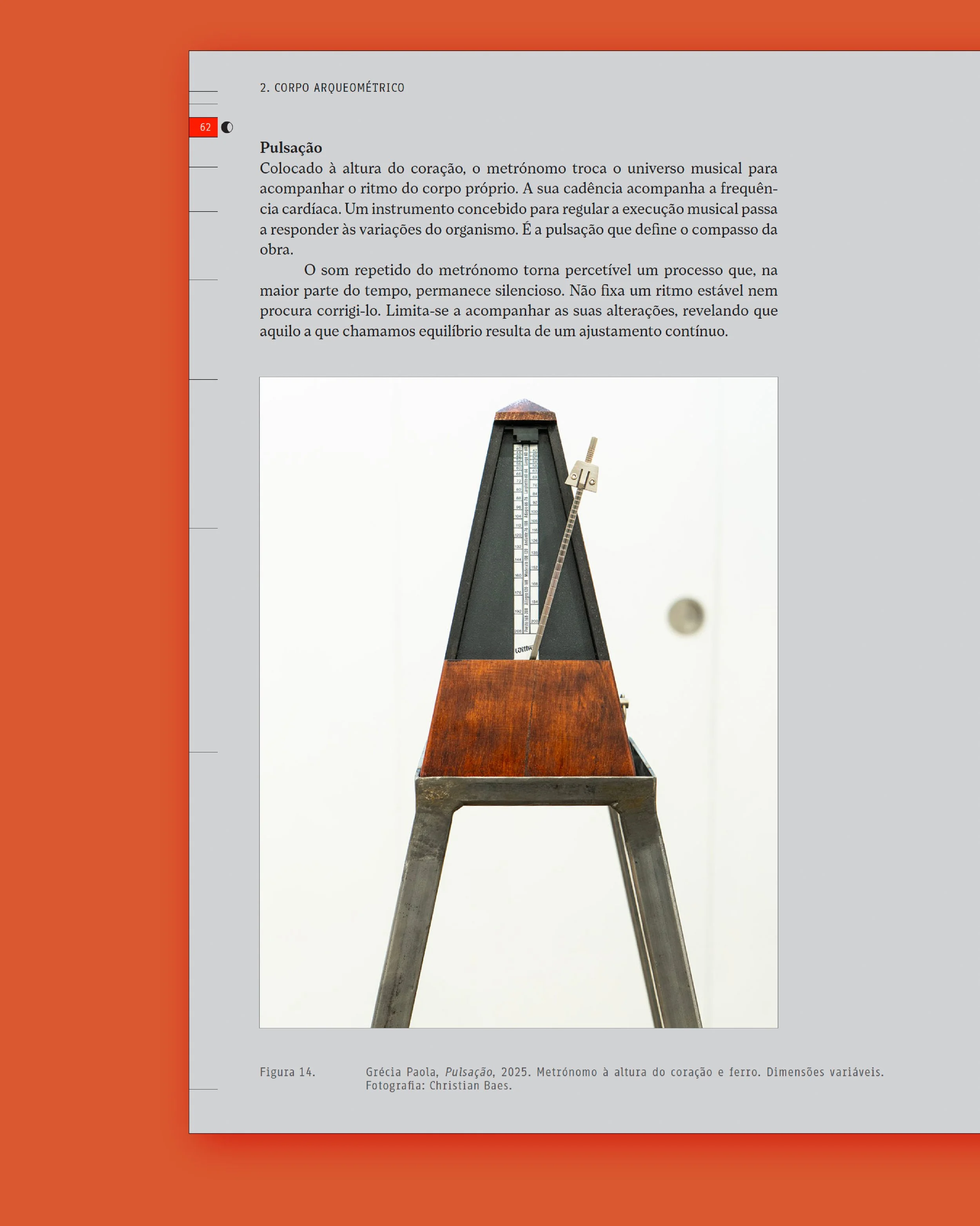
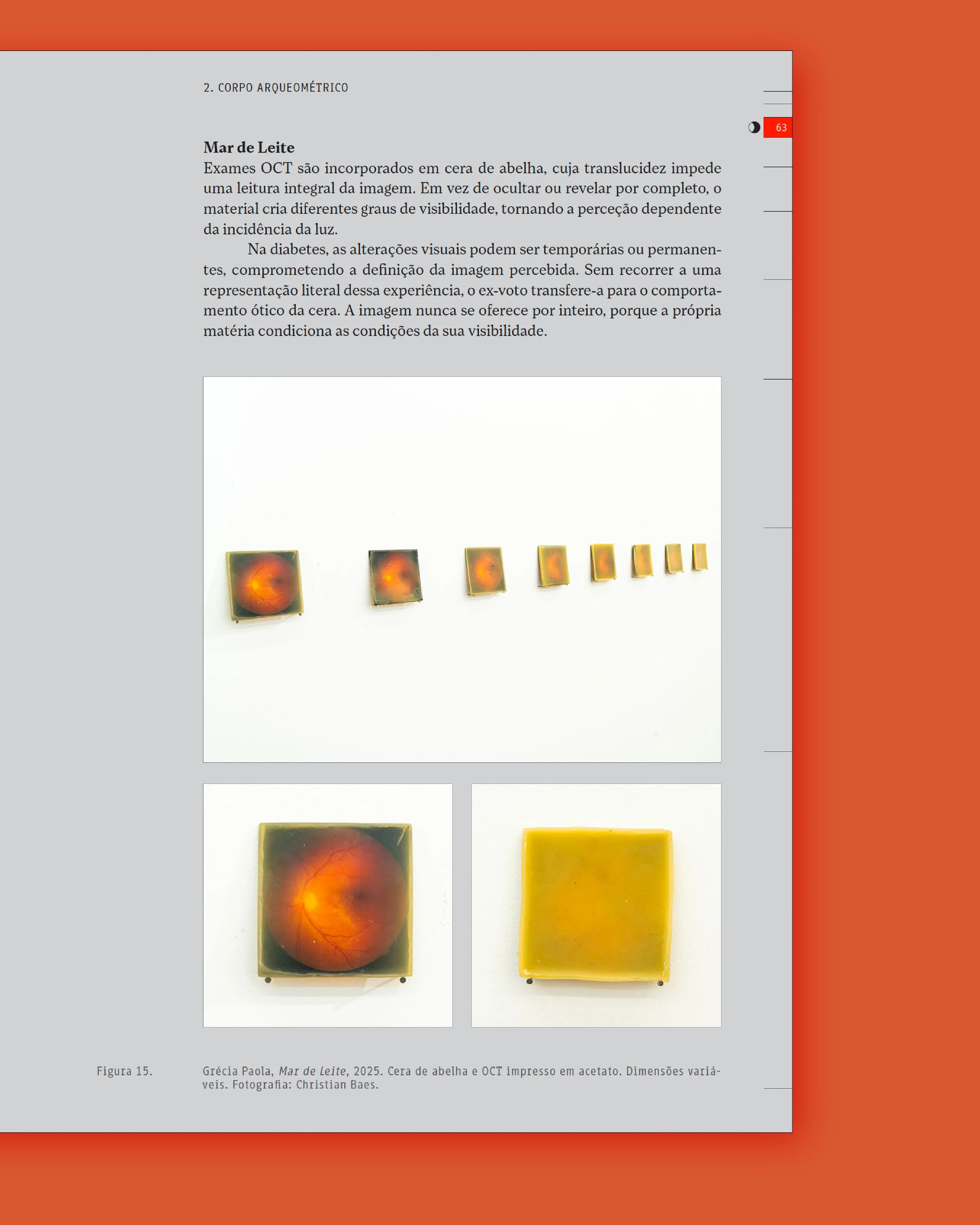
As with any editorial project, the undertaking was divided into four parts: creative and art direction (defining the project's "look and feel"), editorial design (grid systems, visual elements, composition, organization…), layout and composition, and budgeting. As you can imagine, three weeks is not much time for all of that.
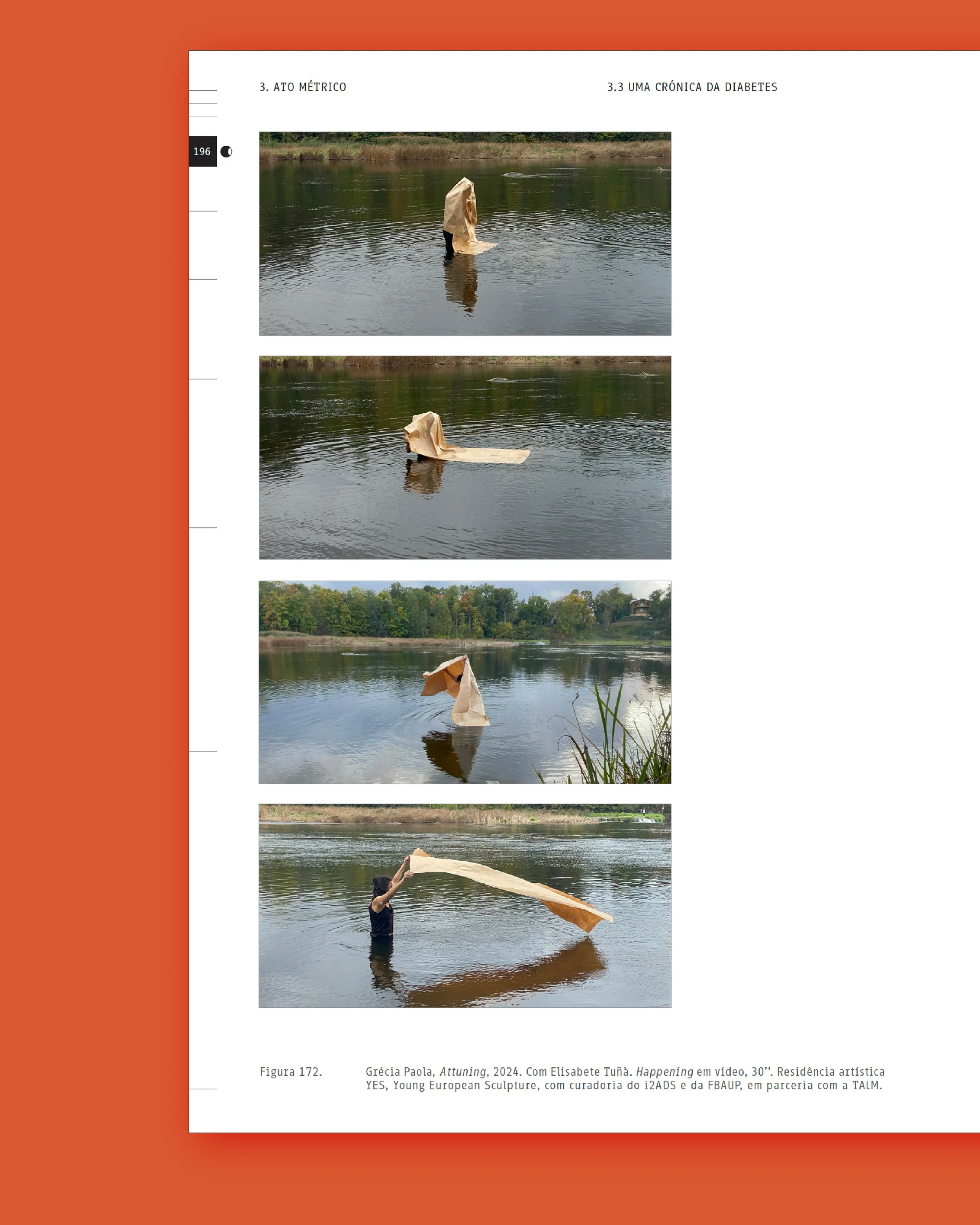
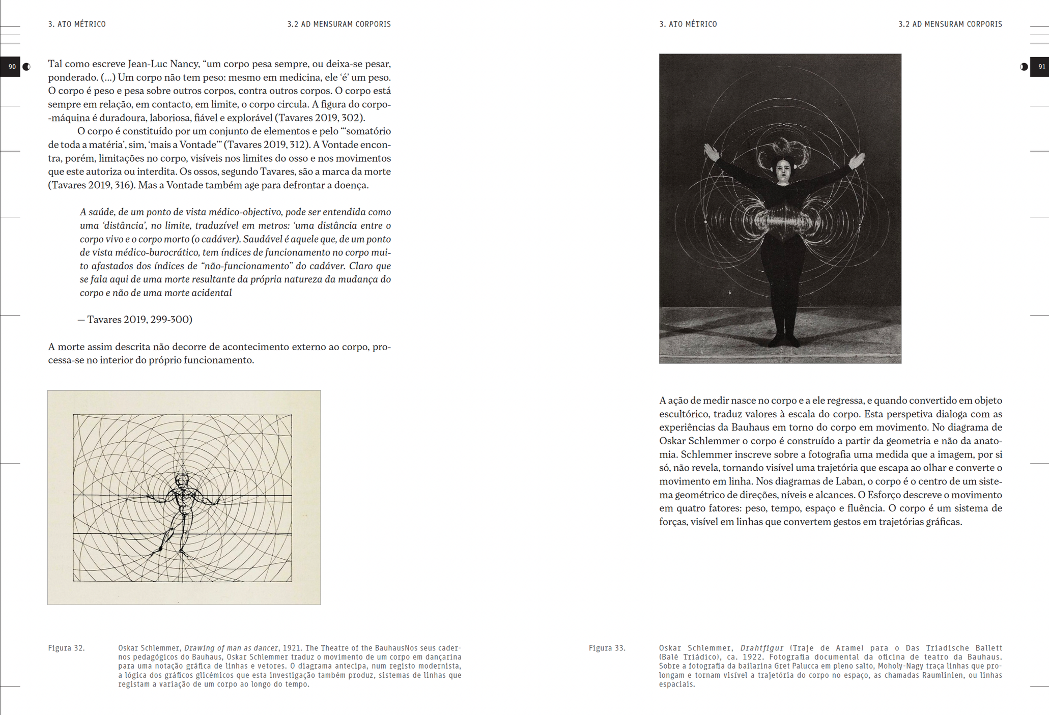
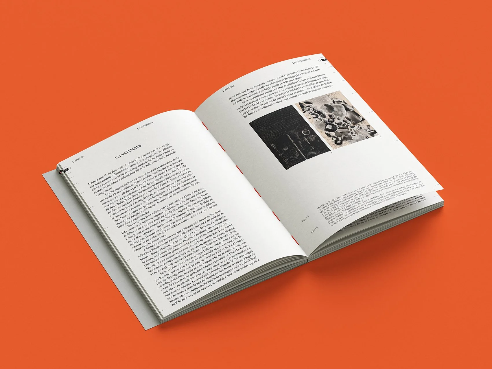
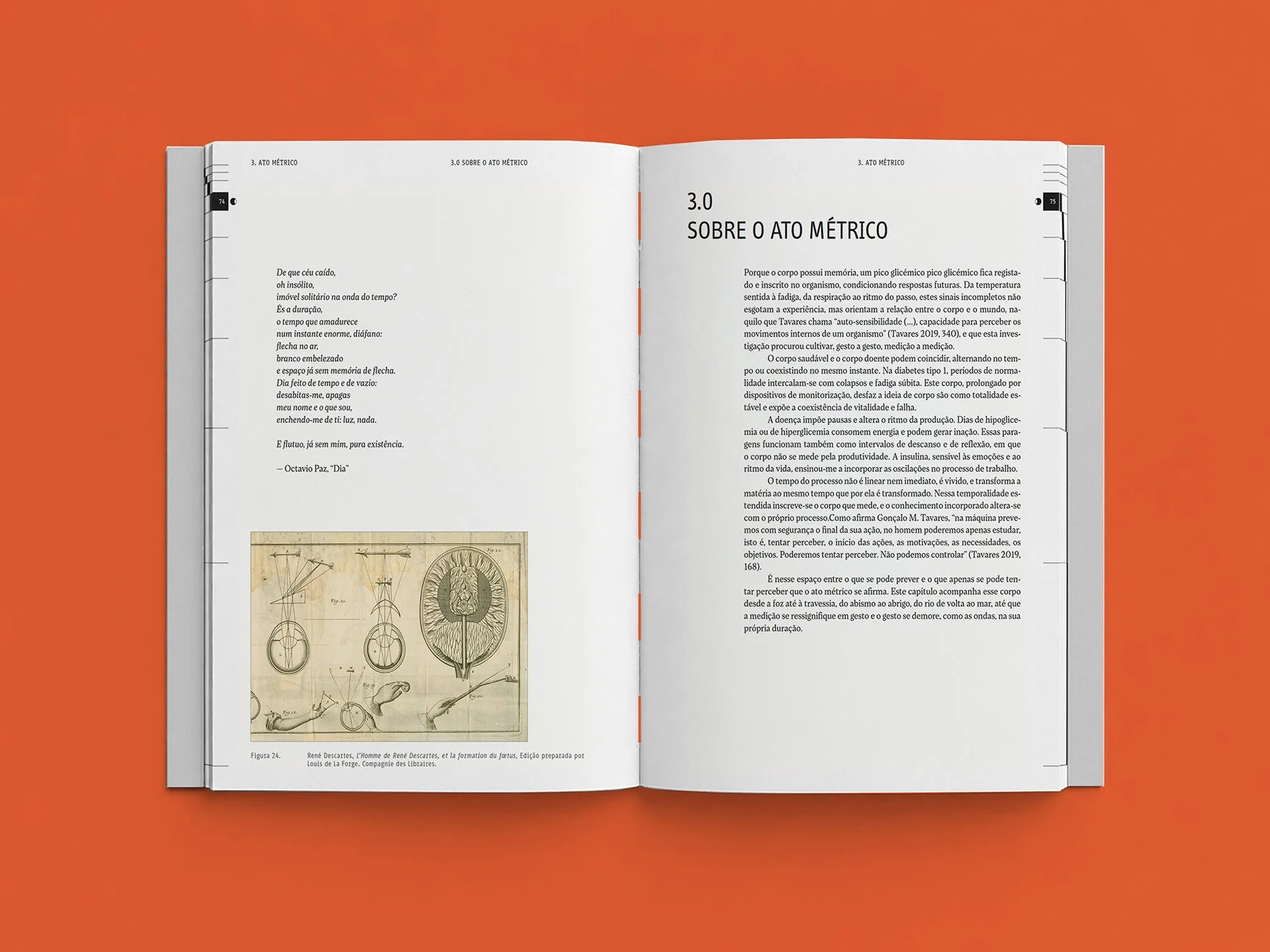
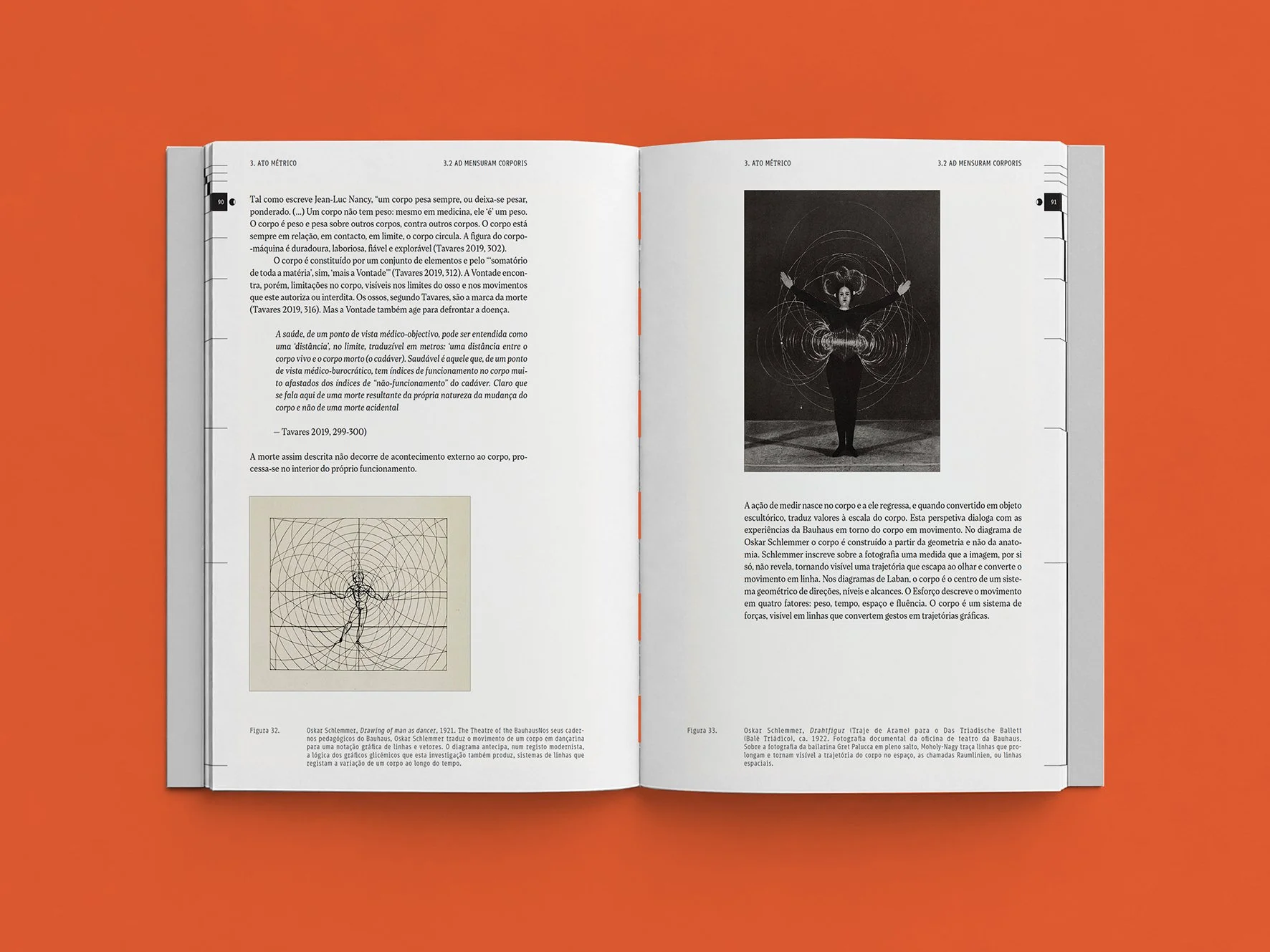
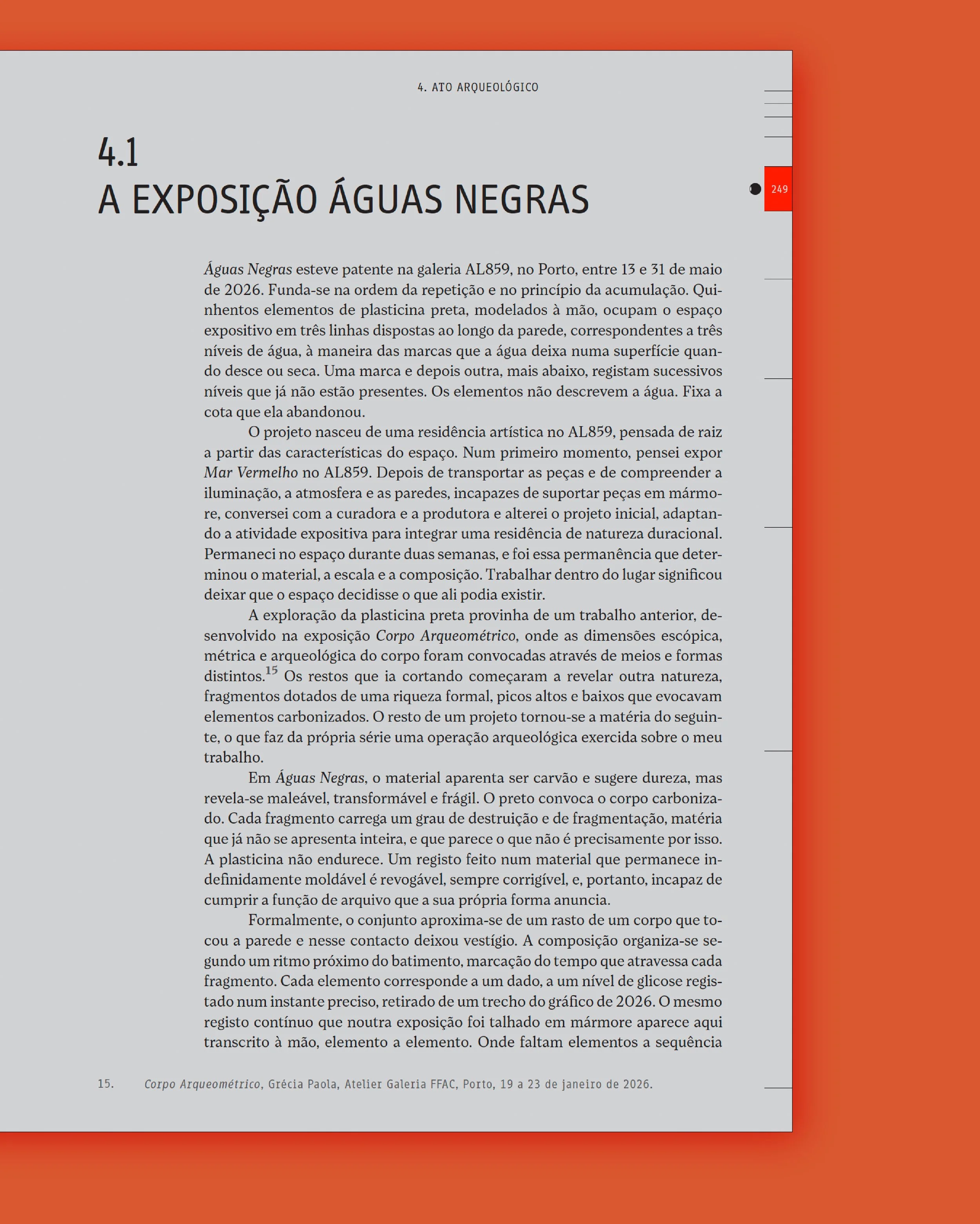
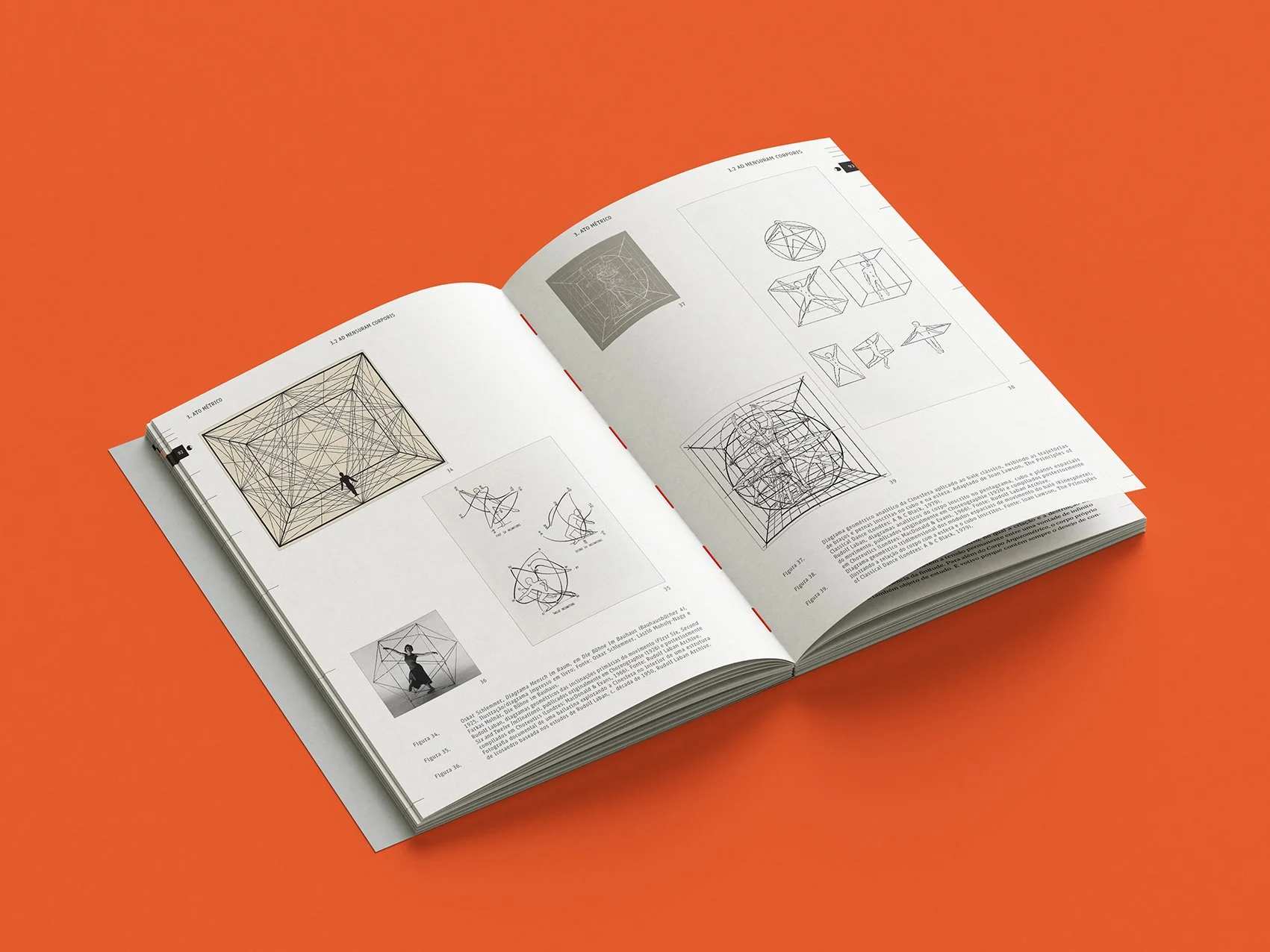
We started from the author research's core ideas to build the book's visual language. With the concept of measurement in mind, we designed a grid based on lateral line markers and symbols to mark each chapter. The graphics reflect the passage of time and signal the idea of movement and transition, while also marking the page number.
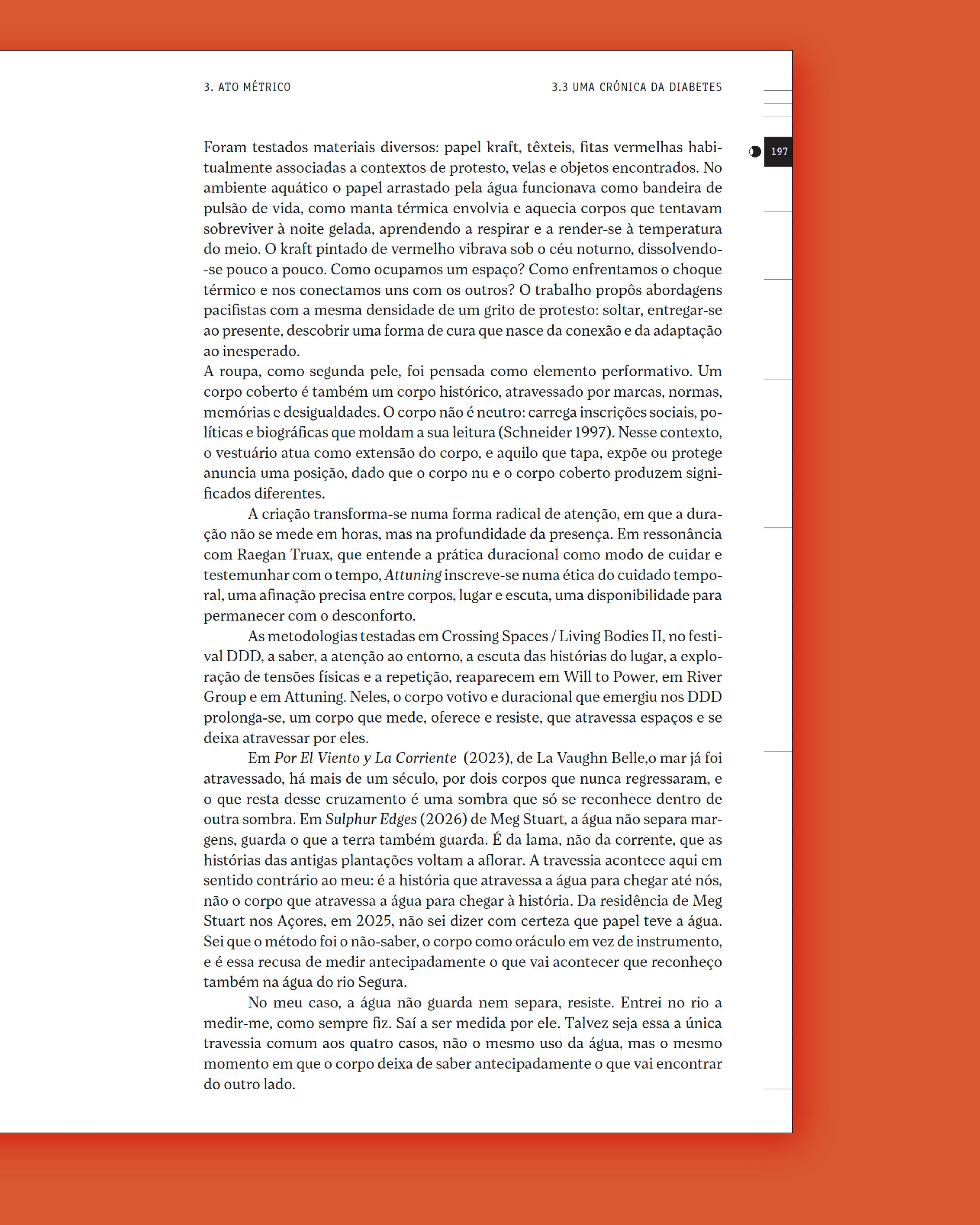
The content is rich in text and photographs, displayed within a six-column grid, allowing different layouts, with the main content on a five-column layout and the remaining inner columns used to display larger photographs or footnotes and image figure numbering.
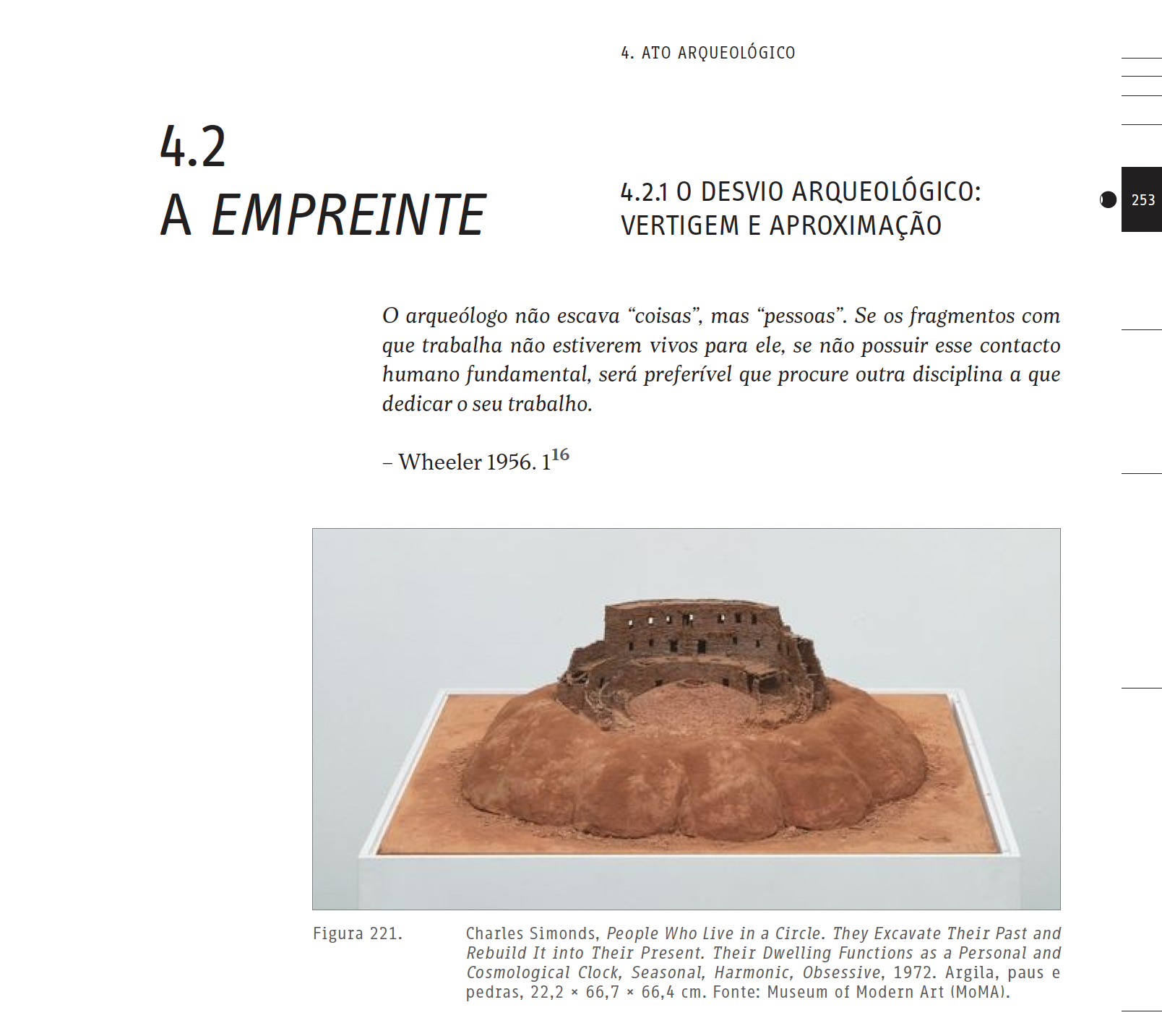
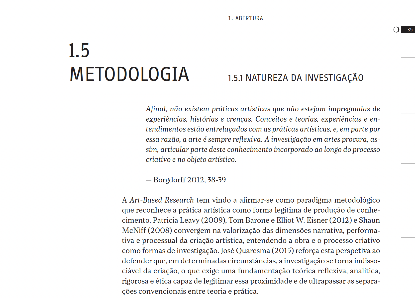
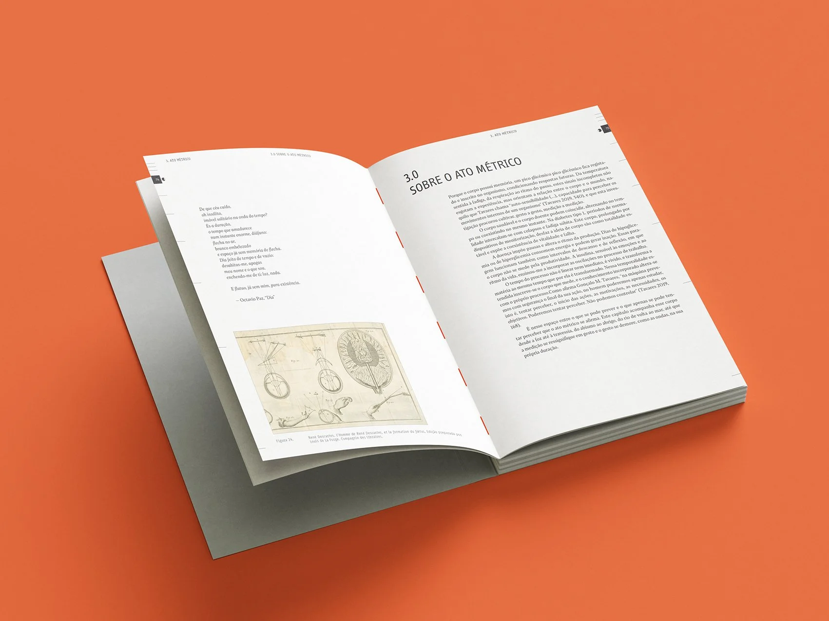
For the body text we used Loretta by Nova Type Foundry by Nova Type Foundry. For our editorial projects we tend to use Loretta or Artigo, two typefaces designed by our partners at Nova Type Foundry, that are incredibly gentle on the eyes for long-form reading.
Loretta is highly optimised as a serif body text with lively true italics, designed to contrast stylistically with the upright regular weight.
To pair with Loretta, we used the FF Info super family by Erik Spiekermann and Ole Schäfer, created in 1996 for the Düsseldorf airport temporary signage. We used FF Info for the display and the micro typefaces: Info Display Pro for titles and Info Correspondence Pro for footnotes and image legends. Both have advanced typographical support and are highly technical, function-first typefaces, with space-saving geometry built for structural clarity. Info Correspondence Pro borrows its structural lines from old typewriter fonts with clear spacing across printed blocks.
By now, it’s no secret that we like revisiting iconic 90’s fonts and pairing them with humanist fonts for body text.
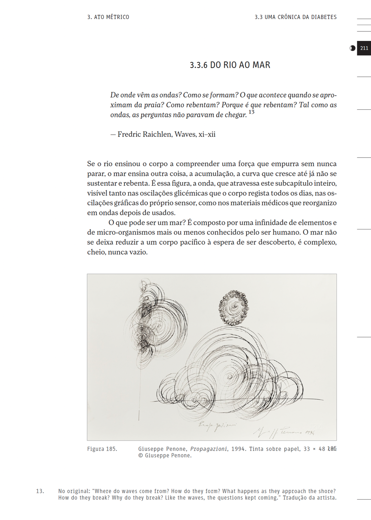
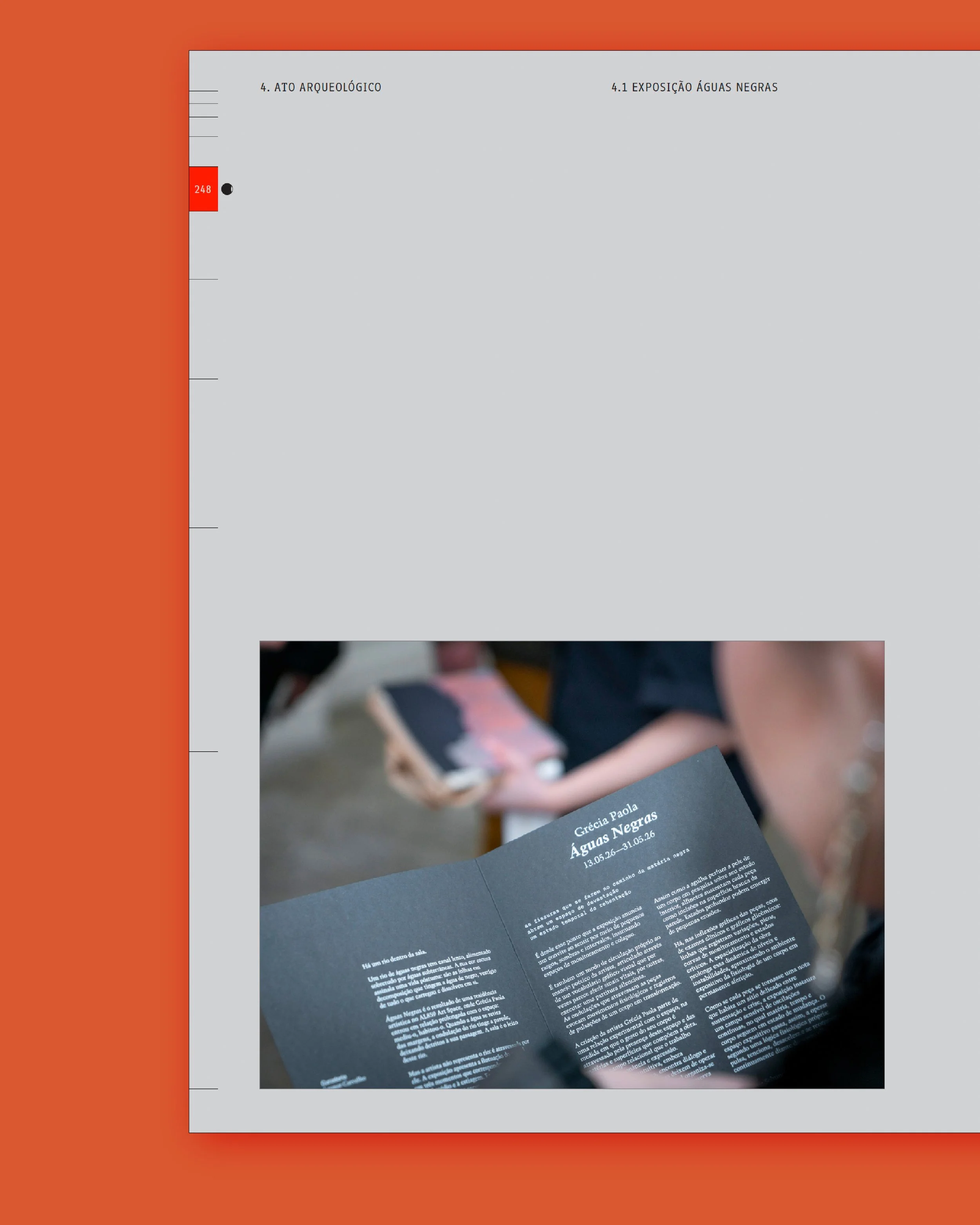
For the page spreads about the artist exhibitions, the background turns grey and the marker orange so that Grécia Paola's work can be highlighted throughout the book.
The design creates a framework that gives the work space to unfold within the 600 pages of content. The result is an editorial system that is rigorous without becoming rigid, allowing the thesis to move between dense research, personal reflection, documentation, and images while maintaining a clear visual rhythm throughout. The grid, markers, typography, and shifts in colour work together as a visual language for measurement and duration, echoing the ideas at the core of Grécia’s research.
Credits:
Creative direction: Miguel Barbot
Art direction and editorial design: Maria Helena
Typesetting and composition: Mariana Teixeira, Maria Helena
Cover design: Cristiana Braz