
Unicepe - How we designed a new website (and a bit more) for the bookshop that marked a generation of politically engaged readers
Words: Cristiana Braz, photos Miguel Barbot
Sometimes you walk into some spaces, and the story just seems to write itself, or some projects arrive at your door with the brief already written into the walls. Unicepe was one of those.
Founded in Porto in 1963, in the middle of Salazar’s Estado Novo dictatorship, by a group of university students who knew exactly what they were doing, Unicepe - Cooperativa Livreira de Estudantes do Porto CRL began as a deliberate act of cultural and intellectual resistance, shaped by a generation that refused to accept the limits imposed on what could be read, discussed, or even imagined.
At a time when books could get you into trouble, it set out to make ideas accessible: cheaper books, harder-to-find titles, foreign works, banned works — the kind of titles being read across Europe that simply never made it to Portugal. The PIDE, the regime’s secret police, visited regularly, arriving with or without a warrant and confiscating what they found. So that meant what couldn’t be displayed was often hidden, and what couldn’t be sold openly was passed hand to hand. The members of the bookshop knew the risks, and they still acted in spite of them.
Unicepe quickly became one of Porto’s most important cultural nuclei — a place where part of the city’s opposition quietly congregated, where ideas circulated that couldn’t circulate anywhere else, where thoughts were exchanged as much as books, and where political awareness was quietly but persistently cultivated. More than a bookshop, it functioned as a living network. Alongside other cultural nodes, like the Cineclube do Porto, Árvore, and the Teatro Experimental do Porto, Unicepe helped sustain an underground intellectual life that fed into broader currents of opposition, contributing to the movement that spearheaded the “Carnation Revolution” on April 25th 1974.
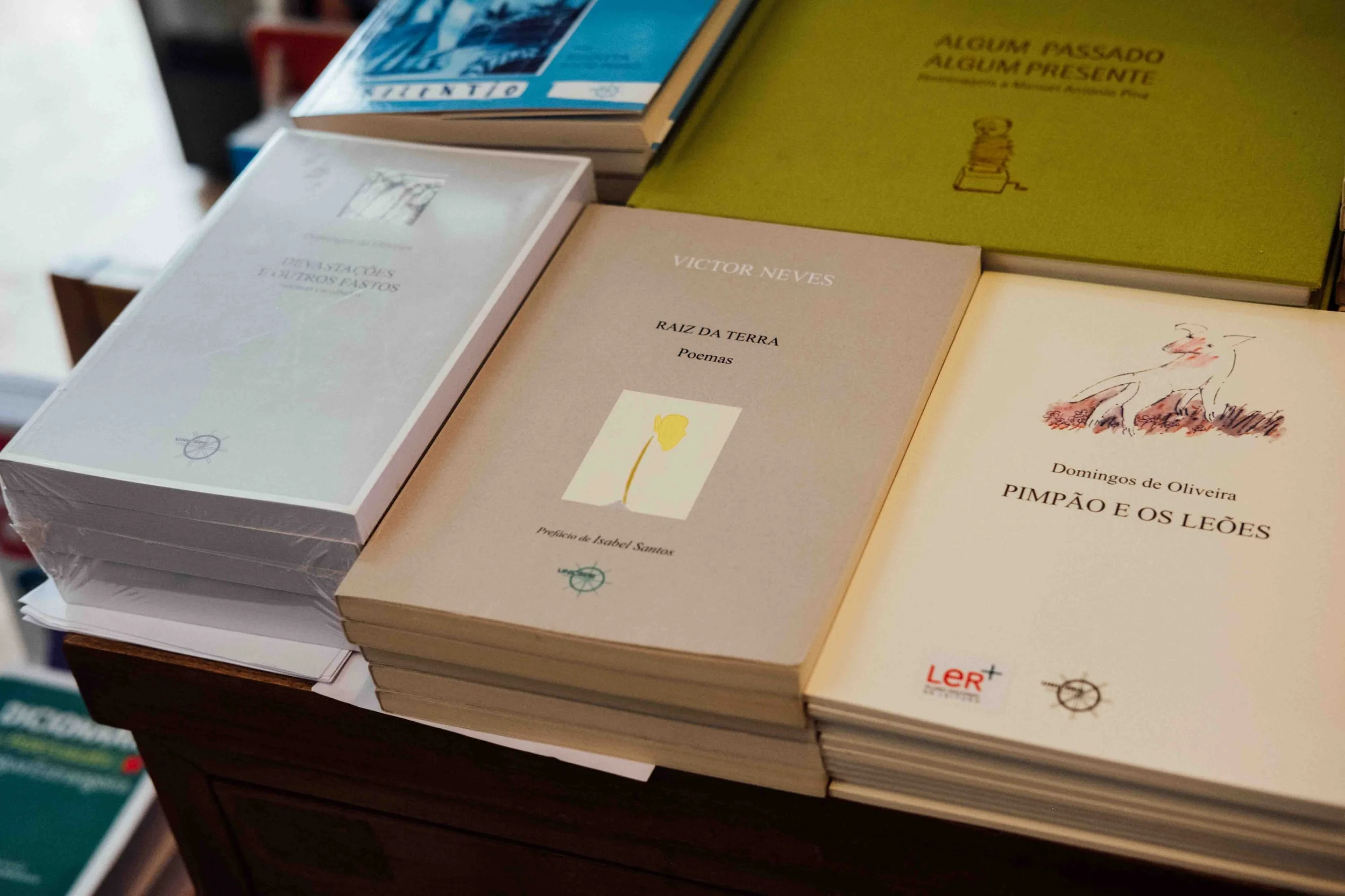
More than sixty years later, that same ethos continues to shape Unicepe. Still operating as a cooperative, it remains rooted in the idea of access and community: a catalogue with a strong focus on Portuguese literature, its own editorial projects, and a regular programme of events that keeps the space active. It hosts poetry readings, weekly presentations, debates, language courses, book launches, music sessions, and the long-standing “jantares de amizade”, which maintains a rhythm of gathering and exchange (less clandestine now, but no less committed to dialogue). Described by its own members as a “community of affections,” Unicepe now exists somewhere between a bookshop, a cultural venue, and a collective memory.
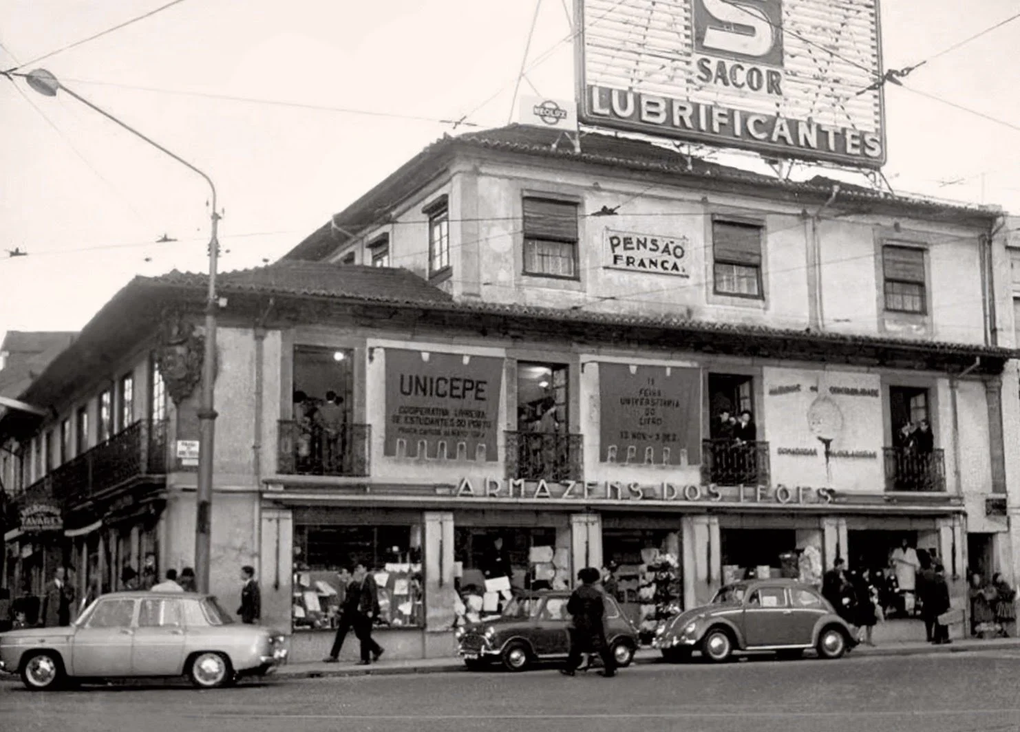
The first book fair at Unicepe. Photo by Sérgio Valente.
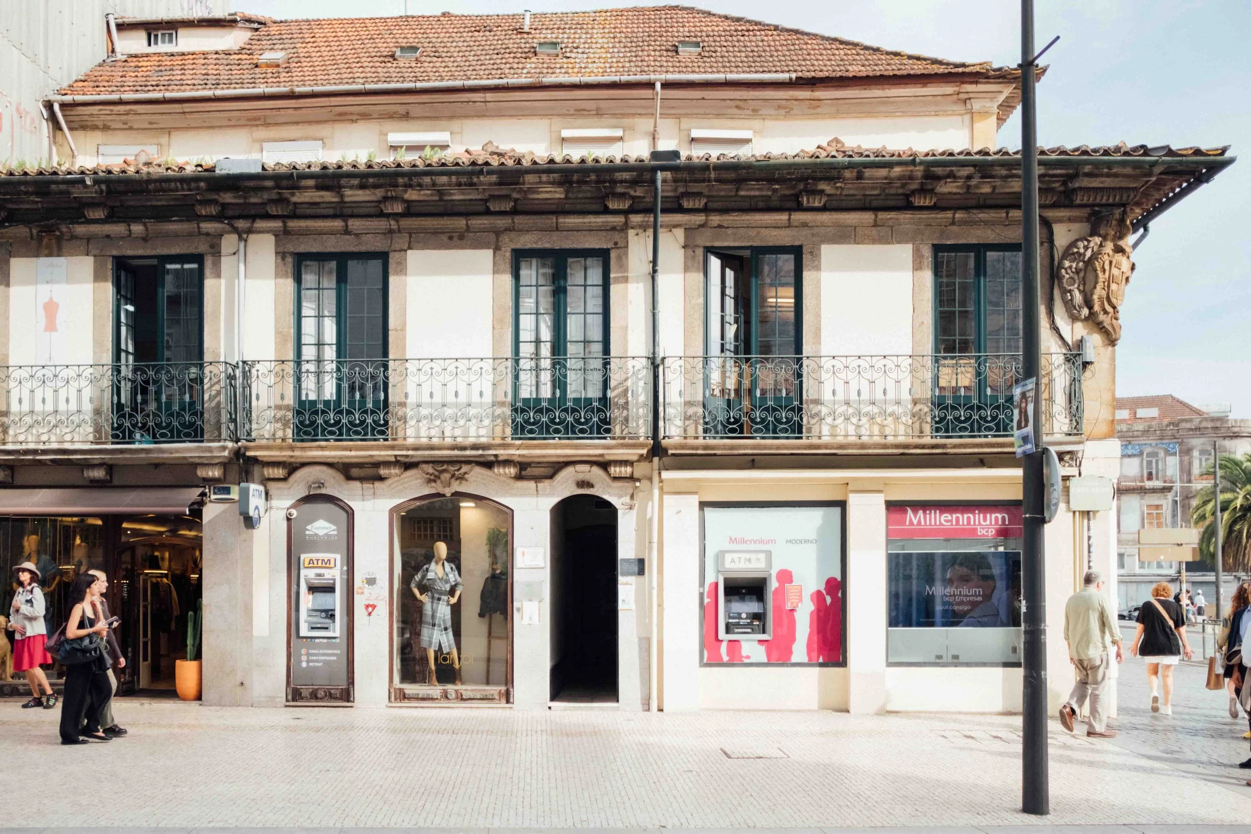
Unicepe has its home in Porto’s city centre, just atop the stone staircase at n.º 128 Praça Carlos Alberto.
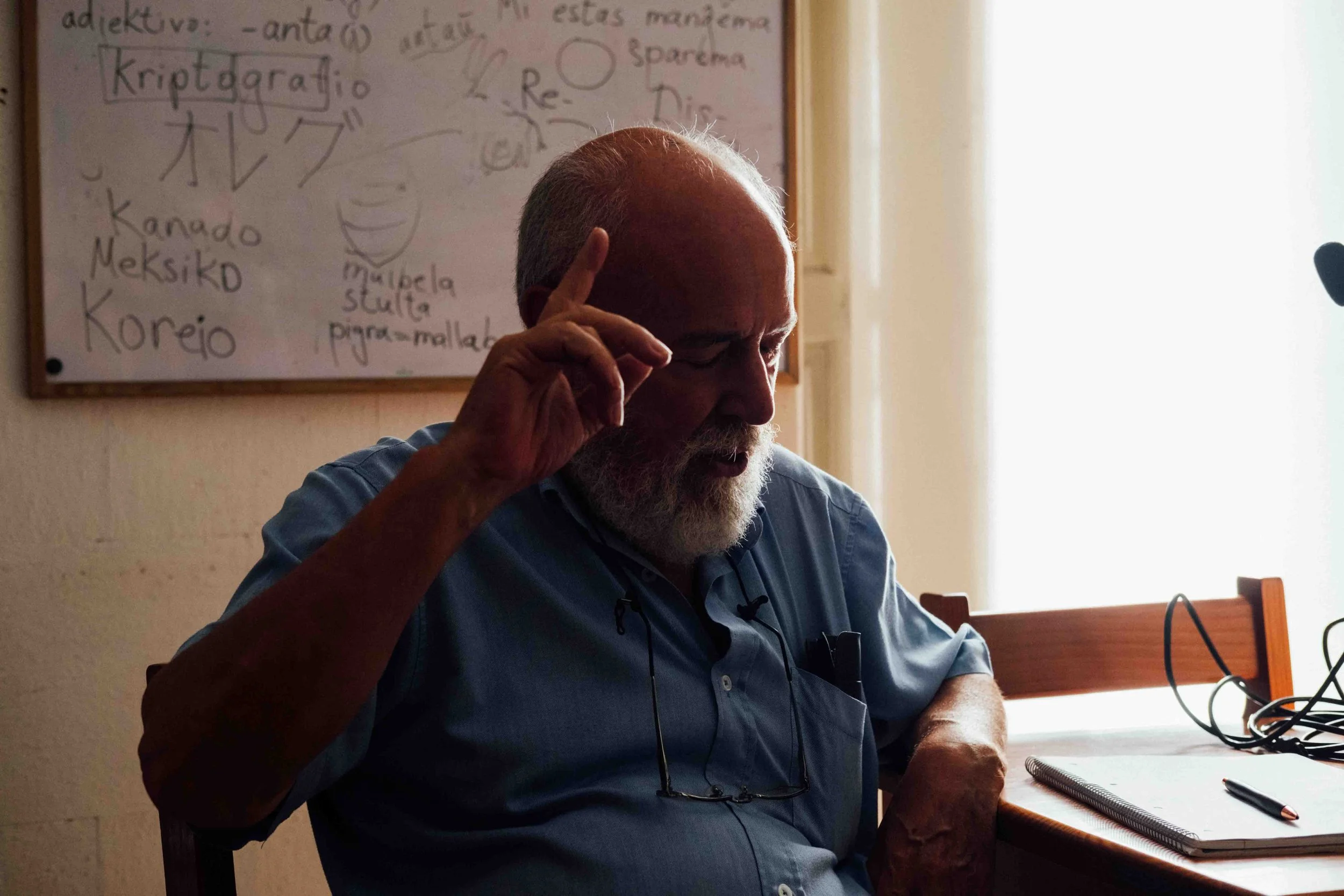
Rui Vaz Pinto has been the president of Unicepe’s board of directors for the past 23 years.
As excited as we were to work on this project, it came to us through less-than-ideal circumstances. The person who had maintained the Unicepe website for years passed away at the beginning of last year, and with him went the institutional knowledge of how to keep it running. Rui Vaz Pinto, the president of the board of directors, passed the torch to João, one of the relatives closest to the cooperative. They quickly recognised the situation for what it was: even though the website had been up and running for many years and was much beloved, it could not be maintained or updated as easily without the person who understood it best. Rather than patching it indefinitely, they decided to rebuild something new and easier to manage (you will see what we mean in a second).
So that became our brief: honour what was there, look to the future, and build a website that would last a long time (just as the original had, and hopefully even longer).
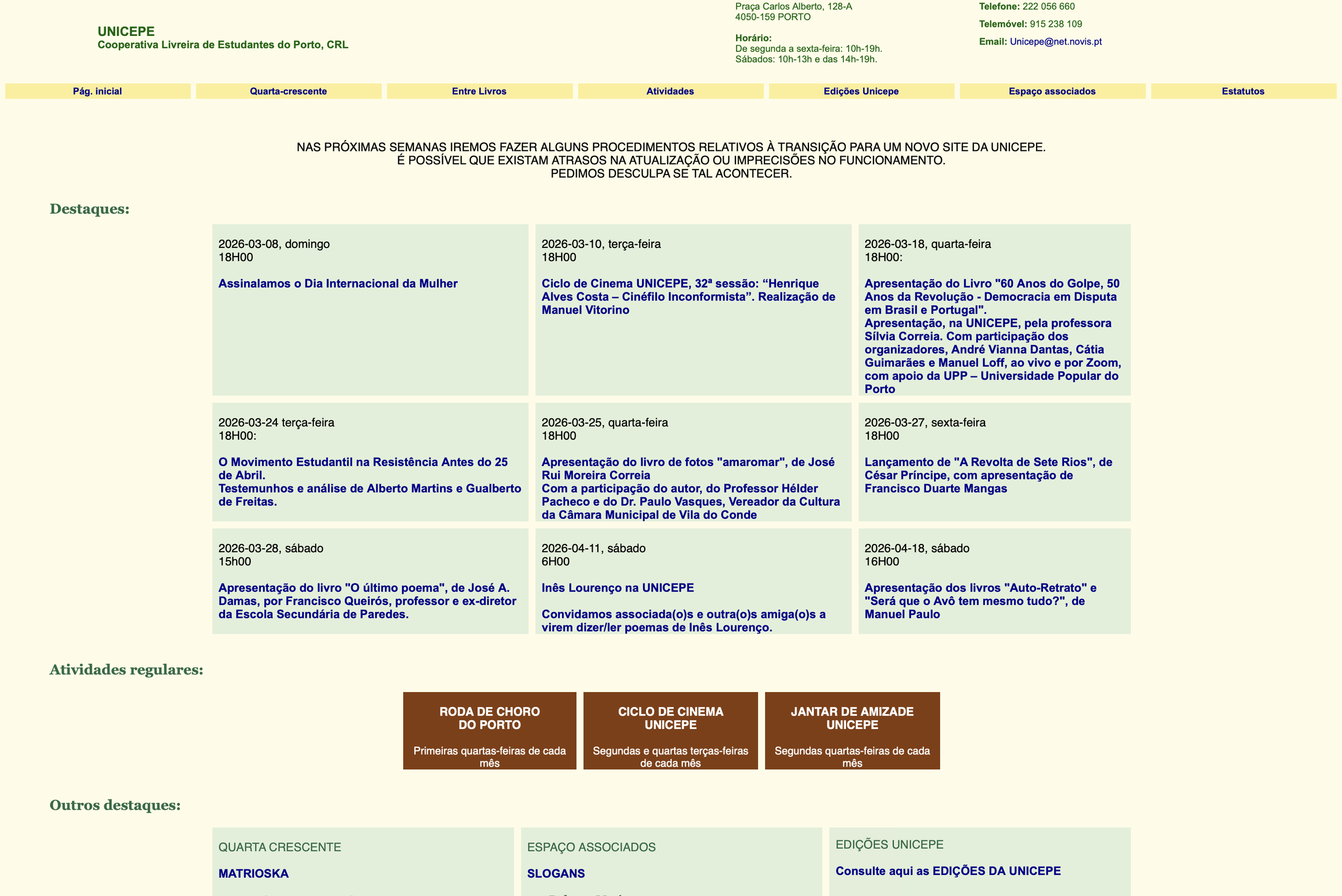
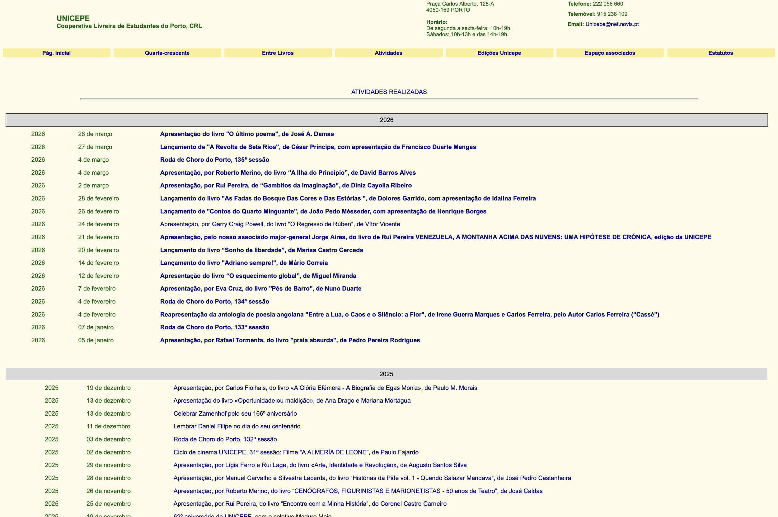
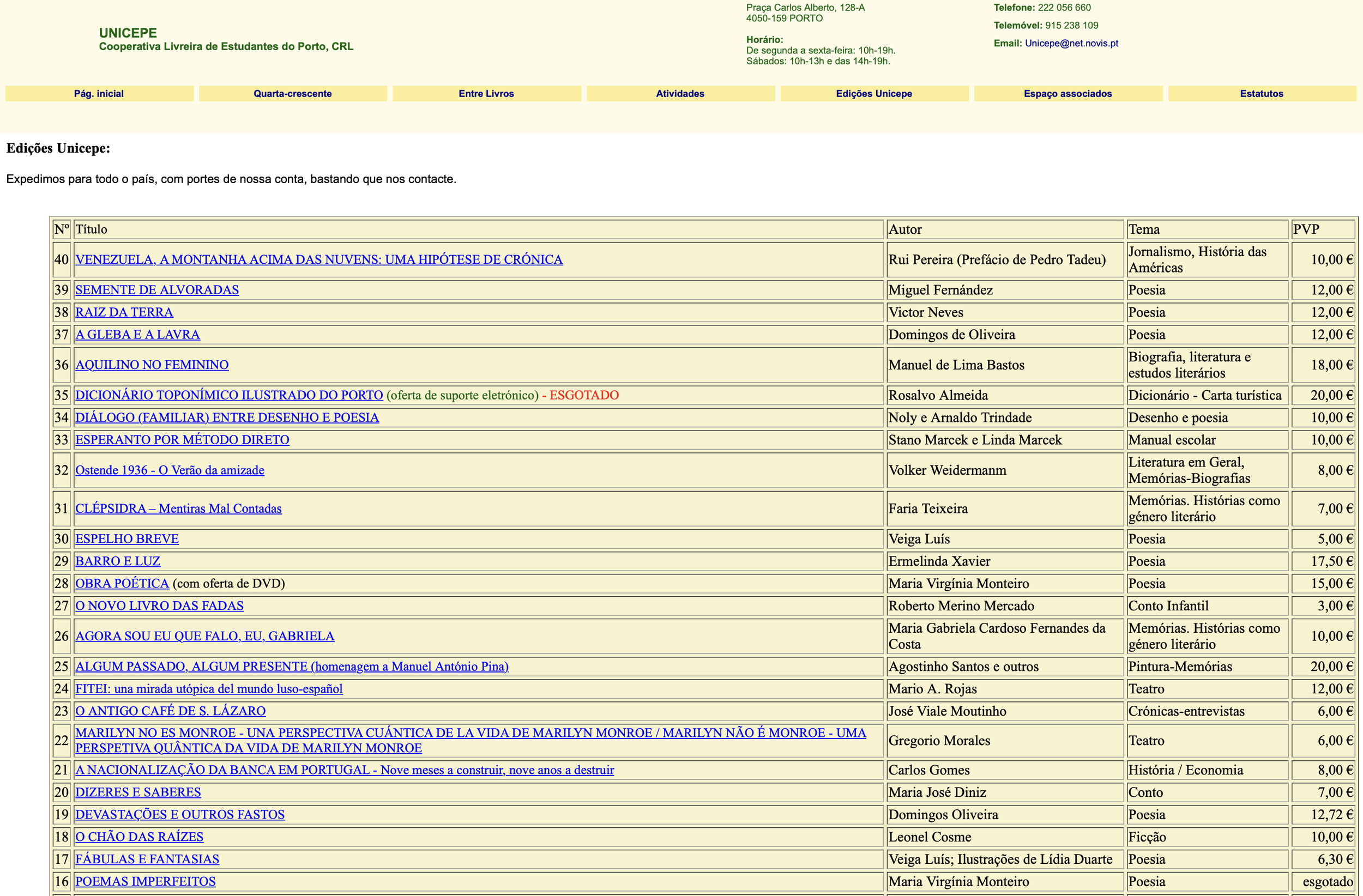
The first step was visiting the space. Unicepe already had a very specific visual universe: the graphic language of liberation and of clandestine publishing. Add to that a website that had been running since what felt like the early days of the internet itself, with text inside coloured boxes, bright blue hyperlinks (truly the most 90's-early-web-fossil you can imagine), and we had a project with a very strong starting point. We loved the original website, genuinely. It was one of those instances where something is so bad it ends up being good, so we knew we really didn't want to lose that association.
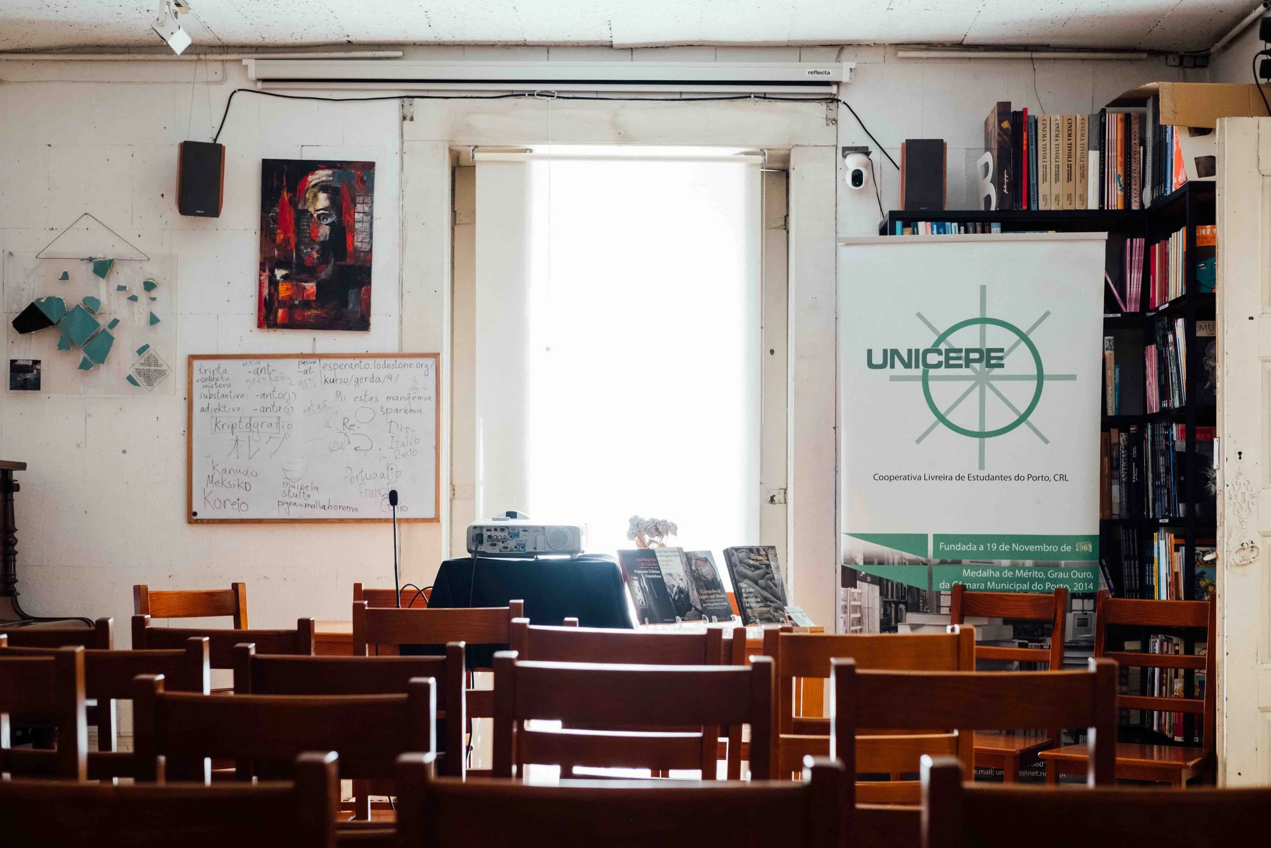
Here you can see the room used for the community gatherings and the original Unicepe logo developed many years ago (not by us, but we do appreciate it).
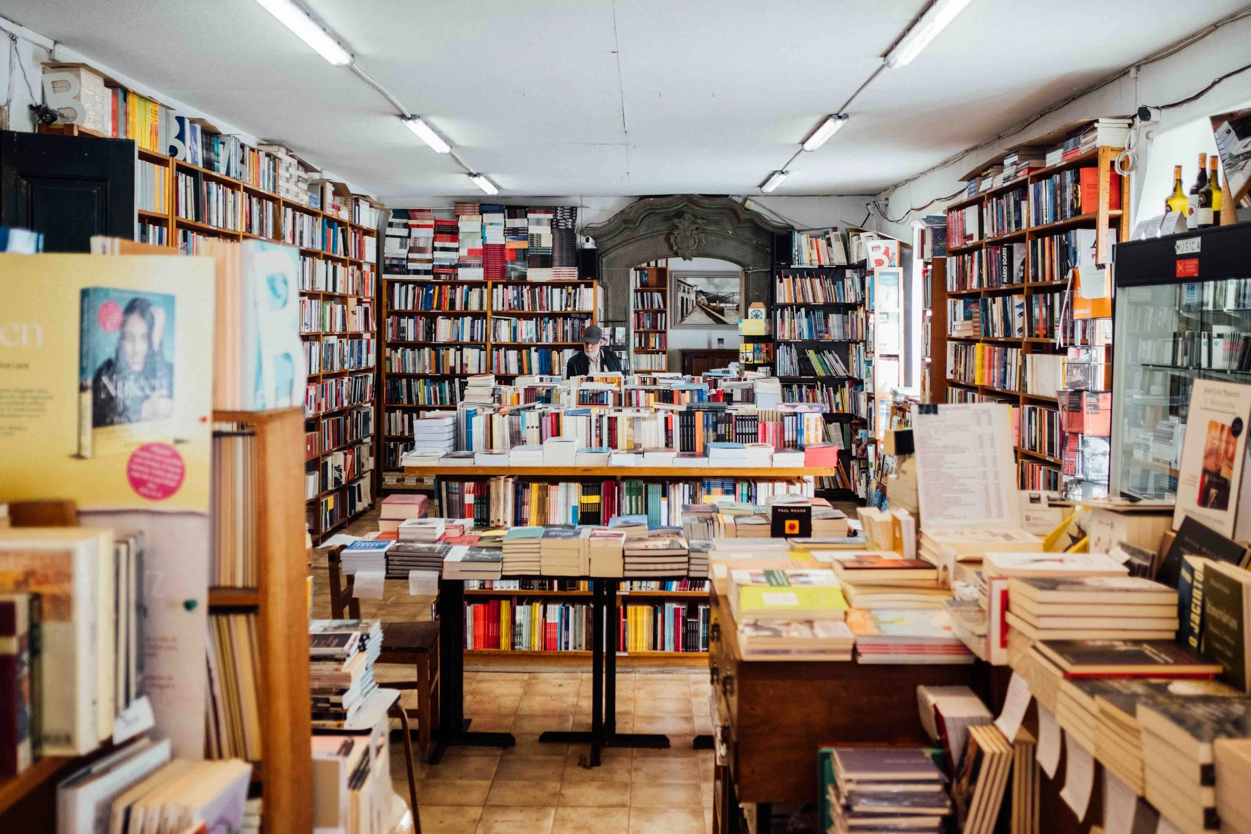
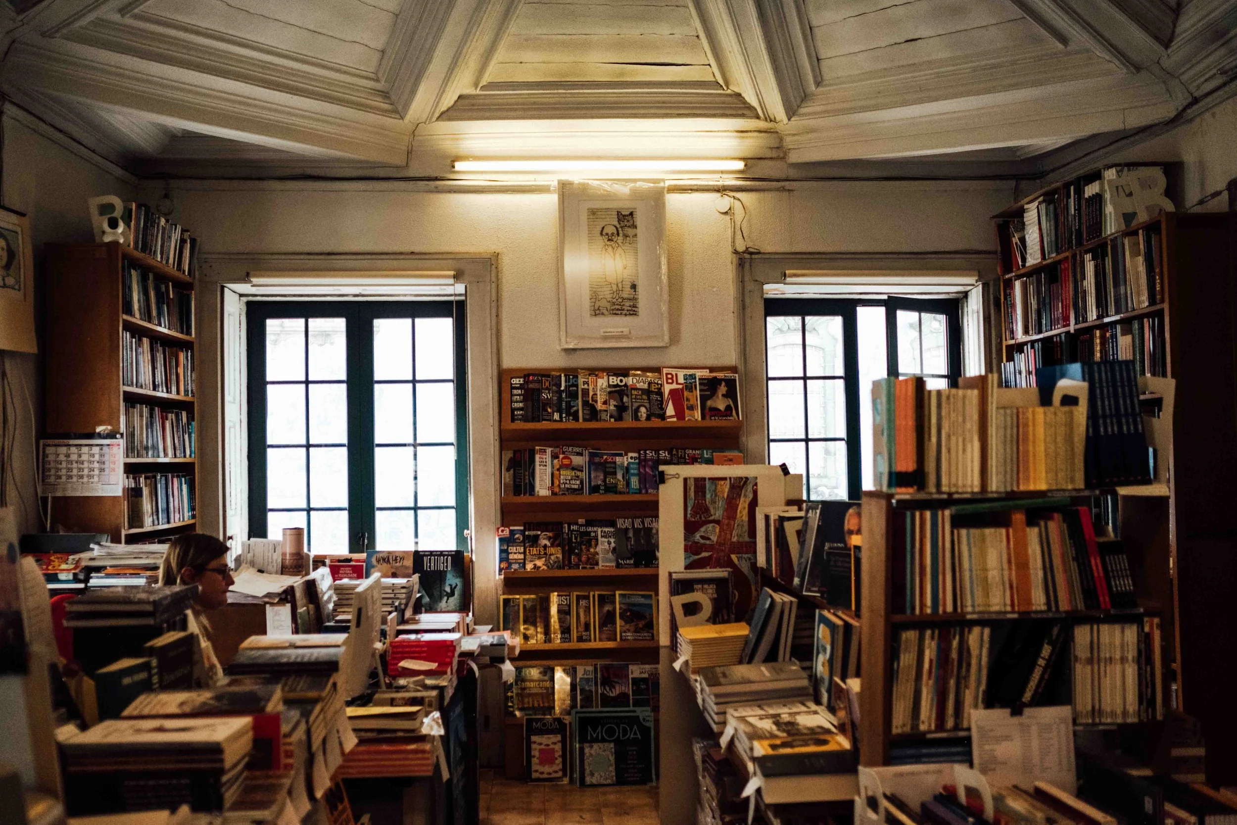
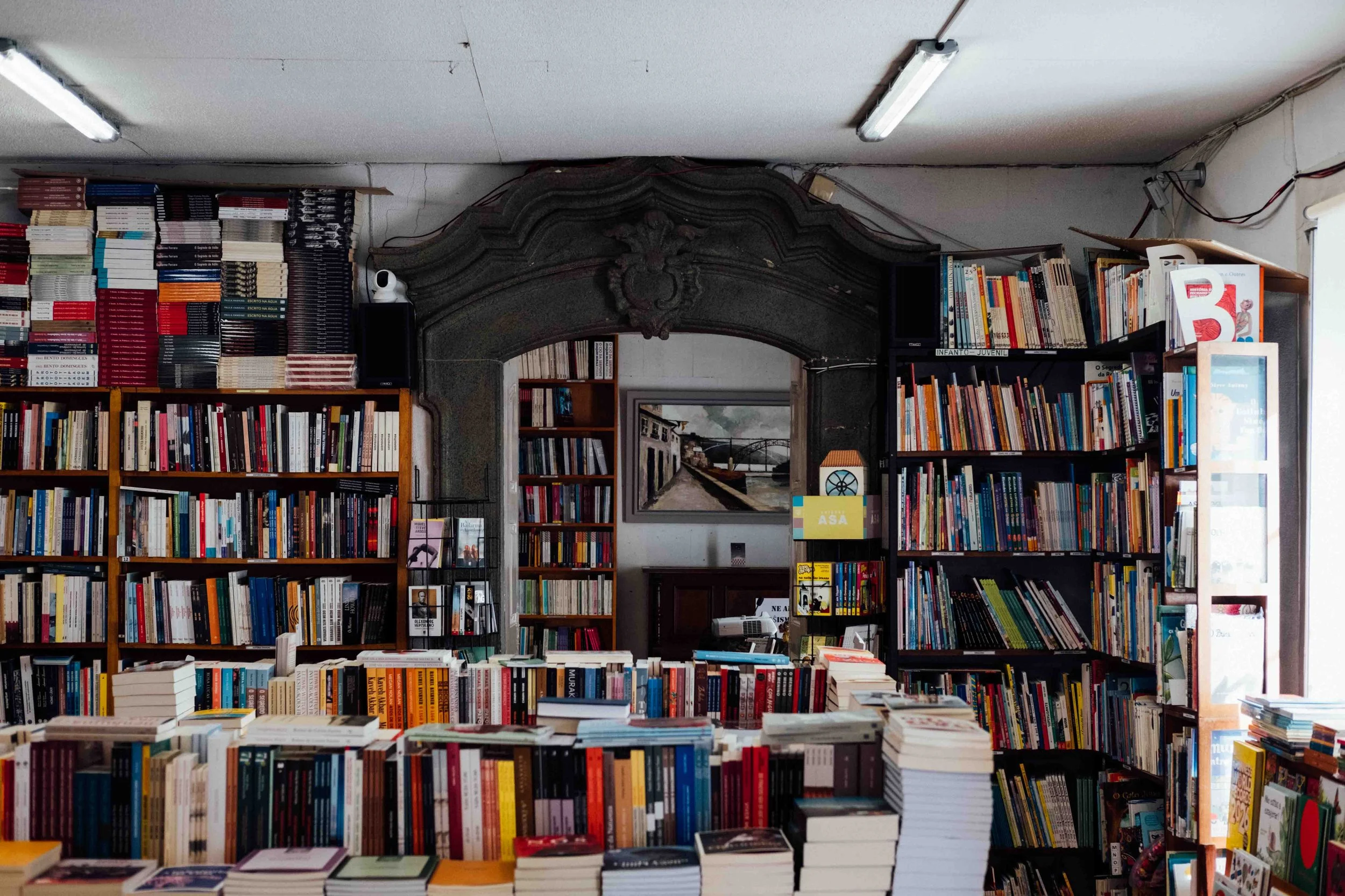
Photographs of the bookshop taken by Miguel on our first visit to Unicepe.
The homepage, events page and shop of the original Unicepe website.
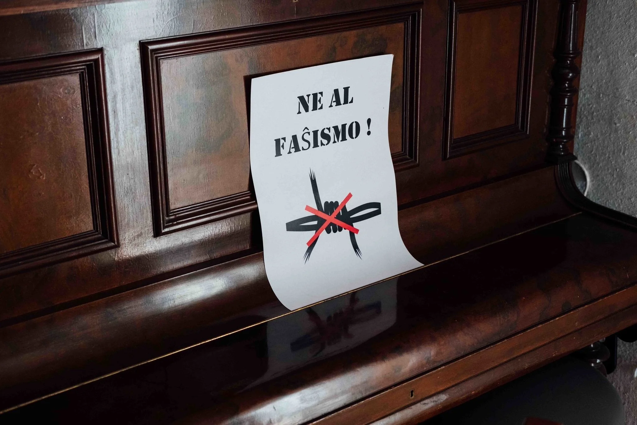
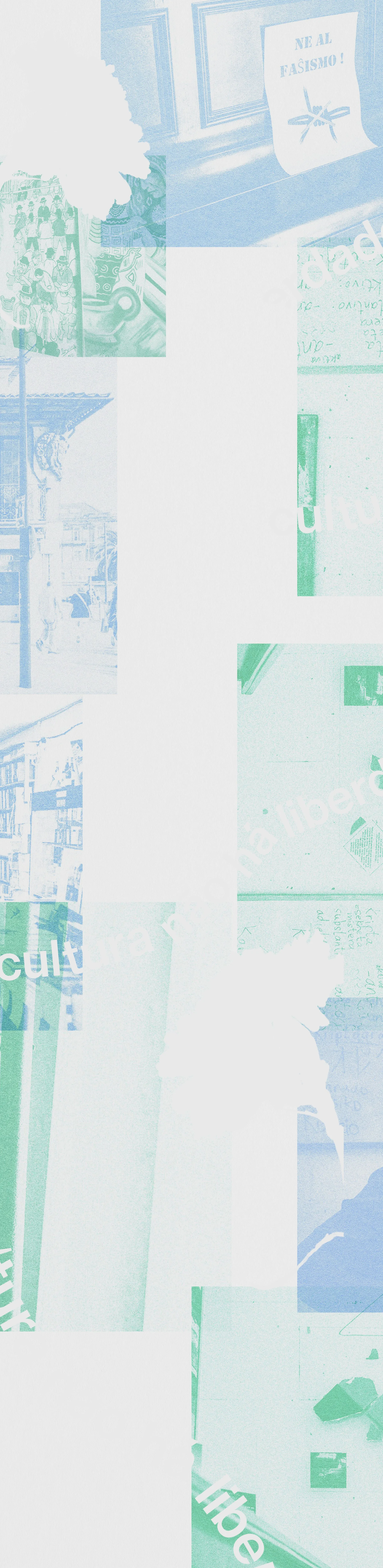
The moodboard came together quickly because we already had so much to draw from. The aesthetic we were going after was that sort of DIY, urgent, layered imagery — photographs edited into monochrome to let solid, bright colours carry the weight; overlays and juxtapositions of photography creating pattern-like backgrounds; bold, slightly retro (but still modern) typography; and a texture in the backgrounds that felt tangibly like paper. We wanted the site to feel like it had been made by hand, even if the making of it was actually digital.
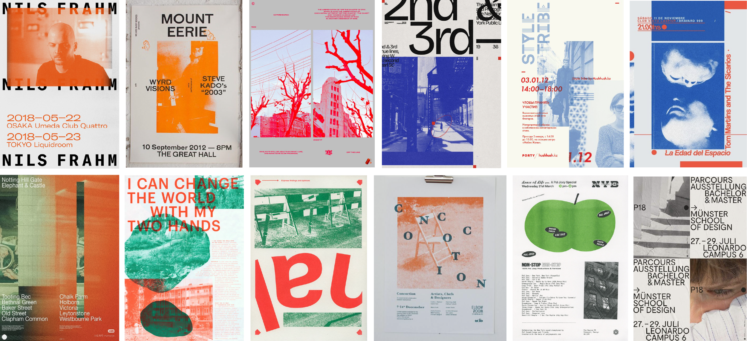
Starting with typography, Eurostile was an easy first choice — the squarish, superellipse-shaped geometric sans-serif designed by Aldo Novarese in 1962 for Italian foundry Nebiolo, coincidentally around the same time Unicepe was founded — as it was already being used in the original Unicepe logo. With its associations with modernist architecture, early space-age graphics, and science fiction and media of the 1960s and 70s, Eurostile felt historically right and exactly what we were looking for visually. We adopted it for headlines and even designed a new logo for the website header.

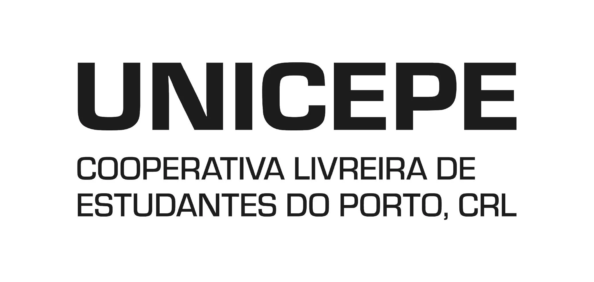
The new version of the logo for the website header.
For body copy, we turned to Neue Haas Grotesk, a studio favourite. Neue Haas Grotesk was originally designed for hand-set letterpress type, with proportions and spacing optimised for each point size. Over decades of technological transitions (linotype, phototypesetting, digital adjustments), those subtleties were flattened, resulting in what we know now as Helvetica. Christian Schwartz's 2010 revival restored what had been lost, bringing back the original curves, alternate glyphs, and the slightly looser, warmer feel of the pre-digital version. For a project about a bookshop with sixty years of history, that felt right. We used the Text Pro variant for all body copy to keep it as legible as possible on top of the busy backgrounds.

For details such as headers, buttons, and smaller interface elements, we chose Ballinger Mono designer by Max Phillips for Signal Type Foundry, a monospaced, sturdy typeface with a generous x-height and open counters. Not only did it add that tech-y undercurrent to the design, but it also made the connection to the hyperlinks and the internet-core of the original website more legible.

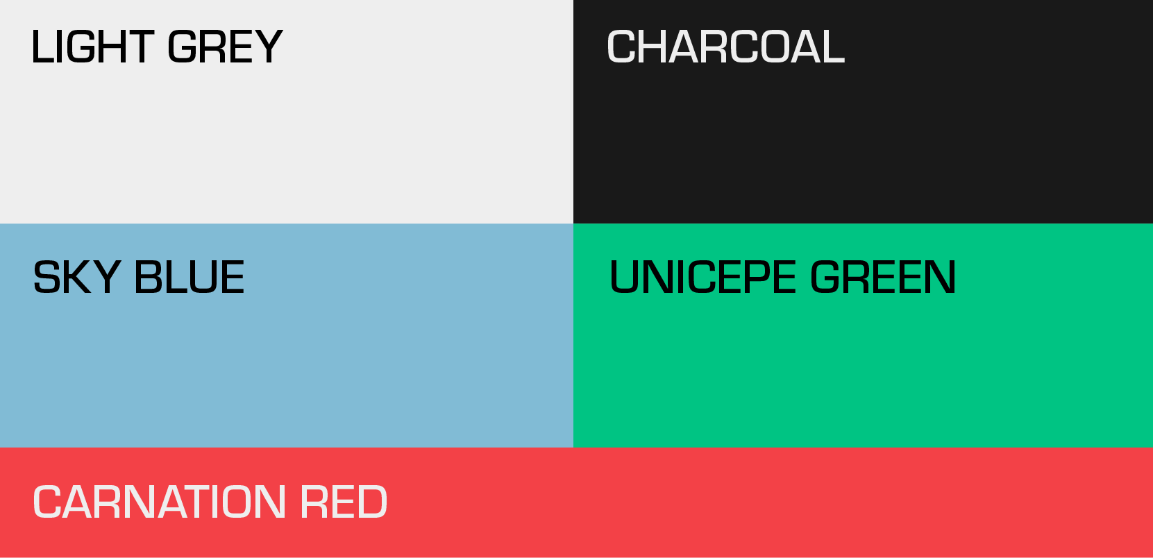
The colour palette is anchored in a cool grey for the textured paper-like base, with light blue for the hyperlink association, green drawn from Unicepe's existing logo and colour history, and red used sparingly, inspired by the carnation flowers.
The background was where most of the design work happened and where the site's identity really took shape. The process was one of layering: first, photos edited and tinted in each main colour (blue and green); then placed and overlaid to create a kind of scattered pattern across each page; then a further layer added with carnation silhouettes in the negative, alongside large fragments of text and letterforms placed on top and in between the images (words about freedom of expression and related values).
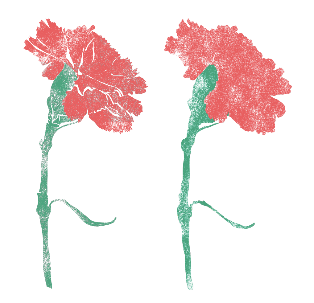
Carnation flower illustrations created in a stencil-like fashion. The red and green have a direct connection to the colour palette.

All of these decisions were as much practical as they were aesthetic. We knew the images that would actually be used on the site for blog posts and events wouldn't be perfect. After all, that was part of the charm of the original website. Rather than fight it, we designed with it in mind: a rich, complex background that pulls everything placed on top of it into coherence, giving the page grit and personality without becoming overwhelming. A flat, single-colour background would have drawn all the attention to the photos, and we wanted something that could hold everything together.
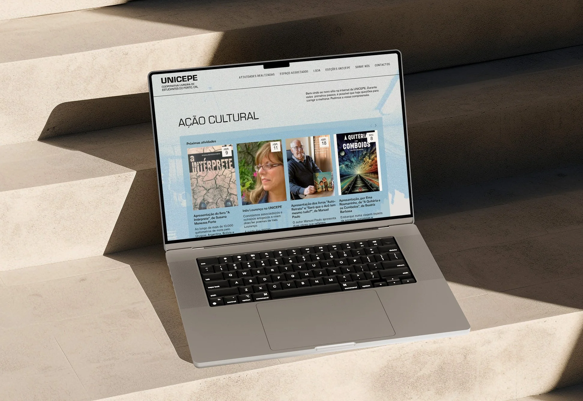
From there, it was a matter of translating that logic across every section of the site, while keeping it highly functional. It needed to work simultaneously as an events archive, updated frequently enough that it earned its place at the front door of the site; as a blog, giving cooperative members and contributors a space to publish their writing; and as a shop, presenting both a selection of books and also the complete catalogue of Unicepe's own editions. It needed to be expository, informational, and commercial all at once.
With that in mind, every page type got its own treatment through the same background approach and image editing, but adapted to what that section needed to do, while staying within the same visual logic. To keep the spirit of the original site alive, we brought the blue boxes back to the homepage and the shop, framing images and text elements and creating separation and emphasis against the layered backgrounds.
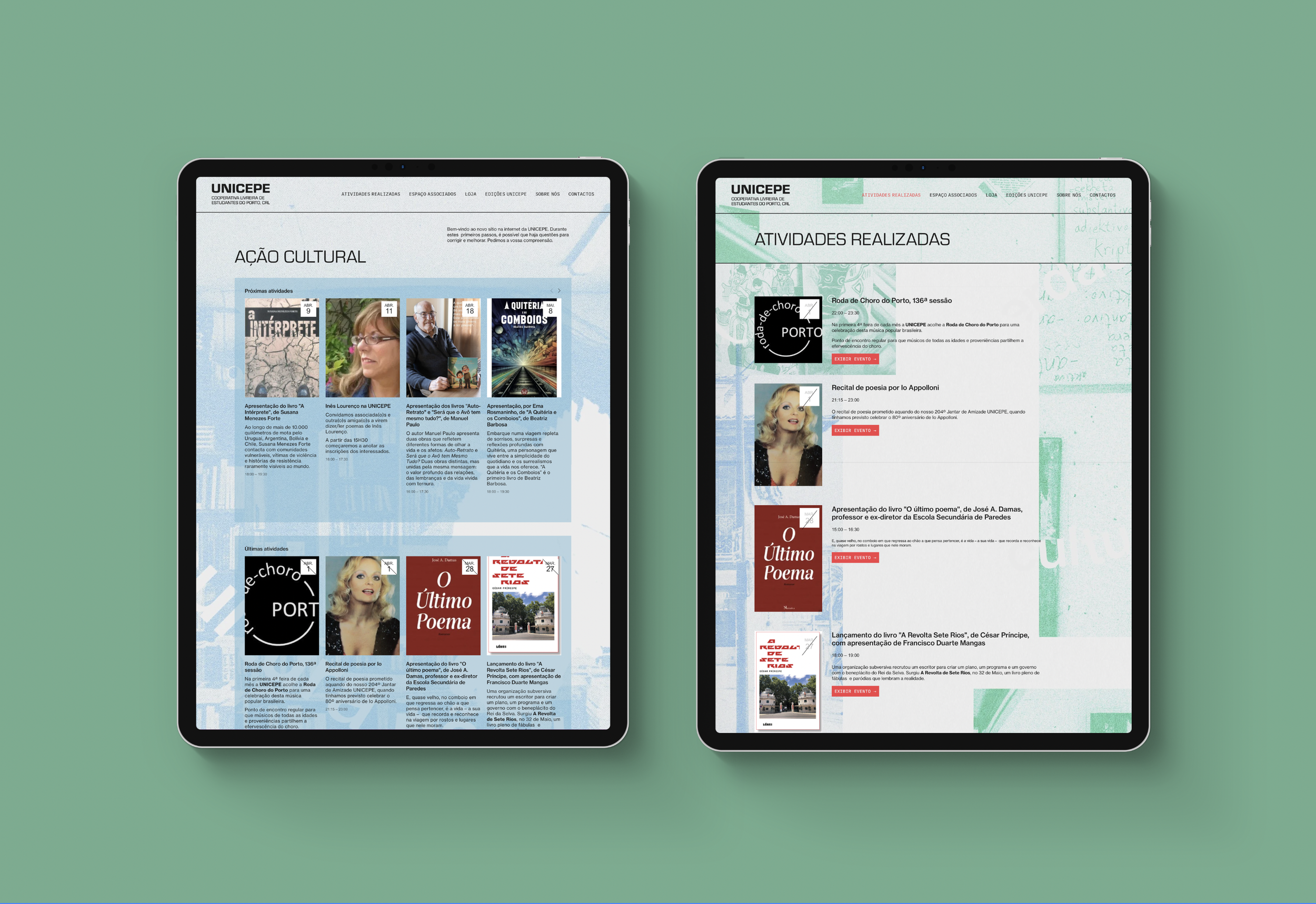
The homepage and events listing page of the new website.
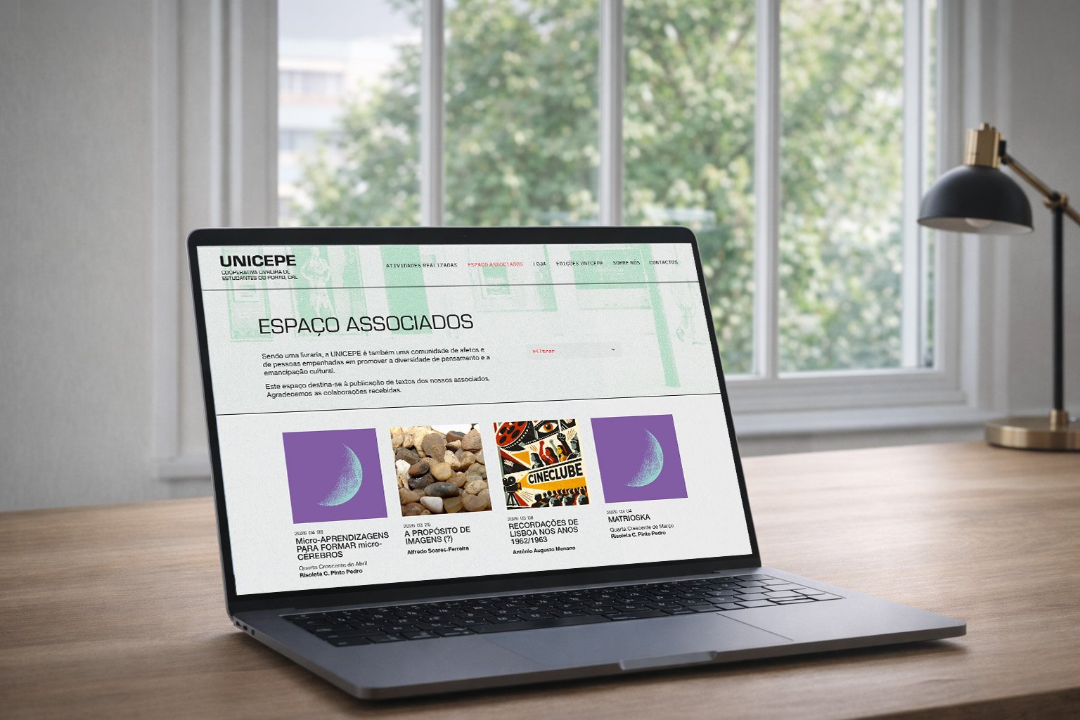
The blog page dedicated to contributions.
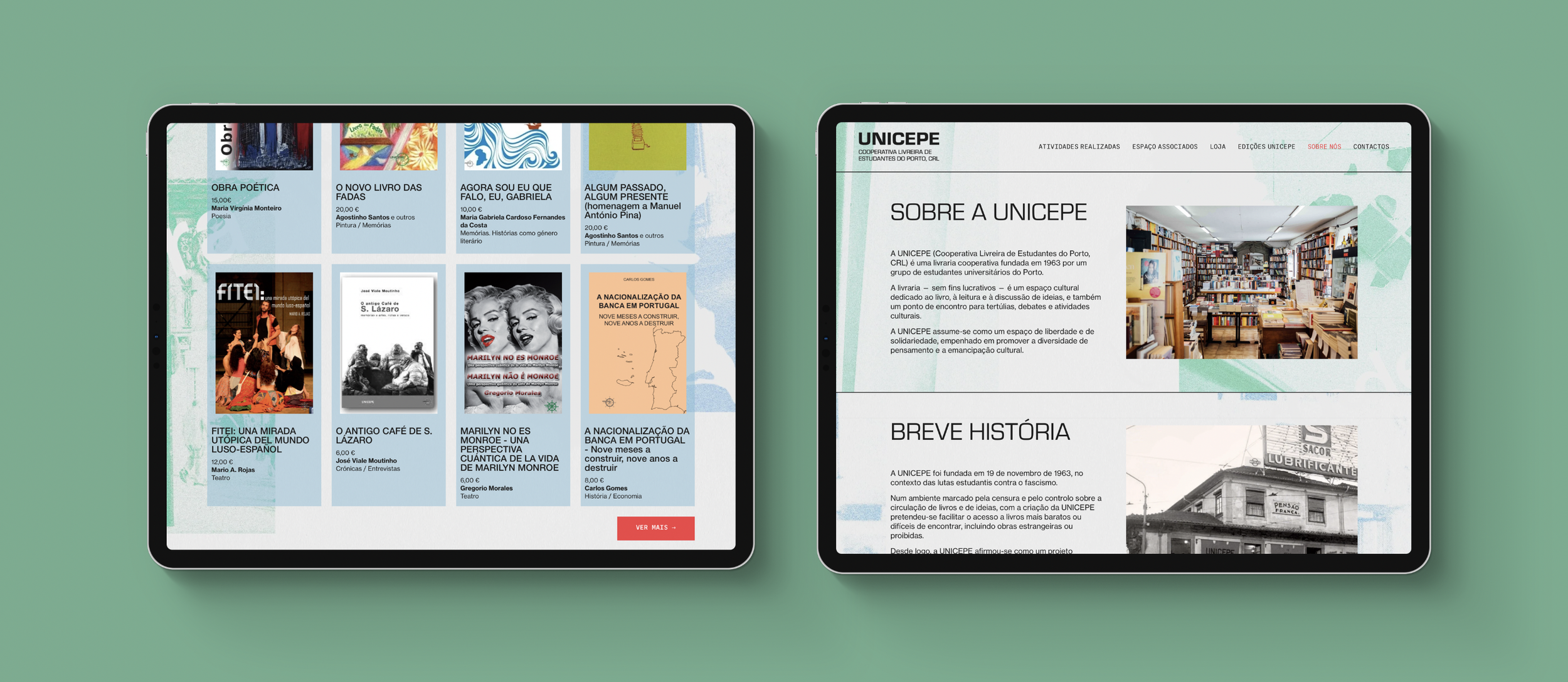
The online shop and about page.
Both the team at our studio and the people at Unicepe took a lot of care and time in making this website and in getting everything working and looking the way we wanted it to. It took a lot of revisions, changes, and code-related work, a necessary investment to make something like this come to life. The Unicepe website is now live and fully operational, and we can only hope it's still running many more years from now.
You can visit the Unicepe website here.
Credits:
Creative Direction: Miguel Barbot
Art Direction: Cristiana Braz & Maria Helena
Graphic Design: Cristiana Braz
Web Development: Cristiana Braz