
We designed the visual identity and learning tools for 10,000 years of textile heritage
Words: Maria Helena / Cristiana Braz
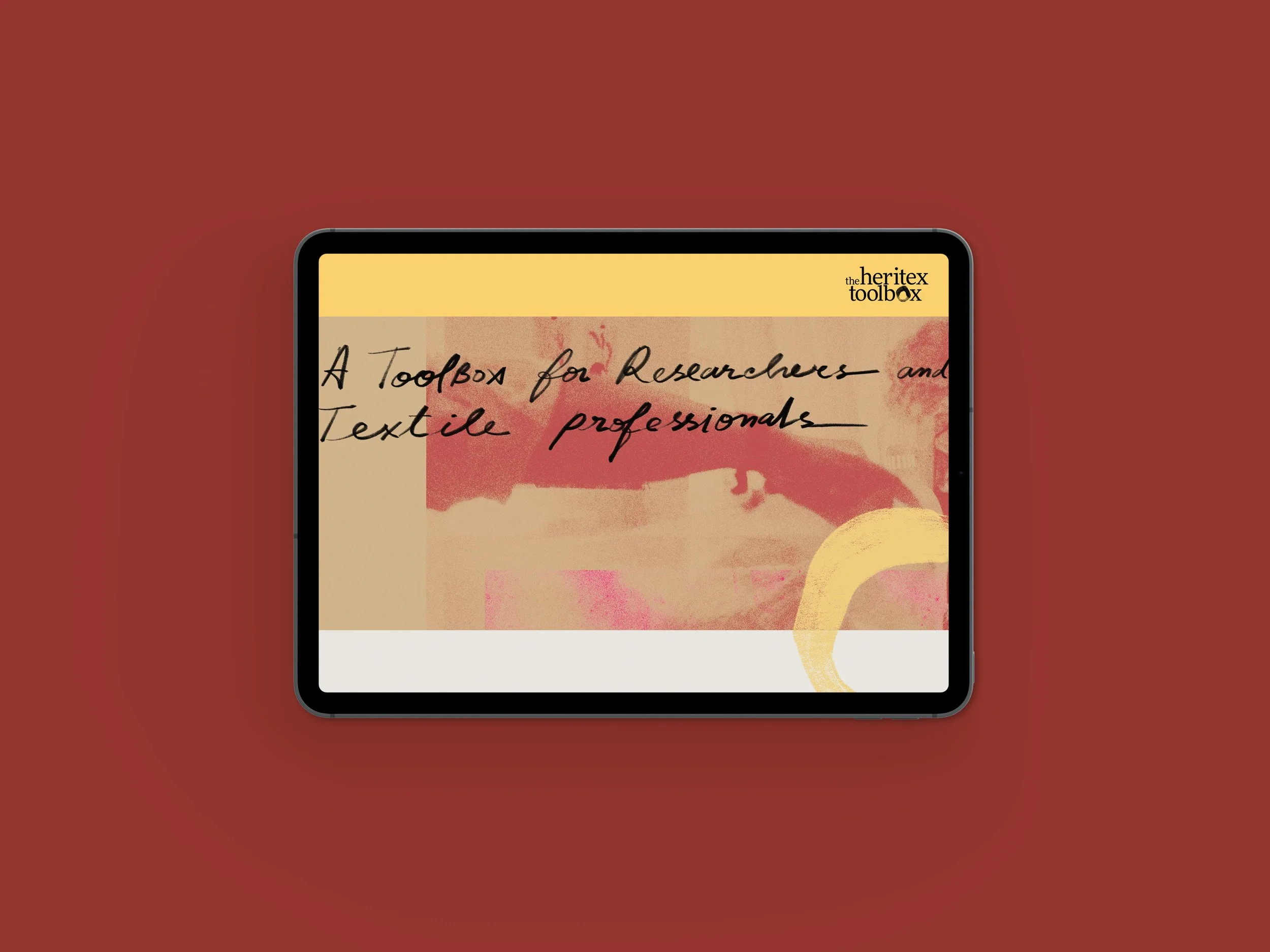
The Heritex Toolbox is a platform for entrepreneurs, researchers, and fibre enthusiasts — a living archive of the knowledge embedded in textile heritage.
Built as part of HERITEX-HUB (COST Action 19131), a networked knowledge hub to empower the green transition in textiles and fashion by harnessing the wealth of data and insights provided by the study of Textile Heritage.
The project is led Francisco B. Gomes (Archaeologist, University of Lisbon) and Paula Nabais (Heritage Scientist, NOVA School of Science and Technology), in collaboration with researchers from across Europe.
We were brought in to design the visual identity, learning tools, the website, and the editorial objects that hold it all together. The main goal was to make thousands of years of textile history feel alive — without turning it into a dusty archive or a sterile database.
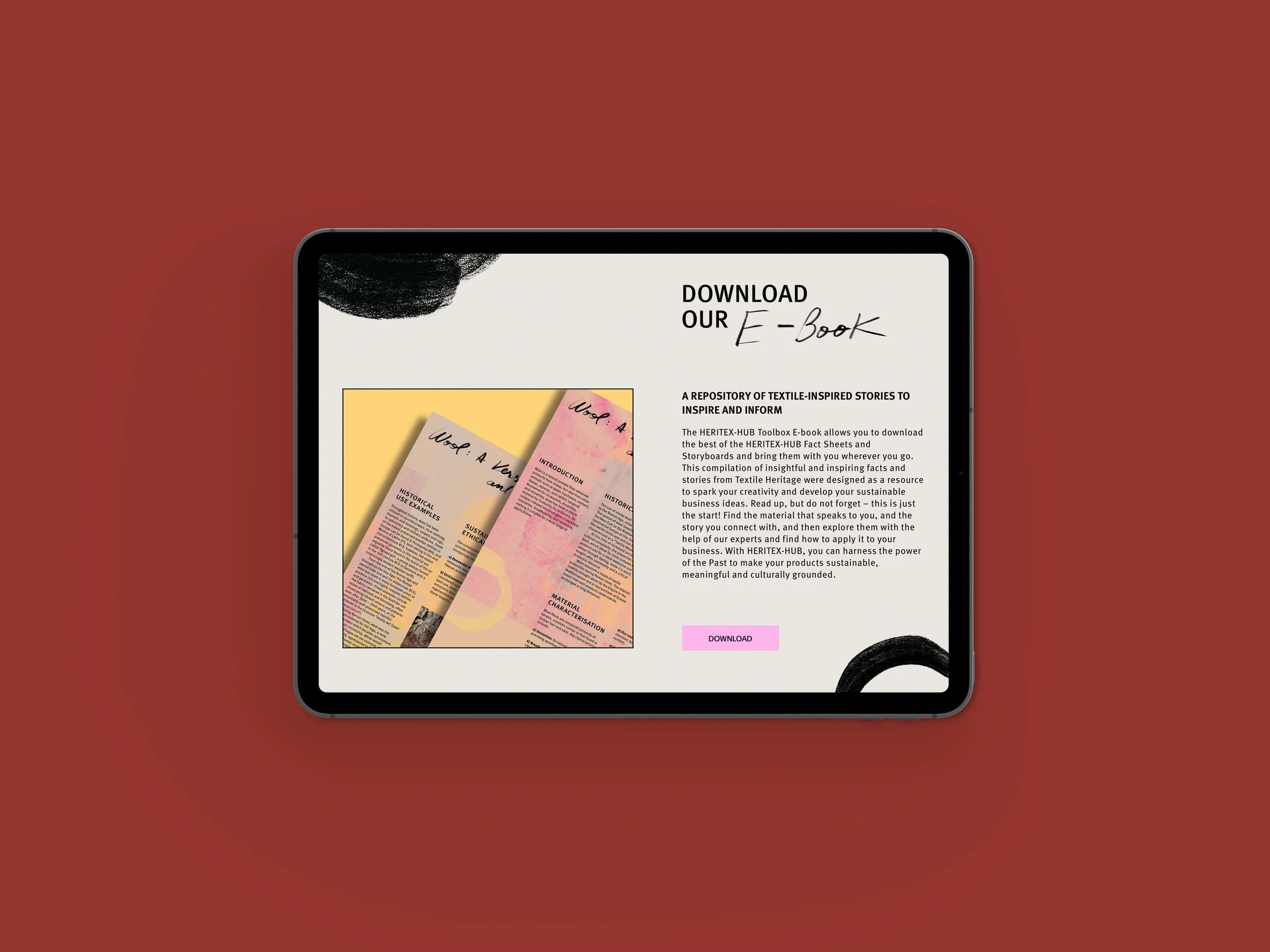
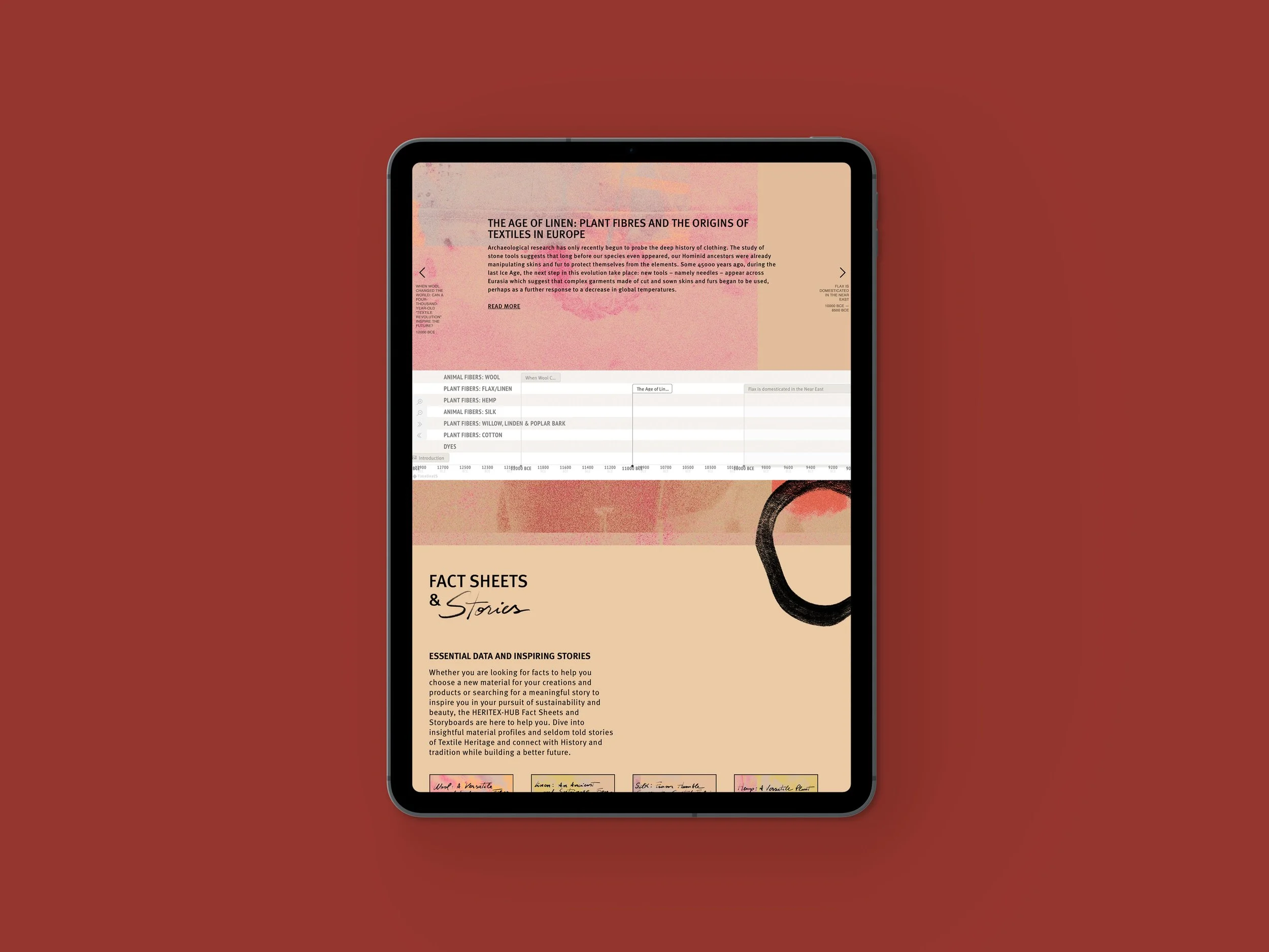
Within The Heritex Toolbox, we also created an interactive timeline spaning more than 10.000 years that allows users to navigate the development of natural fibres — such as linen, hemp, wool, silk, cotton — and trace how techniques, dyes, and traditions evolved across the globe and centuries, as well as fact sheets and an e-book.
As we began, we asked ourselves: How can we create a flexible visual system to communicate and make legible thousands of years of textile history, without feeling like an old, dusty archive?
Initially, we worked on the project’s brand name, from TheHeritex Toolkit to The Heritex Toolbox, to amplify a message of craft and ownership.
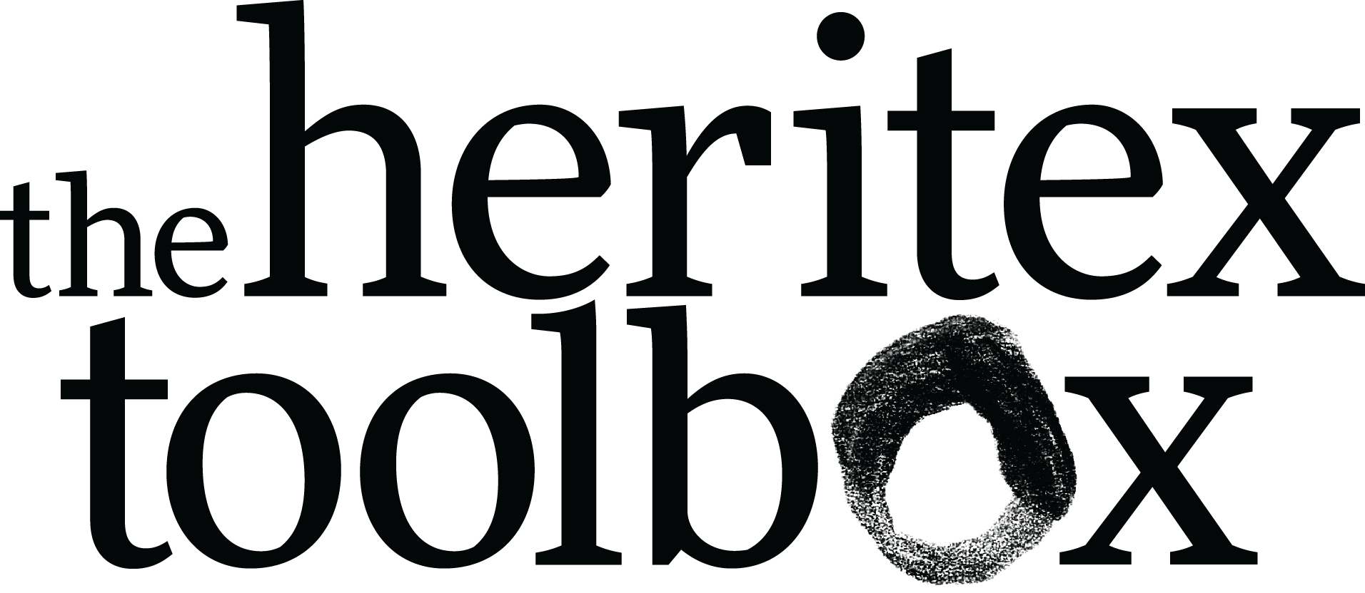
For the visual identity, we started with the logo. We had some specific challenges with the glyphs: the repeated “x” and “t” in both words, and the way the words stacked. The aim was to create a cohesive logotype that would represent the project and all its details, be tactile and expressive, but not overpowering.
Something we knew right away was that we wanted to work with a humanistic serif type family, for all its meaning and close ties to calligraphy.
Humanistic typefaces were the first Roman typefaces to emerge after centuries of handwritten forms. The letters initially were written with a broad-nib pen held at a consistent angle, with an oblique stress gradually drawing from thick to thin. We can see these details, particularly in the terminals and asymmetrical serifs.
The standout "o" in "toolbox," drawn with charcoal, is the hinge upon which the entire identity turns, as part of the imagery.

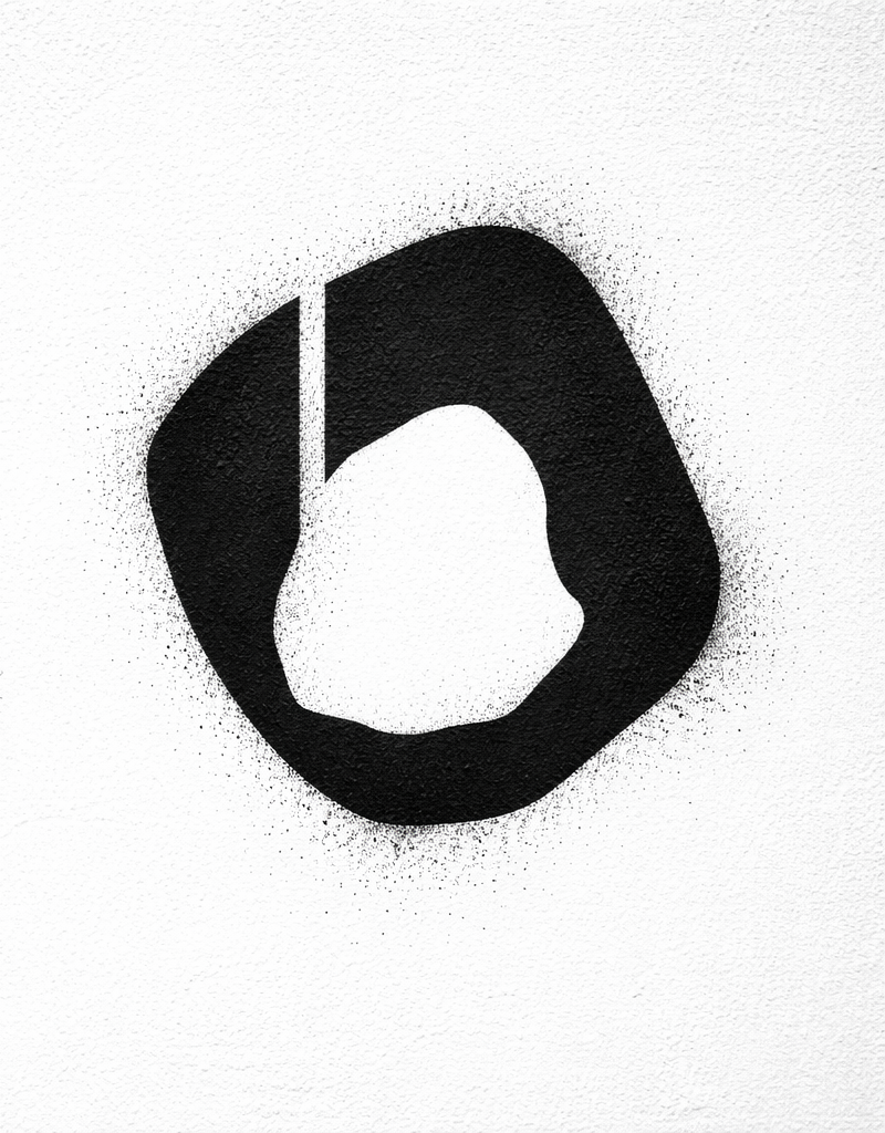
Stencil version of the letter "o" to be applied at future events.
Typographically speaking, we dived deeply into FontFont. The logo is set in FF More, a typeface by type designer Łukasz Dziedzic, released by FontFont in 2010, and the headline and body text typeface is FF Meta, designed by Erik Spiekermann.

FF Meta's stroke ends, and partially curved terminals create a distinctive character, warmth and texture, further supported by round dots on the "i" and "j" and distinctive two-storey "g". Meta is also highly legible at small sizes thanks to its large x-height and open counters, making it perfect for the high volumes of text in this project.

For us, FF Meta also references the revolutionary type scene of the 1990s, with the growing accessibility of computer hardware and font software during the ’80s and ’90s, connecting to the project’s attitude and the toolbox concept.
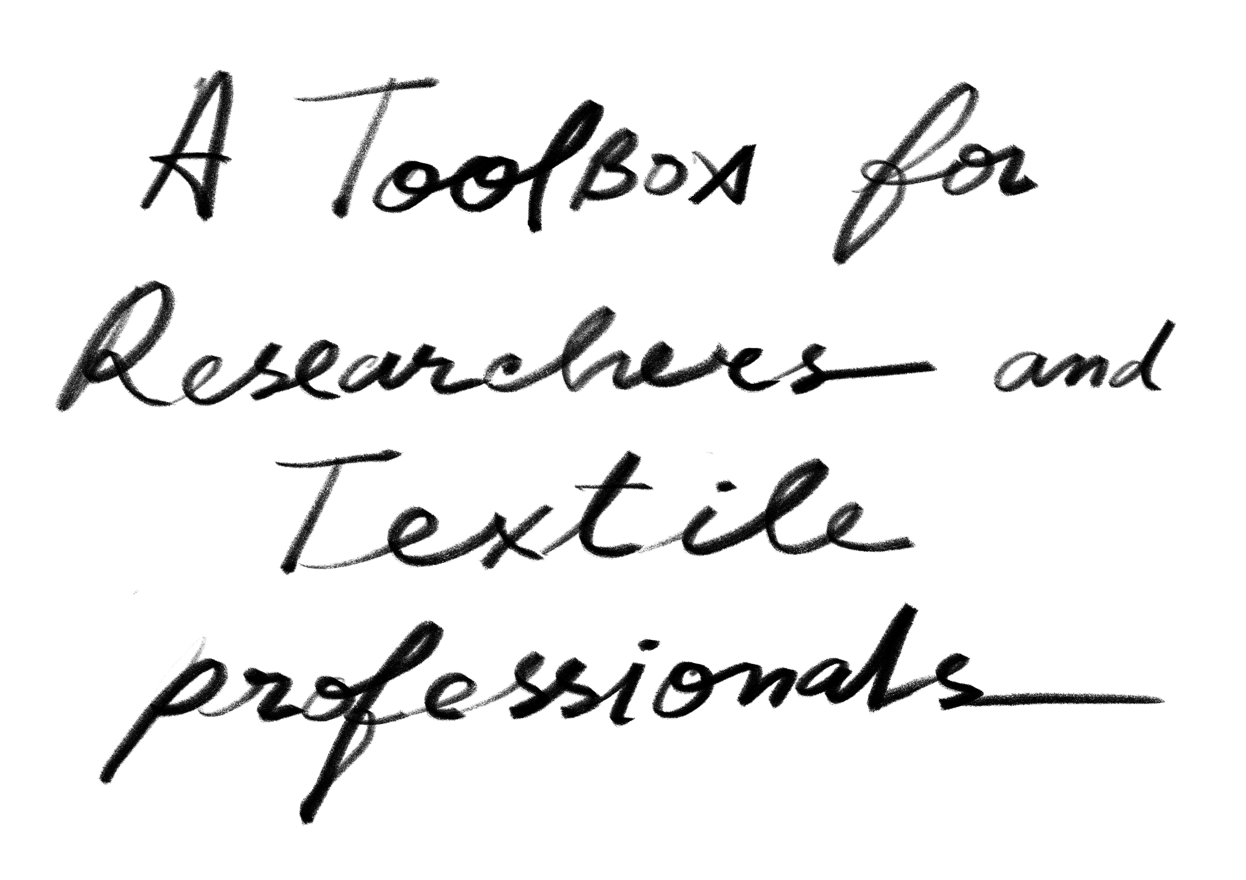
Pairing with the FF fonts is a handwritten script that runs across the visual identity, in strategic places, graphically balancing the text-dense information, conveying the idea of note-taking during research and spontaneous creative thinking. The calligraphy has a highly oblique gesture, as does the urgency and the need to quickly make notes. Enthusiasm, aliveness and depth.
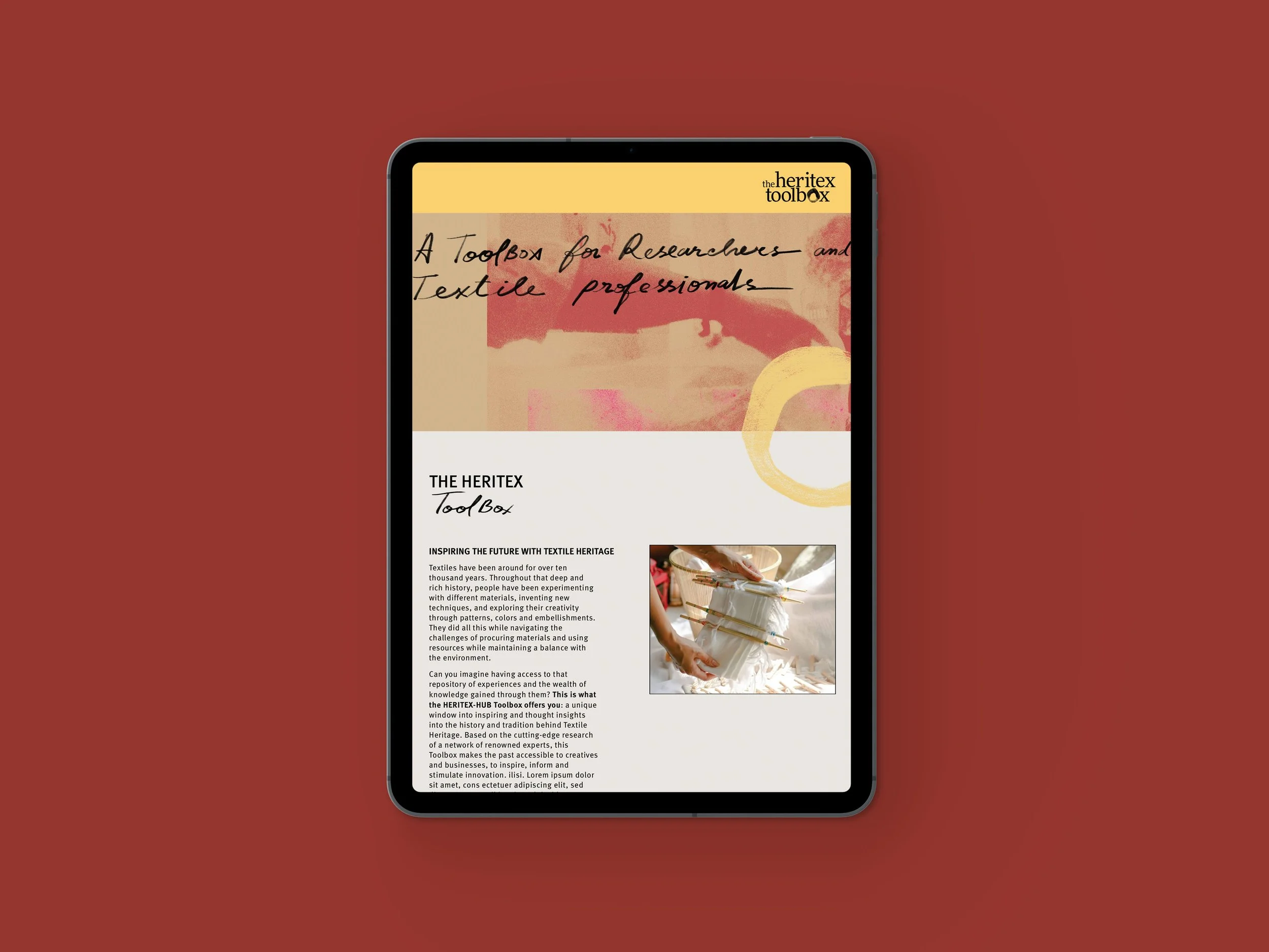
The website functions as a tool for gathering thousands of years of textile history, featuring a timeline and downloadable fact sheets and stories.
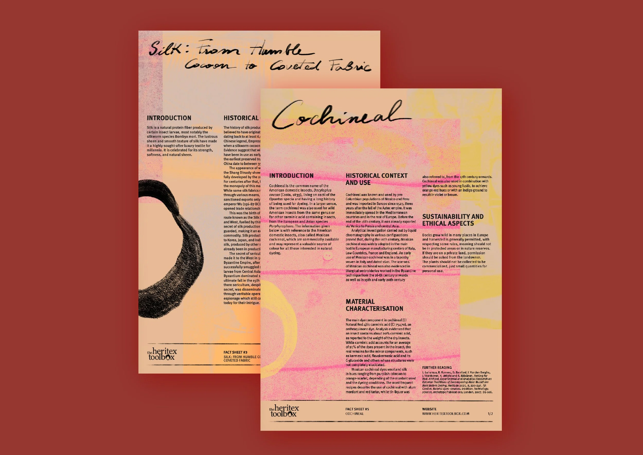
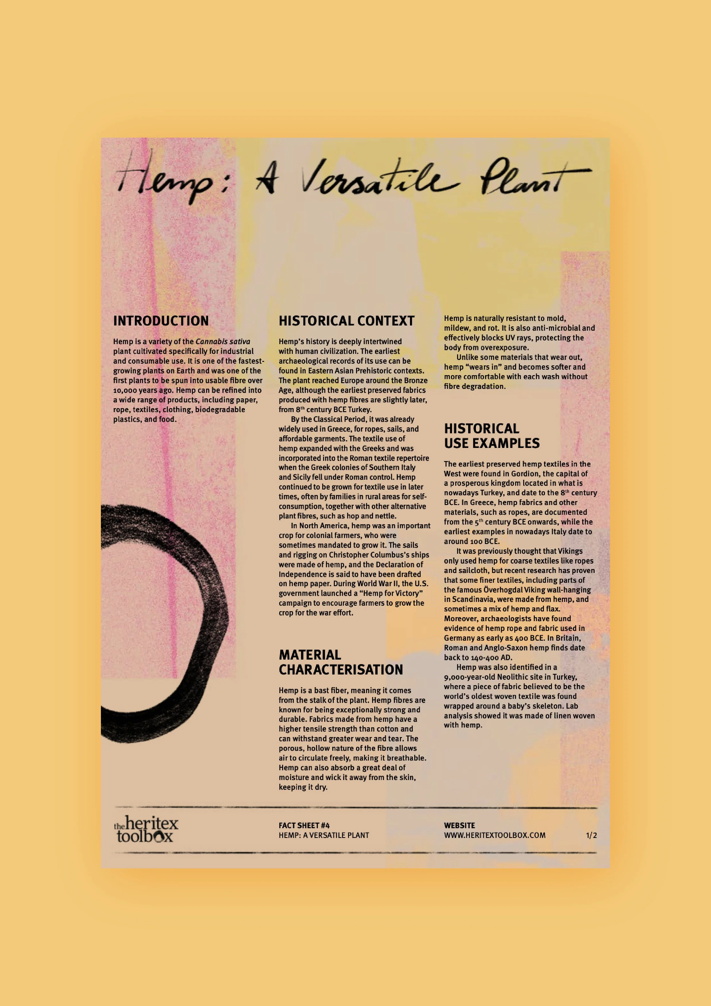
Fact sheets and stories, available for download.
The design language borrows its warmth from the materials it references (wool, silk, flax, linen, hemp, and cotton) and from natural dyes derived from plants and animals, such as madder and cochineal for reds and pinks, and saffron for golden hues.
The visual system is anchored in layering the expressive and the functional without allowing either to dominate. The collaged monotone imagery used across the identity, in pinks, reds, and golds, overlaps with photographic documentation and operates as a visual prologue. The imagery and graphic background establish the atmosphere, signalling experimentation, texture, and a pinch of mystery.
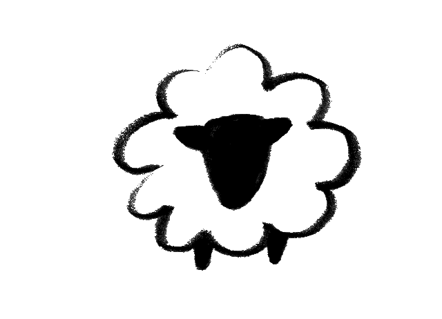
To identify each fibre, we created a series of icons in charcoal,
in the same handwritten style.
With the visual identity in place, we faced one significant challenge in the project: creating an embedded textile heritage timeline spanning more than 10.000 years!
For this interactive tool, we aimed to develop a navigable experience that could accommodate multiple types of content, including text, images, and embedded videos. The timeline needed to be not only scrollable and clickable, but also structured in a way so that users could explore and locate information clearly and organically.
Using open-source solutions (used by the likes of The Financial Times), we built a fully functional timeline with information on fabrics, dyes, techniques, and other relevant topics, along with stories exploring textile history, materials, traditional techniques, and innovations. Drawing on our UX/UI design knowledge and the project’s visual identity, we aimed to create a coherent, seamless experience across the website. As such, one of the main challenges involved understanding the possibilities and limitations of the original code and identifying ways to overcome these constraints through customisation (and some heavy-duty coding).
Through this process, we structured the timeline into distinct groups, such as plant- and animal-based fibres and dyes, enabling quicker identification and clearer categorisation of information. We also worked extensively on the visual aspects of the interface, including the colour system in the navigation of the timeline and the customisation of typography, ensuring consistency with the project’s overall visual identity.
The photos and images were also consistently treated in terms of colour and format, reinforcing visual identity across the platform. All in all, this part of the project represented not only a technical challenge but also an opportunity to integrate and balance functional development with graphic design principles, an approach that is central to our practice as designers.
Credits:
Creative Direction: Miguel Barbot
Art Direction: Maria Helena
Graphic Design: Maria Helena, Cristiana Braz
Web Development: Cristiana Braz and Mariana Teixeira