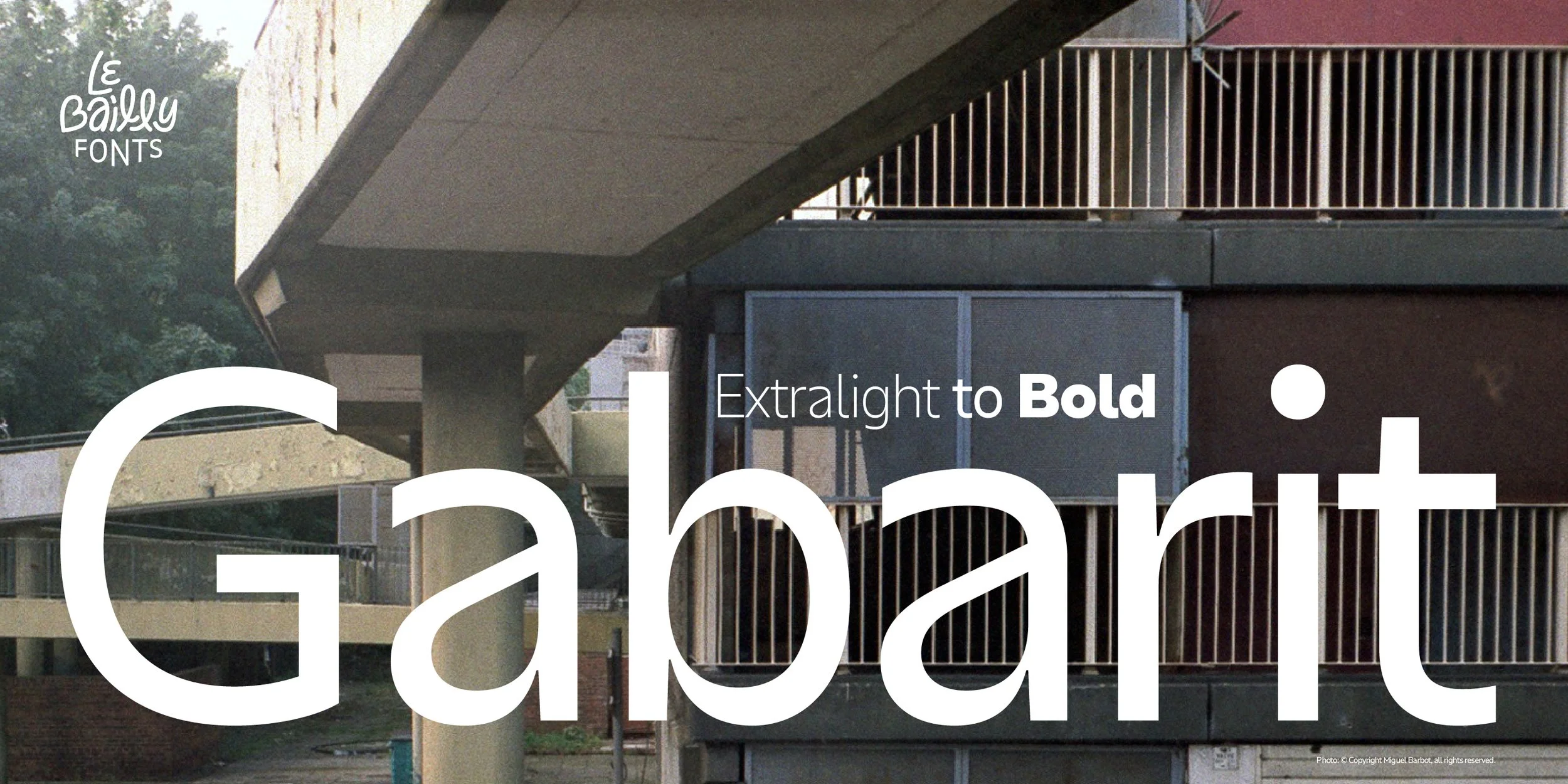
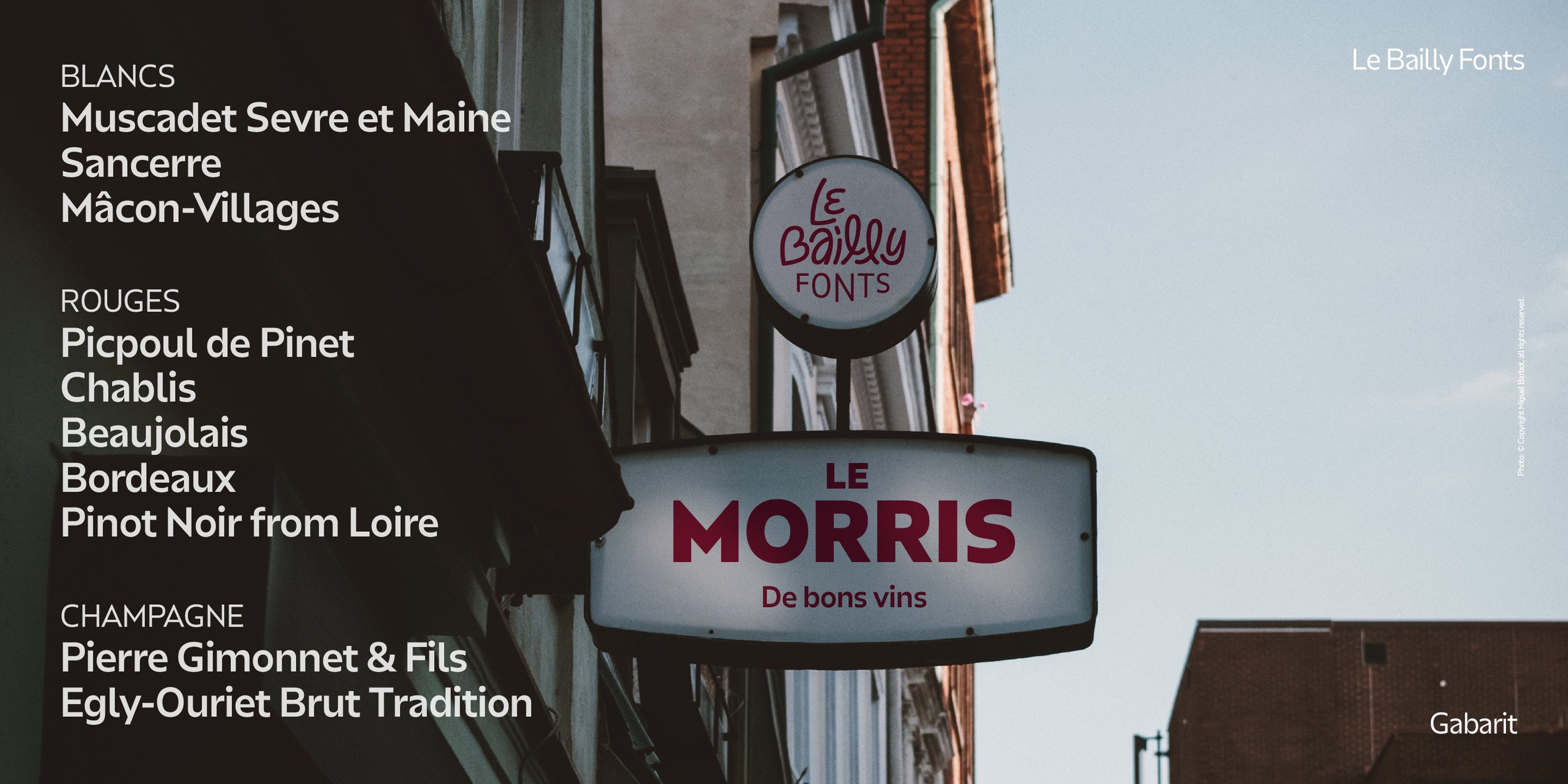
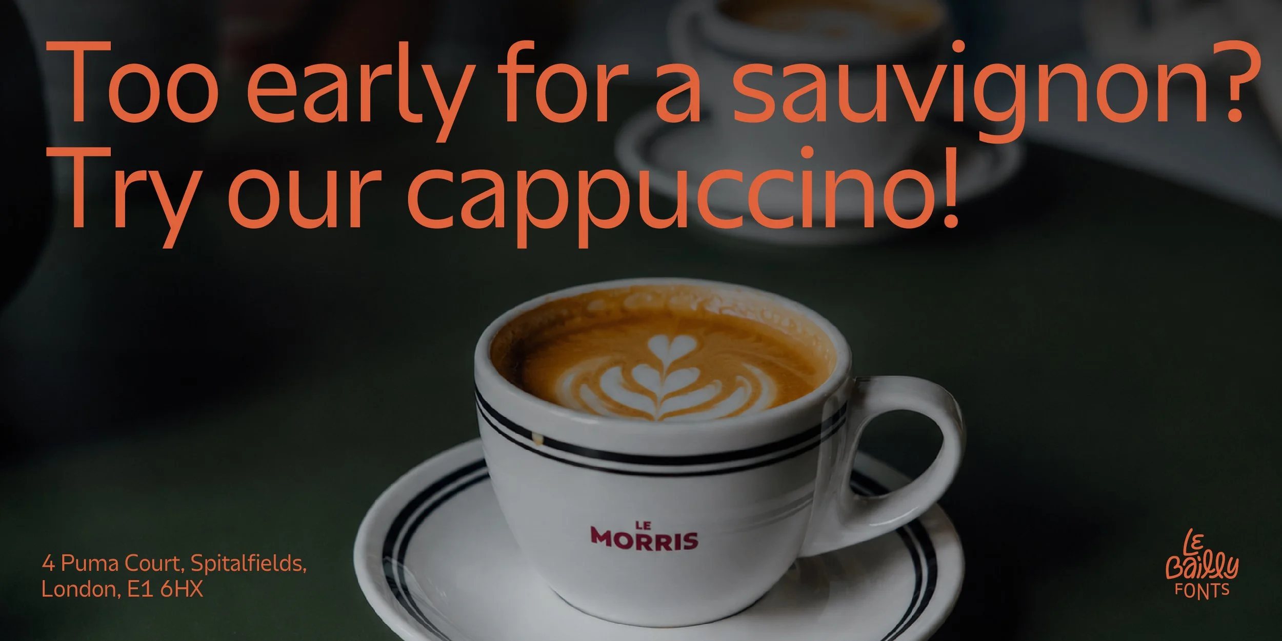
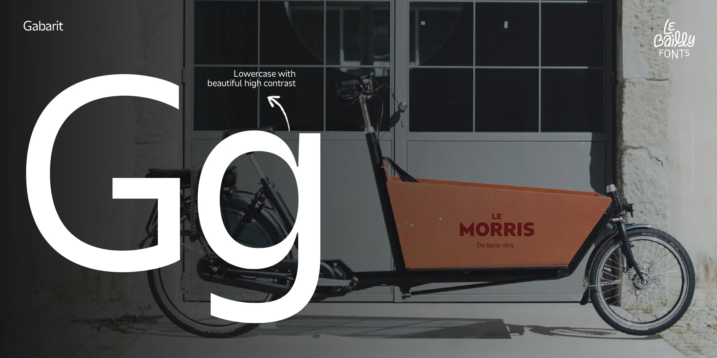
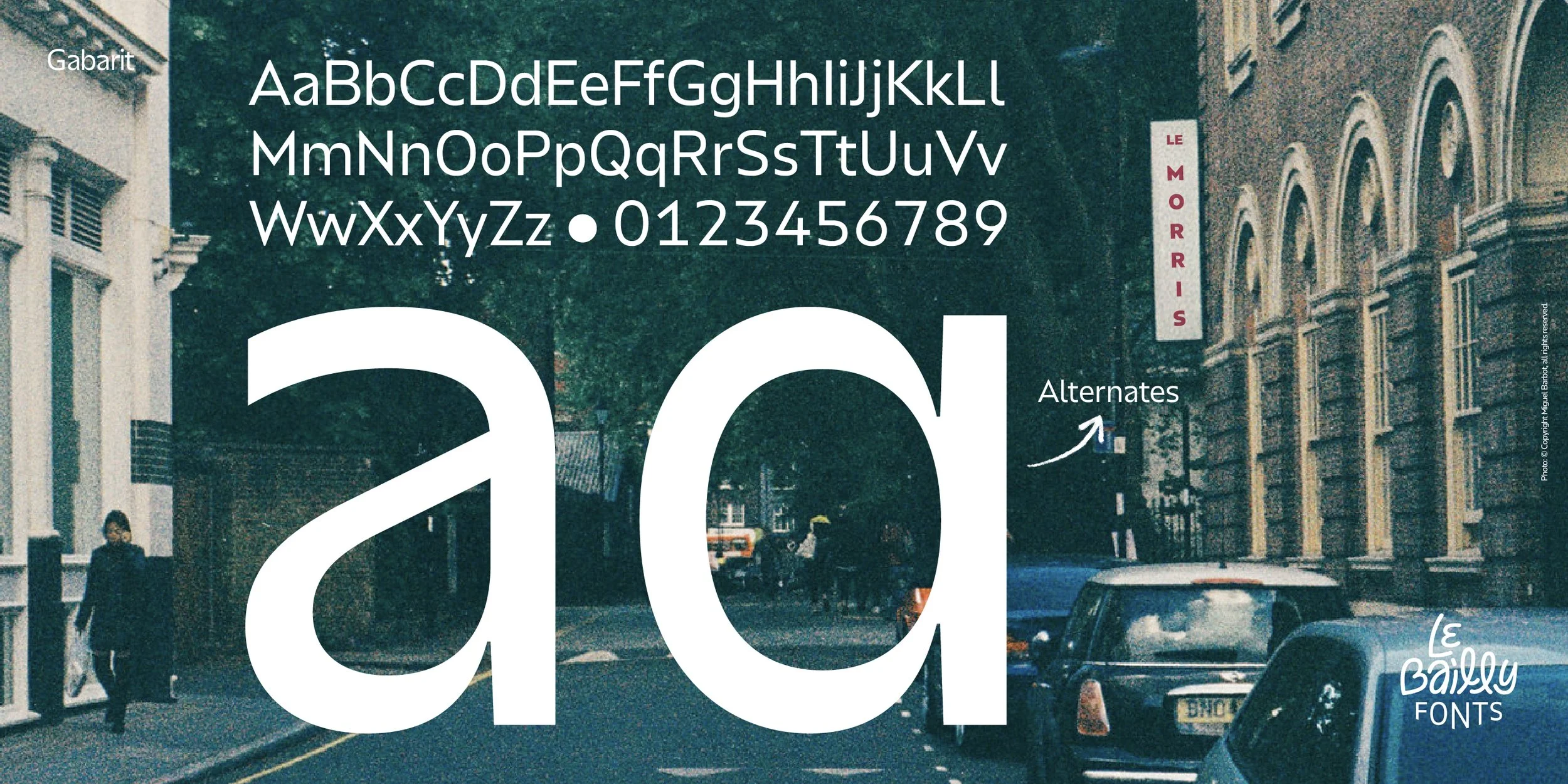
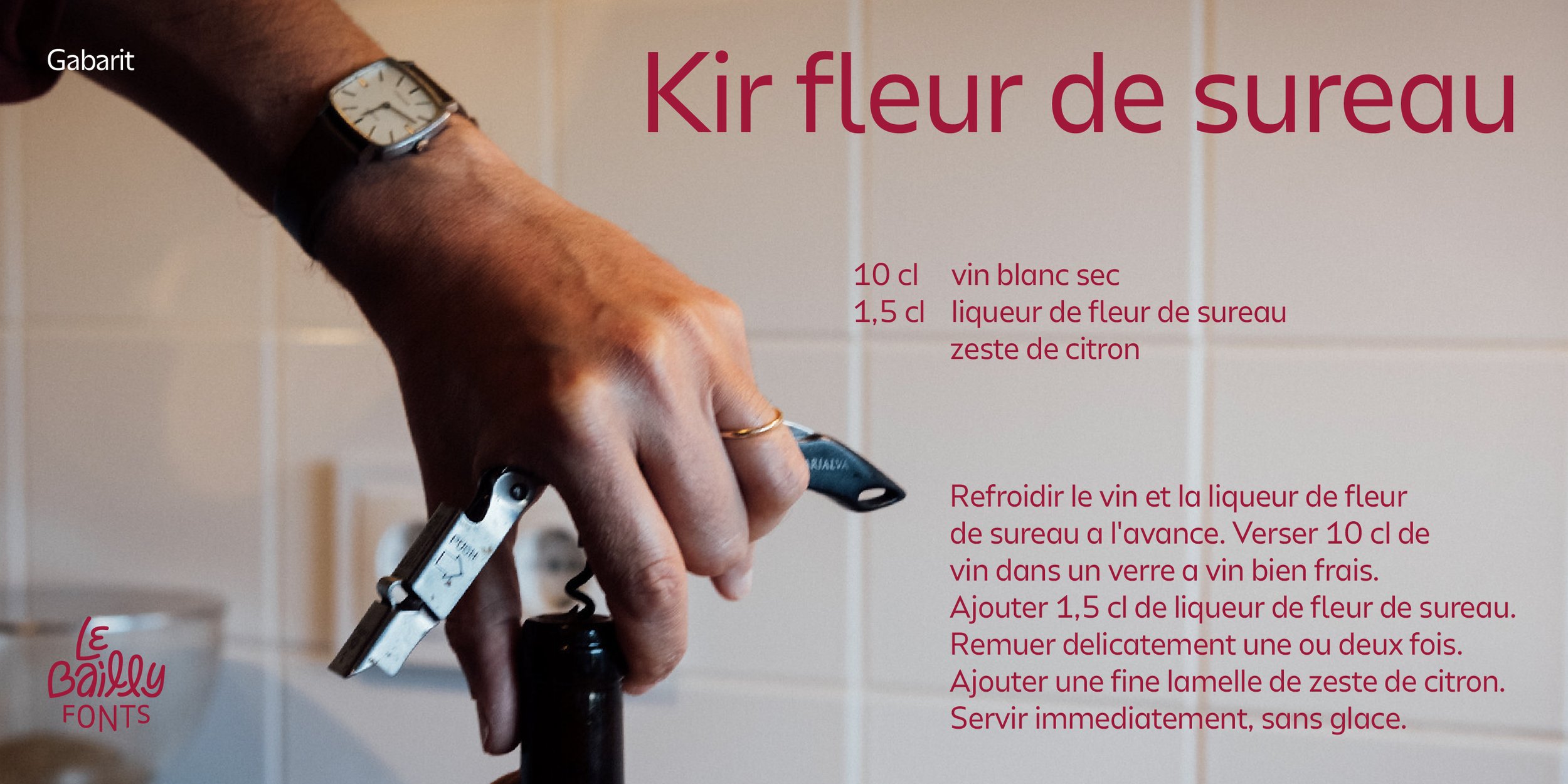
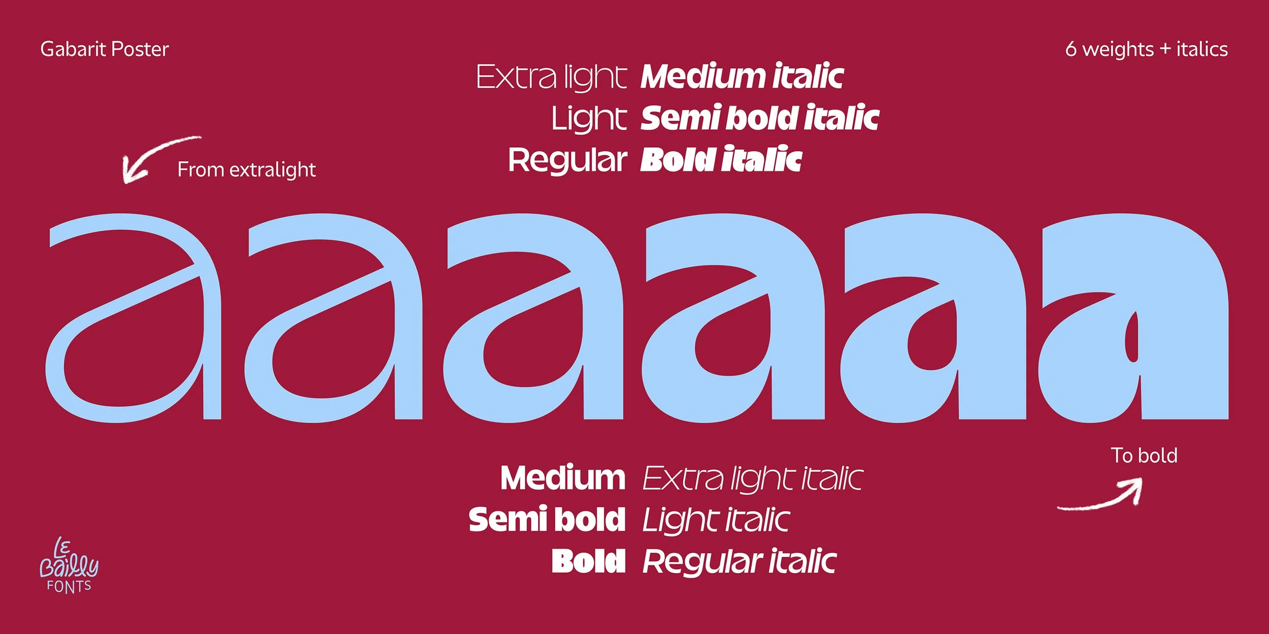
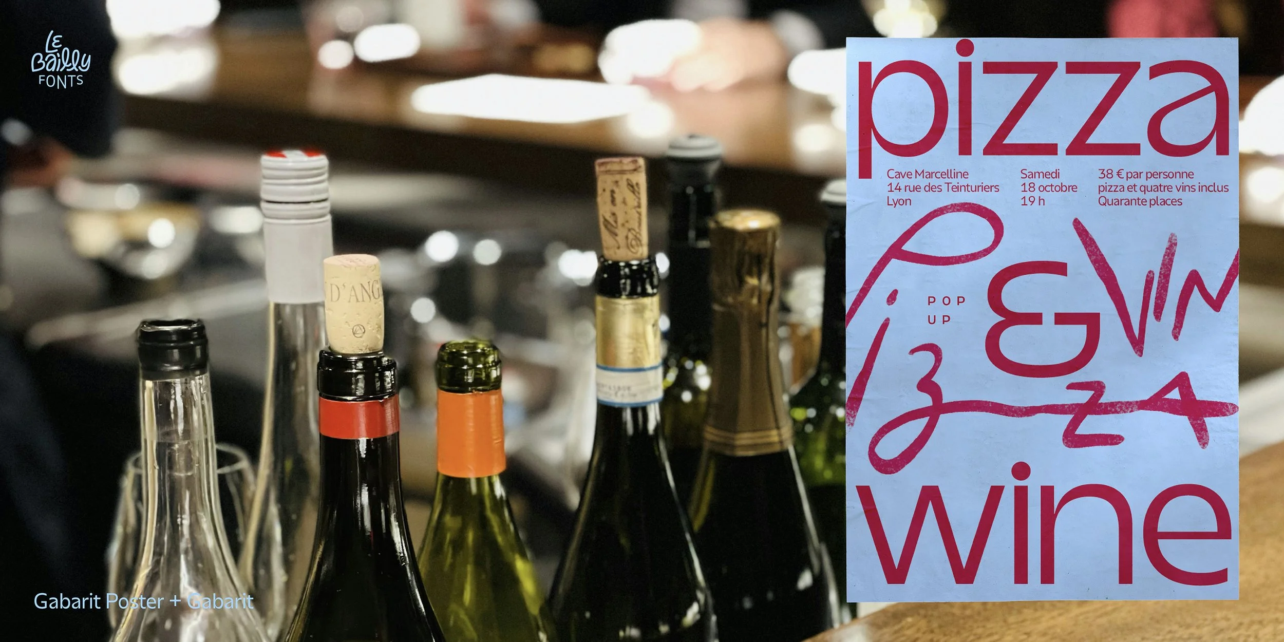
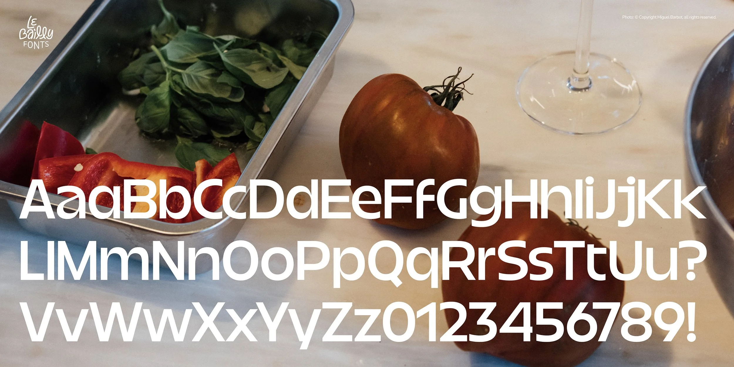
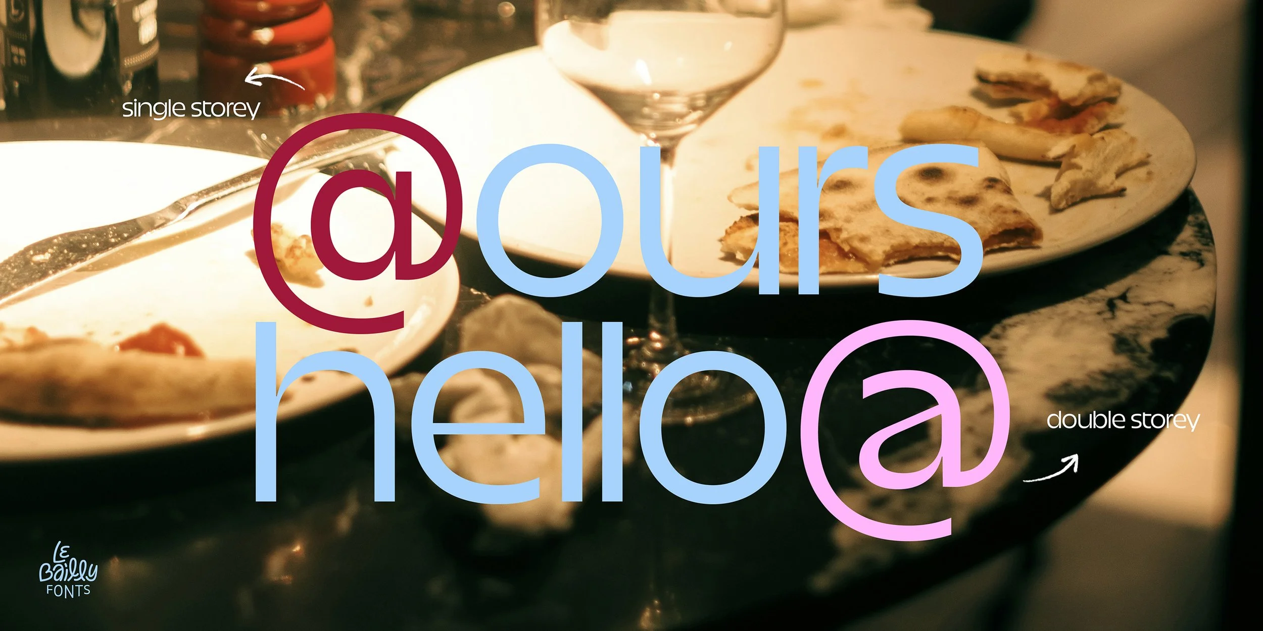
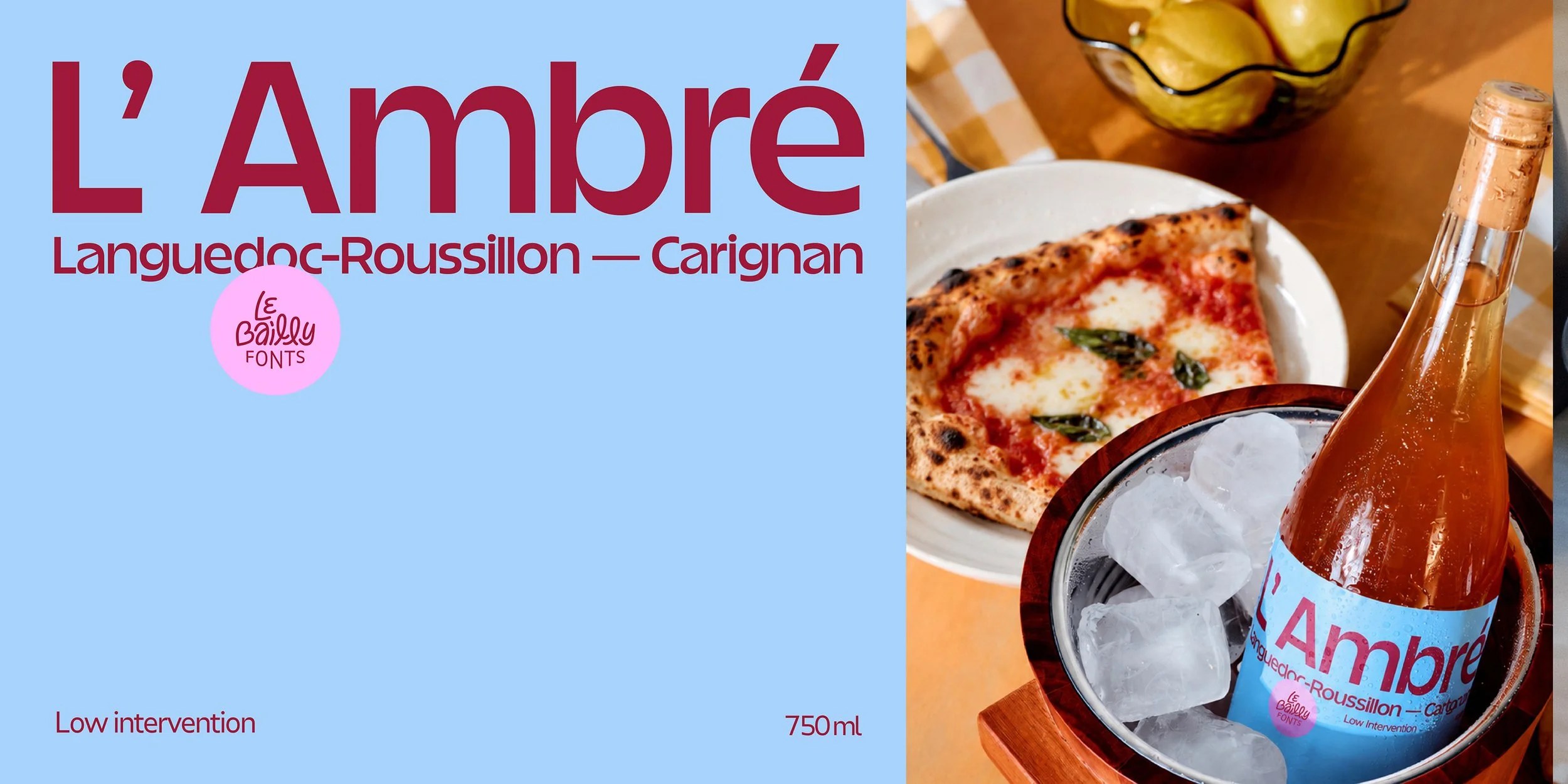
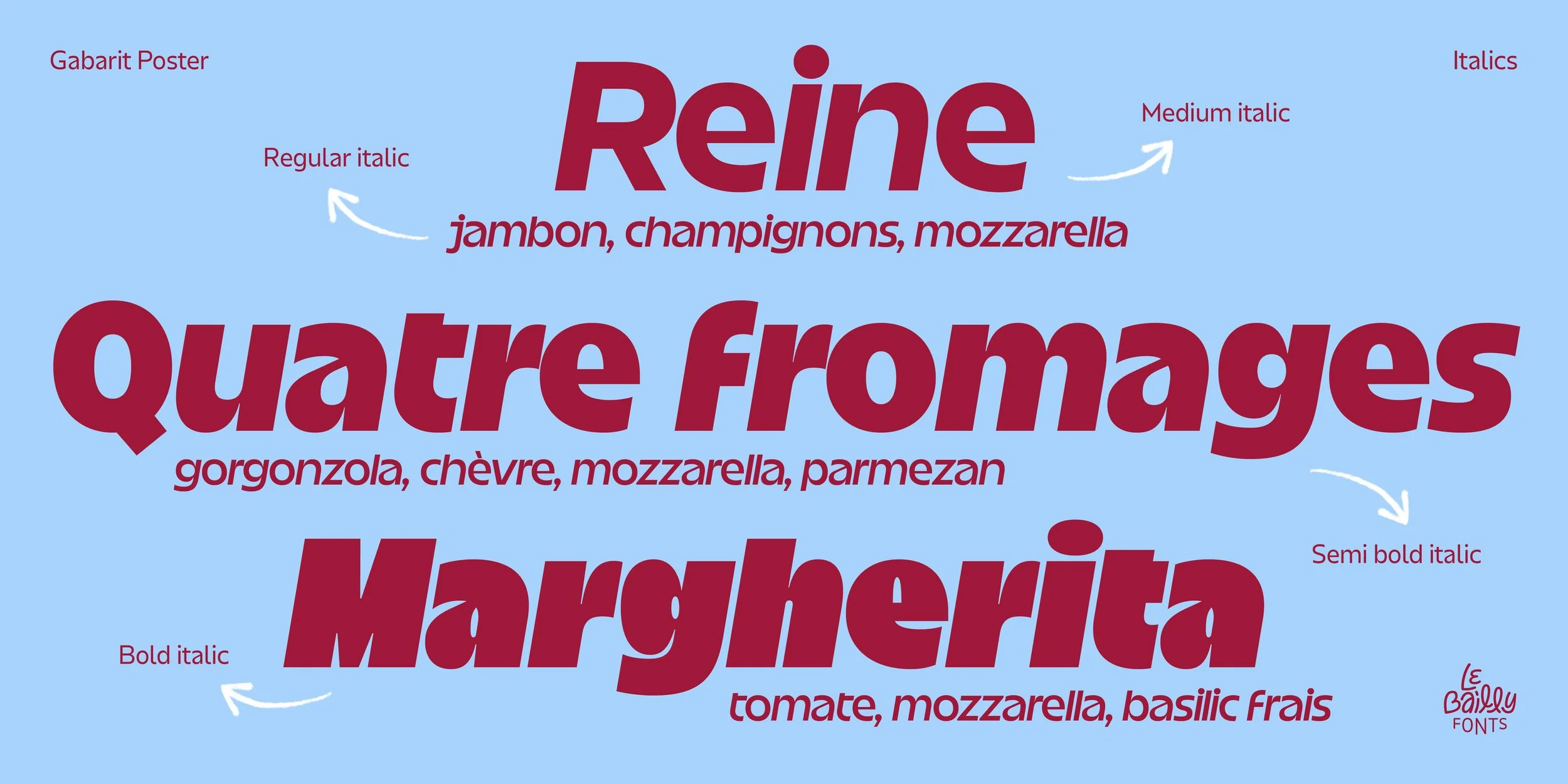
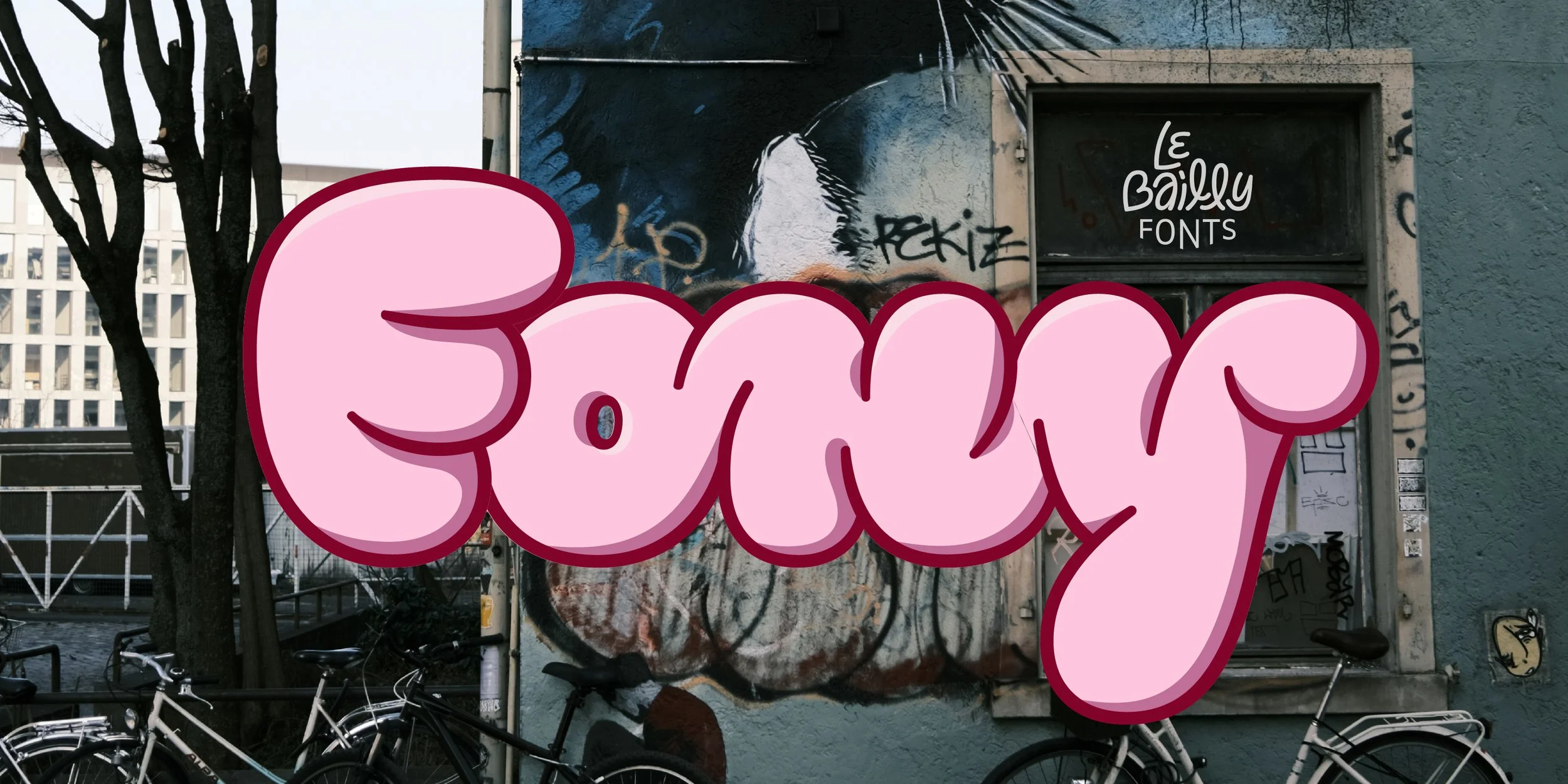
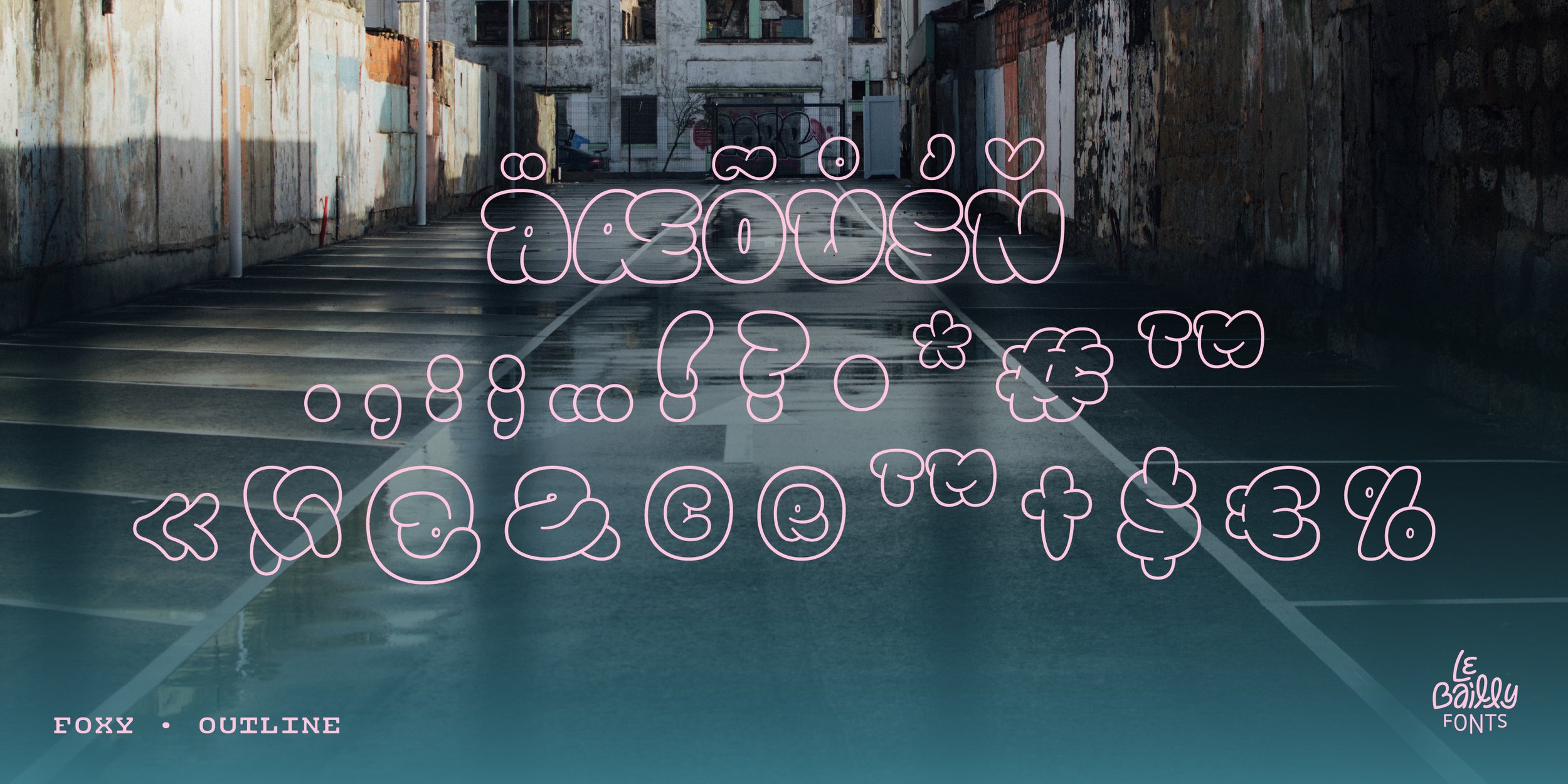
We’ve been designing a collection of images for Le Bailly Fonts typeface catalogue, each created to showcase the personality and distinctive features of each type family. We developed each set specifically for MyFonts, the go-to platform where design studios, agencies, and designers often research the perfect font for their projects.
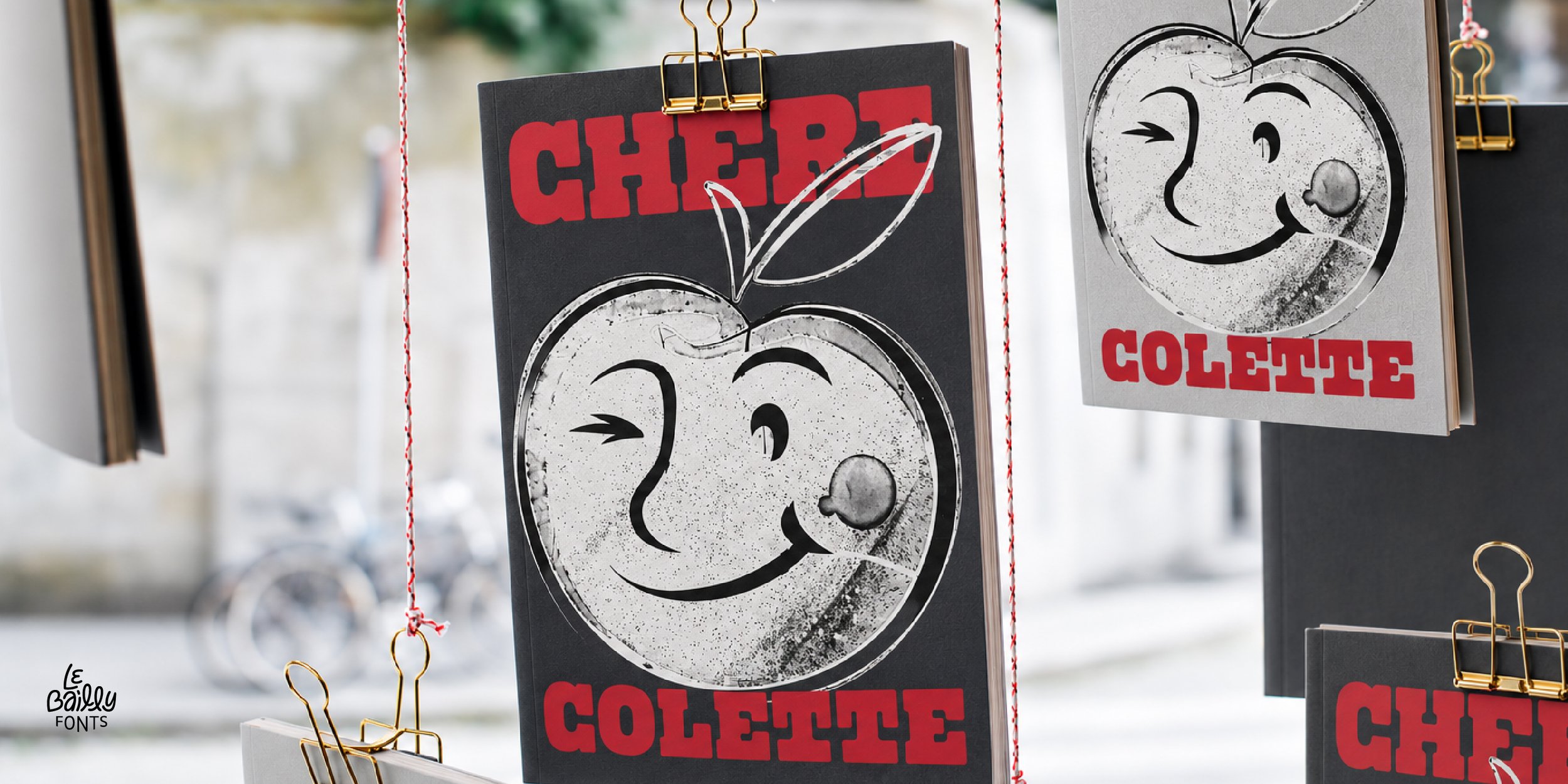
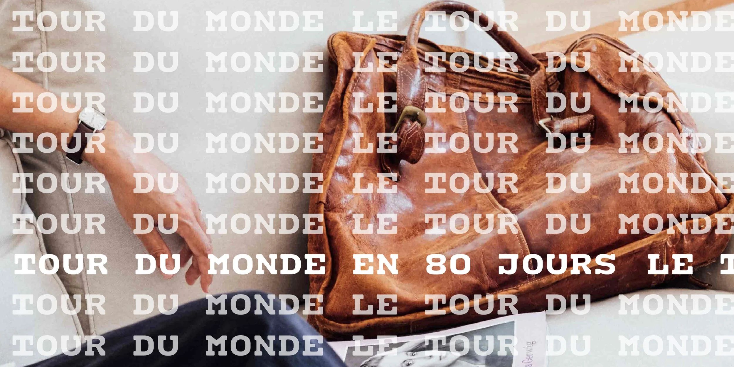
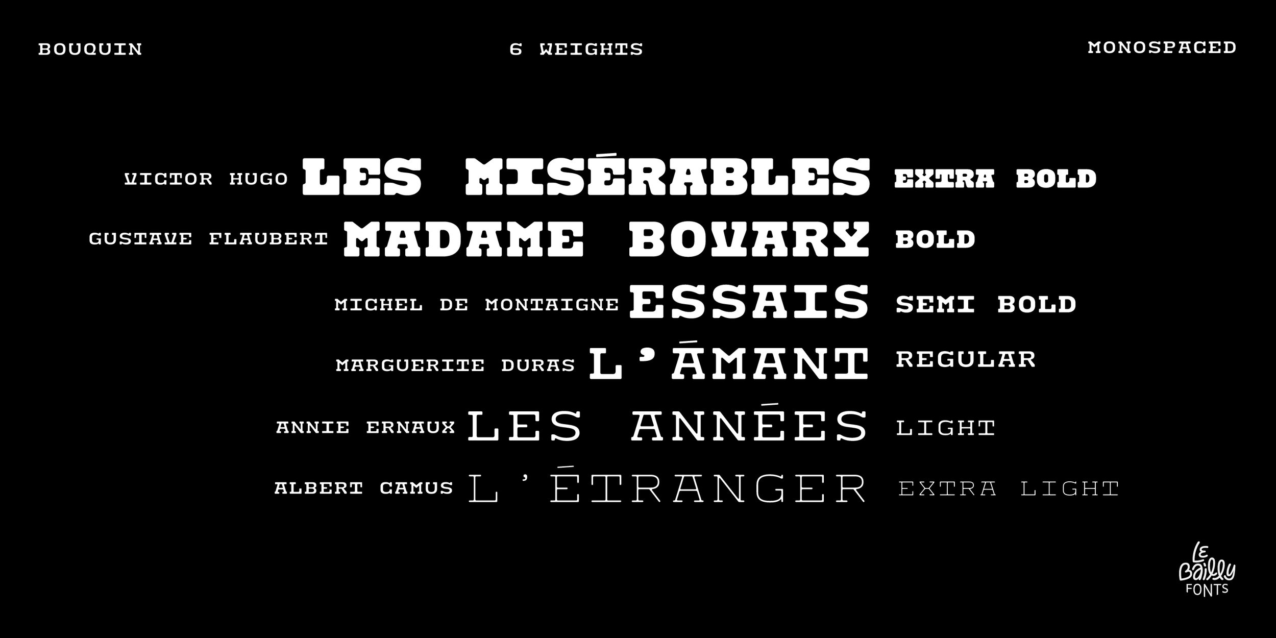
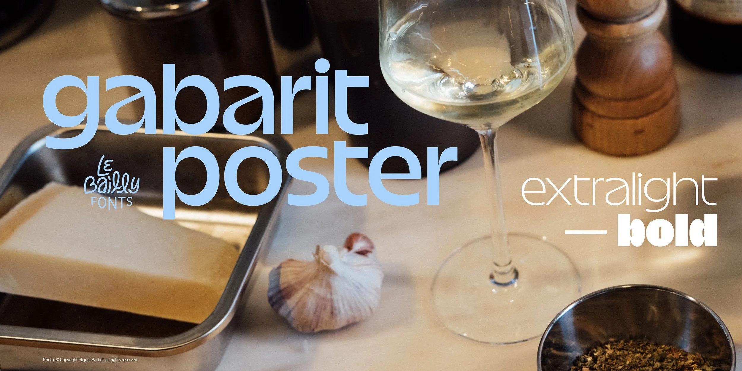
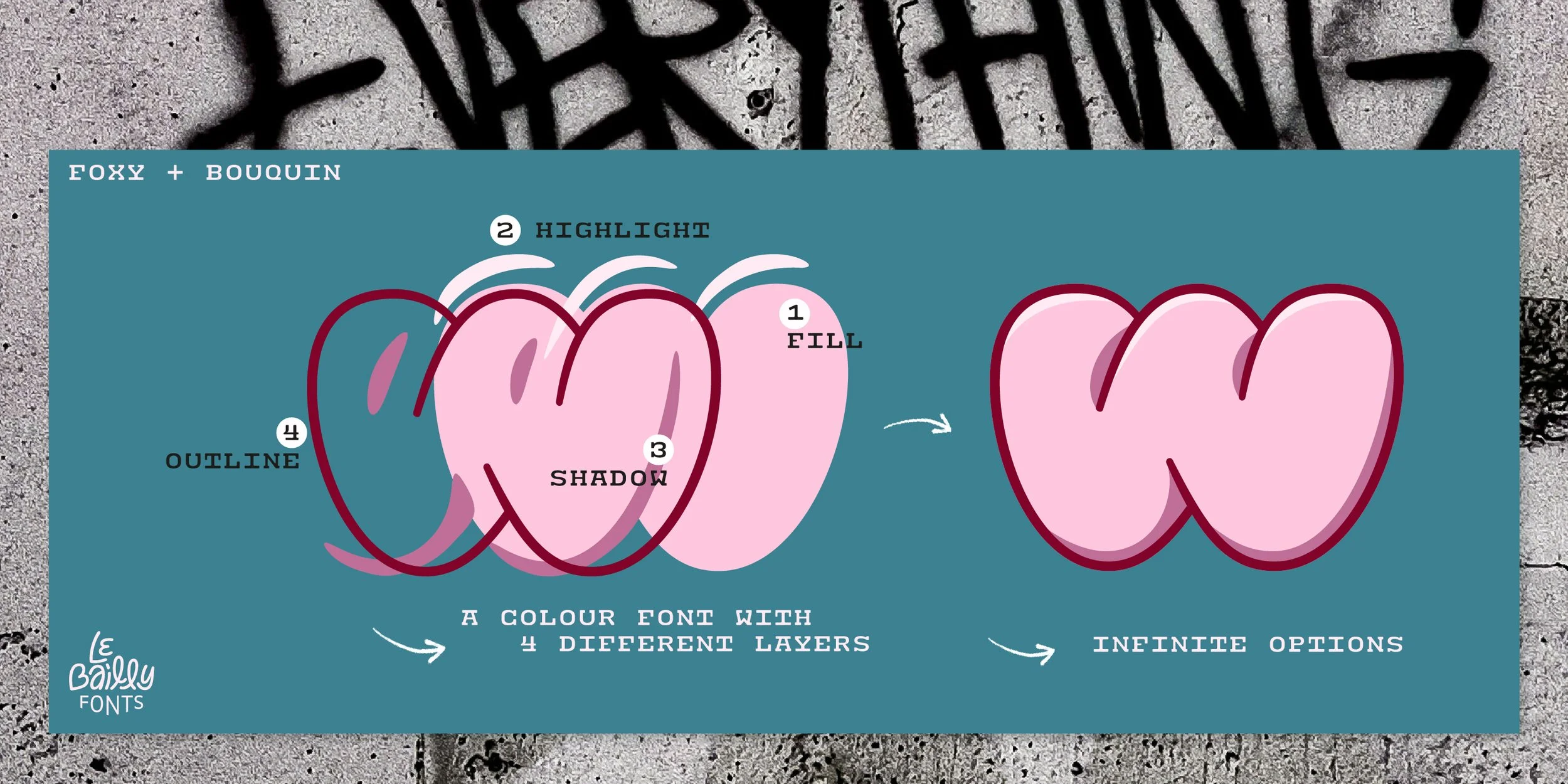
The visuals express the mood, inviting you to imagine each typeface's potential while also showcasing the story and thought process behind the type designer’s intention.
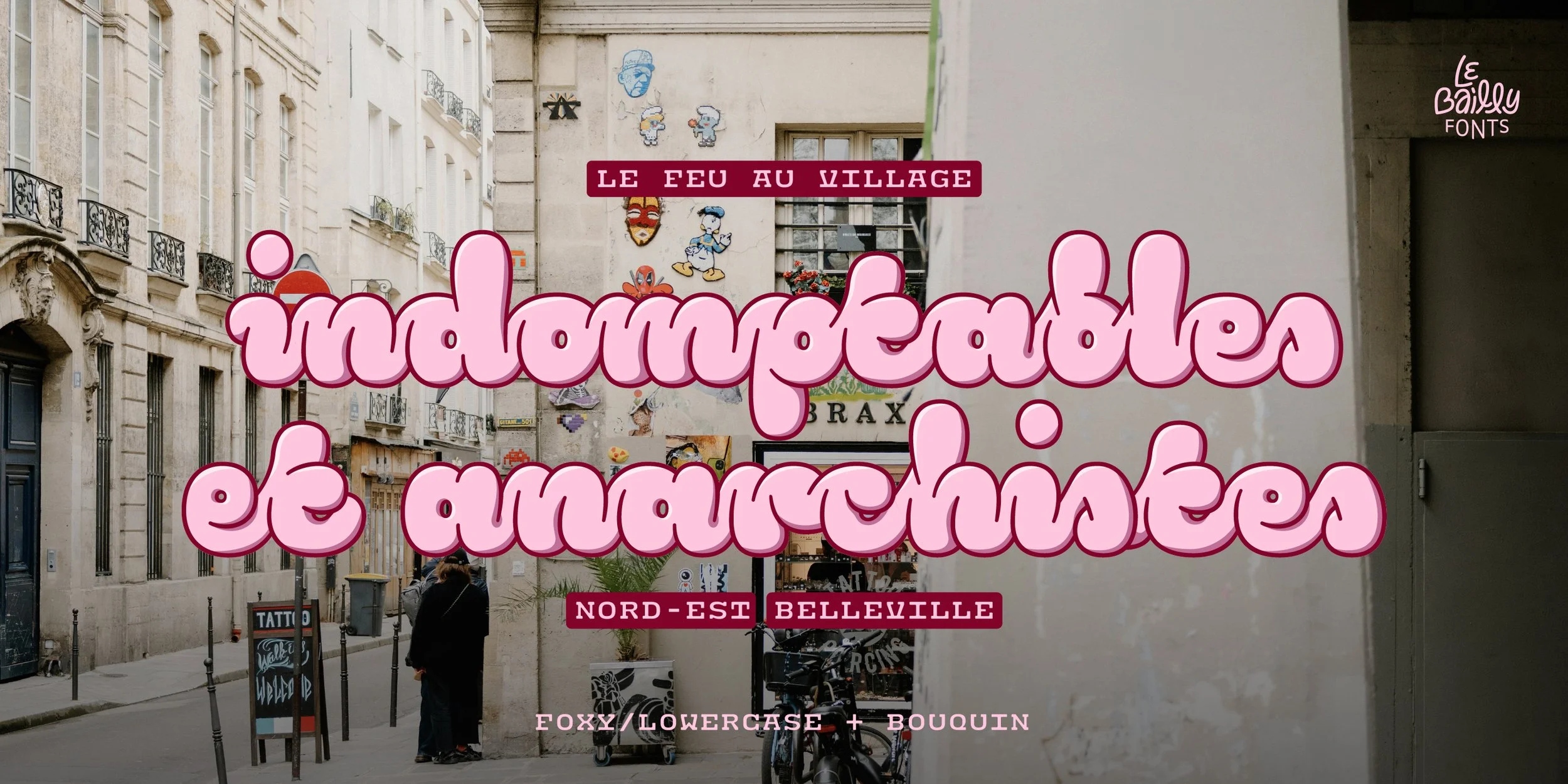
Every set is built around its own theme, capturing the essence of the typeface while revealing its versatility, range, and the many contexts in which it can be put to work. From editorial layouts to branding, packaging and signage, each composition suggests real applications, helping designers judge a family's character at a glance and picture it in their own projects.
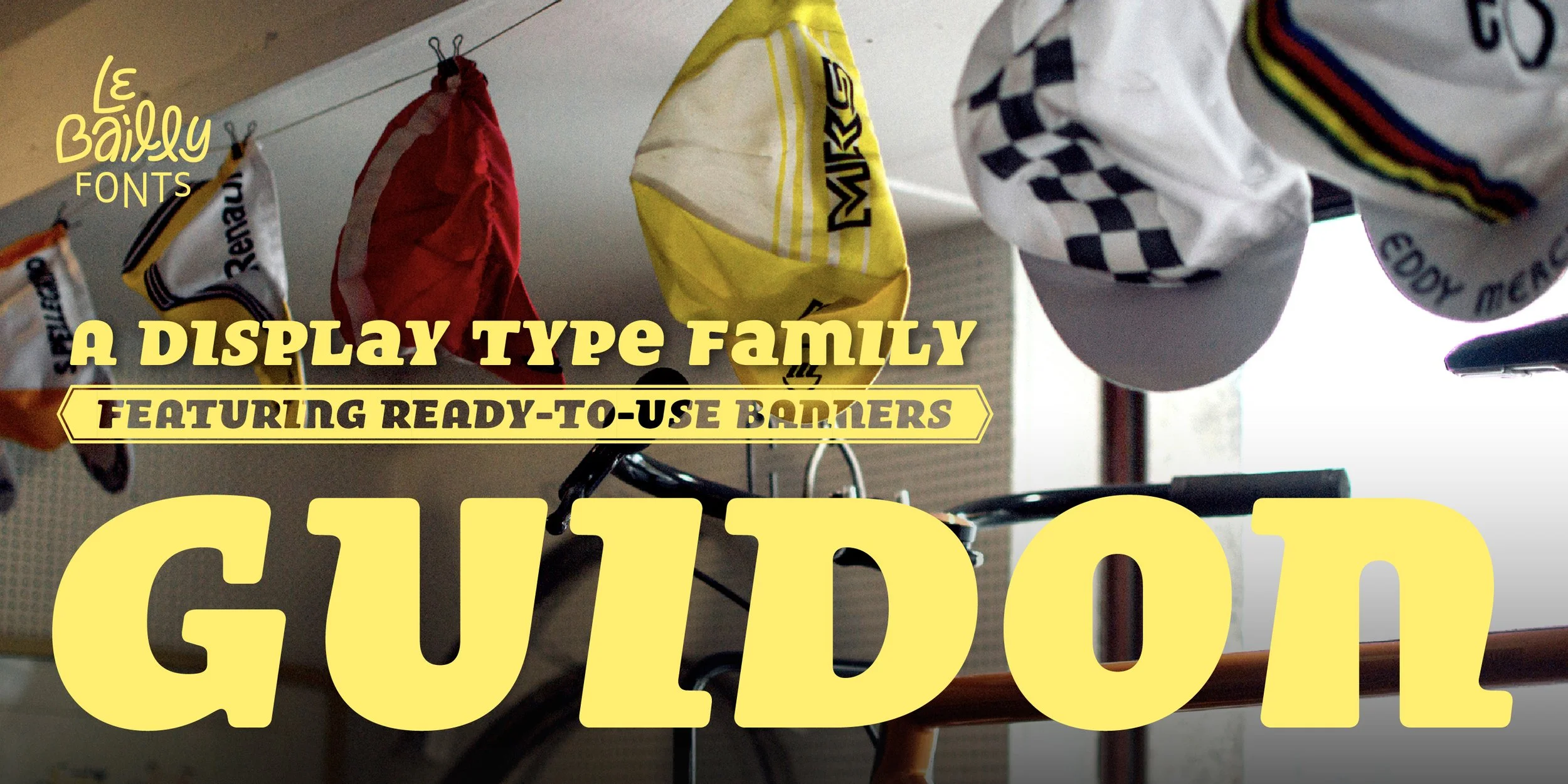
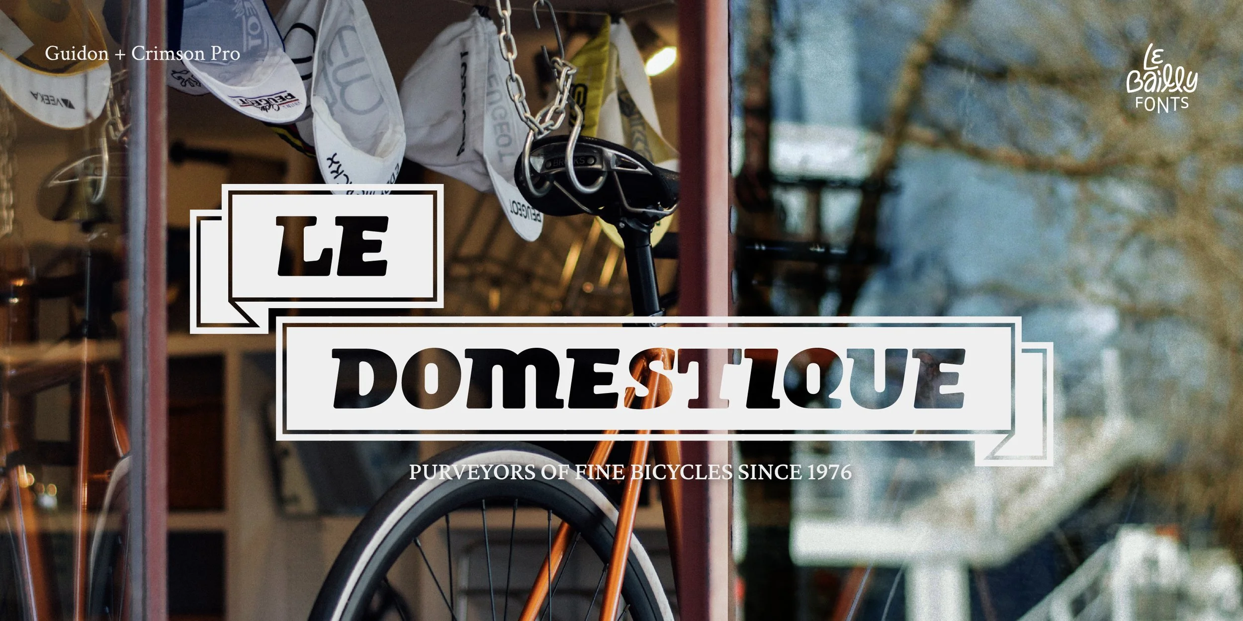
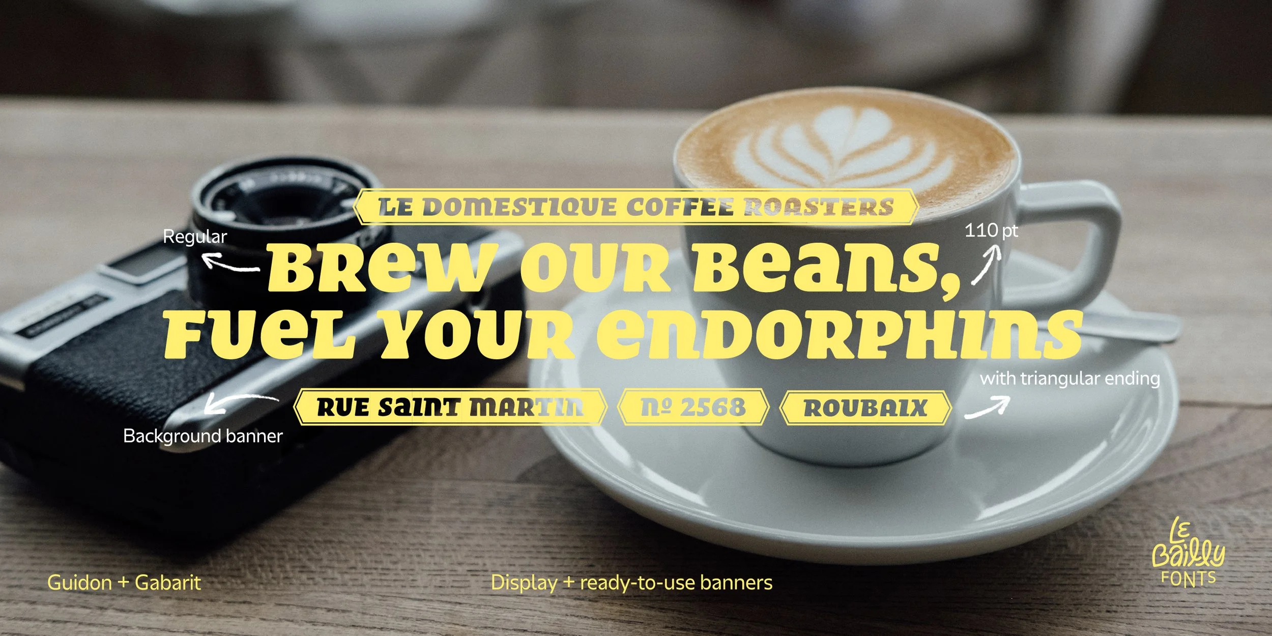
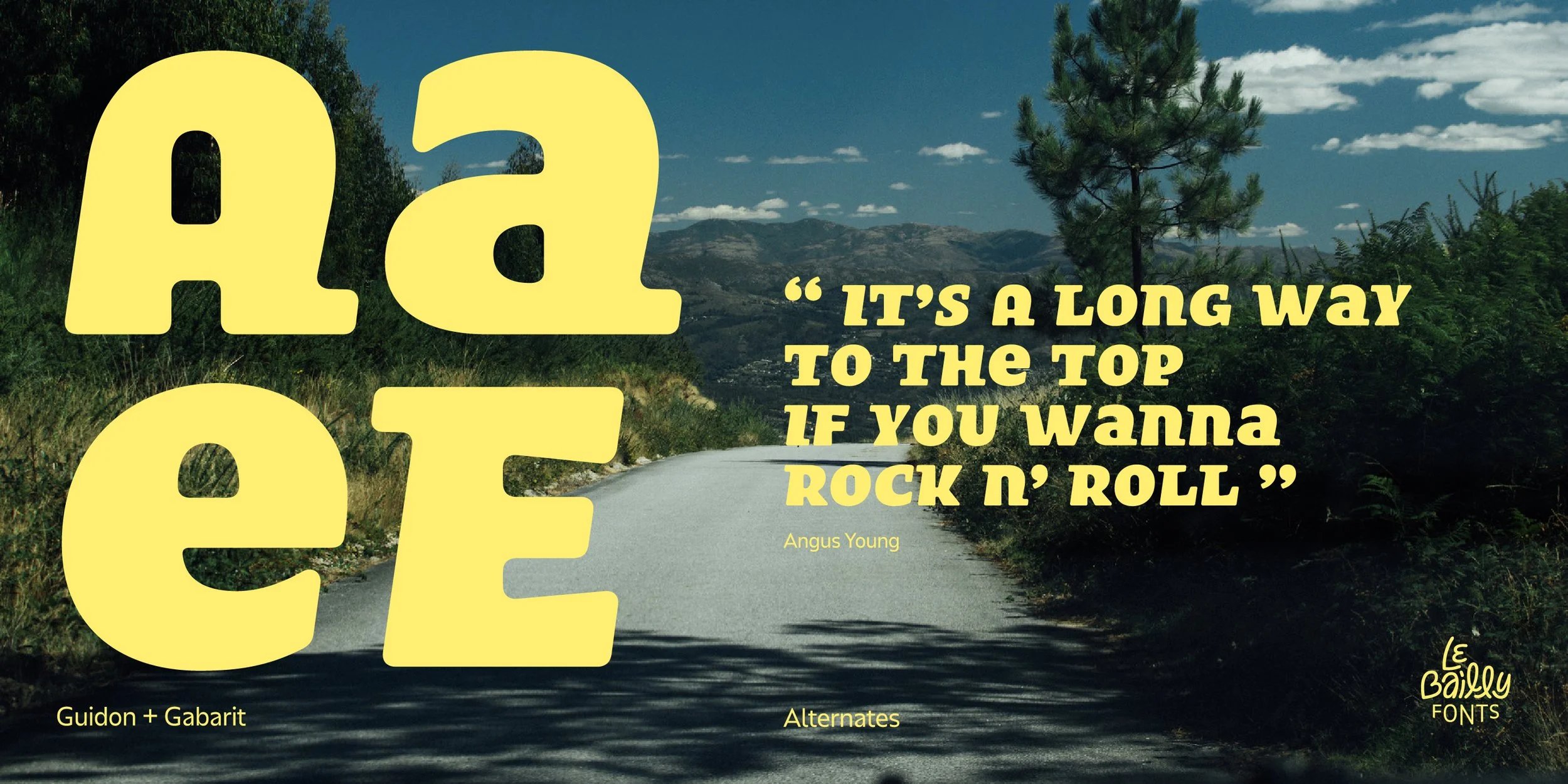
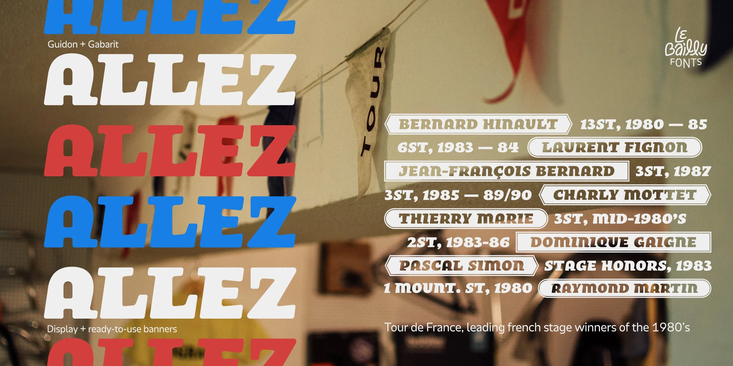
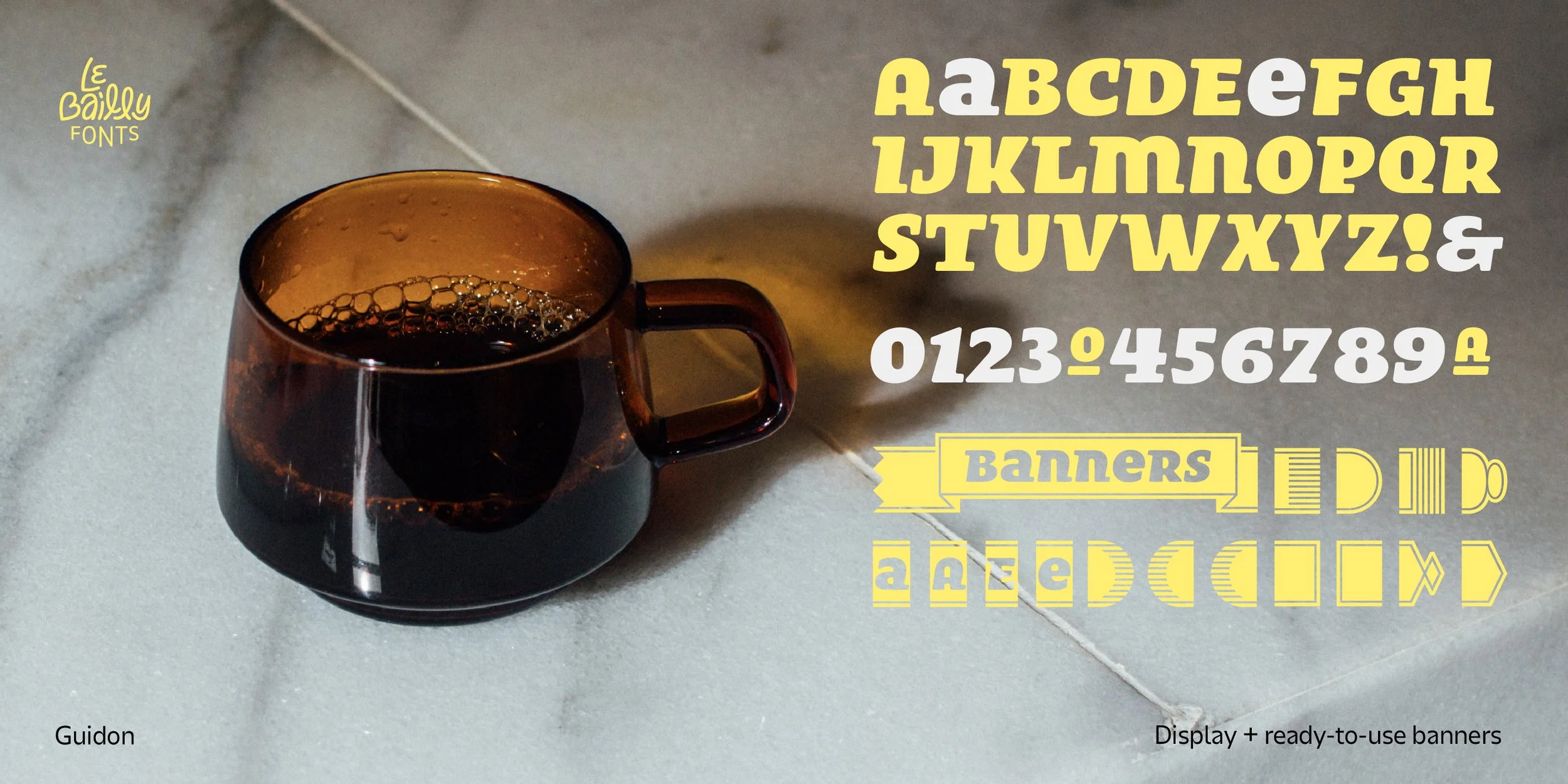
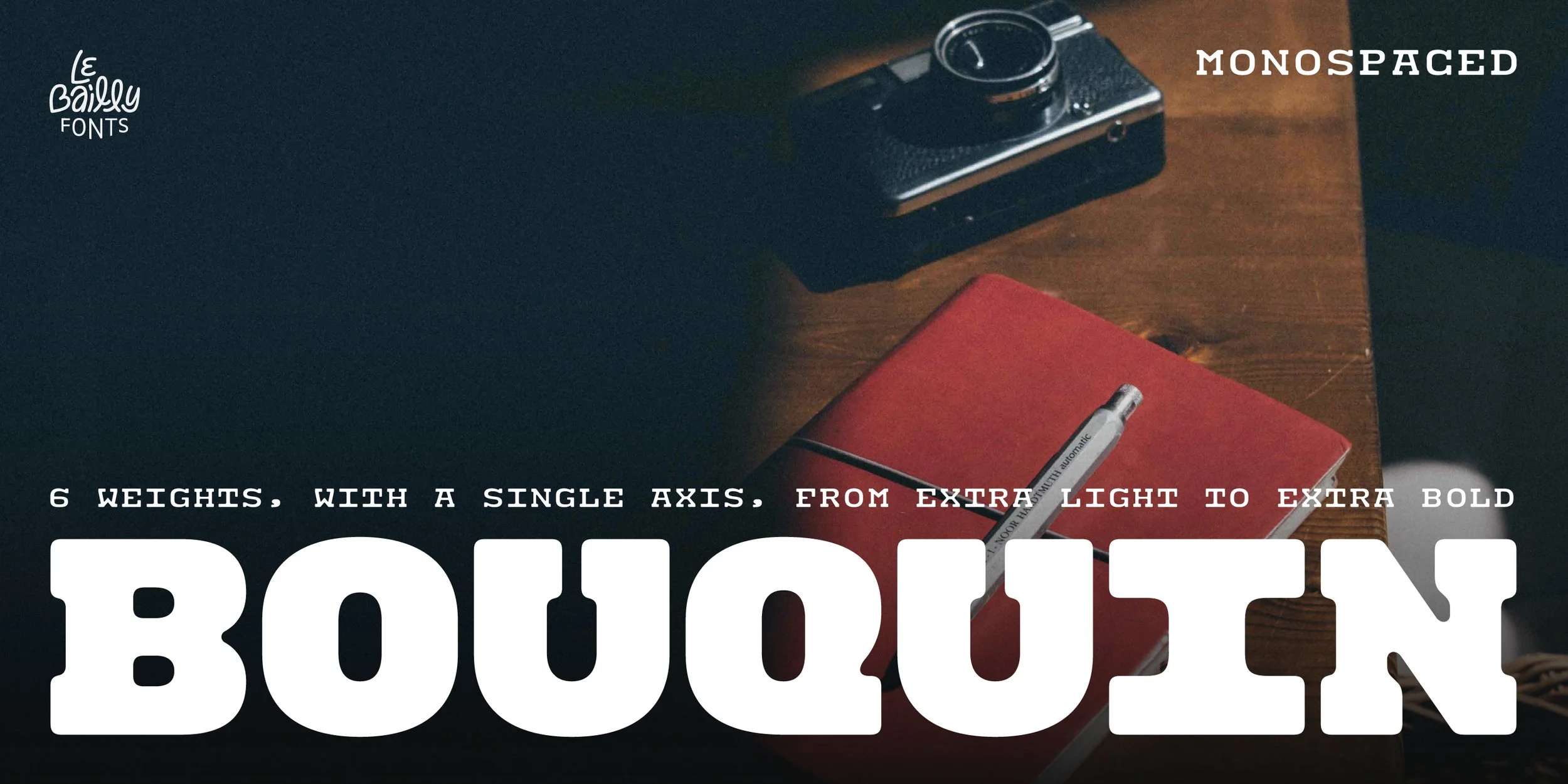
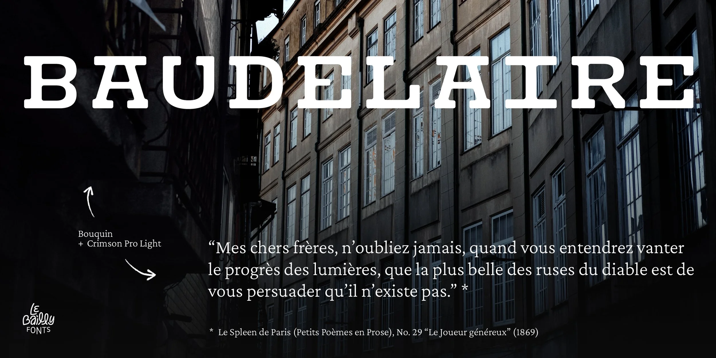
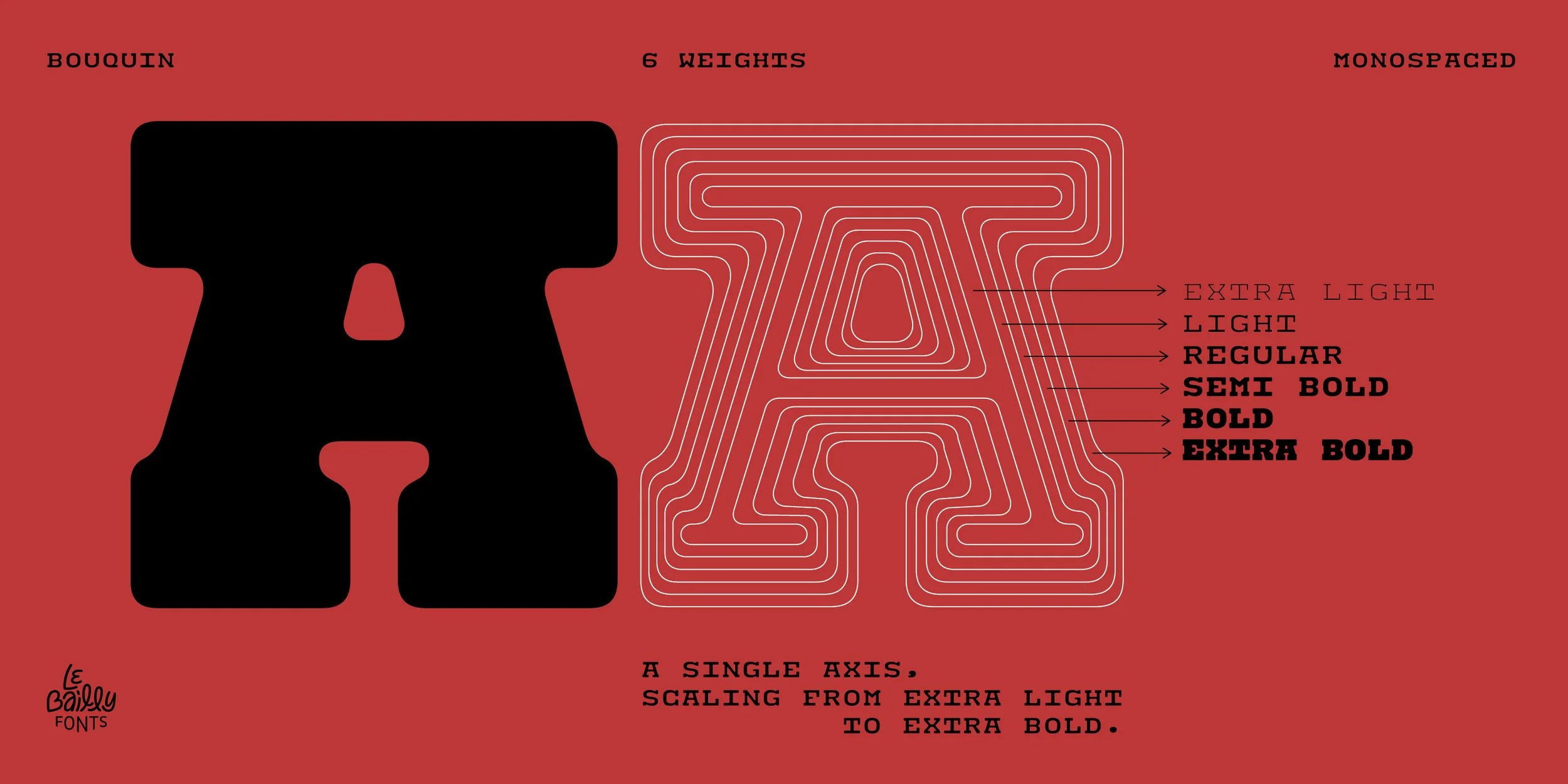
For Guidon, Bouquin and Gabarit type families, we used Miguel’s own collection of photographs from different places and moments in time, creating a genuine atmosphere difficult to reproduce otherwise. From there, we developed the story, mood, copy and graphics.
Together, these visuals let each typeface speak for itself, in its own look and feel.
Credits:
Creative direction: Miguel Barbot
Art direction and graphic design: Maria Helena
Guidon, Bouquin and Gabarit font collection photography: Miguel Barbot